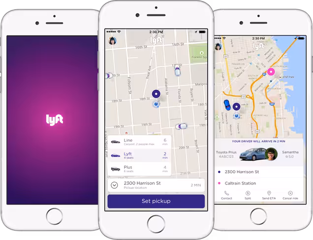
The latest update for Lyft, available today for iOS, gives the app a brand new coat of paint. In addition to ditching the icon’s pink color for a blue hue, the overall UI looks more streamlined and provides for more functionality “in the future.”
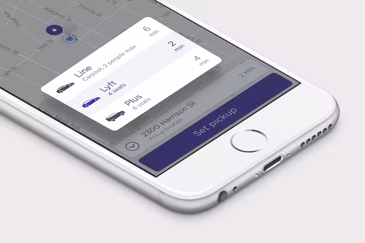
The first thing that’s immediately noticeable in the app is that it has much more visible map space than its previous iteration. This is because the old header, which was used to designate the kind of ride hailed on the app, has been fully shed in favor of a small circle near the bottom left corner of the screen.
The bubble serves two purposes. One is ergonomics: the company says that the new UI is better for “one-handed” use throughout, possibly to combat the larger phones released by both Apple and Android. Additionally, it also serves as a level of transparency — when tapping the bubble, users can see how far away other kinds of rides are.

The 💜 of EU tech
The latest rumblings from the EU tech scene, a story from our wise ol' founder Boris, and some questionable AI art. It's free, every week, in your inbox. Sign up now!
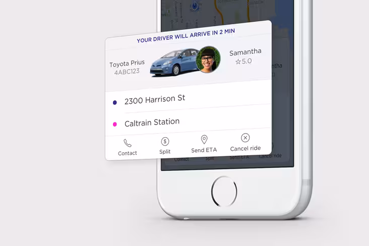
Once a ride is hailed, there are more immediate options to keep users engaged within the app. In addition to providing clearer photos of both the driver and the car he or she is operating, users will get a set of easily tappable options: Contacting the driver remains available, alongside the option to split rides, send an ETA, or cancel the ride. The new positioning of the ‘Cancel’ button makes it much easier to reverse the ride request, and its visibility (alongside a much more prominent driver rating) is very helpful.
“Sharing your route is something we expect to be more prevalent as we work with things like Slack,” Lyft VP of Product Tali Rapaport told TNW. “We’re moving from something you just use before your ride to into your ride as well.”
But the new UI serves as a springboard for what Lyft promises will be many more “future” endeavors. Rapaport specifically spoke about more transparency as the company continues to pursue more commuter-friendly ride options. The company, specifically, is currently gathering data on popular commuter routes to help launch a door-to-door carpool-style service.
‘We’re launching a commuter product that announced to our users to preregister their routes,” she explained. “We’ll launch this commuter offering inside these mode options. With price and ETA side-by-side it makes it really transparent to make that trade-off decision.”
So perhaps sometime in the future, when you open your Lyft app, you will be able to clearly see exactly what you’re getting, in terms of time and money, between a Lyft, a Line and a different commuter option. This could compel users to pay a little extra to get to where they need to go faster, or perhaps save their money and take a more time-intensive trip.
The new design is available today for iOS, and will roll out to Android in January.
Get the TNW newsletter
Get the most important tech news in your inbox each week.