Help me. I’m on a laptop running Windows 8 right now.
Like many others, I hate it and think it’s the worst operating system since the not-so-distant Vista.
If I didn’t have to use it, I might be able to appreciate for a second that Microsoft made a bold design decision that actually ended up being influential.
Microsoft’s Metro design language was one of the first instances of flat design in technology and it came in the least likely form: a terrible mp3 player nobody bought apart from this one kid at my school. The short-lived Zune.

Windows 8 came six years after the Zune and used the same design language, but since it was seen by more than five people it had a much larger sphere of influence.
Although I’m not sure how much attention Apple pays to Microsoft’s products, it seems they grabbed Apple by the shoulders and shook the clunky, skeuomorphic excesses away. The next iOS after Windows 8 had left the old ways behind.
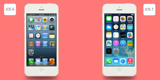
In iOS 7 there was not a leather-bound book, bevelled button or drop-shadow in sight.
Within the space of a few months, the two major software developers in the world popularized what has since been called flat design.
Let’s take a deeper look at the roots of flat design — the style Microsoft brought to the world’s attention, then watched every designer do it better.
Modernism: pure functionality
It’s because of modernist architecture that I live in a brutalist, Soviet-era block of plain concrete apartments, built to house as many people in the smallest amount of space possible.
Popular in the 1920s, Modernism emphasised practical, stripped-back design and cut out everything unnecessary.
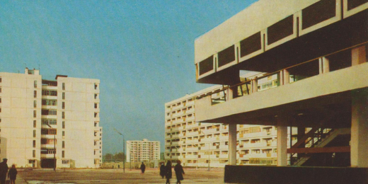
Modernist design was pure function — a rebellion against the gilt-framed portraits of queens and angels and the grand Victorian manors which still exist in some parts of London.
The way that the modernists trimmed functional items down to the barest necessities is similar to today’s move towards flat design. There’s not a lot of art from the period that reflects flat design, but modern architects inspired by thinkers like Karl Marx showed the world that luxury doesn’t always equal good design.
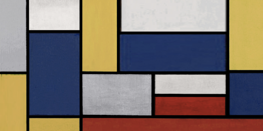
Mondrian nailed the Windows 8 UI in the 1940s
The design principles of modernism were expressed by Piet Mondrian’s minimalist work in the 1940s, which I used to like a lot more before Windows 8 came around. Now whenever I look at his art I expect the squares to awkwardly start spinning around at uneven intervals…
*shudder*
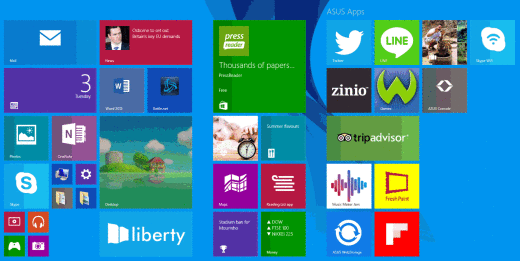
Anyway, we’ll get back to Windows 8 later. The next stage of flat design formation builds on the minimalism of the 1940s and combines it with Apple’s favorite font.
Swiss Style & Helvetica
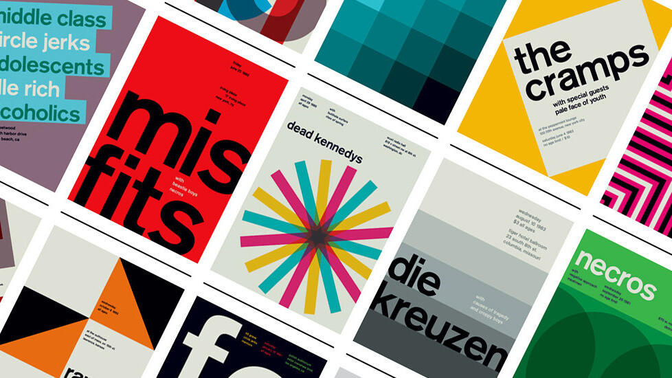
Bright, geometric shapes, sans-serif typefaces and total lack of shadow or depth. Look familiar? If the founders of Swiss style were to have set up shop in 2012 creating landing pages for SaaS companies, they’d be loaded.

Helvetica, developed in 1957 by Max Miedinger and Eduard Hoffmann, is one of the most popular sans-serif typefaces. The reason it became so popular is similar to the reasons behind the shift towards modernism in the 1920s and today’s flat design trend.
Above all, Helvetica is practical. It’s easy to read at a distance, even in small sizes. That made it perfect for posters like the ones above. It’s no-frills, meaning it lends itself well to minimalism. Unlike script and serif typefaces, Helvetica doesn’t mess around with unnecessary curls, flicks and wiggles (expert typographical terms).
Design in the Swiss style retained popularity all the way up to the point where it was possible to transition the principles into the digital space. Somewhere along the way, however, there was a revolution.
Technology imitates life
As I looked at in an earlier post about the user onboarding process, it can be hard for software designers to ease the user’s transition into a new piece of technology. When the first graphical user interfaces (GUIs) came out, they mirrored the layout of a real desktop, with icons representing their physical equivalents (stacks of paper, the clipboard, a calculator, the trash can, etc).
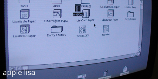
Apple kept this up for a long time.
From the ripped paper edges of the iCal to the varnished wooden shelves filled with eBooks, Steve Job’s design principles stated that if something were to be easy to use, it had to look familiar. Apple’s user interfaces got shinier as time went on, and with each graphical overhaul the icons became glossier, with more complex drop-shadows and deeper gradients.
Around the same time, Microsoft was rolling out the monstrously awful Aero design on Vista — an attempt to out-gloss Apple which thankfully didn’t last long.
Between 2006 and 2012, Apple and Microsoft were engaged in a battle to see who could make their UI look more bloated and gross.
Then, as if the bubble burst, in October 2012 everything went flat.
Windows 8 set low standards for flat design
When Windows 8 came out with its new flat interface in 2012, plenty of people, myself included, were revolted.
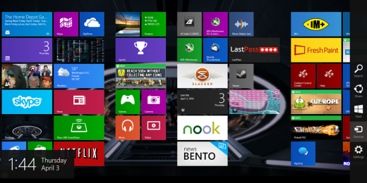
The sidebar appeared when I needed it least accompanied by that ridiculous rectangle displaying the time and date. Half of the interface insisted on being permanently full-screen, and Microsoft took one last stab at Internet Explorer before admitting that the only thing it’s used for is to download Chrome or Firefox.
It took the adept hand of Apple to do what all good tech companies do: take Microsoft’s ideas and actually execute them properly.
Before flat design got its name, Windows 8 was discussed in terms of a ‘metro design’ language. It’s only when iOS 7 came out that people started talking about flat design.
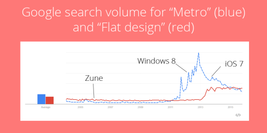
No one wanted to use it when it was associated with Windows 8, but Apple’s beautiful rendition saved flat design from the same fate as the Zune.
What’s next after flat design?
According to Wells Riley, design is nothing more than a form of problem-solving. A problem with flat UIs is that they have a tendency to leave a lot of the functionality up to your imagination because there is no room for clutter. With a limited number of ways to make elements stand out, flat UIs can be as beautiful as they are confusing. Wells says:
“Unlabeled icons look great in a screenshot, but will a user understand what they do? Will they make the product easier to use? Will they help make the product useful? Think about whether or not your aesthetic decisions will hinder your solution to the customer’s problem.”
This was back in 2013 around the same time as Dropbox’s flat UI overhaul which caused mass user confusion. It’s been two years, but I’d say with a degree of certainty that most have gotten used to it.
If you haven’t, well… Why don’t you go and install Windows Vista if you love bevels so much!
Oh, and if flat design has you missing your fix of drop-shadows and gradients, here’s a beaut courtesy of the Wayback Machine.
This piece first appeared on Process Street.
Get the TNW newsletter
Get the most important tech news in your inbox each week.


