
Perfection.
The very word brings to mind ideas of the unattainable and absolute. Infinity, parallel lines, the final numeral in pi, and of course: a responsive design that displays attractively across every imaginable platform.
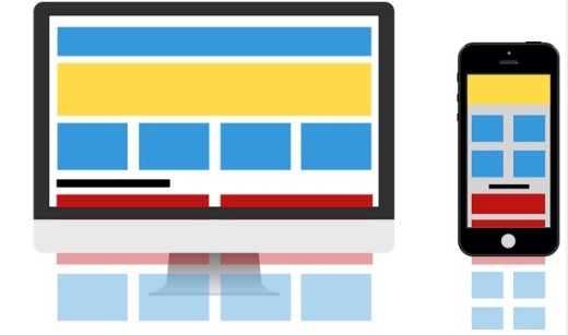
Photo credit: UXPin
Design perfection is obviously an abstraction. If there were a single right way to do things, then everyone would copy it. Then it would be boring, marring its so called perfection.
That being said, it’s certainly possible to approach the sun without melting our waxen wings.
So follow along and let’s see how far we can push towards perfection in our pursuit of the ideal responsive design.
Responsive Layouts: Less Is More
Much has been made in the past about the magical line known as “the fold.” If the content is above the fold, it’s high priority and immediately visible to the user with no scrolling required.
Now, on desktop, there’s plenty of room above the fold. It’s a roomy area with plenty of space for images, text, video, carousels, and all the fixings.
On a mobile screen this area is pared down significantly. You have to carefully consider what should appear above the fold on a mobile screen. Though scrolling down is far more common than many originally theorized, it’s still true that the content on top of the page receives the lion’s share of user attention. That means you must decide which of your elements are most important.
- Imagery is often put on the backburner, as it is somewhat superfluous.
- Text and navigation are usually brought to the forefront, feeding the user the information that they’re searching for first.
- Elements like buttons and especially CTAs are seldom left at the bottom of the page when the screens shrinks.
You’ll probably need to rearrange the order in which you display your content as the screen size decreases. You may even need to hide content. But don’t worry, this is often a better move than you might think at first. Removing content from the screen makes a design more attractive by reducing clutter.
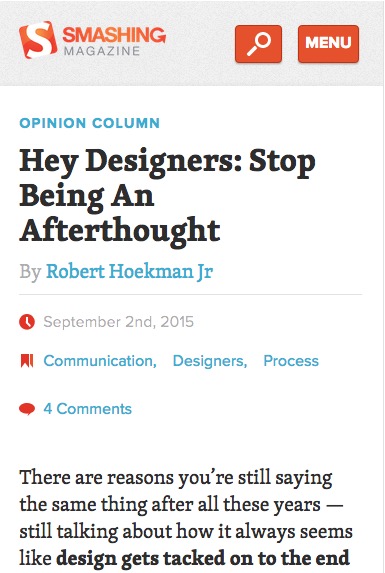
Consider the difference in the mobile view versus desktop view for Smashing Magazine’s responsive site:
Smartphone View:
Desktop View:
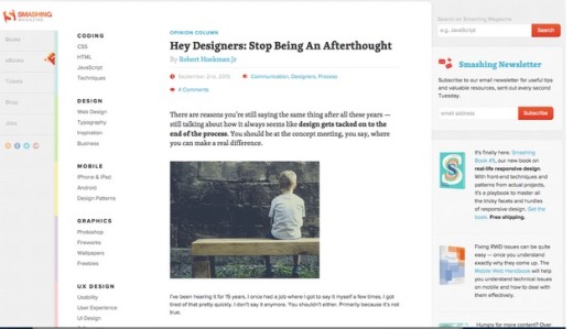
Source: Smashing Magazine
The logo and header are still at the top, reminding users what they’re here for, but the image is skipped entirely in favor of focusing on the headline and intro paragraph. Smashing Magazine understands its users will scroll, so it doesn’t feel the need to cram the “Subscribe” CTA right above the fold.
The navigation menu is also clearly labeled instead of being just a hamburger icon. Although you can’t see it here, the site also features six breakpoints (which is fantastic considering best practices calls for a minimum of three).
As explained in the free guide UX Design 2015 & 2016, remember these important maxims in relation to the differences between screen sizes:
- Prioritize content over visual appeal. Create a content inventory, assign priorities (primary, secondary, tertiary, etc.), then follow the mobile-first process by creating your smallest views first.
- Your site shouldn’t try to make your site look the same on all devices. You should, however, create a consistent visual hierarchy in which content categories maintain their relationships. See below for a quick visual explanation. Notice how the primary and secondary content shifts in shape, but preserves the same relationship to each other.
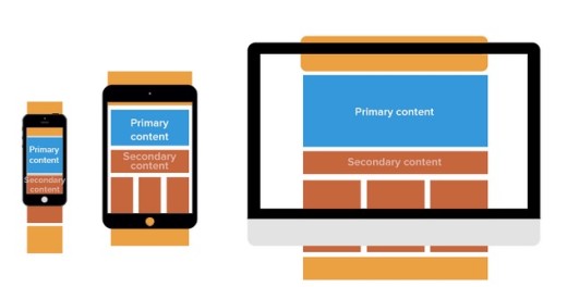
Create a minimum of two viewports (320px for smartphone viewport, 767px for desktop/tablet viewport), but three+ is recommended (320px, 767px, ~1200px) for the best device flexibility. We wouldn’t recommend more than six breakpoints since it can bloat your code. You can see some popular sizes below from the breakpoint feature in the responsive prototyping tool UXPin.
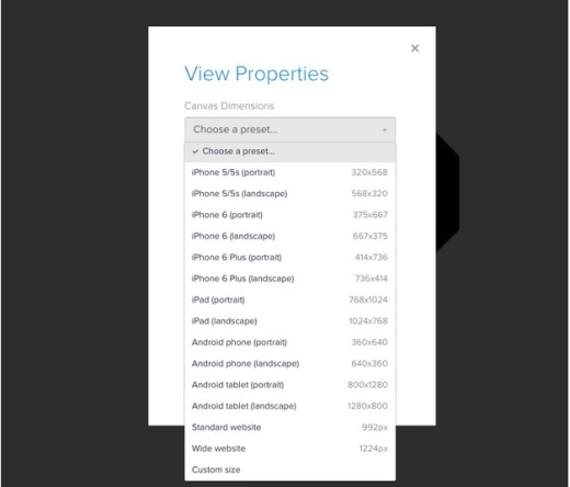
Photo credit: UXPin
Availability in Navigation
Responsive designs are meant to be attractive, certainly. But all the aesthetics in the world won’t redeem a website with poor usability.
The first and most important concern for your website’s visitors is navigation. Always keep your most important user paths open and available wherever the user goes on the site.
One way to accomplish this is with sticky navigation. No matter where you go on the page, the navigation options stick with you, ensuring you never have to scroll excessively do an inordinate amount of scrolling to get to your next destination.
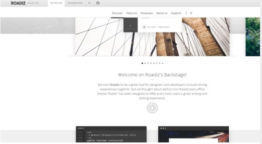
Image credit: http://www.roadiz.io/
This gets a bit trickier when you’re limited on screen space though. You have to ensure that your navigation options aren’t taking up too much real estate. Viewing our example site, Roadiz.io, from a mobile device shows one way to handle this problem.
Enter the shrinking navigation bar:
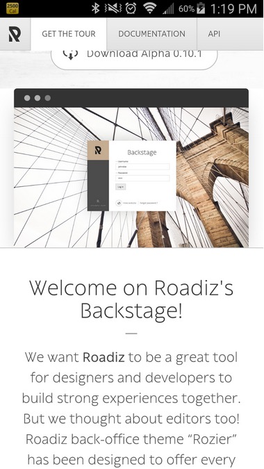
Image credit Roadiz.io
As you can see, the navigation options shrink to a single line as the user scrolls down the page. This prioritizes the software’s tour, open-source documentation, and the API. To find the Discover, Features, Showcase, About Us, and Support navigation options, you have to scroll back up to the top of the page.
While this isn’t a deal breaker for usability since the scroll isn’t excessive, it may cause a problem for at least some of the site’s users. While we suspect there’s a sound reason for featuring the Documentation & API in the shrinking nav, it might be more valuable to include Features and Showcase instead.
Of course, there are other options to address this issue, such as the various types of hidden menus:
This is largely a matter of preference, but the toggles seem to be the most prevalent for the moment. To learn more about responsive navigation patterns take a look at this excellent article by designer Brad Frost.
You’re Really Pressing My Buttons
Button visibility is always a big concern when it comes to usability on a smaller screen. You have to highlight the clickable elements in order to indicate their priority.
According to the official guidelines for the iPhone interface, clickable touchscreen targets should be a minimum of 44 points in width and height. The visual cue for the clickable area should be big and obvious. But it should also be surrounded by negative space to such a degree that ensures users won’t accidentally click anything else.
Desktop View

Image credit: Lyft
Notice how the CTAs in the above Lyft example are located close to the other clickable elements on the desktop display. This allows for more clicking precision.
Compare this to the same landing page seen on a smartphone:
Smartphone View

Image credit: Lyft
- Here the buttons are stacked vertically, not just to save space on the screen, but also to keep users from accidentally clicking “City” when they meant to click “Calculate.”
- Note that the relative size of every clickable element is much larger than on the desktop display.
- Some of the visual appeal is sacrificed when the full screen image is removed, but the omission actually improves overall usability.
One thing that could be improved is the grouping. Even though there’s a space between the buttons and the field forms, it’s still a bit too close for comfort. Closely grouping clickable elements on a touch screen is asking for trouble, which is why you should design for fat finger UI.
According to a study performed by MIT, the average person has a fingertip that’s between eight and ten millimeters wide. The finger pad (which is more than likely what most users will use) is slightly wider, around sixteen to twenty millimeters.
Since we’re already on the topic of text, let’s examine the best practices for responsive typography as well.
Responsive Text
The readability of a web page is always a major concern in any design. You have a number of obstacles right off the bat.
- Line length and height
- Font size and weight
- The typeface you’ll use
- The ratio between heading and body text
All play a part in your decision making process when it comes to determining which font you’ll use and how big it will be. Here are a few responsive guidelines to consider:
Header Overhaul
High definition displays on mobile have made things easier for designers who can now comfortably use smaller text sizes, but it’s still a gamble going too tiny. Default font sizes for example, should never require zoom in order to be legible.
The one place you can comfortably reduce font size is with headers. Scaling down your headers saves space and makes the screen more legible. It’s best to keep your headers as short and sweet as possible. Keep them to a single line if you can, that way you push as little content as possible below the fold.
Take a look at the difference between the headers as the screen size is scaled down on the homepage of design agency, Deux Huit Huit:
Desktop View

Image credit: Deux Huit Huit
The header and imagery are clearly prioritized when there’s extra room. However, when the browser window is scaled down, the navigation options are highlighted with darker text and the header and image both shrink down significantly relative to the viewport size.
Mobile View
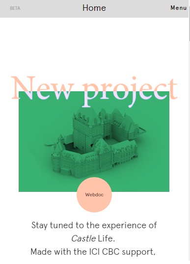
Image credit: Deux Huit Huit
The text size is increased and it’s no longer overlaying the image. This ensures that the web page is still legible, and it doesn’t sacrifice anything in the way of visual appeal. Still this site isn’t exactly content-heavy. When you’re designing for a blog or a news site, you have to make sure that large blocks of text can still appear legible, scannable, and attractively spaced.
So some basic ground rules for attractive responsive text would read something like this:
- Reduce header size
- Keep headings and subheadings to a single line
- Deemphasize imagery
- Use simple yet bold typefaces with large x-heights and more open counters. For example, Vectora, Oxygen, and Droid serif are solid choices. For the prototyping tool UXPin, we prefer Proxima Nova for the same reasons.
- Increase text size
Optimize Font Size & Line Length/Height for Leisurely Reading
As explained in the free guide Web Design for the Human Eye, it’s good practice to keep line length in mobile views between 40 and 60 characters.
Going from line to line with small text in spaces that span great distances can be difficult. So not only are shorter lines preferable, but it’s also nice to keep your fonts a little larger than you might normally be comfortable with. Larger screens can offer a lot more flexibility in line length.
As Google suggests, base fonts should usually be sized around 16px on both mobile and desktop screens. This will of course vary slightly according to the type of font you’re using, so make adjustments as needed. The absolute minimum, however, should be 12px. Luckily, 16px is usually the default. As far as line height goes, you’ll want to keep it around 1.2em, which is again, normally the browser default. With a base font size of 16px, 1.2Em converts to 19px.
Let’s look at the Time Magazine homepage. Here’s a website that’s a little weightier in terms of text.
Desktop View

Image credit: Time.com
On the full size version, the site has a lot of what you might expect: three vertical stacks of content set in a grid. In the central body of text (beneath the video featuring the clowns in politician’s clothing) the text measures thusly:
- Text size: 16px
- Line height: 18px (right around where it should be)
- Line length: 85 characters (longest line)
When you shrink the browser window the numbers are modified ever so slightly.
Smartphone View

Image credit: Time.com
- Text size: stays consistent at 16px
- Line height: 14px (a little smaller than what’s normally preferred, but still legible nonetheless)
- Line length: 49 characters (longest line)
The legibility is undoubtedly preserved in the smaller view. The text size doesn’t change at all, so it looks larger on the smaller screen. The line height and length, on the other hand both decrease.
In the case of height, the shrinkage is negligible, but necessary in order to get a little more content to appear above the fold. Length decreases significantly though. Again, to preserve legibility and keep the reader from losing track of the line they’re reading.
To quickly recap:
- Line length should be between 40 and 60 characters on small screens
- Font size is optimum between 12 and 20px, but it’s best to stay on the higher side of that range
- Line height is usually good at 1.2em, often the browser default
Conclusion:
We’ve covered a lot of ground in regards to responsive web design. We’ve learned that conventional wisdom isn’t always so spot on in regards to the oft romanticized “fold.” We’ve also learned that aesthetics should never take a back seat to usability. And finally we learned way more than anybody would ever care to know about responsive typography.
These are the outlines to much better responsive design. All that’s left now is the process of narrowing it down for all eternity, and never quite reaching the ideal.
Perfection is an illusory ideal, after all. A fine dream to keep us striving for the next step in our progression.
If you found this post helpful, check out UX Design 2015 & 2016. Across 164 pages, the free guide offers advice for responsive & adaptive design along with other UX techniques. All the tips are illustrated with analysis of 71 examples from companies like Waze, Tinder, Spotify, Nest, Hulu, and others.
Read Next: How video games improve your interaction design
Image credit: Shutterstock
Get the TNW newsletter
Get the most important tech news in your inbox each week.


