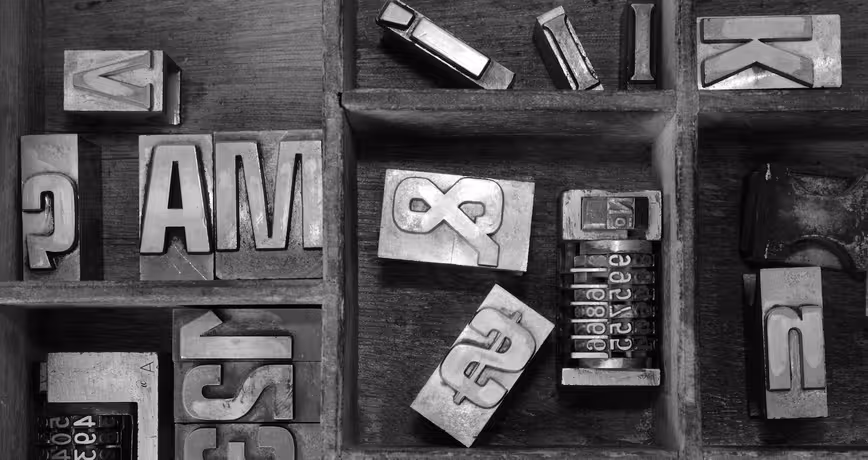
With the rebirth of flat design and the popularity of minimalism, typography is taking a more central role in Web design.
In modern Web design, we’re seeing five typographical trends emerging:
- Extreme size (large and small)
- Superimposed on images
- Creative use of simple typefaces
- Custom typeface
- Artistic fonts

The 💜 of EU tech
The latest rumblings from the EU tech scene, a story from our wise ol' founder Boris, and some questionable AI art. It's free, every week, in your inbox. Sign up now!
These styles are not mutually exclusive, and in fact are usually combined (as we’ll explain later).
In this article we’ll take a closer look at these five techniques, including some expert advice and real examples. To learn more about typography techniques and nine other trends, check out the free e-book Web Design Trends 2015 & 2016 (contains 166 examples and 100 free design resources).
Extreme Size
Text size is the easiest way to control its level of influence. The trend lately is going to extremes, both large and small.
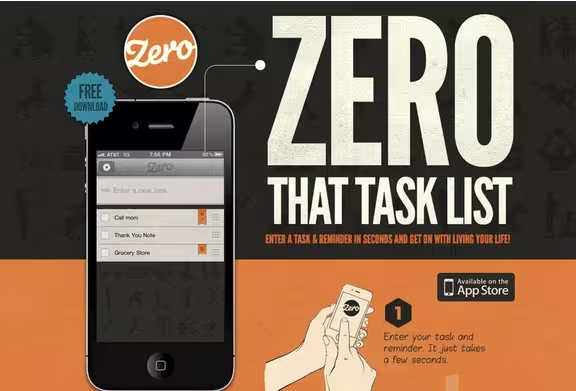
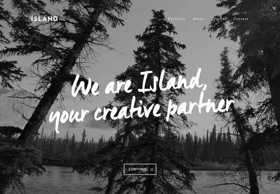
Large Typography
Large typefaces send a powerful and assertive message when coupled with comparable images.
This style typically follows the same guidelines:
- A larger proportion and weight compared to the other screen elements
- Characters larger than 85 points.
- Caps or extremely thick strokes
We’re also noticing some trends within this trend. Often, the words expand to fill the entire screen. Sometimes thin serifs are added to create a dynamic contrast to the thick strokes. We also see on-screen words alternating in size.
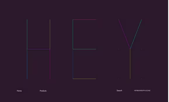
http://junduffy.co.nz/
Because this trend is so popular, you can try a few creative touches. Don’t be afraid of different alignments, such as to the right or left, to avoid the “centered” crutch. At this size, your message will surely be bold, so caps aren’t necessarily required. Last, a customized use of color can give your site a unique personality.
Here’s a technique we found useful for designing with oversized type: begin with an uncomfortably large size, then scale it back until you find the size that works. By starting big and working backwards, you may find yourself choosing a size bigger than you would have guessed.
That’s exactly what we did for our own UXPin website redesign earlier this year. We decided on a moderately-large headline (59 pt) balanced by smaller text against a contrasted background. Because the headline is set against pure white background, the headline appears bigger than it really is (without crowding out the body text). For crisp aesthetics and legibility, we chose a classic sans-serif Proxima Nova typeface.
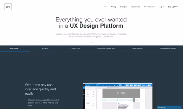
Photo credit: UXPin
Small Typography
For a softer voice that speaks just as loudly, some designers turn to extremely small typography. As long as the other elements on the screen don’t overshadow it, small words can stand out just as much as large ones.
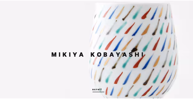
Photo credit: http://www.mikiyakobayashi.com/
The strategies behind large and small type are a little different. Small type is often black, and used with excessive negative space. Both, however, typically use thick strokes.
Small typography works well over a hero-style image, as the contrast creates intrigue, and the minimal space taken up by text allows better appreciation of the image’s content.
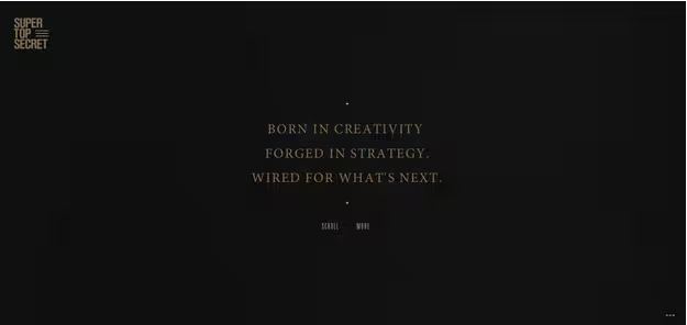
Photo credit: http://www.wearetopsecret.com/
Sometimes small type needs a little extra embellishment to be noticed. A flourish like contrasting color or a simple animation can ensure that it’s seen — but surrounding it with negative space will work best.
Superimposed Over Images
The days when images and text were two separate entities are over. Today, superimposing text over images can make both more powerful.
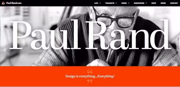
Photo credit: http://www.paul-rand.com/
The two major considerations with this style are contrast and legibility. Where the text appears on the image will impact both, and a designer must be sensitive about breakpoints on various devices. Test out locations to determine where the text is most visible without obscuring the focal points of the image, like faces or product/brand placement.
Another concern is that the two together don’t confuse the meaning. If a sports photographer superimposes his name over his best photo — a picture of Tom Brady — you can understand the confusion.
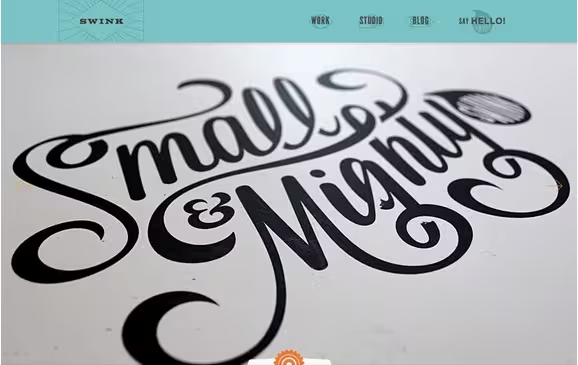
Creative Use of Simple Typefaces
As with other design elements, experimenting with text and typography can yield some great benefits if you’re up for the risk. For example, we just talked about text on images, but what about images in text?
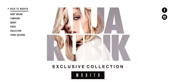
http://anjarubik.mohito.com/en/
You don’t have to follow the trends to use typography in a memorable way. In fact, inventing your own creative usage is the best way to stand out, as long as your idea is sound. As recommended in Web Design Trends 2015 & 2016, remember that readability is the ultimate goal, so don’t do anything to jeopardize the words’ meaning.
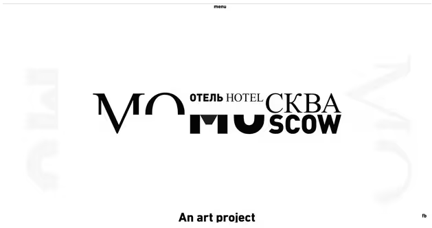
Photo credit: http://hotelmoscow.info/
Creative typography is, by nature, interesting on its own. It’s best to combine it with a simple and unobtrusive background, such as a single-color blanket as in the examples above. You don’t want to clutter your screen with too many elements competing for your user’s attention.
Custom Typeface
A custom typeface can have the same effect as creatively using simple type — better, even, considering the potential for furthering brand identity and character. Designing your own font system is a failsafe way to set yourself apart.
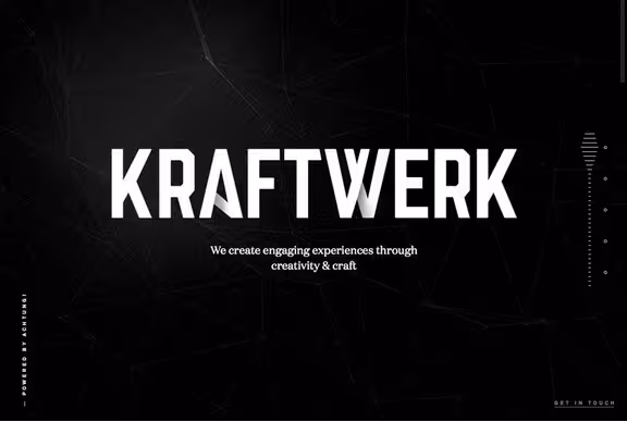
http://studiokraftwerk.com/
However, you’ll find implementing your own typeface is harder than it seems.
For starters, there’s the actual look of your font: it must match the personality of your brand and the atmosphere of the site — otherwise, what’s the point? Next, it should only be used sparingly. To overuse a custom font is to dilute it: trying limiting it to titles, slogans, etc., and avoid heavy blocks of text. Last, keep in mind compatibility: a custom typeface must work across different browsers and devices.
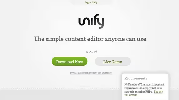
http://unify.unitinteractive.com/
Artistic Fonts
Some fonts are designed solely for looks. Blocks of text written in such fonts act more as graphic elements in a Web layout than they do as text. For some sites, though, this could be exactly what’s needed.
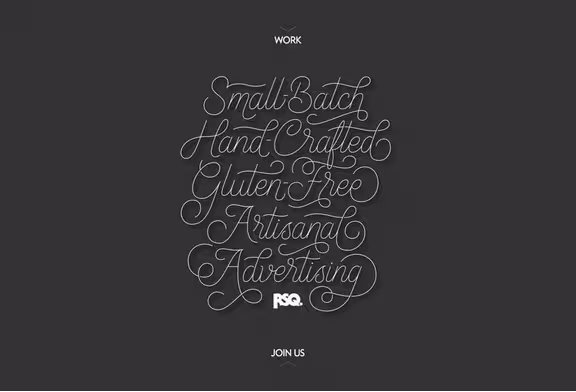
This strategy is a classic one for typography, one that’s been used in advertising posters for centuries. The cost for such a look is legibility and the deemphasis of the message of the words. However, for aesthetic gains, this embellishment could be worth the price if you limit it to headlines only.
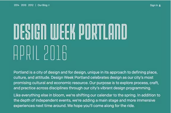
http://www.designweekportland.com/
Try to avoid the commonly used artistic fonts, such as word clouds or the word etched in the shape of what it means. These clichés undercut what you’re trying to accomplish, and because artistic fonts have their drawbacks, you must use them responsibly.
Combining Techniques
Use common sense. For example, if you’re placing an image inside your text, you’ll obviously want to use oversized text (or else the image would be too small and unseen).
Likewise, think about which techniques would not go well together. For example, artistic fonts, are inherently flamboyant, so they’re best used in a straightforward way. Using an artistic font in a creative way might be overkill, and risk convoluting your design.
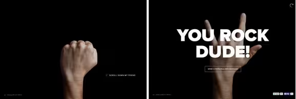
http://sendamessage.to/
Sendamessage.to (above) combines techniques in a practical way. It starts with small, simple text to draw attention away from itself and onto the image. After interacting with the site, though, the textual message — the point of the site — appears. This is written in a large typeface, and superimposed over the image, two strategies for grabbing attention back from the image.
Conclusion
These five techniques are popular as ways to keep minimalist site structures visually interesting. With the right typography, text becomes a graphic element as well as content; art as well as content. Using the above tips, try playing with your site’s typography — even subtle differences like color or size can alter the meaning.
To start prototyping visually stunning websites without code, feel free to start a free trial with UXPin. The collaborative design app comes loaded with 1000+ custom elements and popular typefaces to speed up the design process.
Read Next: The future of color in Web design
Image credit: Shutterstock
Get the TNW newsletter
Get the most important tech news in your inbox each week.