
It happens to everyone from time to time. A creative block. An empty mind. Staring at a blank screen and wondering, “well, what do I do now?”

Photo credit: “Waitin.” Khalid Albaih. Creative Commons.
Some people prefer to just wait it out, but that’s not always an option with deadlines, anxious clients, or your own natural impatience. So we’re sharing seven proactive methods to conquer your designer’s block. These are the strategies that worked for us, and we think they can work for you, too.
Design Badly on Purpose

The 💜 of EU tech
The latest rumblings from the EU tech scene, a story from our wise ol' founder Boris, and some questionable AI art. It's free, every week, in your inbox. Sign up now!
There’s a big difference between having no good ideas, and no ideas at all. Chances are, the more bad ideas you have, the more pressure you apply to come up with good ideas. In these cases, the best way to beat designer’s block is to get all the bad ideas out of your system.
Try designing a mockup in which you make all the wrong decisions on purpose. You may find it strangely productive.
For starters, you’re exercising your design muscles a lot more than just staring at a blank screen: designing badly is better than not designing at all. On a deeper level, designing a purposefully bad mockup forces you to think critically on the same topics, but from a different perspective. If you can figure out the worst place to stick a call-to-action, for example, that will shed some light on the best place. This kind of productive distraction allows you to think about solutions without actually thinking about them.
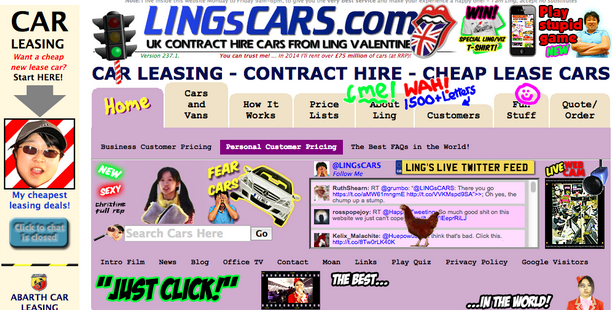
Photo credit: Lings Cars
Some sticklers will feel uncomfortable designing badly, so there is another similar alternative. Stream of conscious designing has the same benefits of designing badly — thinking about the design without the pressure — but appeals to more goal-oriented thinkers.
Like we described in the free e-book Web Design for the Human Eye, this procedure requires building a mockup with as little thinking as possible. Design for speed based on your instincts and, like the above strategy, don’t worry about designing badly. Set a time limit (like 15 minutes), add the first thing that pops into your head, and then immediately add the next thing, and so on, with as little judgment as possible. The only bad choice is hesitation.
In theory, this gets you in touch with your subconscious — bypassing the pressure and the fears so that you can return to your designing roots.
Recreate Existing Sites
The logic of this strategy makes sense. First, you’re exercising your design muscles, and that’s better than staring at an empty screen. But in addition to that, you’re learning.
When you rebuild an existing site, you are deconstructing a site you respect and learning what makes it so respectable. This shines a light on the details you usually overlook and poses questions about why the designers made certain choices.
Furthermore, the more sites you recreate, the more patterns you’ll start to notice. Stripping away sites to their bare structures, you’ll start to notice that the designers you admire tend to do things a similar way, and you’ll quickly pick up on why.
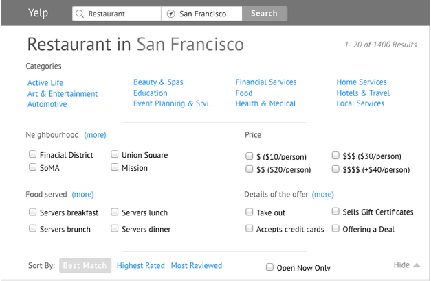
Source: UXPin via Yelp
This is a strategy we have some personal experience with. The free ebook User Testing and Design: Improving Yelp’s Website documents how CEO Marcin Treder collaborated with UserTesting and Optimal Workshop to rebuild Yelp from scratch (as a design experiment) with using UXPin. The project allowed — or rather, forced — us to examine which elements of the preexisting site worked and why. It was the perfect avenue for testing our own design theories, and inspiring new ones.
Recreating other sites develops your design skills and lets you take an active, hands-on approach to studying your craft. It’s a tactic that’s useful at any time, but when you’re blocked, it could very well be a life-saver.
Take a Step Back
This advice can be applied in two ways: in the way you design or in the way your approach the project. Both presume you’re stuck because you can’t see the forest for the trees.
First, you can stop focusing on designing the details and reexamine the big picture. If you’re stuck on one small piece, perhaps after reapproaching your overall strategy, you’ll see that this piece is ultimately unnecessary. Sometimes the reason we get blocked by significant details is because they’re not needed in the first place.

Photo credit: UXPin
Second, you zoom out the actual viewpoint on a mockup. This allows for more context to reevaluate the problem, a physical representation of our advice above. Zooming out shows how all the elements work together and gives you the chance to see things in a new way.
Start with the Easy Part
Our nature is to start at the top and work down, but in design this can sometimes be counter-intuitive. The top of the screen is often the most difficult part (that’s where your users start, too, making it prime screen real estate), and usually it’s the basis of the entire site’s information architecture and navigation.
Tackling the hardest part right out of the gate can be intimidating, so knock out the easy parts while you warm up. Of course you have to handle those tough choices eventually, but you’ll feel less pressure if you cross some simple items off your to-do list first.
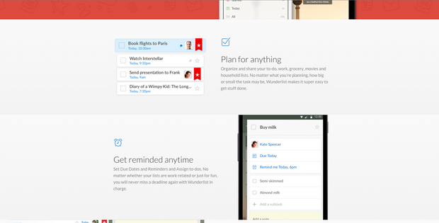
Photo credit: Wunderlist
Plus, as we keep mentioning, any work is better than no work. Even a small spark can ignite an inferno — and sometimes just the apprehension over starting a new project is enough to paralyze you.
Use the Blur Test
We wish we could take credit for the blur test, but really it’s the brainchild of Lee Munroe, which he describes on his blog. The blur test is an excellent push if you’re stuck half-way through a mockup and don’t know what to do.
All you do is blur your mockup and reexamine your layout without being distracted by the fine points — literally. The blurry version will reveal the truth about your visual hierarchy; wherever your eyes go in the blur test, your users’ eyes will likely go with the real site.
Photo credit: UXPin via Lee Munroe
The blur itself can be done by using Photoshop’s Gaussian Blur filter at 5-10 pixels. At this point, you’ve likely spent way too much time piecing together these elements, so a fresh look can make a big difference. You can learn more about this technique in Web Design for the Human Eye.
Try New Tools
Spoil yourself with a new “toy.” Between the excitement of an upgrade and the concentration of learning a new system, you may get inspired on how to solve your problem.
Whenever you use new software, two things will likely happen.
First, you’ll have to relearn how to apply your old techniques with the new system. This presses you into reassessing those techniques, or maybe evolving them. Second, you have a whole new set of features to incorporate. New tools means new capabilities, and perhaps experimenting with a new toolbox will reveal a solution to your problem.
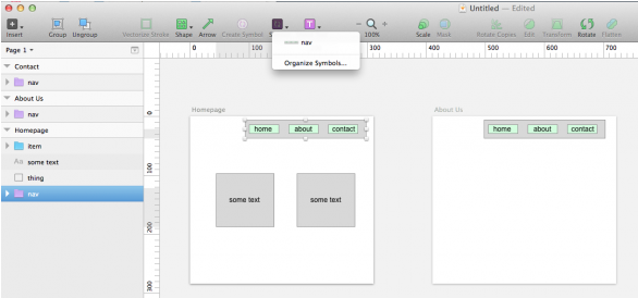
Photo credits: UXPin via SketchApp
SketchApp, for example, targets web design in particular, as opposed to the broad graphic editing of Photoshop. Our designers found that features like resizing complex shapes and multi-screen views facilitate design-based thinking.
Even if the new software turns out to be a dud, you might still earn a new appreciation for your old software. The things you find you’re missing most might be the key to breaking the block.
Find Outside Inspiration
Inspiration can run but it can’t hide — not if you know where to look. We’ll end with a list of sites created to help designers solve their problems, including designer’s block. Poke around the ideas, comments, and examples posted by other designers and see if you get any good ideas.
Dribbble – This collective for sharing work lives up to its description of “show and tell for designers.”
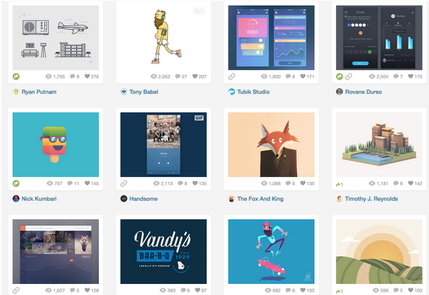
Photo credit: Dribbble
ZURB PatternTap – In the same vein as Dribbble, Patterntap focuses more on designers sharing effective and inspirational UI patterns.
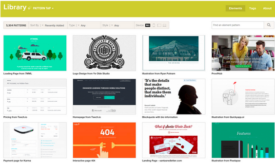
Photo credit: ZURB PatternTap
UI Patterns – One of the best pattern libraries around; if you’re having a common problem, chances are other designers have had it before and discovered a solution. Get inspired, then customize for your own project.
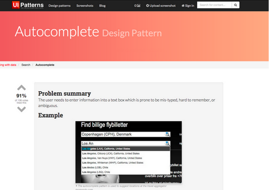
Photo credit: UI Patterns
Capptivate – Another pattern library, this one strictly for iOS animations.
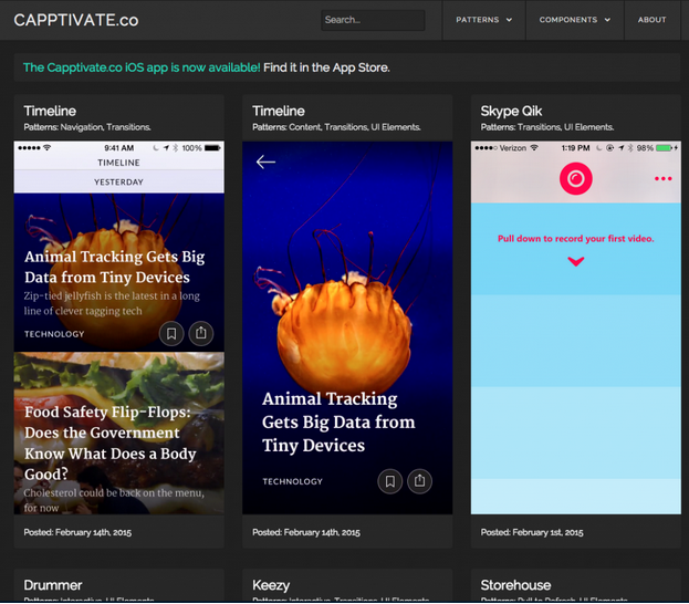
Photo credit: Capptivate
Use Your Interface – A specialized pattern library for interactions and transitions, with animated GIFs to illustrate each in action.
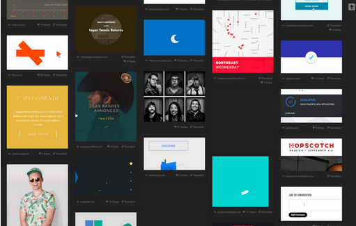
Photo credit: Use Your Interface
If these sites aren’t enough, Smashing Magazine lists over 40 resources for UI designers.
Conclusion
Remember that if you have designer’s block, you’re not alone. Aside from these mockup aids, you can always try traditional remedies: exercise, lots of sleep, a healthier diet, and some playful distraction. And take a deep breath if you find it hard to relax: the more you stress about the problem, the harder it becomes to solve.
For more web UI design advice and inspiration, including the most effective techniques and deconstructed examples from 30+ companies, check out the free ebook Web UI Design for the Human Eye.
Read Next: The pro guide to the perfect UX portfolio
Image credit: Shutterstock
Get the TNW newsletter
Get the most important tech news in your inbox each week.