
Building any website that users will fall in love with requires a few very important things.
It must be easy to find. It must know who it exists to serve. It must anticipate and address their questions. It must be their guide. It must help them solve their problem. It must provide ways to connect with the people behind the curtain.
As a UX designer, you play an integral role in addressing, guiding and delighting these users.
But the question is: How can you achieve these things when the finished website makes users feel stupid?

The 💜 of EU tech
The latest rumblings from the EU tech scene, a story from our wise ol' founder Boris, and some questionable AI art. It's free, every week, in your inbox. Sign up now!
In this post, we’ll show you how to avoid making UX mistakes that led to overly wrought designs that leave users confused.
1. Being Clever Instead of Usable
Creativity is all well and good. But when you’re clever for the sake of being clever, you risk confusing your users more than guiding them.
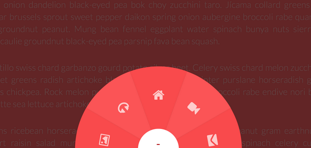
Photo Credit: Codedrops
That radial-navigation idea (like the one above) that you’re thinking of using on that marketing website? The one you’ve had on paper for what feels like forever, and you finally have the chance to use?
Now, it may be super clever. But users might not get it.
Do push the boundaries of the industry, though. After all, there could be cases where your radical idea could not only be used, but prove to be really effective. This is where design standards and design patterns can help guide your decision making.
A few things to keep in mind:
- Some contexts are more viable than others for creativity. For example, apps often provide brief walkthroughs and guidance on first use. These opportunities are great for introducing new interface elements. Users often accept that a certain level of learning is required in the beginning for new designs, so inform them when they are most primed for learning.
- Be conscious of a user’s learning curve. A user may not have time to learn how to use overly clever design. Users don’t have you around to show them how to do it. And it’s probable they wouldn’t bother even if you were. Radically new interfaces with zero assistance will make some users feel stupid.
As emphasized in the free e-book Interaction Design Best Practices, be sure to weigh the “cleverness” of a new interface up against the cost of entry, and whether users are prepared to pay that cost.
2. Overly Enthusiastic Design
Designers can sometimes feel like they’ve “done it wrong” if their interface isn’t exciting and different, throughout the whole design, every single time. But it’s OK to put clarity and simplicity over complicated and creative.
The thing about standards is that they’re just that — standard. There’s clarity in standards, which users will appreciate.

Photo Credit: Sassi Holford
Let’s take site navigation as an example.
Considering that 69 percent of users spend their time on the left half of the page, you won’t want to hide your navigation where someone might not see it. In the example above, the navigation is hidden until you click on a hamburger icon on the left-hand corner. However, the hamburger icon is now a standard design pattern and most of us are familiar with its function.
Usability is the backbone of interaction design. If people can’t easily navigate your product, then they certainly won’t think your design is clever.
Here’s some tips from an excellent article by Etsy’s VP of Design, Randy J. Hunt:
- Avoid overzealous use: Don’t go overboard in your application of gestures, swipes and creative copy. Getting too creative could confuse and frustrate users.
- Avoid unnecessary change: Changing common standards and practices — such as making a radio button into a dial — makes your product harder for users to comprehend. Build on their previous knowledge. Don’t forsake it for showmanship.
Don’t try to be boring by any means. But don’t try to be clever purely for the sake of being clever. Ultimately, designers need to delight the users they serve — and service those users must always come before Dribbble accolades.
3. Assuming Users Know What You Know
It’s easy to assume every user is on the same level, but that’s not always the case. Do a little legwork to understand your users before you design.
Conduct user research to better understand your users. Here’s a few helpful tactics:
- User personas: Create life-like personalities that outline a user’s psychological, behavioral and professional reasons for using your product. For example, a newcomer persona that reflects their doubts or a power user persona that captures their focus on efficiency.
- Experience maps: Experience maps help you understand how personas behave before, during, and after using your product. They create context for the entire experience by helping you better understand when certain features might come into play.
- User interviews: Go out and meet your users. Interact with them, recording everything what they say. Whitney Hess has some good advice if you want to learn more. Check out this e-book download on user testing, too.
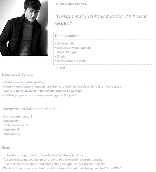
Photo Credit: Persona Tool
That’s not to say you should watered down design on the chance that not everyone will know what it’s talking about. Rather, the UX itself can assist users as they negotiate the site. Well-versed users appreciate the ability to fast-track through the experience. Newcomers will appreciate a bit more of a helping hand.
As a designer, you know how important it is to consider the flow of the experience. Remember to consider the newcomers, and to help and cheer them on through their experience.
4. Forcing Users to Play By Your Rules
One of the most delightful parts of user testing is watching users do things in a completely different way to how you thought they would. As designer Marcin Treder advised in Interaction Design Best Practices, “never underestimate the path of least resistance”.
User behavior should surprise you. These are the sorts of findings that you test users for in the first place. It means that your testing was well worth the effort.
If users prefer to do things in a particular (different) way, we essentially have two choices:
- Celebrate them, and celebrate their processes
- Shut them down, and point to the official Usage Guidelines.
We should adopt the former. Future iterations of your UX designs should help those users do what they’re already trying to do.
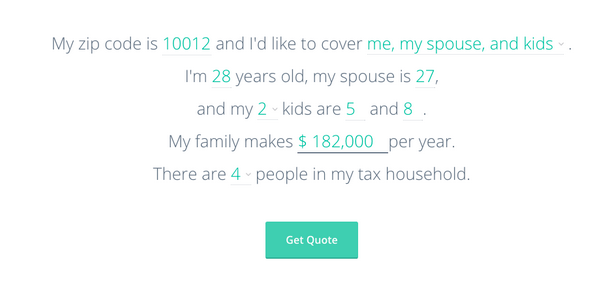
Photo credit: Hi Oscar Insurance Quote Generator
Armed with your findings, you can enable them to complete tasks how they would like to complete them. To create easy and smooth interfaces, you need to design for what already comes naturally to your users.
Forcing them to adhere to a previously established guideline (one that doesn’t know about what you’ve learned from user testing) could make them feel stupid if they can’t adjust.
Be prepared to change the guidelines in response to changes in user behavior. After all, those guidelines exist to help you serve users, not to tell users to do as they’re told!
A great example of this comes to mind. Can you remember when Google made the mistake of forcing everyone to use Google+, if they used any other Google product? Whether they wanted to or not?
Or what about when they enabled Google Buzz (a public, social tool) by default in Gmail (a very private tool)?
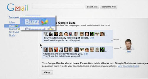
Photo Credit: Search Engine People, Creative Commons 2.0
I’m sure that Google meant well, but those changes were pretty badly received by their community of users. For those users, Google broke the “rules” of how they wanted to do things.
They’ve since fixed the issue, making Google+ optional.
Your UX designs should help users succeed, and they should recognize how those users want to do things. If the design is preventing user success, it’s the guidelines that need to change.
Be their champion, and craft the experience towards them and their habits.
5. Not Testing With Users
iPhone users had a tough time with the keypad when they launched iOS7. And it angered a lot of iPhone users because the space bar was too small and difficult to use.
Apple later corrected this in later iOS releases, of course. But the damage had been done for that release. Since Apple is secretive, it’s not really known to what extent they do or do not do usability testing. But this is a good example of why usability testing is so important.

Photo Credit: Apple iOS8
Usability testing will help you ferret out where people will trip up and get frustrated. More importantly, it’ll keep users from feeling stupid and frustrated once you release your product.
Here’s a few things to look for:
- Task success: Learn to see if users can complete a task. Look at how they learn to navigate, recover from errors and their memory recall. Nielsen Norman Group has some excellent tips for measuring task success.
- Navigability: See how many clicks it takes them to go from place to place. Check to see if they notice things such as calls to action, links, etc.
I’ve also outlined how you can use these tools, along with a few others, over in this user testing article.
Try to take any opportunity to see a real user interacting with your designs. User testing is a great way to do this, as is using Inspectlet, a tool that records anonymous sessions with your designs. In both cases, you get to see when users hesitate or make mistakes.
Conclusion
Building a great experience is the product of creativity and genuine care for users. And great experiences will inspire users to take action, as you solve their problems before their eyes.
Whether you’re new to the world of UX design or you’re a seasoned pro, the same rules apply: users must be served and observed, not left to fend for themselves. As their guide, you have five ways to guarantee the users of your designs never feel stupid.
Let’s recap:
- Clever interfaces don’t mean better interfaces. Don’t make users work to use your designs.
- Boring doesn’t always mean bad. Your version of “boring” may result in an easier experience for users.
- Don’t assume users know what you know. Guide users through content and options.
- Actual usage patterns trump your desired usage patterns. Let users do things their way.
- Test everything to see where users trip up. Then test everything again.
If you’d like to learn more techniques for smart UX design, take a look at the free e-book Web UI Best Practices. It’s a comprehensive but fairly quick read with dozens of visual case studies to show how it should be done.
Read Next: 7 shortcuts to making users trust you
Image credit: Shutterstock
Get the TNW newsletter
Get the most important tech news in your inbox each week.