We’re all creatures of habit with predictable minds. If you know how to take advantage of your user’s habits, such as with hooks and behavioral cues, you can create processes for building trust.
Photo credit: Marcin Treder
The following seven tips act as either conscious or subconscious signals to your users that you’re worth their time. Some rely on social proof, while others function on a more complex psychological level.
If you’d still like to learn more about subtle design techniques, feel free to check out the free e-book Interaction Design Best Practices: Mastering the Intangibles.
1. Respect the Power of Visuals
Believe it or not, studies show that people make decisions based on looks alone. This holds especially true for Web UI design, a sight-based medium where visuals are most of the communication. In fact, Stanford conducted a study evaluating how users determined the credibility of new websites. The results revealed that visuals alone were overwhelmingly the leading factor, with 46.1 percent of the users citing a site’s look as the basis of their decision.
A clean, appealing interface suggests reliability and even usability, as shown by Masaaki Kurosu and Kaori Kashimura’s experiment comparing users’ perceptions of two equally functioning but visually different ATMs. A user will find it hard to trust a site that’s unattractive, even if it’s fully-functional. Similarly, users will be more trusting and forgiving of shortcomings for sites that look good.
That doesn’t mean you need to fill your interface with exquisite art or anything. A clean interface with a clear visual hierarchy certainly helps.
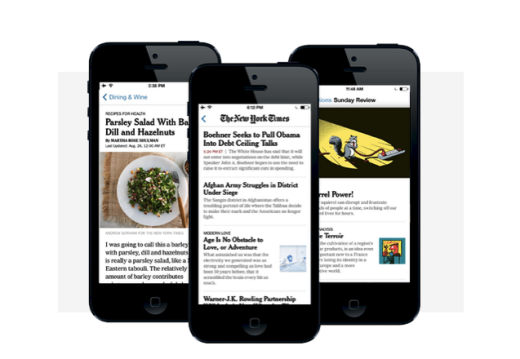
Take, for example, the New York Times Mobile App:
Source: New York Times
Their app doesn’t feature any special visuals outside of the images in individual articles, and it uses almost entirely black and white, with some gray and an occasional flourish of color. Yet, all the information is displayed in a way that’s clear and easy-to-read, and the interaction design is simple and intuitive. There’s very little chance for hitting the wrong button or going to the wrong page.
The design looks professional and well-structured, which subconsciously suggests that it will also work as intended. Predictable designs are trustworthy designs.
And for a news site like the New York Times, trust is mandatory. No one wants to get their news from a sketchy source, which means no one wants to get their news from an ugly source.
2. List the Top Companies Using Your Product
Social proof is one of the quickest ways of building user trust – there’s a world of difference between what you say about your product and what others say about it.
Otherwise known as the bandwagon effect, social proof has been proven to increase business, especially with the rise of social media. Social proof can be implemented in a few different ways, and the first one we’ll discuss is listing companies that use your product.
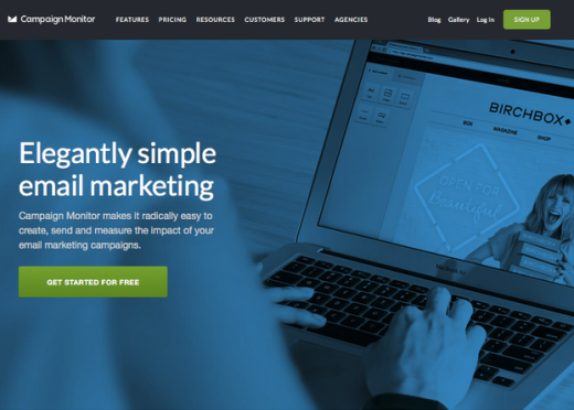
The bigger the name, the better the impact. It’s a mentality like, “well if this brand I trust uses them, they must be good.” You’ll seem more trustworthy by listing the companies that support you on your home page, whether mentioning them in text or displaying their recognizable logos.
Source: Campaign Monitor
Campaign Monitor adds legitimacy to their service with familiar brand logos like Mac and Coca-Cola. These don’t have to be overt – Campaign Monitor tucks them under the fold, in a monochrome color so as not to draw too much attention. (Also notice how they list the number of clients, which we’ll explain below).
The strategy only works with well-known brands. Otherwise you might as well be saying, “My friend Dave thinks we’re great!”
Finally, don’t feel like you need to list 10+ brands for people to take you seriously. In fact, doing so might even dilute the more noticeable companies. Five or six of your most recognizable customers will be enough to get started.
It’s even better if you can get those companies to vouch for you in a testimonial, which leads to our next point…
3. Include Testimonials from Users Who Love You
Testimonials are most effective when they’re specific. It’s much more helpful if people explain why they like your product – specific features and services, or even better, a personal story.
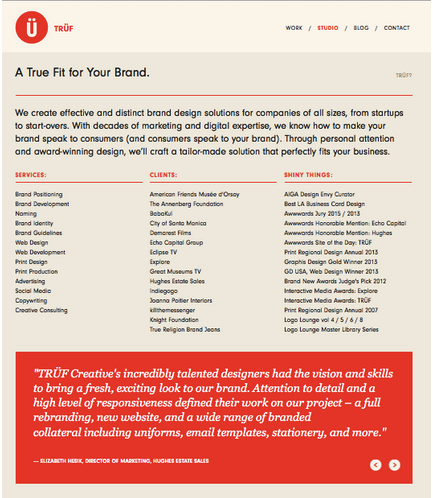
Some companies, like Trüf Creative below, insert their quotes unobtrusively into their pre-existing layout.
Source: Trüf Creative
… whereas we designate an entire page to our testimonials:
Source: UXPin
When it comes down to gathering testimonials, don’t be shy about asking the most appreciative clients to say something nice about you. If they genuinely like the product, they’ll be happy to help (and if not, why would you ask them?).
Getting a workable testimonial may require some urging, for example, asking them to elaborate, or following up regarding how a specific feature may have helped them.
For more instructions and advice on using testimonials, read this article from Entrepreneur.
4. Show How Many People Use Your Product
Like we described in Interaction Design Best Practices, another helpful approach showing social proof by the numbers.
No one wants to eat at an empty restaurant, so showing just how many users/customers you have will help you get even more. It’s a system of momentum – the more users you have, the more impressive you’ll seem, and thus the more new users you’ll attract.
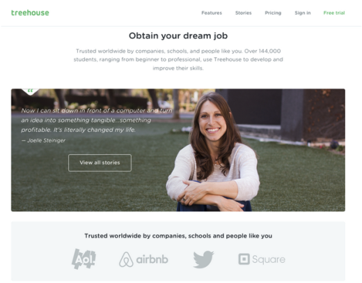
There are two common ways to do this. The first is to just simply say, in numbers, how successful your product is. Does the phrase, “over 99 billion served” sound familiar? A lot of companies will simply state their stats in an introductory message. Take Treehouse, who uses one cleanly-designed page to show all their social proof: number of users (144,000), testimonials, and company logos from respected brands.
Source: Treehouse
Notice how Treehouse even includes a well-composed photo of the person, suggesting that their service is so outstanding that people are willing to lend their face to the brand.
If this top-level testimonial section isn’t enough to convince you, the “View all stories” ghost button redirects you to an entire portal of student testimonials and case studies.
Once you’ve hit the portal, you can click on each person below to read a page-long story about how they discovered Treehouse, which courses they found helpful, and how that knowledge helped them further their careers.
Photo credit: Treehouse
Treehouse’s testimonial strategy is definitely a best practice that any company should study and embrace. Imagine the persuasive power of a potential customer seeing a dozen of your top customers vouching for you alongside prominent brands and usage numbers.
Treehouse’s design succeeds on a logical and emotional level. The clean layout suggests professionalism, the human faces help users relate, and the detailed storytelling holds our interest. Undoubtedly, it took Treehouse some time to gather all the stories and lay out the design, but it certainly pays off in the long run.
5. Dive Deeper With Case Studies
Case studies are the most involved method of social proof, requiring more user investment than glancing at logos or numbers. The payoff, however, is well worth it.
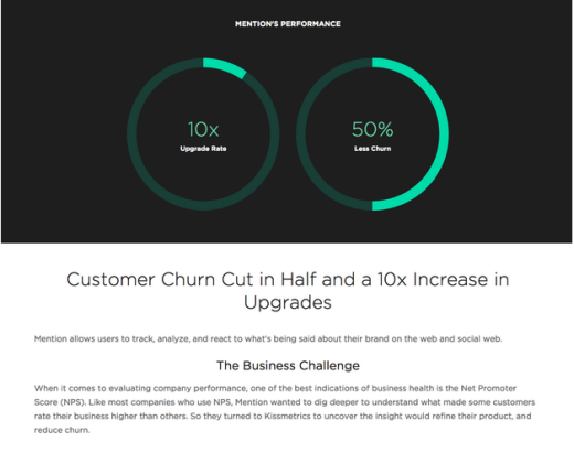
The best case studies explain how your product solved someone’s problem, presumably a common problem that your readers can relate to. In fact, a lot of case studies are broken up into sections, the first one being titled “Challenge” or “Problem”, followed by a “How We Helped” and finally a “Results” section.
Photo credit: KISSMetrics
The best case studies rely on narrative. They help readers identify with the subject and picture the product in their own life. When writing case studies, it’s always best to take a personal approach.
Use the traditional story-telling format of beginning/middle/end: show the pain, explain how you cured it, and show the happy ending in terms of results. Case studies can even incorporate testimonial quotes for glanceable content.
You could include the testimonials in the story, or small testimonials elsewhere on the site that link directly to the relevant case study (like what Treehouse did).
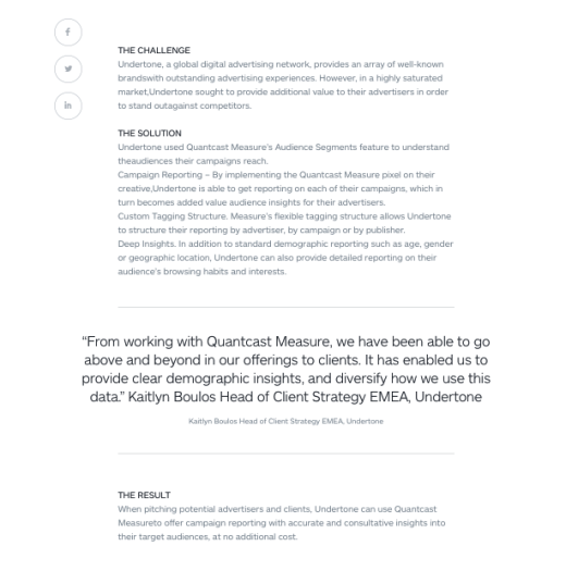
Source: Quantcast
Quantcast is a great example of straightforward yet effective case studies.
Each of their case studies is divided into three sections: The Challenge, The Solution, and The Result. Their writing is personable and succinct, making them easy to read, and they incorporate testimonials right in the middle of the story to give the user a stronger voice.
As a final touch, they could have included a photo of the person to break up the text, but their narrative is certainly strong enough on its own.
6. Don’t Be Coy About What Your Value
Trust is about honesty, both in what you provide and what you don’t. No one likes an obnoxious salesman, but there’s a fine distinction between that and explaining why someone should use your product. If you don’t tell them the benefits of your product, how else will they know?
You want your descriptions to fall into that nice, honest middle ground between bragging and not explaining enough. To do this, you feature a strong value proposition, a lot like the web equivalent of a sales pitch. A good strong value proposition will explain:
- how your product helps users
- who specifically the target users are
- what makes you special compared to similar products
A value proposition is not a slogan or special deal, although these may be included. Remember that “People don’t buy products, they buy better versions of themselves”. Lead with benefits over features, explaining your value in a way that’s easy to visualize.
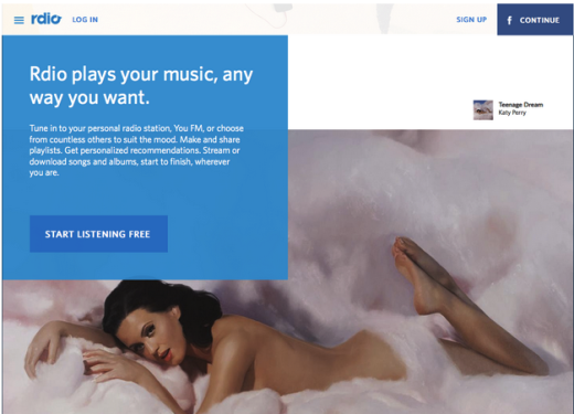
Source: Rdio
Rdio is not the only online music service, so they need to demonstrate what they do differently and why users should choose them. Their headline speaks to what users care about, not about why their features are so great. You immediately understand how the app improves your life, and you can read the body text to learn more about the features.
For more information on how to create a value proposition, read this article from ConversionXL.
7. Give Something Back
One of the oldest and most reliable ways to build a connection is the free gift.
This is especially true if you’re asking something from the user, such as their email, their time if they’re taking a survey, or any other interaction with the site.
Free gifts like these are good for more than just trust-building. They build brand identity for whatever you’re offering, and promote your company after the user has left your site.
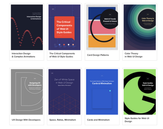
Source: Design Library
This is our thinking with our free Design Library. In exchange for an email, users can download any of our free ebooks on design. Not everyone will sign up to use our app just because they downloaded our book, but that’s not the point. Users appreciate the free service, and we stay on their minds when they read and apply the advice in these books.
Conclusion
Trust isn’t something that you should trick your users into. None of the above points will be successful if you’re lying. These tips are simply mouthpieces for your to get your message heard.
Avoid exaggerating and hyping your product. Your users are more attuned to these than you might think, and they won’t like being mislead. By the same token, if you’re being realistic about your product – both its good and bad qualities – users will appreciate your honesty in comparison to other sites which they know are misleading.
If you’d like to learn more about persuasive design techniques, feel free to check out the free e-book Interaction Design Best Practices. You’ll find examples analyzed from 20+ companies including MailChimp, Apple, Airbnb, and others
Read Next: When does design become ‘too advanced’?
Image credit: Shutterstock
Get the TNW newsletter
Get the most important tech news in your inbox each week.


