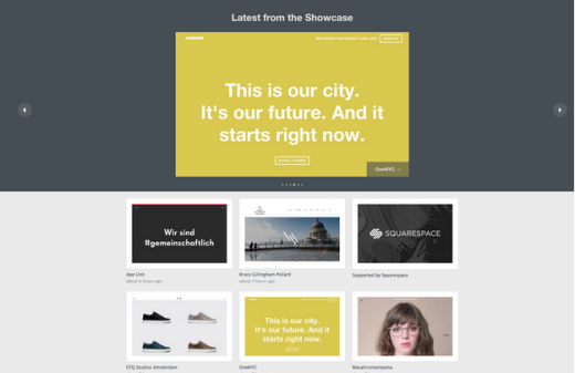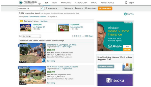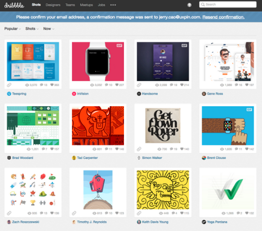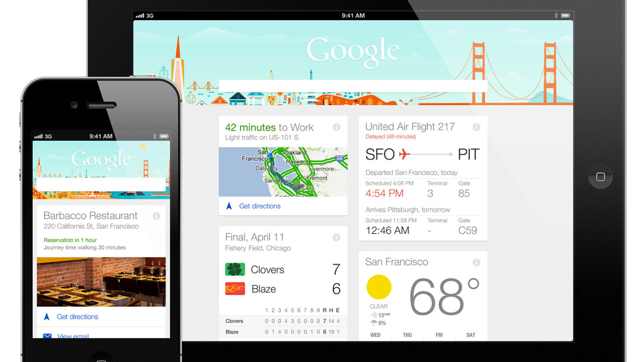
You’ve been seeing those rectangular boxes on a lot of websites lately, right? Those are cards, and they’re popping up more and more. But don’t mistake cards for being a mere trend or simply eye-candy. Cards are as practical as they are popular – in fact, that’s why you’re seeing them so often.
Photo credit: Site Inspire
In this article, we’ll help explain what cards mean to the modern web UI designer: pros and cons, best practices, how they’ll likely evolve in the future, and finally some online resources to help.
If you’d like to learn more about card UI techniques, check out the free e-book The Curated Collection of Design Techniques: Cards & Minimalism.
Pros and Cons of Using Cards
As with any design technique, a card-style interface is not a magic bullet for perfect usability. Card design is actually one of the topics that designers seem to be able to argue about all day.
Is it visual or interaction-based? (Arguably both.) Is it dated and stale? (Only if you design it that way.) Do users actually even like it? (When it’s done well.)
Photo credit: https://bezar.com/#_=_
Photo credit: http://www.realtor.com/realestateandhomes-search/Los-Angeles_CA
Photo credit: dribbble.com
Cards have reached a level of mainstream saturation that also make them a controversial design choice. From retail (Bezar) to home sales (Realtor.com) to the focus of plenty of Dribbblers (basketball cards), you can find cards in almost every corner of the Web.
Let’s examine some of the pros and cons:
Pros
- Responsive nature makes cards easy to use. The rectangular shape resizes smoothly to fit the horizontal and vertical orientations of mobile devices, which means users get a consistent experience across all devices (which improves trust, learnability, and therefore usability).
- Great for aggregated content. Cards work well for pulling in information from multiple sources into a single website framework.
- Digestible content blocks are easy for users to scan and click. In a standard layout, cards are presented with equal hierarchy (each representing one “thought”), which gives users complete freedom to browse and engage as they wish.
- Cards encourage users to share content on social media. Don’t forget to size cards for social platforms and include hover-to-reveal buttons for easy sharing.
- Not limited to a certain aesthetic. Cards complement everything from flat or minimal to embellished designs. As the building blocks of “container-style design”, cards can be arranged into a more structured magazine-style format or laid out in an infinitely-scrollable masonry format (it all depends on your site and users).
Cons
- The style can feel somewhat overused and tired. This is especially true for sites that just replicate the design of Pinterest or Facebook. As we described in the free e-book Principles of Visual Consistency, designers need to get creative in order to make a card layout feel both familiar and original.
- Require development chops. Cards are more than just a look. Cards require an active user experience that includes plenty of interactions and usability.
- Danger of visual overload. Because cards are often used with sites that contain a lot of information, they can eventually produce a cluttered feel. A magazine-style format, however, is a nice solution for especially content-heavy sites.
- Difficult to create an effective design. Successful card design requires careful attention to details and a mastery of design techniques in a much smaller and more unforgiving space. Each card must contain the perfect visual balance between images, text, and subtle secondary actions – otherwise they’ll perform much worse than standard linear layouts.
Cards serves a definite purpose in design, but just make sure you know what you’re getting into beforehand.
Card Design Best Practices
The one thing that everyone seems to agree on is that mastering card design isn’t as easy as it looks. Using a card interface requires clean aesthetics and direct user engagement with a distinct action – the perfect marriage of visual design and usability principles.
Photo credit: Elite Model Management
According to The Complete Guide to an Effective Card-Style Interface Design: “The best card design is simple. It also features a rich content experience. For a successful card-style project, both of these elements must be present. But there are plenty of other design techniques that can add to functionality and aesthetics as well.
“The great thing about cards is that there isn’t really a pure set of design rules you have to follow. Basic principles of good design are all you need to understand to start making a card-style project.”
We can boil card design down to seven design components:
- Use plenty of space – As we described in the Zen of White Space for Web Design, negative space helps organize and separate elements within each card.
- One piece of information per card – Think of each card as a unique call to action. Pinterest is about as information-heavy as we’d suggest – they include the image, user, category, repins, and favorites (along with more options upon hover).
- Select a clear, crisp image – Card images are often small and should be cropped and scaled appropriately for the containers in which they reside. We recommend that the image occupies 50-75 percent of the space in your card, leaving the rest for text and negative space.
- Use simple typography – While a fancy headline can work, simple typography rules in the often-small format. To start, try a timeless sans-serif typeface with medium weight for the card headline and normal weight for body copy.
- Include an unexpected detail – Consider an animated effect, video, round frame or a unique color scheme to make your cards stand out from what other designers are doing. Treat these effects like a potent spice: add just a dash, and don’t mix in too many effects or your design looks like it’s trying too hard.
- Create an open grid – Create a standard grid that outlines consistent spacing between cards and works across various sizes and breakpoints.
- Prioritize usability – Focus on what each card is supposed to do ahead of the visuals and then design it to fulfill that user promise. As we recommended in Interaction Design Best Practices, Fitt’s Law could not be more applicable here: create generously spaced hyperlinks.
Mastery of card design is all about flawlessly executing the fundamentals of design theory 101 (which perhaps why it can be so difficult). Every card interface is only as strong as the design of each individual card.
When you think about it, you only have a few inches of screen real estate to organize multiple elements into an enticing visual teaser. Proper use of color, type, spacing and creating harmony is vital. Also, don’t forget size and scale. While some designs can accommodate oversized or large cards, most require small cards (think mobile-sized) and the design must work in that tighter framework.
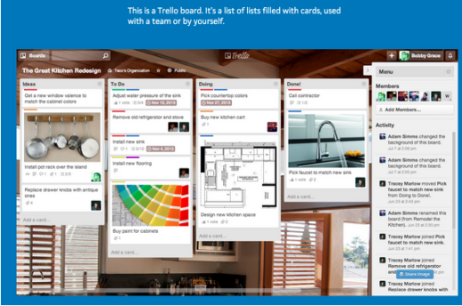
Photo credit: https://trello.com/
The Trello task management app (above) does a great job of overlaying a card-style interface on top of cool background images to create a custom dashboard for users. In this case, cards organize content and make information easy to find and use again and again.
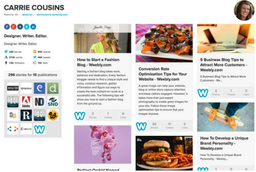
Photo credit: https://carriecousins.contently.com/
Contently’s portfolio-publishing platform uses cards to showcase an almost endless amount of links in a useful manner. Each article is linked using a card with an image and short description, with multiple bits of micro-information (like Shares, Tweets, and Likes) included in each card. This is a perfect example of how to design a lot of information into a small card while maintaining an intuitive user interface.
The Future of Cards in Design
Card-style interfaces have been in a constant state of evolution and will continue along that path. You’ll likely see the most innovation within the responsive and app design space, especially considering Material Design’s paper-like influence on Android app design.
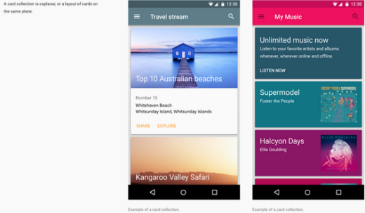
Photo credit: http://www.google.com/design/spec/components/cards.html
Material Design defines cards as “a piece of paper with unique related data that serves as an entry point to more detailed information. For example, a card could contain a photo, text, and a link about a single subject.”
Google’s documentation is some of the most expansive on the subject of cards that we’ve seen to date. While a lot of what is suggested is almost overwhelming in its level of detail, Material Design provides a clear outline of what types of content, design and interaction contribute to a card stack that works.
Cards are an interactive tool by nature and interaction design is one of the most rapidly developing design disciplines. We wouldn’t be surprised if, in the near future, you might start seeing more cards that feature video or auto-updating content.
While most designers use cards as a link to other content or information, cards can certainly work in more of a Material Design style of usability in which cards showcase information as individual interactions happen, from sorting automatically to including new or updated data such as the weather forecast. Windows Phone users are already accustomed to this type of interaction, but it could very likely expand to a wider Android user base.
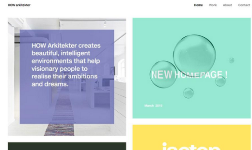
Photo credit: http://www.howarkitekter.se/
While designers have focused on cards that tend to be more “mobile-sized,” oversized card designs are also growing in popularity. Big cards, especially with bright colors and bold typography, are a fun way to add emphasis to Web design and create distinct points of visual interest.
A mix of large and small cards can help focus users on specific content first and set a visual hierarchy among all cards. HOW arkitekter (above) uses a mix of oversized cards – some as links to other pages and some as direct information – to help users navigate the site while displaying important information.
Bright color and simple typography leads the user through the content with ease and the oversized design with wide gutters is a fresh take on the card-based minimalist style.
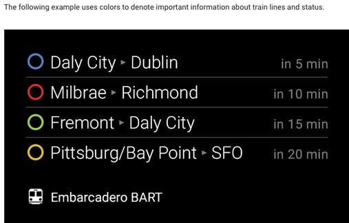
Photo credit: https://developers.google.com/glass/design/style
Starting with Google Glass, cards have definitely left their mark in the wearables space. Even though Google Glass is widely considered a consumer failure, it may yet survive in the professional market. While its future is undoubtedly in question, there is no doubt around its dependency on cards for its interface design. The product might have failed, but it will be interesting to see how the lessons learned from its design may apply to other augmented reality products (or even just to responsive and app design in general).
It’s always fun to think about the type of technology that has yet to be developed – and how the old will become new again.
After all, let’s not forget that cards were just plain pieces of paper before we saw their potential as a digital interaction design pattern.
To learn more about card-based Web design, check out our free e-book The Curated Collection of Design Techniques: Cards & Minimalism. The book includes 70 pages of advice explaining how to create card-style and minimalist web designs with 43 examples from Google, Microsoft, Squarespace, and more.
10 Additional Free Resources and Tools
- Tutorial: How to Build a Card Interface with Sketch App 3: Learn to make your own simple card using Sketch, a new but popular piece of Web-focused design software.
- “Implementing the Card UI Pattern in Phone/HTML5 Applications” by DZone: Once you know how to design the aesthetic of a card, it’s time to work on implementation with code. This article takes you through that structure.
- “Getting Started with jQuery Masonry” by Creative Bloq: This plugin for Web designers and developers is part of the magic that helps make grid and card style layouts work seamlessly.
- CardStack: This open source embeddable card runtime looks like responsive Web content, works like a mobile app, and feels like a saved file that you can share and reuse.
- 10 Material Design Cards for Web in CSS and HTML: As material design continues to grow, designing within its specific card guidelines will become more popular.
- Polymer: Design custom “encapsulated and interoperable elements” using HTML.
- Masonry: The JavaScript grid layout library works by placing elements in optimal position based on available vertical space, sort of like a mason fitting stones in a wall.
- “How We Used Card Sorting to Design a Style Guide for Web Developers and UX Designers” by Optimal Workshop: Learn the technique that is the backbone behind the design theory.
- Bootcards: Cards-based UI with dual-pane capability for mobile and desktop, built on the Bootstrap framework.
- “Why Cards Are the Future of Ads And the Web” by Dan Ucko: Card-style design works, especially for mixing in paid content. This article explains why it makes sense.
Read Next: How cards are taking over Web design
Image credit: GoogleBlog
Get the TNW newsletter
Get the most important tech news in your inbox each week.
