
Native app UI design doesn’t give you much room to work with. When designing for smaller screens and shorter attention spans, your UI design must work at the speed of thought. Ideally, you want to design an interface that’s easy enough for novice users, without boring experienced users.
In this post you’ll learn proven ways to get it right.

Photo Credit: Omar Jordan Fawahl, Creative Commons 2.0

The <3 of EU tech
The latest rumblings from the EU tech scene, a story from our wise ol' founder Boris, and some questionable AI art. It's free, every week, in your inbox. Sign up now!
If you’d like to dive even deeper into mobile UI design, check out the free e-books Mobile UI Patterns and Interaction Design Best Practices.
1. The Rules of Interaction Design Always Apply
Just because you have less screen space doesn’t mean the rules of good interaction design don’t apply.
Let’s review the Five Pillars of Interaction Design again here before we dive into tips on creating usable native app interfaces.
- Goal-driven Design: You want to design for the right user. User research, such as surveys and interviews, will help you create personas for those most likely to use your app. This allows you to create specific goals for your users and tailor your app’s workflow to suit their needs.
- Usability: This seems like a no-brainer, but your app has to be usable. If your audience can’t easily use the app, then they certainly won’t download it from the App Store. Usability makes a product useful, which is the first step in being desirable.
- Affordance & Signifiers: The affordance is the function. Signifiers hint at affordance. For example, blue, underlined text indicates that clicking on it will take you elsewhere. Use signifiers correctly so users don’t need to think about what each UI element does.
- Learnability: You want users to instinctively know how to use an interface. This is where design patterns come in handy, which we’ll talk about later in the article. Familiar patterns help a new user easily acclimate to an app.
- Feedback & Response Time: Feedback lets users know if a task was completed or not. It can be as simple as a beep, or more complex like a modal window. Make sure your feedback is friendly, human, and responds within the timing guidelines set forth by the Nielsen Norman Group.
As Andrew Maier points out in his excellent UX Booth article, these five rules are the foundation you should consider before embarking on designing any kind of interaction, whether or not it’s for a native app.
2. How to design better mobile apps? Know Your Users
Screen size isn’t the only constraint in mobile design. According to Maier, users form the basis of your interface’s constraints. So the first step in creating a goal-driven app UI is to know your users.
Photo Credit: Kārlis Dambrāns, Creative Commons 2.0
There are three fundamental tactics for understanding your users, as highlighted in the free Guide to UX Design Process and Documentation:
- Personas: Personas are fictional characters fashioned from the expected behavior of your target users. They allow you to determine what will drive users’ decisions within your app.
- User Scenarios: Scenarios provide insight into how a persona will act. With user scenarios, you’ll be able to design a UI that best suits them and the goals they want to accomplish.
- Experience maps: Here you’ll explore all the possible conditions for a single interaction. Experience maps chart each step that personas are most likely to take while using an app. They help you understand all the emotions and circumstances that surrounding those steps.
Doing this upfront will save you headaches down the road, as Google Venture’s Braden Kowitz points out:
“So replace the startup dogma of ‘launch early and often’ with ‘learn early and often.’ For me, it opened my mind to all the different kinds of ways startups can learn, and how valuable user research can be to the core mission of any startup.”
In other words, make sure you conduct usability testing sessions between each major iteration. At a bare minimum, run some remote usability tests with a service like UserTesting so you can see how people use your app in natural settings. For more insights into behavior nuances (e.g. gestures and body position), we recommend running an in-person lab session with at least five users.
To learn more, usability expert Jeff Sauros offers some excellent advice for mobile usability testing.
3. The best User Experience design starts mapping out the Content and building User Flows
Design and research work in parallel. For example, you can quickly sketch out user flows based on what you’ve learned thus far. Before committing to a path, however, create a simple prototype. It doesn’t have to be anything fancy — your prototype can be done on paper so you can start understanding how users flow between content and actions.
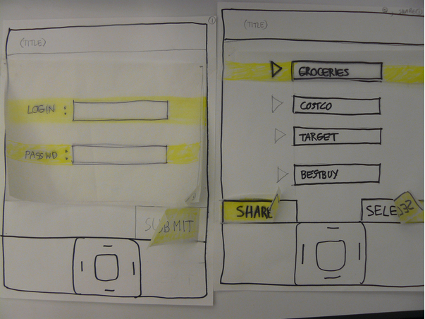
Photo Credit: Rodolphe Courtier, Creative Commons 2.0
If you want to outline the flow, you can use the writing-first approach, which Jessica Downey writes about in her excellent article “Jumpstarting Your App Conception Without Sketching UI.” This outlining method helps flesh out app ideas and build a “common understanding” of each page of your app.
Let’s create one for, say, a banking app. The scenario: someone wants to turn on auto deposit.
Auto-deposit off
[Set auto-deposit]
Select Deposit Frequency
[Once per month][Twice per month]
[Every other week][Every week]
Deposit
Once Per Month
[Select calendar day]
Set Amount
[Enter amount]
[Set auto-deposit]
Before sketching or prototyping, a written outline helps you explore the most important part of your app – the content. Building flows around content gives you a much more accurate assessment of the total number of pages required for your app.
As a next step, you could then create a sketch for each page of your flow (in this case, you could create four sketches). From there, you could continue iterating the sketches on paper and cut them out for a paper prototype, or move to a digital prototyping tool like UXPin.
The outline helps you quickly explore different page flows. The sketches bring those flows to life with more detail around layout and structure. Finally, a quick prototype helps you test those ideas with users.
4. Enhance Usability With Familiar Mobile Patterns
Mobile design revolves around many device-specific nuances , such as thumb placement, and orientation and posture.
Examine popular interfaces and study the common mobile patterns, such as slide-out nav (see below). This will allow you to create a UI that makes users “feel at home,” according to the Treehouse Blog.
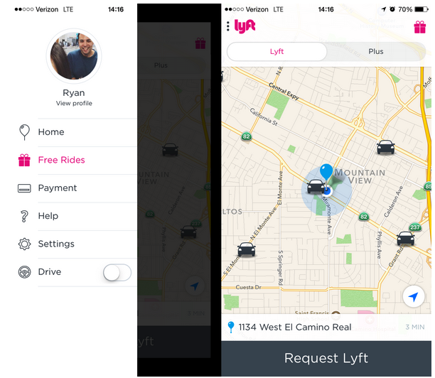
Image Source: UXPin, via Lyft
We’re not suggesting that you flat-out copy the designs of others. Use common UI patterns as a baseline for usability, then layer on your own creativity. In doing so, you’ll ensure that your app design matches user expectations without feeling boring.
As showcased in the free e-book Mobile UI Design Patterns, there are two categories of interaction design patterns you must master for good mobile design.
- Gestures: Touch devices are defined by gestures. Touch, swipe, double-tap, pinch and zoom are becoming second nature to users. Follow Luke Wroblewski’s gesture guide so that your interaction design always makes sense.
- Animations: Motion keeps users grounded in the UI while adding context. There’s a difference between elements that vanish and those that slide out of sight. The former is deletion; the latter is available for use later. When animations are combined with gestures, they add another depth to the experience.
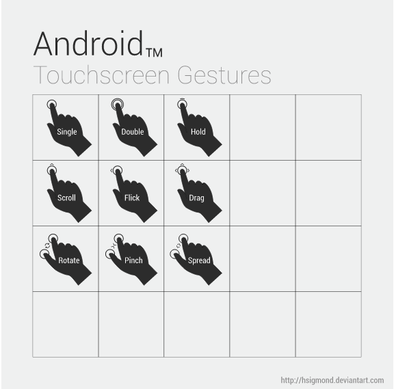
Image Source: “Android UI Design — Touchscreen Gestures,” hsigmond, Creative Commons 3.0
Mobile interaction patterns help dictate the layout of common interface elements. For example, navigation buttons at the bottom of the screen are easier for users to tap with a thumb than buttons at the top.

Image source: UXPin, via Yelp iOS app
Yelp is a good example of intuitive mobile interaction design. The app is very clean, with nice, big buttons that state their purpose. The buttons’ clear labels are easily understood by just about any user. Much more than that, the app uses some common mobile UI patterns, like the toolbar at the bottom, which is a pattern you’ll see in a lot of native apps.
Speaking of text, you’ll want to make sure that copy is always easy to understand. Some tips for text:
- Phrase labels positively to make users feel in control.
- Important words must appear first. Mobile users are especially impatient, so use “Full name” instead of “Name (full)”.
- Wording must be consistent and styled uniformly across each screen.
Check out the UI libraries capptivate and Use Your Interface for excellent interface examples that incorporate all the gestural, animated, and textual nuances of mobile design.
5. Don’t forget Accessibility: design For Fat Fingers
Fingers are much thicker than pixel-precise mouse cursors, so you should pay attention to finger-friendly design.
Specifically, allow enough space for users to tap with a fingertip. If your buttons are too small or bunched too closely together, users can’t tap them accurately (which only increase frustration and therefore abandonment).
Here are a few tips to keep in mind when designing buttons and other touch targets:
- We hold our phones in different ways. According to Josh Clark, there are three ways to hold a phone: one thumb/one hand, two hands/one digit and two hands/two thumbs. And there are also different ways to hold a tablet, but users mostly hold tablets on the side.
- Our fingers are fat. OK, not really. But they are currently about 45-57 pixels wide, which is bigger than what most guidelines recommend for touch targets. For instance, Apple recommends a target around 44 pixels square.
The 44-pixel guideline isn’t always true. You don’t want to design a button so big that folks won’t think of it as an action, as Steven Hoober warns. Nevertheless, you should factor in people’s fingers and how they’ll interact with your app.
6. Web design trends: Don’t Discount Gradients and Shadows Just Yet
Flat is the new black ever since Apple ditched skeuomorphism.
But that doesn’t mean that shadows and gradients are dead. They’ve creeped their way back into design. Just look at Google’s Material Design to see how they’ve made a strong comeback.
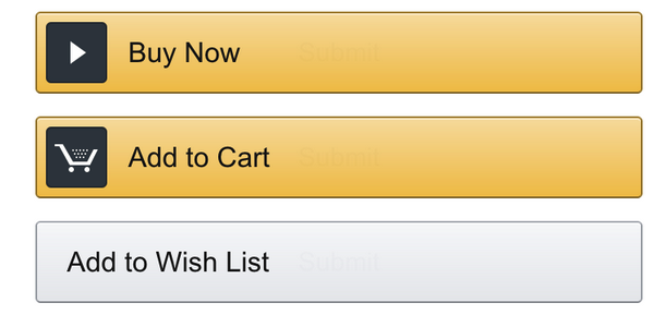
Photo Credit: UXPin, via Amazon iOS app
As Erik D. Kennedy points out in his excellent Medium article, shadows help our brains interpret a user interface — which is probably why they were so common during the full-skeuomorphic fad.
When thinking about buttons, toggles and other visual cues, you must consider the use of shadows. As Erik points out, “just as we have little shadows on all the undersides of all our facial features, there are shadows on the undersides of just about every UI element you can think of.”
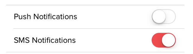
Image Source: UXPin, via Doordash IOS app
Shadows, and by extension gradients, make UIs appear much more natural to the user. You can use shadows and gradients to create 3D buttons and input forms, where the effect makes the element appear inset or outset.
Let’s take a look at the common ones of each, according to Erik.
Inset elements include:
- Input fields
- Pressed buttons
- Slider tracks
- Unselected radio buttons
- Checkboxes
Outset elements include:
- Unpressed buttons
- Slider buttons
- Dropdown controls
- Selected radio buttons
- Popups
As described in Flat Design Trends Present & Future, using a semi-flat design gives you the best of both worlds when tackling inset and outset elements. Your mobile interface will have a modern appearance while still cueing users about possible actions.
7. A basic principle of simple and clean design: Cut Out the Clutter
While the 3-click rule has been debunked in UX design, it’s still worth considering when in app design. Why? Because it forces you to consider whether you really need all of your screens.
Ideally, the user should be able to perform tasks quickly and in as few steps as possible. Yahoo CEO Marissa Mayer advises designers in a FastCo article to use the “two-tap rule” too. She says, “once you’re in the app, is it two taps to do anything you want to do?” If not, it’s time to redesign.
As she pointed out:
“The Yahoo Flickr app uses this to great effect: from the opening screen, you can take a picture, surf your screen, navigate albums, check out groups, set alerts, and more, all with just a couple taps.”
So think about how to reduce the amount of work that users must do. The less they have to think about, the more likely it is that your app will achieve success.
Free Mobile Design Resources
- Mobile Book of Trends (free e-book) – 156 pages illustrating 12 mobile trends that are quickly turning into timeless best practices.
- Mobile UI Patterns (free e-book) – 46 UI patterns from top companies are analyzed in a problem/solution format across 100 pages.
- 20 UI Design Photoshop Tutorials That Will Come in Handy on Hong Kiat’s site
- UI Design Tutorials to Create Amazing Web and Mobile UI Elements at Design Junction
- Interaction Design Best Practices: Words, Visuals, Space (free e-book) – seven chapters explaining the practical use of affordances, white space, size/distance, visual consistency, cognitive load, and more.
- Interaction Design Best Practices: Time & Behavior (free e-book) – six chapters explaining how to reduce friction, design for time, create delight through animations, affect user decisions & behavior, and more.
- Designing for iOS on the Apple Developer’s site
- iOS 8 Wireframing Kit – Quickly mock up design ideas with 90 handcrafted lo-fi elements for Photoshop & Sketch. Supports iPhone 5s, 6, 6Plus.
- iOS 8 UI Kit – 90+ detailed UI elements for Photoshop, Illustrator, and Sketch. Supports iPhone 5s, 6, 6Plus.
- Comprehensive iOS guidelines and cheat sheet by Ivo Mynttinen
- Android Developer’s UI Guidelines
- Android Developer’s UI Best Practices
- Android Inspired – collection of UI examples for Android and iOS
Read Next: How cards are taking over Web design
Image credit: Shutterstock
Get the TNW newsletter
Get the most important tech news in your inbox each week.