
The uses and capabilities of animation in Web design are changing every day. With the quickening development of technology, animation is less of a visual luxury and more of a functional requirement that users expect.
Before we delve into the specifics, let’s talk about the two main ways to think about animation as it relates to interaction design:
In a tiny format where almost invisible interactions requires little input or help from the user. These minor interactions and formats include design elements such as spinners, loading bars, counters or hover tools.

Photo credit: Dunckelfeld

The 💜 of EU tech
The latest rumblings from the EU tech scene, a story from our wise ol' founder Boris, and some questionable AI art. It's free, every week, in your inbox. Sign up now!
As a primary interaction tool essential to the function of the website. Primary functions include interacting with a call to action or watching a video on the screen, while primary interactions refer to scroll-activated animations (like parallax scroll), notifications or bringing attention to content, providing user information or direction for how to use a site.
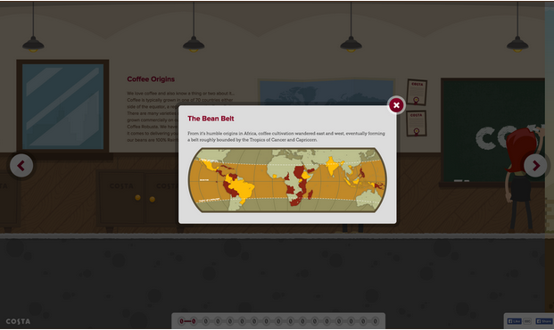
Photo credit: Costa Coffee
With that distinction in mind, let’s examine the nine modern uses for animation in Web design, the best way to approach each, and some current examples.
1. Galleries and slideshows
One of the most common uses for animation is commonly done incorrectly. The trick is in how fast (or slow) images load and how they move on the screen. Motion within galleries and slideshows should feel realistic and function in a way that mimics flipping through a photo album. This link between reality and digital “reality” establishes a logical connection for users.
It is important to note, however, that you don’t need to represent the gallery in a photorealistic fashion (skeuomorphism) – it just needs to function realistically.
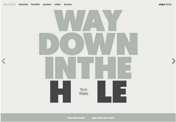
Photo credit: http://geomanist.com/
2. Form fields or calls to action
Animation can make forms easier to fill out and show users how to properly complete the desired action, whether highlighting field-by-field or marking fields as complete. Since forms are specifically designed for user interaction, animation fits in perfectly.
Nerisson uses a simple color animation on the “Works” button to entice users to click. The design combines the ghost button trend and animation (also note the animated background) for a layered interactive effect in a simple package.
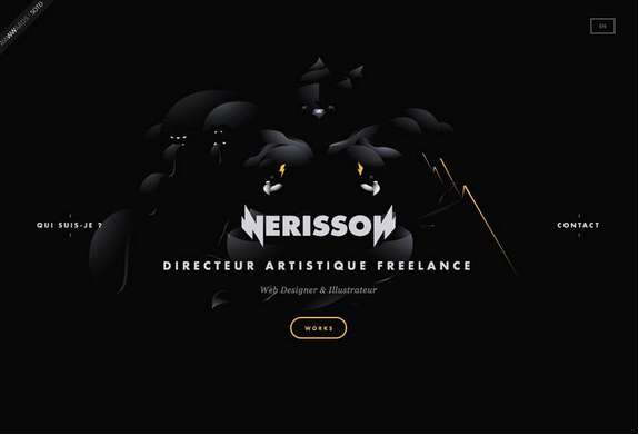
Photo credit: http://www.nerisson.fr/
3. Navigation and menus
While hamburger animation might be the trendy option here, there are plenty of other ways that animation complements navigation. From sliding options to sticky nav bars, animated effects serve as a valuable user map on a website.
Purple Rock Scissors uses simple animations throughout the site, beginning with a nice loading effect, but the navigation might be their best example. The “bouncy” hamburger icon expands to a full-page navigation menu with links featuring colored hover states. Every element is designed to engage the user and capture his or her attention; animation further explains how to use the site and access content.
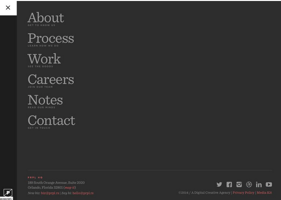
Photo credit: http://purplerockscissors.com/
4. Page motion
While this might be one of the trickiest types of animation to work with, simple page motions are an effective way to make content more stimulating
From AJAX loading options to simple shakes or cartoons, full-page motion is certainly a captivating effect. Be warned: too many loading items can bog down a site and cause it to render slowly, so test and plan accordingly.
Every movement of the mouse makes the image for Hunger Crunch shift on the screen. The movements mirror user actions and while they can be somewhat jarring, the animation creates distinct interest. This effect can be very difficult to replicate, but works well for a lighthearted site like this one.
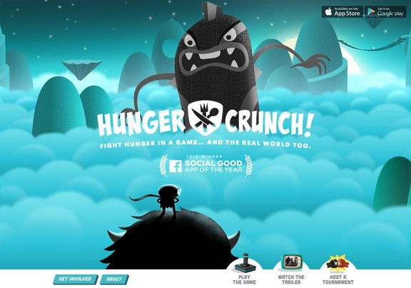
Photo credit: http://www.hungercrunch.com/
5. Backgrounds
Typically restricted to aesthetics, an animated background can bring attention and focus to a site, creating a strong first impression to help attract new users.
The background for the Terna site is in constant motion. Users can watch the on-screen urban bustle for an extended period of time, which is what makes the animated background special – it demands to be looked at.
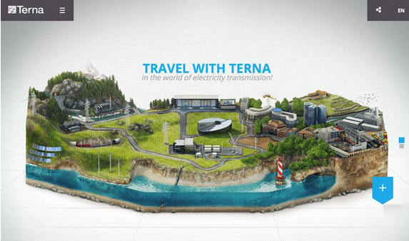
Photo credit: http://trasmissione-energia.terna.it/
The trick to all animated effects is simplicity. Too many animated effects feel jarring and distracting for users. The best animated design techniques provide simple direction (or entertainment) without requiring the user to think about the animation itself.
6. Loading
As we described in the free Curated Collection of Web Design Techniques: Interactions & Animations, loading animations are some of the most popular “unseen” elements on the web. We call these unseen elements because no user actions are required to trigger the animation.
Photo credit: http://www.dogstudio.be/
Loading animations are entertaining and provide a sophisticated feel for an otherwise simple website, making them a popular option for designers using flat design or minimalist styles or for sites that offer relatively simple content, such portfolios and one-page sites.
To make the best of a loading animation, keep it simple. Don’t overwhelm the effect with other elements such as sound or “flashy” techniques. The animation should match the design outline of the site – if the site is minimal, the animation should be as well.
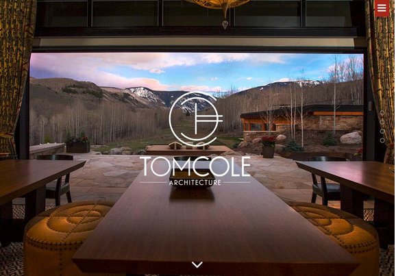
Photo credit: http://tomcolearchitect.com/
Tom Cole Architecture has a classic and beautiful feel to the site. The logo text loads as a smooth and beautiful animation – just once, not on a loop – that embodies the trend and mirrors the feel of the brand. The site also includes a hamburger menu with a smooth, animated navigation bar. The effects are simple and elegant.
7. Scroll Animation
When it comes to designing one-page websites, scrolling animation is one of the most effective design tools. The effect allows a website to go on for an unlimited number of “pages” (or scrolls) in a single-page format. What’s especially nice about this style of animation is that it works with and at the pace of the user.
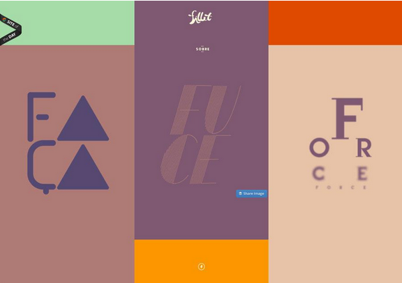
Photo credit: http://fillet.com.br/
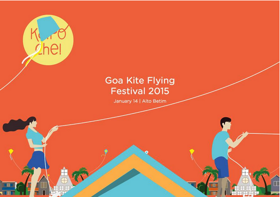
Photo credit: http://www.kaipoche.co/
The animated scrolling method mimics the browsing aspect of traditional print mediums, and accomplishes three main functions, according to Interaction Design Best Practices:
- Orients the user with how much content is on the site and where they are in relation to the rest of it.
- Opens up opportunities to browse and discover new content that page-to-page layouts sometimes lack.
- Smooths jarring transitions from page-to-page.
Scrolling is also a tool in activating on-screen elements. While this can refer to the addition of content in a one-page environment, it also applies to how other objects on the screen behave. For example, scrolling can activate elements within an infographic, tell a story or play a game.
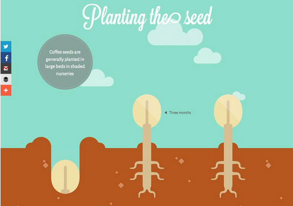
Photo credit: http://www.bizbrain.org/coffee/
Where Does Coffee Come From? is a scroll-activated infographic filled with other touches of animation.
Moreover, the clouds move across the screen in an auto-loading animation while scrolling helps the hand on the left side of the screen drop and plant the coffee bean. Subsequent pages are equally entertaining with the mix of loading and scroll-based animations.
What makes them work together is subtlety and purposefulness. Users barely notice the background animations on their own, while scrolling engages the user by controlling the pace of the story.
8. Hover
Animations can indicate change as well. As described in Web UI Patterns, the hover state is actually one of the most popular subtle animation patterns to show change in an interface object. A button or image may appear one way when the website loads, but will look another way when the user interacts with it, such as sliding the mouse over the element.
This subtle change helps users better understand how to use a website by revealing related actions without needing to occupy additional space.
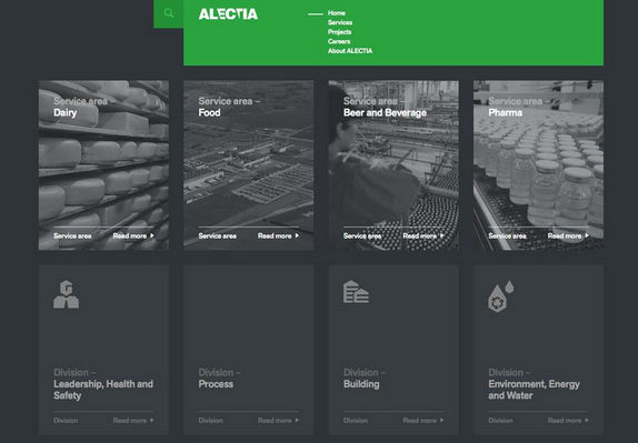
Photo credit: http://www.alectia.com/en/
As you can see above, Alectia uses very simple animations as the user hovers over any block, with a simple visual that encourages a click on that content section. In this case, the animation only improves the interaction design since no additional content is revealed.
On our own website, the Design Library uses hover animations as calls to action to download our free ebooks. The treatment provides a nice aesthetic effect while saving space to preserve the clean cards layout.
9. Animated photography
This last use is a glimpse into the future – the use of animated photography is still young, but is growing in popularity.
Designers can animate still images and combinations of images, shapes and text to create a more immersive experience. As the flat design trend continues to morph with more touches of realism, photo animation will increase in popularity.
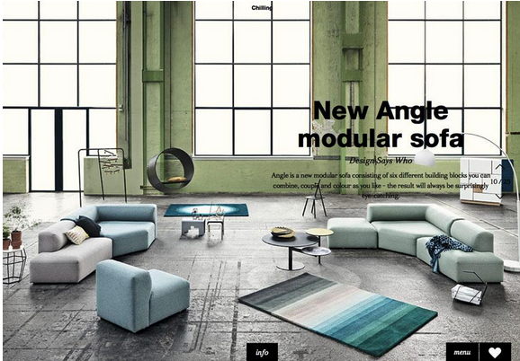
Photo credit: http://lookbook.bolia.com/chilling/
Bolia uses simple still photographs with parallax scrolling animation to create an experience that introduces users to their furniture. The mix of full-screen images, scroll effects and product placement combine for a user experience that does not push a the product on a user but makes him or her want the items in the images.
Photo credit: http://www.sa-studio.fr/
The site for Suspended Animations mixes multiple animated effects, photography and scrolling in a refreshingly modern yet classic manner. As the company name suggests, each image is suspended on the screen as animated effects are added; the user is introduced to the staff and learns more about the company as a whole.
Conclusion
Animation is not just fun and games.
Despite its inherent connection to childish cartoon, in the Web design industry it’s an effective tool that serves several important roles. A good designer recognizes that animation can be a powerful problem solver… but that doesn’t mean it can’t still be fun at the same time.
To learn how to master the art of modern interaction design, check out the free ebook The Curated Collection of Design Techniques: Animations & Interactions. The book teaches with 42 examples of some of the best web interactive designs and includes a hand-curated list of 20 helpful tools to get started.
Read Next: 7 pillars of minimalist Web design
Image credit: Shutterstock
Get the TNW newsletter
Get the most important tech news in your inbox each week.