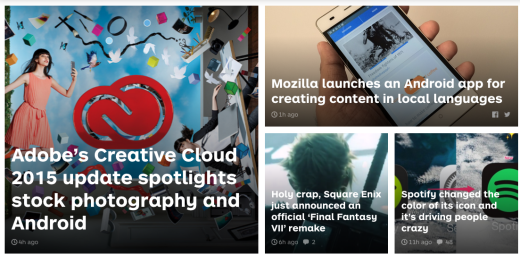
From news sites to real estate, cards are everywhere on the Web today.
Those little rectangles full of inclusive images and text have been so successful in Web design that they’ve almost become a default option when it comes to balancing clear aesthetics with simple usability. But don’t mistake trendiness for usefulness – there’s a reason cards are so popular.
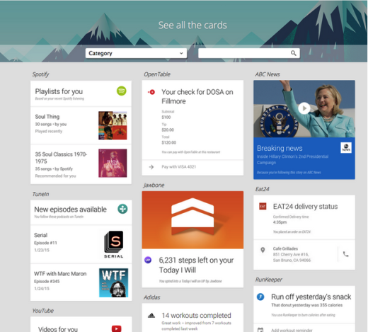
Photo credit: Google Now
As a design framework for organizing large amounts of content – image, headline, main text, call-to-action (such as a share button or link) – on an equal plane, cards have become the go-to structure for the container style of design.
Furthermore, this emphasis on organization and clarity extends outside of the desktop, making them ideal for mobile and responsive designs as well. Cards are far from a trend, they’re a practical method for design whose usefulness is just now being understood.
In this article we’ll explain how cards benefit the container, responsive, and mobile design styles. But first we’ll go into a little more detail about what they are.
The What and Why of Card Based Design
Popularized by the image-sharing site Pinterest, cards have been steadily growing in popularity over the past few years and evolving alongside other techniques like responsive design and flat design.
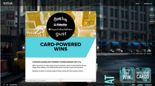
Photo credit: https://citia.com/content/title/citia
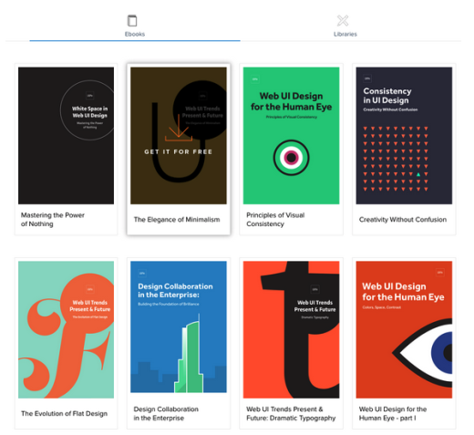
Photo credit: UXPin
Card layouts came to the forefront of web design when web giants Facebook and Twitter each adopted card-driven interfaces for their desktop and mobile websites. Both took full advantage of container-style design to group together information despite a nearly endless stream of activity.
The best approach to understanding cards is to think of each as a singular thought. Even though they contain different images, texts, buttons, links, and other interface elements, every individual card suggests only one primary action – usually clicking through to explore content in greater detail.
Thinking of cards in this way, it’s easy to understand their usefulness in a container-style format for Web design.
Cards in the Container Style
Card-style design has experienced quite an evolution, having embedded itself as a core pattern in grids, magazine, flat design, and pin-style design formats. All of these techniques fall under the category of container-style design since the basic concept is the same – one block (or card) “contains” one chunk of user interaction.
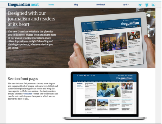
Photo credits: http://www.theguardian.com/us
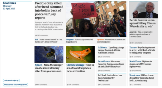
The best definition of container design itself comes from The Guardian newspaper, which applies this layout style to their website.
As described in their excellent piece on the site redesign, a container (as you’ll see below) is essentially a category of cards grouped in a horizontal format. Each page is created through stacking these containers in order of descending priority. Not only does each container function as a standalone content group, but they are also very responsive and can easily adjust to new screen dimensions.
Photo credits: The Guardian
Let’s examine a couple manifestations of container-style design below – some of which prevail while others fade in popularity).
1. Pins
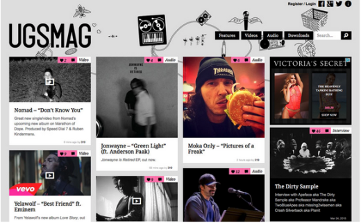
Attempting to mimic Pinterest, plenty of designers added elements that look just like the “pins” from the popular social media site. In fact, WordPress users quickly picked up on the technique by creating dozens of pin-style themes. Unfortunately, the look quickly became stale since every site using the technique started to feel the same.
Photo credit: http://ugsmag.com/
The problem with this format is the card layout can feel inconsistent with the internal or external pages you arrive at upon clicking each card. However, this style already served its purpose as the birthplace of individual containers for specific bits on content.
The philosophy broadened so that information in cards was more than links; content styles include video, images, forms and social sharing tools. In some interfaces, cards also served other purposes, including micro-interactions such as notifications.
2. Metro & Flat Design
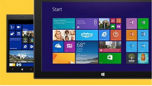
Coined by Microsoft, the Metro typography-based design language originated in 2006 as the earliest representation of card-based flat design.
Photo credit: https://www.microsoft.com
While it still retains the colorful chunked-out look of its Metro roots, Microsoft has now evolved its design language to “modern design,” which is really just a fancier way of saying “flat design.” In fact, as we described in the free e-book Flat Design Trends, flat design is again evolving by embracing the textures, shadows, and gradients previously associated with more skeuomorphic techniques.
3. Grid (or Masonry)
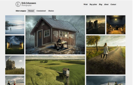
The classic look of grids never really fades away.
Photo credit: http://erikjohanssonphoto.com/work/imagecats/personal/
Rather than forgetting the style, designers are iterating the technique by adhering to a more strict grid or masonry-style framework that includes blocks of content either spaced out or connected perfectly throughout the layout. Some designers create the grid by weaving together container-style patterns, while others prefer a more purist grid to showcase images and graphics (more common in the stripped-down sites we explored in Minimalist Design Trends).
4. Magazine-Style
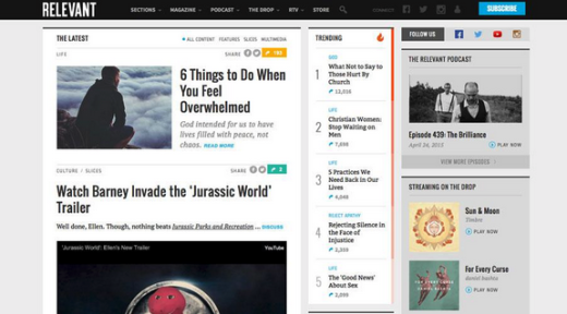
While this design concept was almost exclusively used for news and magazine websites, it has also emerged as a popular option for content-heavy sites like portfolios and blogs.
Photo credit: http://www.relevantmagazine.com/
Characteristics of magazine-style design include blocks featuring a “teaser” image and text linking to a full article or post elsewhere on the site. Magazine layouts are especially suitable for regularly-updated sites with large content inventories because the framework allows designers to prioritize content based on relevance (instead of just recency).
As you might imagine, magazine layouts require strong visual balance due to the multiple categories of cards. The extra work upfront, however, is definitely worth the design creates an immediate sense of familiarity and professionalism.
Categorize Your Cards with User Testing
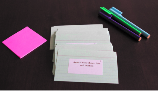
Interestingly enough, one of the most helpful ways to create a container-style design is to first start with a usability test rooted in information architecture – card sorting.
Photo credit: CS028 – Figure 8.1. Rosenfeld Media. Creative Commons.
In this technique, you present users with cards representing individual navigation or content items, then have them sort everything into their own categories or pre-existing categories. To create a cards layout, you can conduct this exercise yourself, validate with at least five users, then incorporate the most usable structure into your design. Card sorting can even be done digitally and remotely, using a site like Optimal Workshop or ConceptCodify.
Of course, keep in mind that this technique is only helpful if you plan on categorizing your cards – it won’t really help if you plan on just listing your cards in an infinite scroll without much structure.
Cards in Responsive and Mobile Design
One of the reasons cards became a popular design choice is their compatibility with responsive frameworks. Not only are the digestible chunks a perfect match for most mobile user scenarios, the rectangular aesthetic also works well for the UI design itself.
Just think about the design of a card: it’s almost the exact shape and size of a mobile phone screen. (Not exact dimensions because of all the different models available, but a good representation based on aspect ratio.)
Card-style design lies at the intersection of design for desktops and mobile devices; it bridges the gap between interaction and usability. As we first described in Mobile UI Patterns, cards create a consistent experience regardless of device.
Consider the common AirDrop function on Apple devices. When you have incoming data, a card pops up on the screen as a notification with two options embedded – accept or decline. With a single action you can access (or refuse) this information. The action works in the same way whether you are on a phone, tablet or computer, which means that the user easily understands what is supposed to happen and how to use the design.
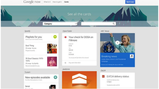
Photo credit: https://www.google.com/landing/now/#cards
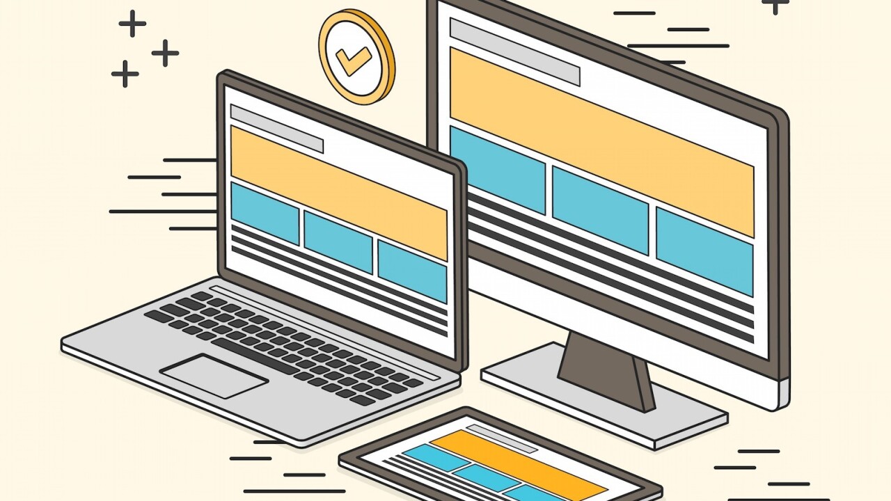
In responsive design, cards work best when they are designed in frameworks to expand or contract, and sort and resort based on breakpoints and screen size.
Cards are especially powerful in responsive design because they allow information to populate based on device and screen size without disrupting the flow of the overall layout. Because each card easily adapts to horizontal or vertical layouts, a card-based interface may not require drastic restructuring for different orientations since every component is already neatly organized in its individual container.
Not only can cards adjust to screen and device, but individual card containers can be designed specifically for the content within. Because each card is a rectangle, the design allows for a lot of flexibility with regard to the aspect ratio of the rectangle and how multiple rectangles group and work together.
Most commonly, designers stick to a framework with a fixed-width for each card and allow varying depths, at varying increments or in a handful of fixed-depth sizes, using equal spacing between each card.
Some have even referred to card-style design as a native mobile format.
“The easiest form of cards to understand today are the cards by Tinder, Jelly, Spotify and others, where the card is a design metaphor for how to deliver information that is easy to read and act on, particularly for mobile,” said technology writer Taylor Davidson in his excellent article on card design.
“The rise of mobile created user interface and user experience pressures on many mobile websites and mobile apps, and the information and interaction design of cards emerged as a solution and an opportunity. When we rewire how we access the Web, we rewire how we use it.”
Conclusion
Cards aren’t just easy on the eyes – in container-style design, and in responsive and mobile design in general, they are one of the most flexible layout formats for creating consistent experiences.
If nothing else, the mindset behind card-based design stays true to the reality of web experiences. People seek out information quickly, and cards serve it up in perfect bite-sized teasers – regardless of device.
To learn more about card-based web design, check out our free e-book The Curated Collection of Design Techniques: Cards & Minimalism. The book includes 70 pages of advice explaining how to create card-style and minimalist web designs with 43 examples from Google, Microsoft, Squarespace, and more.
Read Next: 7 pillars of minimalist Web design
Image credit: Shutterstock
Get the TNW newsletter
Get the most important tech news in your inbox each week.
