
In my last article, I mentioned some of the best tools for data visualization. While all of them were powerful tools, they are only as useful as the hands they are in. Selection of the right tool is just the first step, the bigger job is to create an easy-to-understand visualization that makes data interesting and unambiguous.
In dataviz, as in any other field, there are rules, best practices, guidelines and then there is common sense. And contrary to what we might believe, common sense gets ignored quite often, as we’ll see in the examples below.
Let’s get started with a few most common mistakes!
Numbers Don’t Add Up
When you draw a pie, stacked-bar or stacked-area chart, the numbers should add up to 100. This might sound too silly a mistake to point out here, but you will be surprised to see how many times people make it. Look at this image from Fox News (source):


The <3 of EU tech
The latest rumblings from the EU tech scene, a story from our wise ol' founder Boris, and some questionable AI art. It's free, every week, in your inbox. Sign up now!
Can you see what’s wrong here? The three pie slices don’t add up to 100 percent, but 193 percent instead. The survey probably would have allowed for more than one response and a pie chart is clearly not the right choice to reflect that.
Also, if you don’t read the numbers and just observe the size of pies, you’ll get an impression that each of the three candidates has a close to third of the support. This again is the wrong conclusion.
To avoid this mistake, double check your numbers and make sure you use standard tools. Those tools would not allow you to make a wrong pie chart like this.
Not Following Conventions
Just like slices in a pie-chart should add up to hundred, a graph that is moving up and right is meant to represent growth in numbers. So when you look at this chart what do you think happened from 2005 to 2012? (source)
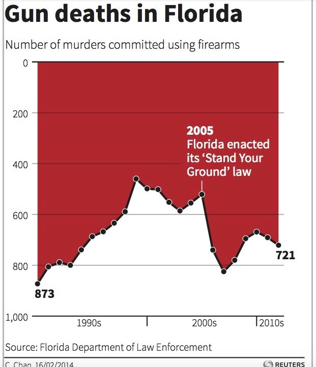
Normal conventions would make you think that gun deaths declined in Florida from 2005 to 2012. But when you observe closely you’ll realize that the y-axis is upside down. Zero is at the top and maximum value is at the bottom. This violates the well established convention that y-values increase as we move up.
You don’t need anything special to avoid this mistake. We all have seen enough charts to have a general idea of what is normal. Just do that and you’ll be fine. There may be cases where you will need to go against the convention. But that will be an exception rather than the rule.
Cropped Axes
Axes values provide context to charts. You mess with axis and you have a visualization that will paint a completely wrong picture. To understand my point, look at the graph below (source):

Fox News has truncated the y-axis of the bar graph here. And now it looks like that seven million is almost three times of six million. This is certainly not the case. Here’s the corrected version of the same chart (source):
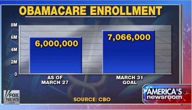
Isn’t this better? This one displays the data with zero-baseline y-axis and tells a more accurate picture.
Here’s another example of the same mistake (source):

You can avoid this mistake if you don’t mess with y-axes. When it is necessary to show a detailed view, start with a broad view first and then show detailed view in second chart to focus on a certain area.
Not Using Annotations
Not really a mistake, but definitely something worth doing every time you draw a chart. Sometimes a visual alone doesn’t suffice, and you need to add qualifying text or numbers to the chart to make it more meaningful. To understand my point, observe this chart (made using Google Charts):
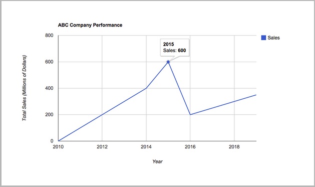
It is a good chart with proper title and axis labels, but when you look at it you can’t stop wondering what happened in 2015. What caused such a sudden drop in sales numbers?
To answer this question, you need to include proper annotation with reason for decline:

Isn’t this better now? As a reader you not only know that decline occurred, but also the reason for the decline.
Improper Bubble Sizes
Bubble charts are very useful for displaying three dimensional data in two dimensions. Not only you have x- and y-axes, but you can depict a third quantity by varying the size of the bubble.
By far the most common mistake I’ve seen people making in bubble charts is that they vary ‘radius’ of bubble instead of varying ‘area’ to display different values. For example, look at this chart (source):
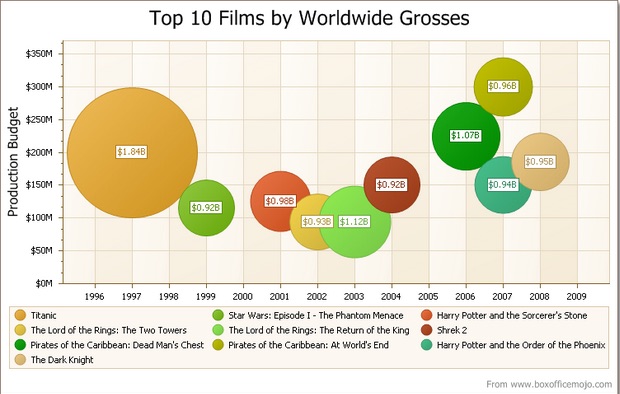
I know there are couple of things wrong in this, but just for the sake of this point observe two left-most bubbles. They are representing $0.92B and $1.84B. But does it seem right? It looks like the larger bubble is at least four times the size of smaller one. And you are sure to misunderstand this if you don’t read the text inside the bubbles.
It’s relatively easy to avoid this mistake if you just vary ‘area’ and not ‘radius’ proportional to the data value.
Incomplete Data
Can you tell which company here has more market share (based on below map)?
(made using FusionCharts)

Based on the above map alone, you are bound to think that ‘ABC’ has a higher market share. But the right answer here is – ‘it is incomplete information’. Here’s why: We definitely know that ABC leads in more number of states than XYZ does, but we do not know anything about the volume of sales of both products in each state.
What if ABC is a leader in all small markets, and XYZ is a leader in all the large markets. This will make XYZ sales huge overall in the country, even if it leads in fewer states. So to know who has a larger market share, we need more data.
Hard to Compare
Suppose you are a business owner and your business has a global presence. You want to compare your company’s market share in different countries. How about using this chart?

Dataviz is supposed to make the task of interpreting data easier and not harder. But in this case it’s very difficult for a reader to compare. Don’t you think following chart is doing a better job at this?

You can avoid this or other similar mistakes if you try to think from a readers perspective. Or try to get feedback from your colleague or friend before publishing it. Ask them how easy it is to interpret the charts? Are they able to easily compare the two charts? Also use ‘labels’ wherever necessary. Pie charts above did not have data labels whereas ‘stacked column chart’ had clear labels.
Resources
Data visualization is a vast field and if you are reading this post it means you are interested in getting better. So now that you know common mistakes, here are some resources that will help you improve:
-
- Get your basics right: Regularly update yourself with the latest in charting libraries and the best practices for each chart. Charting Basics, Flowing data are a few great resources for this.
- Use the right tools: Check out my last post about best tools for data visualization. Using the right tools will make your task easier as they are designed to prevent these common mistakes.
- Avoid mistakes: Either you can make your own mistakes, or learn from others’ mistakes. Follow Junk Charts and WTFViz to remain up to date about blunders other people are making.
What mistakes have you seen on the internet? Why not talk about those in the comments section below?
Read Next: The 14 best data visualization tools
Image credit: Shutterstock
Get the TNW newsletter
Get the most important tech news in your inbox each week.