
Jerry Cao is a UX content strategist at the wireframing and prototyping app UXPin. For advice on how to conduct 30+ different types of usability tests, check out The Guide to Usability Testing.
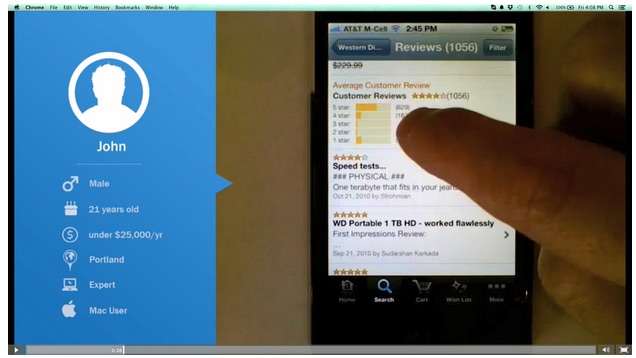
Tests in which people use the product naturally (without a script) are the closest you will get to seeing how your product might perform “in the wild.”
Natural and near-natural tests minimize the amount of interference from the observer, who is more interested in what the user does of their own will. These tests are great for broad data, especially ethnographic, but sacrifice control in exchange for greater data validity.
Source: UserTesting
Because the goal is to minimize interference from the study, natural tests are usually conducted remotely and without a moderator. The most common natural tests (A/B testing and field/diary studies) and near-natural tests (first-click tests and eye-tracking tests)— are intended to understand user behavior and attitudes as close as possible to reality.
A/B Testing
In an A/B test, different groups of participants are presented with two choices or variations of an element. As explained in The Guide to Usability Testing, these are generally scientific tests, where only one variable differs, while the rest are controlled. Mostly conducted with websites to test if a certain layout, placement, or messaging will result in better conversions, A/B testing is considered a natural test because users are not notified nor provided a set of tasks.

Source: A/B Testing Email Creative
Paras Chopra, founder of Visual Website Optimizer, wrote an in-depth article covering the basics of A/B testing. The main benefits include measuring actual behaviors of users, being cheap and highly scaleable, and measuring small performance differences with high statistical significance. While virtually anything is testable, here is an overview of commonly tested website elements — with some unexpected and useful real-life samples:
- Call to actions — This piece by Hubspot explains how Friendbuy more than doubled their response rate to their CTAs using A/B tests.
- Headlines — In this A/B test, it was discovered that a single line of text for headlines increased signups by 38 percent compared to longer ones.
- Forms — A unique style of form field input, the “Mad Libs” style, has been proven to increase conversions by 25-40 percent.
- Pricing and promotional offers — Another A/B case study shows explicitly stating “it’s free” increased sign-up conversions by 28 percent.
- Images on landing and product pages — A specific study involving A/B tests shows the surprising impact of using a human photo on conversion rates.
- Amount of text/pages — show that users prefered a single-page checkout by 21.8 percent.
There are also other usability testing tools like Optimizely (great for everything) and Unbounce (more landing page focused) that make it extremely easy to get started with A/B testing. These usability tools handle the distribution and collection of data for you, so all you have to do is wait for the results. If you’re interested in a comprehensive list of website elements to test, you can also check out this detailed explanation of 71 things to A/B test.

Source: WhichTestWon
Regardless of what you choose to test, make sure you follow these five guidelines:
- Run both variations at the same time — Time is a control, so doing version A first and then version B later may skew the results. Running both tests simultaneously and evenly will ensure the most accurate results.
- Test with enough people for statistical significance— As shown with this sample size calculator, you should test each variation with enough people for a 95 percent significance rate.
- Test new users — Regular users will be confused if they see a new variation, especially if you ultimately choose not to use it. Plus, there’s the mere-exposure effect, in which people prefer what they’re used to.
- Be consistent with variations on all pages — For example, if you are testing the placement of a call to action that appears on multiple pages, a visitor should see the same variation everywhere. Inconsistency will detract from accurate results, so don’t show variation A on page one and variation B on page two.
- Tailor your test length to statistical significance — Cancelling the test too early will reduce accuracy. Decide your statistical significance, then you can use this test duration calculator to get a rough timeline. Many paid online usability tools (especially Optimizely) also have a feature for calculating optimum time based on the goals.
To see some of these best practices put to use, check out this site containing hundreds of free A/B test case studies. Hubspot also provides a highly visual and easily digestible 27-page guide to A/B testing.
First Click Testing
In the late 2000s, Dr. Bob Bailey, UX Designer and Researcher, conducted a series of studies around what he called the “first click” concept. The results of the studies were surprising, and very advantageous to anyone looking to improve their website. As it turns out, for any given task, a user’s success rate is 87 percent as long as their first click is correct. If their first click was not correct, the chances for success fell to below 50 percent.
This type of usability testing is even more relevant if your site gets a large volume of search traffic — because your homepage probably won’t be the first page users find, first click testing should ideally be done across your entire site.
We would consider this a “near-natural” test because users are still assigned tasks (instead of just using the site for whatever purpose they please), but these tests are usually unmoderated and ran remotely in the comfort of the user’s home.
Source: Neo Insight
The test itself is simple, and can be conducted with online testing tools like Chalkmark by Optimal Workshop. The software presents the user with a screenshot and a task, and then records their first click. For example, as we discuss in User Testing & Design, we asked users to find a local mechanic on Yelp and found that 24 percent of them first clicked on the Search bar (suggesting that the existing information architecture may not be clear enough).
First-click testing can be done on a finished website, functional prototype, or even a wireframe. Jeff Sauro, Founding Principal of MeasuringU, recommends conducting first-click testing after each major iteration. We’ve found the following advice of his particularly helpful:
- Write clear task scenarios — Just like you would for a scripted usability test, make sure the participant is thinking about how to solve a problem instead of just where to click. Detail isn’ required, but clarity is.
- Define the best paths to success — Start from the homepage and plot all possible paths that will correctly accomplish each task.
- Time each task — A 90 percent first click rate on the correct label might deceptively indicate that your navigation is effective, unless you timed the test and saw it took an average of three minutes to make that first click.
- Measure user confidence — After each task, you can ask participants to rate on a scale of 1 to 7 regarding their confidence of task completion. Any 3s and 4s will indicate navigation problems.
When running a first click test, it also helps to ask some open-ended questions afterward about what users liked and didn’t like about the site. We did this for our Yelp redesign exercise and it gave us great insights, such as learning that 30 percent of users felt the navigation was confusing with comments like, “it’s a bit cluttered…a lot of it quite useful, but can feel overwhelming the first time.”
For more information on how a first click test might help, the customer experience newsletter Neo Insight wrote about the three biggest usability problems that first click testing can help solve.
Field and Diary Studies
It doesn’t get more “natural” than field and diary studies. Both are designed to observe a user as they behave naturally, without the interference of a testing process. The beauty of these tests is that the user never leaves their natural environment and are encouraged to act normally. The difference between the two is that field studies involve an observer going on location, and diary studies involve the participant recording their own thoughts, feelings, and opinions.
Field Study
A field study provides data you can’t find anywhere else by letting you observe users in their own environment. Jared M. Spool, Founder of User Interface Engineering, believes that while standard usability tests can lead to valuable insights, the most powerful tool in the toolbox is the field study.

Source: University of Washington: Professional & Continuing Education
As mentioned in Chapter 4 of The Guide to Usability Testing, field studies provide three main benefits:
- Witness real user behavior in their everyday lives — In an interview setting, a user may not be aware of how they behave or how they would talk about a product in their everyday lives. However, in the field study, these behaviors are witnessed without a need for explanation.
- Understand the context for decisionmaking— Users aren’t always aware of how external factors, like timing for example, affect their decisions. Field studies mark the times and environments of the user, and their impact can be seen during the analysis of the data, even if the user themselves doesn’t know.
- Scope out the competition — By observing how the user interacts with different products, you can start to notice similarities and differences, which will flesh out your data to enormous degrees.
The biggest downside is primarily the cost of organization and time required (they can last anywhere from a few weeks to several months). Workers have to leave the office for large periods of time, plus scheduling these studies can be troublesome.
However, if you still think field studies could help with your usability goals, take a look at this helpful list of tips from the Nielsen Norman Group, and you can also follow this process for field research that helped companies like Apple, Yahoo, DirecTV, and others.
Diary Study
A less-involved study of a user in their natural environment is the diary study. In this study, participants are asked to keep a diary and account for their experiences with a type of product or system. As Carine Lallemand, Researching Engineer and UX Scientist, explains in her piece for User Experience Magazine, the diary study is similar to surveys and interviews, yet is distinguished by its length and depth of user-generated research.

Source: The User Experience White Paper
A diary study captures the expectations, mindsets, moods, and social contexts that affect the user experience. A diary study might reveal that a bad mood or criticism read on the web impacted the user’s assessment of the product experience, independent of the product itself.
Let’s say that you’re asked to improve a web application that helps product managers track progress. You could provide tape recorders and/or journals to five product managers and ask them to document anything odd or frustrating they experienced when using the application. After a few weeks, you would analyze the data and make specific recommendations.
While these may make the diary study seem like the perfect usability test, like all others, it too has drawbacks:
- Significance of participant — The quality of results depends on the quality of the participant. Because this takes a good deal of effort on their part, the participant’s commitment to the project influences the outcome whether positively or negatively. On top of that, the participant’s self-awareness, self-expression, and writing skill can all sway the results.
- Training sessions — While it may sound like the participant acts independently, the truth is that a thorough training session is necessary to ensure the participant understands exactly what is expected before starting.
- Analysis — The analysis of an entire diary is time-consuming, especially if it is hand-written.

Source: Banking Diary Study
Diary studies are best used as a means of cultural probing and go beyond the “find out what’s wrong” mentality that can be prevalent in usability testing. To help counter the downsides, you can follow a few best practices suggested by UX researcher Ruth Stalker Firth:
- Include contextual and open-ended questions in the writing prompt — Contextual questions like, “What prompted you to use the app?” give you direct insight, but open-ended questions like, “What would you have done differently in this situation?” can uncover new solutions.
- Let users decide how to record themselves — Text, online photo galleries, voice recording, even Twitter can all work. It also helps the process feel more natural and makes participants less self-conscious.
- Keep size in mind — The diary (whatever form) can be as small or large as needed. On paper, space for forty entries can be overwhelming, while ten might be more encouraging. That’s also why digital methods might be better since users can use as much space as they want.
For a more detailed explanation, complete with hypothetical examples, check out this extensive post by UserTesting and this list of Dos and Don’ts.
Eye Tracking & Heat Mapping
While diary and field studies let you see the context for how and why products are used in everyday life, an eye tracking test goes into almost microscopic detail.
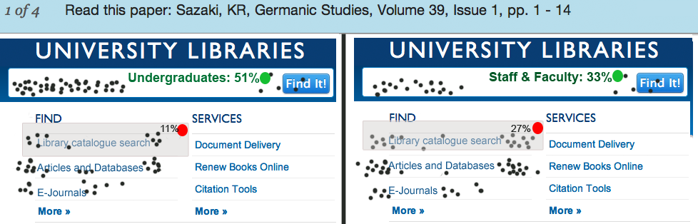
An eye tracking test is just as it sounds, tracking a user’s eye movement, and more to the point where specifically they are looking. The eye tracking test is usually done in a lab environment in which hardware tracks eye movement, while heat mapping remotely tracks where users click (through software like CrazyEgg).
![]()
Source: Nielsen Norman Group
Ritika Puri, co-founder of StoryHackers, writes in a post for Crazy Egg about the five most important lessons eye tracking has taught us so far:
- Users are predictable — As we can see by the eye tracking patterns above, people’s sight follows similar trends, allowing us to plan our visual layouts for the masses. In Web UI Best Practices, we explain how to lay out a site in accordance to the popular F pattern and Z patterns.
- Users search pages differently depending on goals — A user’s eye pattern will differ depending on why they are searching a screen; for example, browsing and searching for something in particular have two different modes.
- Users are drawn to visuals — Visuals like thumbnails or vibrant colors will attract a user’s attention more than plain text, so use this accordingly.
- People ignore ads — In a phenomenon that Jakob Nielson calls “banner blindness,” people will neglect ads habitually, so online advertisers will have to work harder.
- Unconventional products cause confusion — Being creative with the color of a link or the placement of your menu may set you apart from other sites, but it will also take the user longer to figure out how to use your product, which can be risky.
If you’re interested in using eye tracking to help your website, it’s a lot more achievable than it might seem. This instructive guide will explain how you can make eye tracking work for you. If you’re more interested in a more natural test, SumoMe explains how to run a heat map study based on over 1,000,000 tests that they’ve run.
Takeaway
Tests that observe the users in their natural (or near-natural) environments provide a specific type of data that other, more controlled tests can’t access. An A/B test lets you make decisions that are informed by more thorough and statistically significant results (since you have a huge sample size).
Similarly, field and diary studies can provide you with unique information about your target users — namely external factors such as timing, environment, mood, etc. — that more direct card sorting or tree testing cannot.
As for first click and eye tracking tests, they literally let you see your website as your users do, but make sure you run other types of tests for the right context. While each of the different test types has its own advantages and disadvantages, sometimes its best to mix-and-match them to achieve results more specific to you.
For explanations and practical tips for 30 different types of usability tests, check out the free 109-page Guide to Usability Testing. Best practices are included from companies like Apple, Buffer, DirecTV, and others.
Read Next: A guide to user testing
Photo credit: Shutterstock
Get the TNW newsletter
Get the most important tech news in your inbox each week.