The phrase “Android vs. iOS” is usually linkbait fodder, quickly dissolving into an argument amongst warring factions who put way too much emotional investment into their favorite mobile operating system.
There’s a better approach. Both iOS 8 and Android 5.1 are compelling platforms, offering divergent and similar approaches in design, utility, and function. A nuanced analysis of both operating systems reveal where both Apple and Google are headed.
With mobile devices, smartwatches, connected TVs, and soon extensions to the car, choosing a platform is an important decision. So whether you’re on the fence or just want to find out more about what Apple and Google are up to, here’s our deep dive into
Design
After some tweaks and iterations both iOS and Android are pretty settled into their differing design aesthetics.
When iOS 7 launched in 2013, Apple revamped the look and feel of to go with what is known as flat design. Gone was the excessive skeuomorphism of the past, made infamous by the leather stitching in the Notes app.
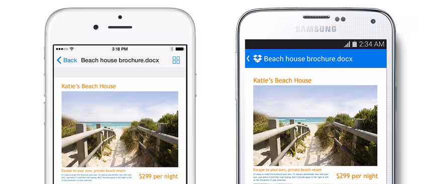
Instead iOS now is the king of a clean, minimalist layout. And Apple enforces its design through the App Store, which creates a pretty seamless experience for the user. Most apps look and perform the same (though Google has gone rogue and revamped its iOS apps to match its own Material Design).
There are a few actions that you just have to pick up. For example, to go back you generally just slide your finger from the left edge to the right – it’s like an invisible back button. Apple has also kept different sections divided up along the bottom, usually denoted with icons. Translucence isn’t everybody’s cup of tea, but it does give you some perspective as the background color comes through.
Google goes with some material differences
With Android Lollipop (5.0) Google started to get serious about Android design. In fact it drew up an entire design scheme, calling it Material Design. The “material” refers to how objects and movement are to reflect real-life objects. Buttons are layered. Touches create an animation. And everything is of course finger-friendly and colorful.

Getting the rest of Android apps there, however, is another story. There are some very good Material Design apps, but others are a little slower to get on board. However, once more devices get over the Lollipop hump we should start to see even more apps go all in with Google’s aesthetic.
Multitasking
Android and iOS vary pretty significantly in how they approach multitasking.
Google’s approach with Material Design plays to its emphasis on breaking up information into easy-to-spot cards. In fact that’s how the most recently used apps are laid out, as if someone flipped a deck of cards backwards and sprayed them across a table.
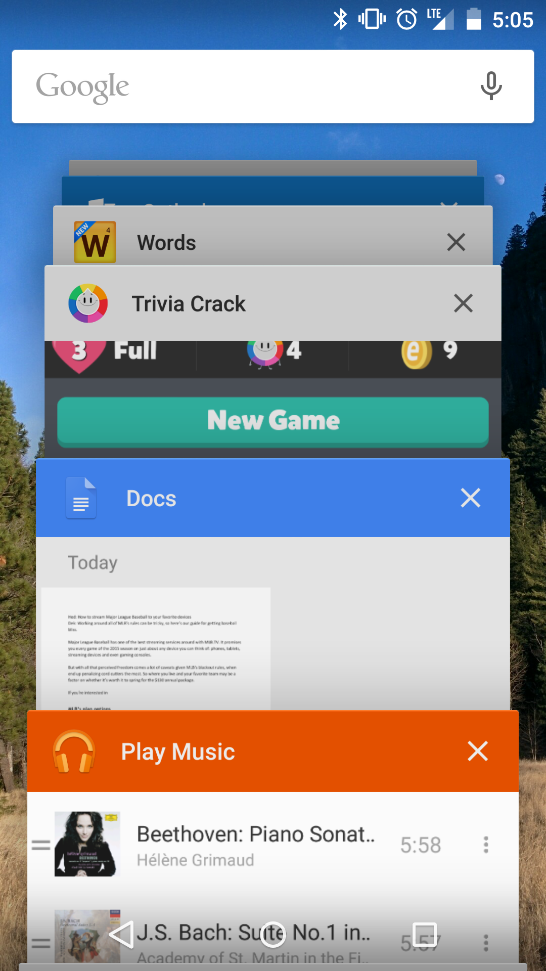
So to change apps, you just need to swipe your finger to scroll through the list. It’s easy to spot the app you’re looking for if you keep your eyes focused on the top of each card, which has the app’s name and icon. Many apps also have a bright color across the top bar, making them even easier to identify.
The downside is that compared to how Android used to handle multitasking, you don’t get to see very much of the screen from the previous app. It was helpful if you needed to glance at a sentence or other content from another app.
A clearer view on iOS
The iOS approach is also well done, taking a slightly different aesthetic. Double clicking the home button launches the multitasking menu, which displays a screenshot of the state of each app with its icon underneath it.
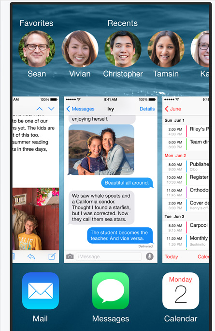
On the top is a list of your most frequently used contacts. Touch one of them to then call or message them. While it looks a little awkward, I have found this feature to be rather useful as a way to quickly reach out to a contact. I do wish you could change up a preference for how they operate, such as setting as default that you would be able to automatically message someone when touching their name.
The main oddity is that by going with vertical screens, you don’t get to see as many previously used apps. It can result in a lot of scrolling to find what you need.
Widgets and Notifications
Google has long held the edge here, with Android using widgets in several iterations of Android. It was also first to offer the ability to swipe down from the top to get notifications packaged together.
Adding a widget is still a little cumbersome, as you have to swipe through multiple pages of all the options based upon which apps you have installed. Widgets also vary in their utility – sometimes it is just faster to open up the app. But when done right they offer a tremendous amount of customization. For example, Gmail lets you place a specific label on your home screen. Or with Drive you can pin a file so you can quickly go right back to editing it.
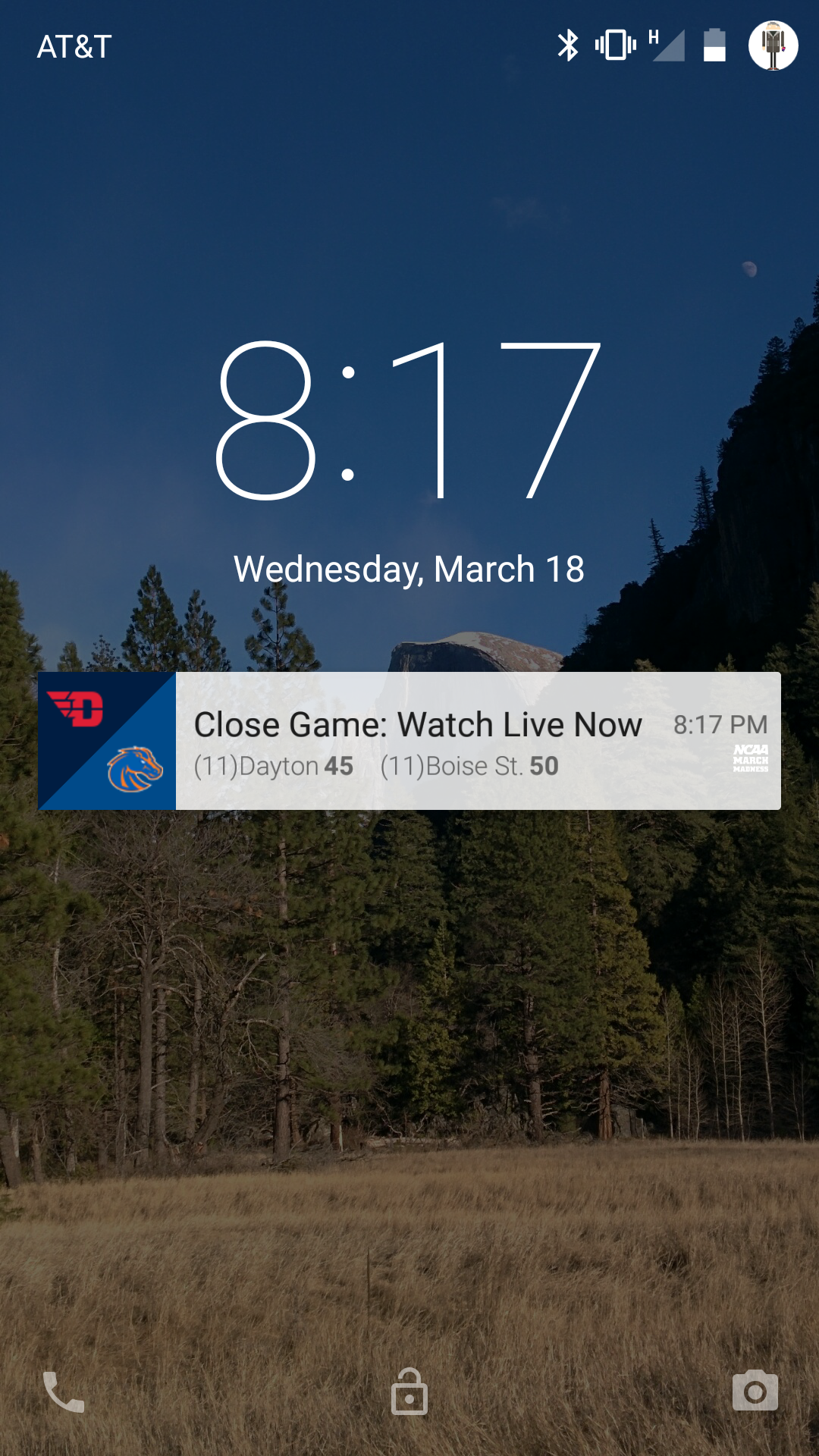
Android’s notifications are still best-in-class. Developers have more customization options. For example, the March Madness app could send out push alerts with specific team logos depending upon who was playing.
On iOS 8, you may be just glad to finally get widgets. Some of the best implementations are from Evernote and Dropbox, putting specific actions and files one touch away. News and sports ones remain a mixed bag, as after swiping down to get to the Today screen, you often have to wait several moments for them to update.

Notifications still remain subpar compared to Android. You can’t dismiss them en masse, the way you can on Android. Sliding to go directly to a specific app that notifies you works well enough, but the double tap method on Android is definitely superior.
The smartest entry here is the quick reply, which lets you type out an answer to an iMessage or other apps by firing up the keyboard when you touch the notification. Notifications are definitely an area where Apple could do some tinkering to make it stronger and more competitive.
Sharing: Android’s intents compared to relatively new iOS extensions
This is another area where Apple finally caught up to Android. In iOS 8 apps now have a sharing menu that let apps interact with one another. For example, you can share a link from Safari directly to Evernote or Pocket right from the browser. Previously, you would have to copy the link and paste it directly into the other app.
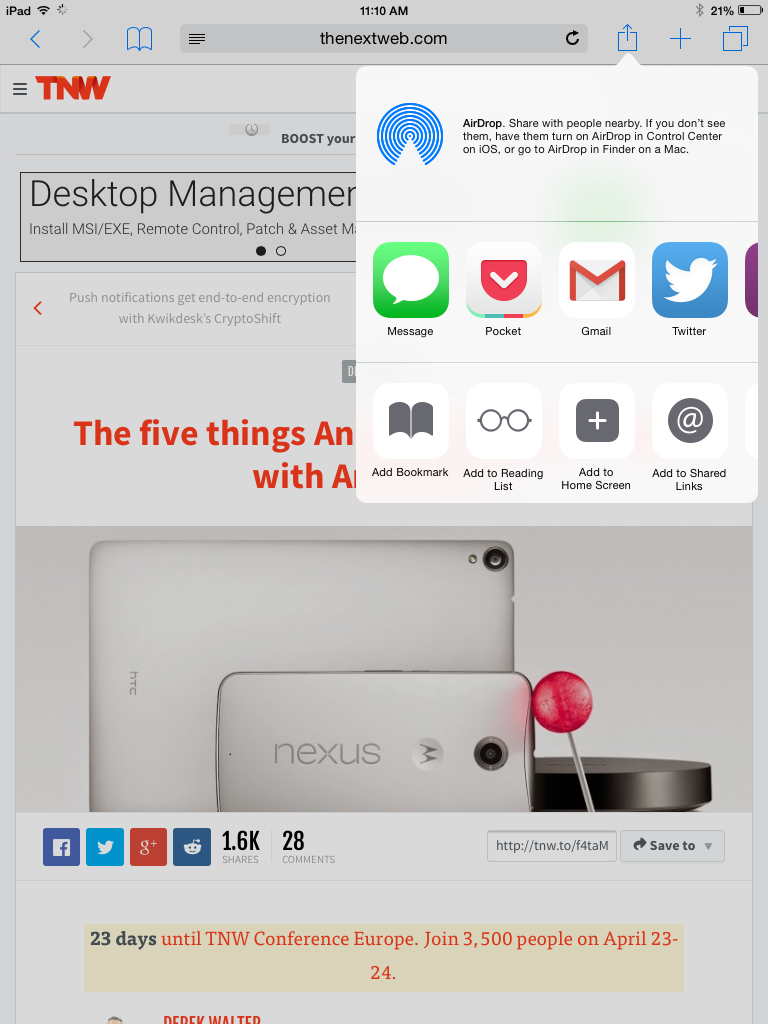
In the months since iOS 8 first went live, we’ve seen apps like Pocket, Evernote, and others jump on the bandwagon. You even have a little more flexibility in how its presented, as you can tweak the order in which the apps appear in the menu.
With Android, this is rather old hat. The biggest change is in how the menu looks, going with a white background and better spacing between options.
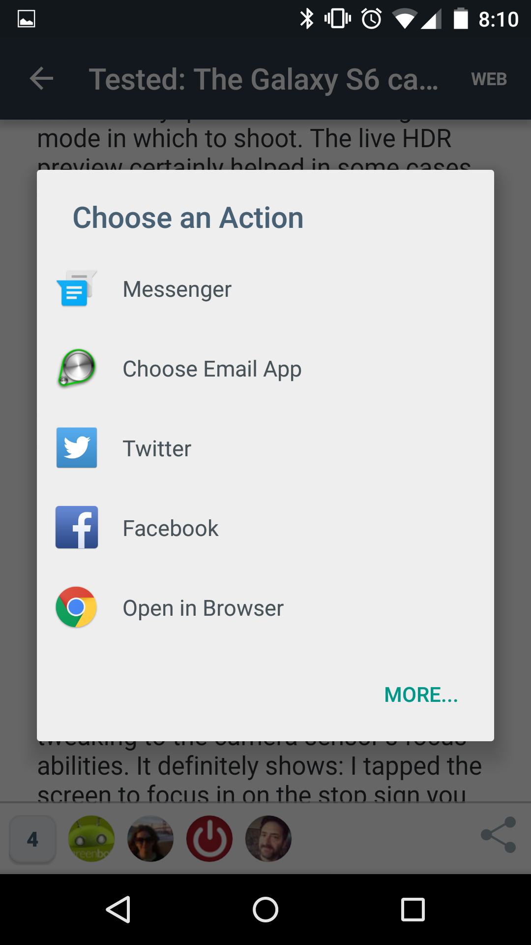
In fact Android could borrow something from iOS, which has done well to let you customize the sharing menu. Right now you may have to do some frustrating scrolling to find the app you are looking for.
Camera capabilities and software differences
The iPhone has reigned as the kind of the camera, both for its hardware capabilities and its easy-to-use software. It’s slowly added in features that existed on Android over time, such as panoramic shots and slow-motion video.
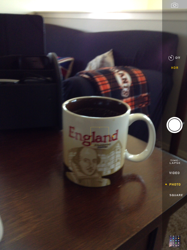
Fortunately if you want more there’s plenty of alternative camera apps to be found in the App Store. The only downside is you can’t set any of them as the default camera app – if you want to swipe up from the lock screen to quickly take a picture, you’re forced to use Apple’s default option.
Good camera quality has been Android’s Achilles Heel. Plenty of great phones like the new HTC One M9 and Nexus 6 tend to excel in many areas but fall short in the camera department.
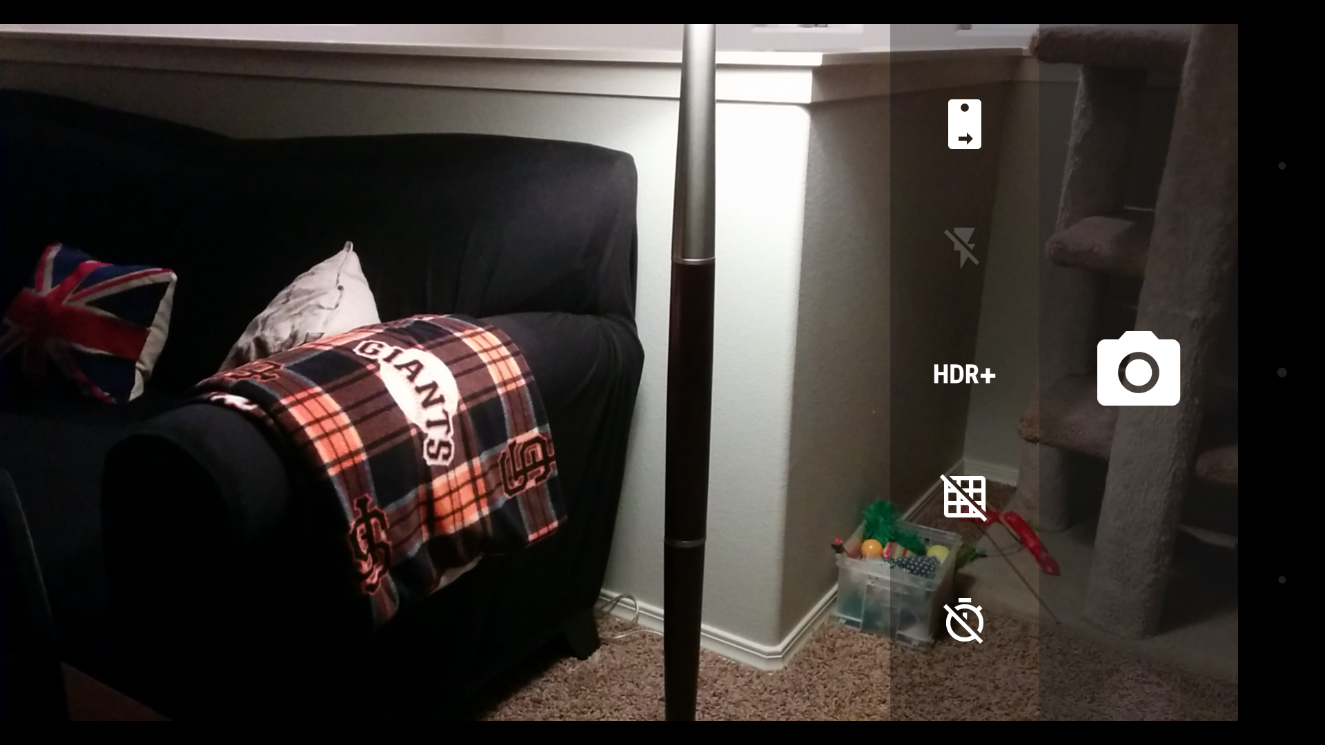
The most promising is the new Galaxy S6, which has a 20 megapixel camera and plenty of custom software choices from Samsung. The Play Store also offers several camera and editing apps that can make your images perform their best.
Software updates
This is where Android gets the ugly f-word: fragmentation. Unless you’re using a Nexus device, you know that waiting for updates can be painful.
It’s not as bad as it seems on the surface, however. Google has moved all its apps to the Play Store, which means it can change key functions in Chrome, Gmail, or its other apps without pushing out a new version of Android. Also, Google Play Services is another method Google rolls out capabilities to developers, giving them extra functionality without an OS update.
Your iPhone or iPad, on the other hand, doesn’t have to wait. Whenever Apple released a new version of iOS, it’s on the way. The only downside here is if you’re the type who enjoys frequent releases and small tweaks, iOS can feel stagnant as Apple usually holds back major software changes until its annual OS refresh cycle.
Security
Mobile device security is a huge issue, with constant reports about hacked passwords and breaches.
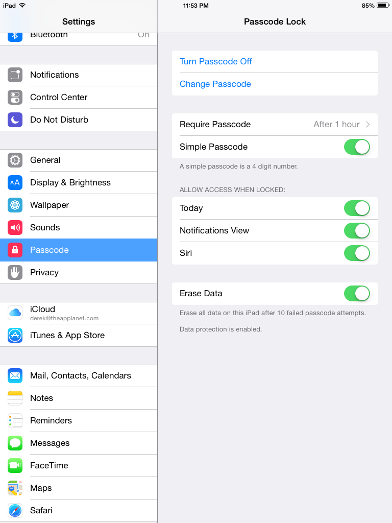
The good news is that both platforms handle security rather well. If we’re keeping score the nod goes to Apple, as its controlled ecosystem gives it an advantage for keeping your device locked down. The U.S. government even finds it too secure, as it’s currently unable to access iMessage or other services, even with a warrant.
Plus, Touch ID is still the most robust option for quickly unlocking your device while making it difficult for thieves to do so.
Google is quickly catching up
In general Android gets dinged as being more susceptible to malware, though this is largely overblown. If you stick to apps from the Google Play Store (which is now pre-screening apps before they go live, just like Apple) and keep your device up to date with the latest software, you should be fine. If you like to throw on a new custom ROM each day and download random APKs, well, you’re on your own.
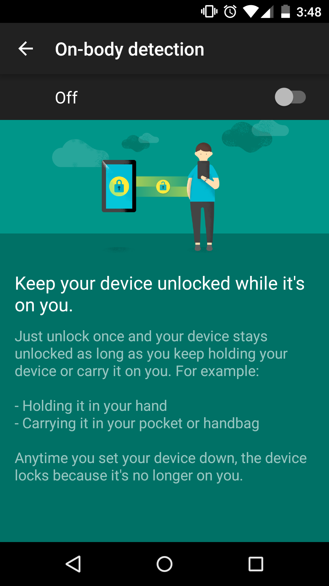
When it comes to personal security with your device, however, Google is to be commended for a number of innovations. For example, the new “on body” detention will nix your password when it’s in your pocket, but re-enable it if it’s sitting on a table. It’s a little hit and miss, but overall it takes a lot of the hassle out of security without making you vulnerable.
The road ahead is a multi-screen world
Ultimately when evaluating iOS and Android you have to think about how each of these platforms are going to power multiple screens. Android not only works on phones and tablets, but powers Android Wear smart watches, Android TV, and now Android Auto. The same goes for iOS, with the Apple Watch and CarPlay all coming soon.
The vision of a seamless, always-connected computing experience is on the horizon. Both Apple and Google are racing to get there. So choose your ecosystem wisely, as all that gear and data makes it harder and harder to get out.
Read Next: The 5 things Android finally got right with Android 5.1
Get the TNW newsletter
Get the most important tech news in your inbox each week.