Jerry Cao is a UX content strategist at UXPin — the wireframing and prototyping app. To learn how to master the art of persuasive design, check out Interaction Design Best Practices: Time & Behavior.
Friction refers to anything that prevents a user from accomplishing a goal.
Friction weighs down interactions, making even the most well-designed interfaces a nightmare to use. Weightless experiences are the best experiences, so your goal is to create interactions which unravel with a natural sense of order and logic.

The 💜 of EU tech
The latest rumblings from the EU tech scene, a story from our wise ol' founder Boris, and some questionable AI art. It's free, every week, in your inbox. Sign up now!
Source: Avoiding Friction
Reducing friction is good hygiene for your interface. A frictionless interface leads to interactions without complications — clean interactions. In this piece, we’ll teach you how to clean up your interface by reducing friction, show you some patterns that help, discuss the importance of motivation, and explain how prototyping can help.
How to Identify Friction
Let’s start by defining friction.
The devil often comes in many names and many forms. Some define friction as any hurdles the user must overcome, whether that’s loading times or poor navigation. Others use the term for anything excessive or unneeded in the interface. Fans of Steve Krug, writer of Don’t Make Me Think, identify friction as “cognitive load,” basically any thought involved in the task that isn’t required.
While a lot of research has gone into cognitive load, we can summarize the forms it takes as:
- Cluttered or distracting visuals
- Inconsistencies in the interface
- Unnecessary decisions/actions
- Confusing or never-before-seen functions
Whatever name you give it, interface friction is every micro-moment that slows your user down. For example, let’s imagine the process of sending a revised design to a client via email:
- Open email service
- Click “New/Compose Message”
- Enter recipient’s name
- Hit “tab” or click to the next field (usually “CC:”)
- Type in the all necessary recipients
- Hit “tab” or click to go to the subject field
- Think of a clear, concise subject
- Type in the subject
- Hit “tab” or click to the message body field
- Drag the appropriate file into the email message
- Type in your message
- Review the message
- Click send
The less steps involved in a task, the less friction. If the steps in your interface are hitting double-digits, try listing out your competitor’s steps for the same task. How do they compare? If a high number of steps is absolutely necessarily, do your best to make sure each step feels as effortless as possible.
Logging in usually requires the most amount of friction, with how often you have to do it, and how tedious it becomes the more you repeat it. As an example of a login with the least amount of friction, let’s look to Reddit.
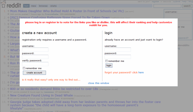
Source: Reducing User Interface Friction
The login overlay above appears automatically whenever the user clicks on an action that requires logging in, so right away that’s one less step. Then, after logging in, the original action is executed right away, eliminating another step.
Consider the Google homepage, as well. A Google search requires only two steps:
- Type in query. (The page opens with the cursor already in the Search field, a pattern we’ll discuss below.
- Hit “Enter” or click the search button.
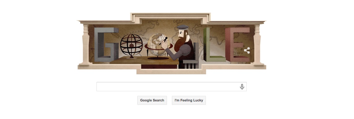
With only two steps, there’s not a lot of room for friction. In this case, the goal of accomplishing user information is literally as simple as plug and play.
How to Minimize Friction
Whether you’re optimizing a site that’s already fairly simple or cleaning up a more complex site, we’ve found a process that helps minimize cognitive overload when designing.
Explore different mediums for balance
Content exists in multiple dimensions: text, images, graphics, and animations. The web is a visual world, so use images and graphics to take advantage of different cognitive processes. This creates a rhythm in the user’s mind, which of course lessens the cognitive load.

In the above screenshot from live performance troupe Dragone, you can see how the design uses clear headlines, magical photographs, surreal colors, all balanced with just the right amount of background space. As a result, the user can process the rich information without feeling overwhelmed from an overload of one type of content (such as too much text or too many images).
It is one of those rare sites where visitors are tempted to click on the “Start the Journey” call to action, even if they already have a specific page in mind (which is still easily accessible in through each of the four bottom grids).
2. Embrace the magic of videos
Continuing from the previous point, most people are naturally visual learners.
But visuals alone aren’t enough, so make sure you create a clear relationship between text and graphics. Either embed the text in the graphic or take advantage of Hick’s Law and place related text and graphics close to each other.
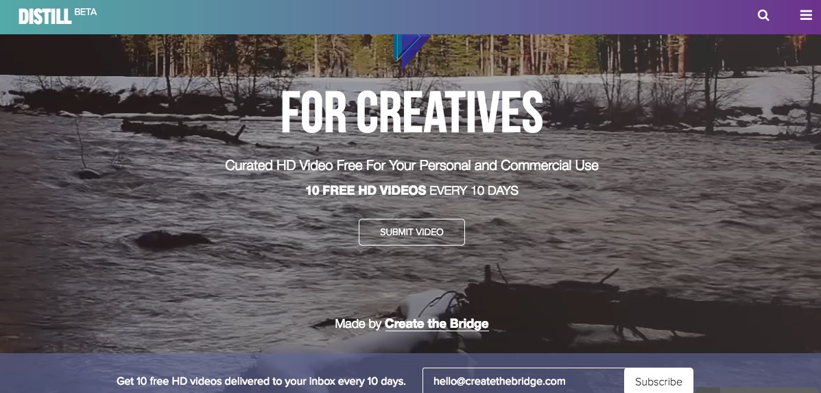
HD video curation and sharing site Distill is a good example of the power of video for persuasion. Amidst a flowing scenic video, the bold words “FOR CREATIVES” pops out to the user and emphasizes the connection between what the site’s purpose (free HD videos) and audience (creative professionals).
The embedded secondary text explains the value in more detail (10 free videos every 10 days). Finally, by offering a persistent preview of the quality of videos, the site makes a more compelling case for users to actually engage with the “Submit Video” call-to-action.
By showing rather than telling, Distill communicates its quality and product details without a large block of text about the video specs or dimensions.
3. Focus the content
Strip down the content so you only include what helps users move forward toward their goals. This applies to everything ranging from the overall layout to graphics and typography.

Prioritize only the aesthetics that convey the brand and match user expectations, then trim anything that doesn’t help the user. You can see this KISS principle in action in the above picture showing a before-and-after shot of the CNN website. As we discussed in Web UI Best Practices, by limiting the visuals only to what’s necessary, you create more breathing room. The extra space then allows for more prominent and crisper typography, and more captivating headline story images.
4. Piece it out
Like we discussed in the first volume of Interaction Design Best Practices, dividing complex content into smaller sections improves the pace of the experience.
Known as “chunking”, this practice prevents the user from feeling overwhelmed upon the first impression. As a result, users actually want to engage with the content, and retain it better.

The site for Norwegian design agency Heydays uses a grid pattern to present content in a visually digestible format. The contrasting images and short section titles help break up the content naturally, while the burst of text in the top left and white accents draw attention where it matters. As you scroll down the page, you notice that the asymmetric grid format strangely works because it lures your eye along a Z-pattern.
5. Keep it consistent, but interesting
Design patterns are extremely helpful since they improve the familiarity of your design, but if your design will look too “cookie cutter” if you follow them too rigidly.
If you follow UI patterns too rigidly, your site loses its rhythm as everything starts to look the same. As a result, users can quickly lose interest.
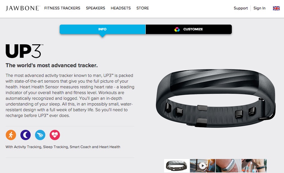
Let’s take a look at the product page for the UP3 wearable fitness device from Jawbone above.
It’s a fairly straightforward fitness device, so the copy on the page and three tabs at the top are enough. Users wear the bracelet constantly, and as a result, get updates that form a complete picture of their health. Once the users understand this benefit, they’ll likely want to play around with some features, which is easily accessible through the tabbed layout.
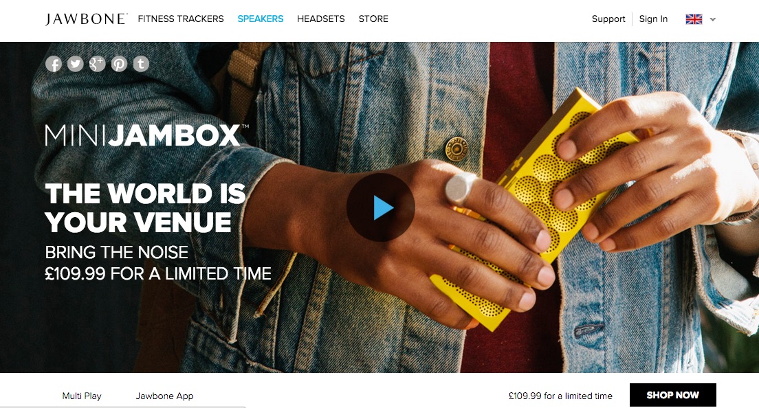
Now let’s look at the Mini Jambox from the same company. A livelier product (literally), with a different set of user benefits. It provides better sound for movies, for parties, all while staying portable. Aside from color, there’s not a high degree of customizability. We’re telling a different story here, so it’s alright that this page is scroll-based (to show off the different user scenarios) rather than tab-based (like the UP3).
The primary navigation, photography, typeface, and placement of “Shop Now” call-to-action remains the same, but each product is given its own distinct layout. This strikes the perfect balance between consistency (which improves usability) and personality (which increases desirability).
Use UI Patterns to Eliminate Steps
Speaking of design patterns, let’s look at a few that are designed specifically to reduce friction. We’ve already discussed patterns at length, outlining and describing 100 of the most effective ones in our books Mobile UI Design Patterns 2014 and Web UI Design Patterns 2014. Here, we’ll only touch on the ones most attuned to reducing friction: Guided Actions, Default Settings, and Wizards/Stepped Forms.
Guided Actions
Your users are open to suggestion.
As long as you’re not suggesting something cumbersome or forcing it upon them, you can guide their actions through a few convincing and well-designed recommendations. While this encourages repeated and deeper involvement in your site or app, it also saves the users time by reducing the steps required.
Source: Twitter
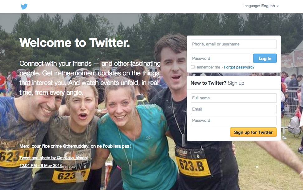
Take Twitter, for example.
When a new user goes to the URL, they are taken automatically to the above signup screen. Not only that, but the cursor is already activated in the first field (Phone, email or username) so the user only needs to start typing to begin the signup process. This guided action saves the user at least two steps: clicking to go to the signup screen, and clicking in the first form field. And because signup is necessary before using the site, these steps would have been necessary.

Source: Spotify
Dmitry Fadeyev points out that guided action can be used on a more subtle level by emphasizing key functions, controls, and buttons. As you can see above, just look at how badly Spotify wants you to download them compared to, say, look at their features. Keep this in mind if usability testing shows your users are having trouble finding certain links — making the action clear will also save your users physical and mental steps
2. Default Settings
Consciously setting your user defaults will both save them the hassle of doing it themselves (reducing friction) and allow you to set them in a way beneficial to you (guided action). Statistically speaking, users will rarely change the default settings, no matter how extensive their customization options. That means the defaults you set at the beginning will likely remain in place.
Living Social takes a smart approach by making the default audience for email deals “everyone,” which encourages users to forward deals to people of the other gender (which presumably, helps with the company’s goal of user acquisition).
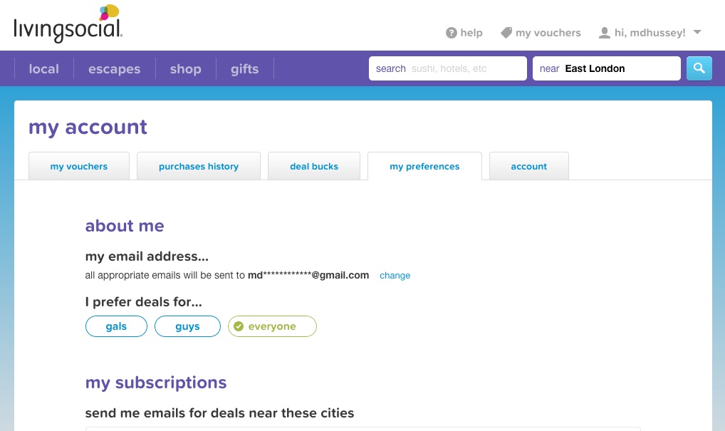
Of course, restricting options causes friction as well, so always give your user the opportunity to change their defaults. For more examples of default settings done right, check out this entry in the UI Patterns library.
3. Wizards/Stepped Forms
As we described before, sometimes it’s best to break up complex content into smaller sections. The same principles apply to input forms in breaking one long form into multiple smaller steps.
Keeping in mind that these should only be used for data-heavy tasks, stepped forms (wizards) allows you to break down the task into manageable doses, and clarify each step without overloading your users. Perfect for gradually initiating new users, this patterns works well with the completeness meter, so your users knows how much exactly is involved.

Source: Cygon’s Blog
In the Grammarly example above, you can see by the top completeness meter that the signup process is broken down into three steps even though all the data could be entered on one page. Breaking the process up is extra important because money’s involved — Grammarly does not want to “scare off” sales with a cluttered interface.
As a bonus, pay attention to that fine print next to the “Proceed…” button. It verifies that clicking the proceed button is also official agreement of the site’s terms of service. By combining the two actions, Grammarly eliminates an extra step in the signup process and becomes closer to a frictionless interface.
How Motivation Counteracts Friction
The trouble with interface friction is that in some cases it’s unavoidable.
There is no way to reduce some frictional elements, and there never will be until they invent thought-controlled computers (which they’re working on). Until then, however, you’ll need to find a way to reduce the inconvenience of friction in the cases that you can’t remove it completely.
An alternative to directly reducing friction is to increase motivation.
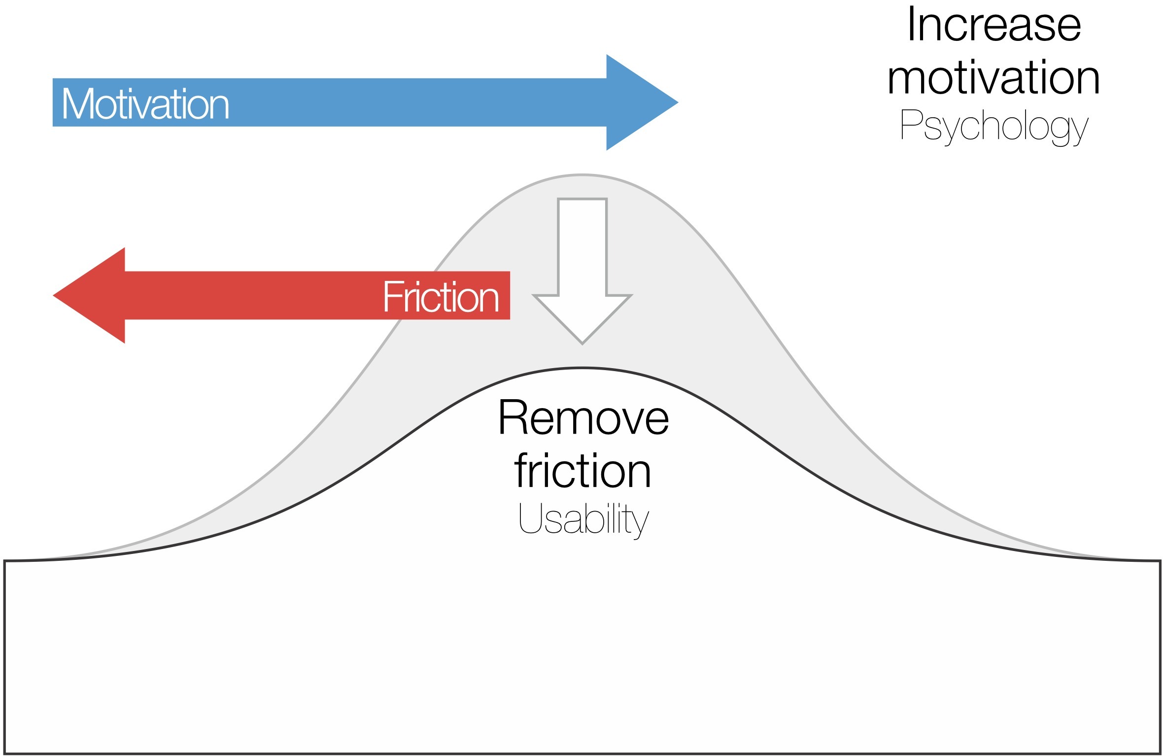
Anders Toxboe, designer for Bonnier Interactive, cites motivation as the force that opposes friction in the realm of interaction design. A properly motivated user will be willing to withstand more friction and still have a positive experience. A poorly motivated user will, on the other hand, give up after only a small amount of friction.
Aside from the biggest motivation — providing a service your user needs — there are subtler ways to get your users excited about your product. Among some of the most common are:
- Recognition — Encouraging feedback makes the user feel that their input is appreciated, which in turn deepens the interaction.
- Reward — Giving the user a reward will incentivize them to perform more tasks or harder tasks.
- Personal Growth — For example, a game that successfully teaches the user to type at a faster speed will motivate them to play the game more to increase their typing speed more.
As Toxboe puts it, “as long as the motivation is bigger than the friction, the user will keep moving in a forward motion.”
Known as progressive disclosure, gradually revealing your site or app helps to build this momentum. As users achieve their goals, the interface should reveal other relevant features to highlight the product’s value (which helps increase motivation). These secondary features could include export functions, email notifications, and integration capabiliities.
But sometimes motivation can be as simple as letting the user know the task won’t take long. If there’s a task that has inherent and inescapable friction, using a pattern the Completeness Meter will reduce the friction by assuring the user that only a little effort is needed.
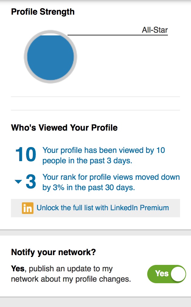
Take the LinkedIn example above. It’s in LinkedIn’s best interest that their users fill in as much of the profile as possible, so they motivate them to do so by showing the completeness meter. Labels like “Profile Strength” heighten the appeal of filling it out (would you want a weak profile?), having only a little space until completion reduces the amount of perceived friction, and finally the title of “All-Star” gives recognition for the users’ efforts so far.
Takeaway
Friction is the enemy of interaction design, the super-villain looking to thwart an otherwise enjoyable experience.
We’ll leave you with one last piece of advice about friction: if you’re having trouble locating the areas of your interface that are causing friction, return to the prototyping and usability testing phase. These experimental phases will shed some light on the problematic points of your user flow, so you know where to apply the tips we discussed.
Read Next: The 5 pillars of interaction design
Get the TNW newsletter
Get the most important tech news in your inbox each week.