Jerry Cao is a content strategist at UXPin — a wireframing and prototyping app with built-in usability testing — where he develops in-app and online content for the wireframing and prototyping platform. To learn how to conduct 20 different types of usability tests, check out The Guide to Usability Testing.
Tests that incorporate elements from one or more of the previous categories (scripted, decontextualized, natural tests) fall under the label of hybrid tests. These tests tend to lean towards capturing attitudinal and conceptual feedback, but nonetheless reveal insights that have very specific impact on the usability of the final design.
 Source: Hierarchy of Action
Hybrid tests present the user with creative methods for discerning what kind of experience or features they would want in a product, sometimes even allowing users to provide direct input for the design.
While they may not be very practical for some of the later stages of product development, the testing we’ll discuss here can make a big difference in the earlier phases by helping you understand the minds of your target users.
Specifically, we’ll cover desirability testing, concept testing, and participatory design.
Next: Desirability testing
Desirability testing
Desirability tests are similar to interviews (covered in Chapter 4) in that the tester and the participant sit down together and discuss the conceptual aspects of a product. The difference — and its a notable difference — is in the approach.
The idea is that asking participants directly what they want can bring misleading results. The approaches in desirability testing seek to circumvent factors like poor articulation, lack of self-awareness, or the apathy that comes from answering similar questions one after another.
In his slide-show on the topic, Paul Doncaster, Senior UX Designer at Thomson-Reuters, explains that desirability testing is a quick and cost-efficient way to separate what users actually desire versus what they say they desire.
Considering that it only takes users fifty milliseconds to form an opinion about your website, we’ll cover four desirability testing methods to help you make the right first impression.
Triading
In a roundabout way of gauging your participants’ emotions, the tester presents the test-taker with three different but related concepts or ideas — for example, McDonalds, Burger King, and Wendy’s — and asks them to explain how one is different from the others and explain why.
This line of questioning drives harder than simply asking “which do you prefer,” and challenges the participant to think critically. It also engages participants more by encouraging open-ended thinking.
Triading is quite helpful for evaluating the competitive landscape and assessing different options from an interaction design perspective. Make sure you follow an iterative process where you encourage participants to continue vocalizing features that they feel distinguish two concepts from the third until they run out of ideas.
Then, repeat the process with multiple participants (5-6 is a good sample) and you’ll be able to see trends that define segments and personas.
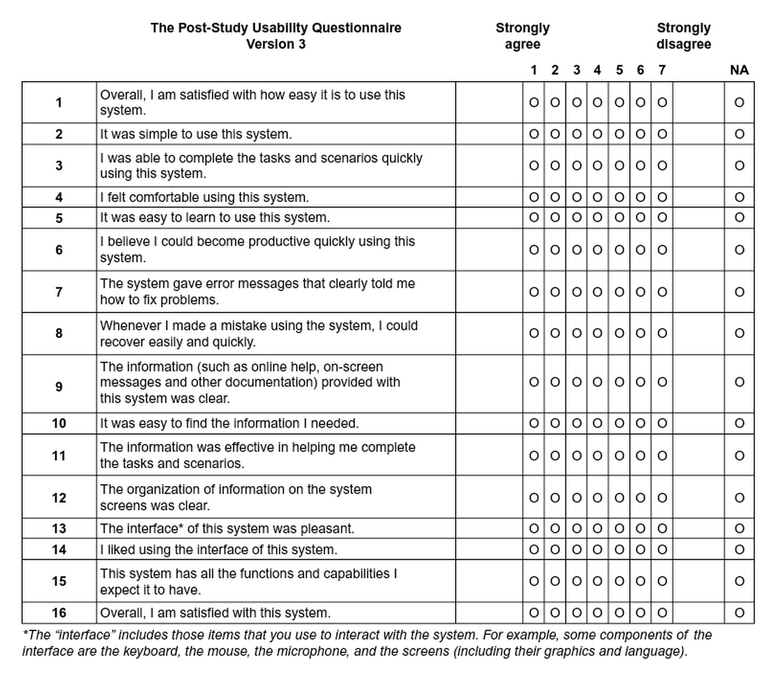
Qualitative questionnaires
These are broad, experience-based surveys that, like other desirability tests, focus more on the emotions of the participant rather than the statistics. Participants are presented with statements, and then answer based on the degree to which they agree or disagree. This format also delves deeper than simply, “do you like our product or not.”
 Source: ChaiOne
As discussed in the Guide to UX Design Process & Documentation, using qualitative questionnaires during your design process and feedback surveys for iteration will also help create a customer feedback loop.
While qualitative questionnaires are fairly free-form, they can be found in three standardized forms:
- System Usability Scale (SUS) — Consisting of ten statements (such as “I felt very confident using this system) and responses ranging from 1-5 in terms of agreeability, this test is technology agnostic and can be tested with as few as two people. The SUS measures usability and learnability and should be administered after a product usability test. To learn how to interpret the scores, check out this comprehensive SUS guide.
- Questionnaire for User Interaction Satisfaction (QUIS) — Applicable to websites and software, this 12-part test gauges user satisfaction on elements ranging from ease of learning to quality of photos. It’s a heavyweight testing method and should be treated as a more technical user test to complement other methods. For more detail, you can find the most recent version of the test in Word and PDF.
- Website Analysis and Measurement Inventory (WAMMI) — A standardized website ease-of-use questionnaire, this test focuses on user emotions with twenty basic statements such as, “this website has some annoying features,” and a scale of 1-5 based on agreeability. This test is more lightweight than the QUIS, and you can find the basic questionnaire here and recommended additional questions.
The questionnaires can be treated as starting points for your own questionnaire, so feel free to adapt as needed. To learn more, check out The Guide to Usability Testing.
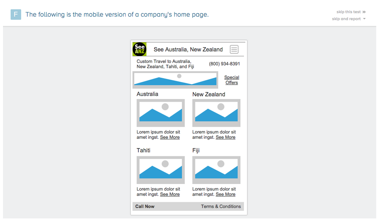
Quick exposure memory test
Unusual but effective, the quick exposure memory test shows the participant a user interface for only a moment before it is removed. The user is then asked to recall what stood out the most in that brief amount of time, and why.
 Source: FiveSecondTest
Similar to first click testing, this test works well for pinpointing initial impressions on layout design, information architecture, and content. But because this test focuses on the user’s memory of particular elements instead of emotional impact, it’s best used as a supplementary method.
You could run this test cheaply and manually by showing screenshots and then asking questions, or use a scaleable online service like FiveSecondTest.
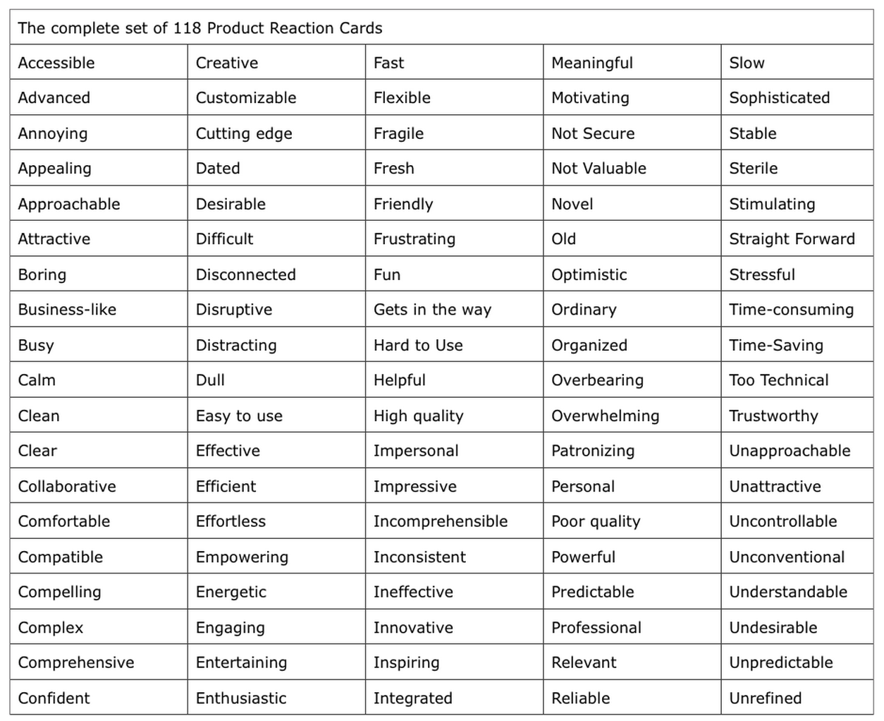
Adjective Cards
Not all desirability tests require deep and probing methods of getting into the user’s psyche. Popularized by Microsoft, adjective cards (also known as product reaction cards) are an extremely simple way to capture emotional responses to designs and products. Simply show the design or have the user interact with the product, then ask them to pick 3-5 cards that best capture their feelings and explain their reasoning.
 Source: UX Matters
Michael Hawley, Chief Design Officer at Mad*Pow, writes about his success with the adjective card. In his test, he gave participants a card with 118 carefully selected adjectives, both positive and negative.
He would then show the participant a user interface and ask them to describe it with 3-5 words on the card. This format allowed the test-taker to better articulate their emotions, and also allowed the opportunity for the tester to follow up on why they felt as they did.
Dr. David Travis, Managing Director of UserFocus, has also experienced success with adjective cards. For him, this method stood out by giving participants permission to criticize the system.
In fact, not only did users select negative and positive adjectives, they could also reveal negative connotations of otherwise positive adjectives. For example, a user might select “sophisticated,” but then explain that the interface was “too sophisticated for my tastes.”
You can run this test manually by printing out and cutting out the full list of 118 cards, or use an online service like MojoLeaf to administer the test remotely to many participants at once.
Next: Concept testing
Concept testing
In the spirit of looking before you leap, concept testing allows you to discover your users’ reactions to your concepts before you spend the time and resources on development. These tests follow the same formats as the other usability tests except they substitute concepts in place of the real product.
As we discussed in the Guide to Minimum Viable Products, a concept test can be considered a bare-bones MVP since you’re only testing for the viability of an idea. A concept test could be as simple as a survey sent out to your target audience or a landing page in which you gauge the concept based on signups (similar to what Buffer did in the image below).

Scott Smith, Founder of Qualtrics explains the main benefits of concept testing include finding the target users of the product, finding out what features they care about, and determining how you might promote and price the product.
Simply put, concept tests provide the feedback to turn a “deliberately sketchy idea for a product or service” into something that users might actually want.
Because testing an idea with an actual product can be tricky, concept testing methods gravitate towards surveys, interviews, and landing pages. However, it is the focus of these methods that set them apart from more traditional usability tests. There are three main types of concept tests depending on the maturity of the product:
- New Product Concept Tests — These identify the benefits that resonate most with customers, and the features to create these benefits. Successful tests let you to prioritize your design elements and better schedule the development process, plus allow you to plan ahead for after the release.
- Product Usability and Serviceability Tests — How can you improve the experience with an existing product or service? This test helps you understand what direction might make the most sense for updates to existing products (whether it’s ease of use, simpler navigation, etc).
- Price and Incentives Tests — These will give you a head-start on marketing and promoting your product since you’ll have a better idea of what people will pay and how you might bundle the conceptual product with existing products. If you’re testing your concept with a landing page, you can create pricing options and gauge the clickthrough rate on each option (like Buffer’s tactic).
If you’re interested in low-cost methods of concept testing, SurveyMonkey offers tips for concept testing with surveys and landing pages.
Concept testing questionnaire layout
When it comes to surveys and questionnaires for concept testing, each questionnaire should lead with a description of the conceptual product, including a headline, overview of benefits and uses, and a picture.
Dr. Bruce Isaacson and Debbie Lesnick, President and Senior Vice President/Head of Research for MMR Strategy Group (respectively), wrote a paper on how to improve concept and product tests. While their advice was written for products in general, we’ve adapted the advice for web, mobile devices, and software.
Concept test questionnaires usually ask the participant to rate hypothetical products in the following categories:
- Interest — How likely they are to buy the product (or use it, if it’s free).
- Frequency — How often they would use the product.
- Value — How they perceive the product’s benefits (compared to its price).
- Uniqueness — How different the product is from its competition.
- Likability — How much, overall, they are satisfied by the product.
- Believability — How realistic the conceptual product is.
- Confusion — Any uncertainty around the product features.
- Brand Fit — How closely the product fits in their existing idea of the brand.
Verifying concept tests
If you’re looking for a more concrete way to test a product, the designers at ZURB created a concept-testing app called Verify. Similar to prototyping, Verify combines concept testing and the quick exposure memory test we discussed above in the desirability tests section.
The app allows you to create sample screen presentations to test on your prospective target audience through quick exposure. As the participant marks what stood out for them, you can get an idea of what to keep or fix — all before designing the actual product.
If you’re looking for a cheaper method, you could do a “hallway concept test” in which you draw a few sketches, grab a colleague not associated with the project, show the sketch for five seconds and then ask for what stood out.
You could just as easily replicate this process with five users or customers for quick feedback on your concept.
Next: Participatory design
Participatory design
Sometimes if you want to design a product your users will like, it’s best to involve them directly in the design process. Participatory design is a usability testing method that falls right within the discipline of user centered design and can be a great complement to the collaborative design methods we discussed in Web UI Best Practices.
It’s become quite a popular methodology with companies like Pinterest, which incorporates it into its design process.
 Source: Bringing Users Into Your Process Through Participatory Design
Erin Muntzert and David Sherwin, UX Consultants for Frog Design, point out how to get the most use out of participatory design. In terms of general guidelines, it helps to treat the session as a conversation (instead of a classroom exercise), be crystal clear about the problem space and scenario, and record the session (or take detailed notes).
We’ll explain below how to prepare, narrate, and conduct participatory design sessions.
Preparing for participatory design
The first phase — framing — is kind of like the pre-planning phase, where you figure out what you want to get out of the test. This phase handles your abstract usability goals, and helps you narrow down the specifics of what will help.
This kind of pre-planning is what we outlined in the first two chapters, but we’ll review its application to participatory design. There are four steps to the framing phase:
- Select your user(s) — Consider your target users’ demographics, psychographics (personality, lifestyle, values, interests), and behaviors. To better reflect real people, follow the persona process outlined in The Guide to UX Design Process & Documentation.
- Create your goals — Ask your team questions (follow the 5W & 1H guideline) and prioritize them based on which ones you want answered most. Your usability goals will be to answer the questions that are top priority.
- Define what you think you know — Create hypotheses to answer your goal questions and jumpstart your research — but don’t get too attached, because they might be proven wrong. If your goal is to understand what young, tech-centric out-of-towners use to find the “best kept secrets” in Los Angeles, one hypothesis could be that “users will first reach out in social networks to find what to do.”.
- Identify methods to use — Categorize your hypotheses as“Understanding Needs,” “Creating Designs,” or “Refining Until Right.” You’ll have a better idea of methodology once you see where most of the hypotheses lie.
In 30 minutes, you can complete the first three steps above, generating around 10-15 hypotheses. Then as we discussed in step four, spend five minutes categorizing hypotheses.
Once you’ve finished that, here’s three areas to consider to run a successful session:
- Group Size — Large groups, small groups, and individuals all have their advantages and disadvantages. Involving more people at once allows for faster data collection, but less people may lead to more detailed results. Because this is a qualitative method, make sure you test at least five users.
- Location — Where will you conduct your test? Typically group size and ease of access will determine whether you hold your test in a professional facility, in the test-taker’s own environment, or out in the world (on the street, coffee shop, etc.).
- Data Capture Tools. Collecting user sketches, writing notes, photographing, and recording video are all important to ensure nothing slips through the cracks.
Now let’s discuss the actual methods of participatory design. An important thing to note is that these activities can be strung together in a single session, as they are often brief and complement each other.
The methods are broken down into four categories: narration, creation, prioritization, and contextualization activities.
Narration activities
Collect anecdotal data by documenting how users narrate their stories. These activities utilize structured stimuli in order to help them recall specific memories or feelings — in other words, to “jog their memory.” Additionally, these activities make great introductory activities by urging the user to access their emotions, and can segway well into the other categories of participatory design.
There are several common ways to do this, each with its own specialty:
- Journey Mapping — Also known as experience mapping, test-takers fill out a worksheet with a timeline and are encouraged to explain the emotional impact of different stages during a part of their life (such as overcoming a disease from diagnosis to aftermath). These help people access their emotions more freely than just conversation, and can be augmented with the adjective cards we described earlier.
 Source: Mapping Experiences
- Love or Breakup Letter — Great for groups as an icebreaker, this exercise lets users write a personal letter to a product or brand about what they love, want, hate, or expect. This helps you see both ends of the emotional spectrum in plain language.
 Source: Bringing Users Into Your Process Through Participatory Design
- Topical Collage — Especially useful in overcoming language barriers, asking your participants to make a collage regarding how they feel about a product allows for a visual interpretation of their thoughts. This is similar to the mood board exercise discussed in Web UI Best Practices.
Creation activities
Once you have the emotional context, it’s time to let users create elements for the product in question. Seeing the kinds of things your participants come up with of their own free can validate or disprove your hypothesis, not to mention inspire new theories.
When planning creation activities, the key component to keep in mind is the balance between structure and interpretation.
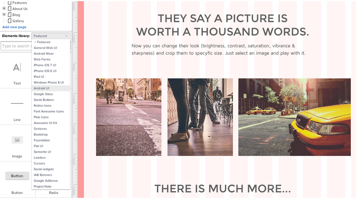 Source: UXPin
- Interface Toolkit — Using a tool like UXPin, give participants various pre-made elements and ask them to “build” their perfect interface. Not only is this fun, but it’s also ideal for seeing how your users prioritize features.
- Fill-in-the-Blanks — A less-involved and less costly version of the interface toolkit, you prime users with a narration activity, then provide a blank set of UI elements (Post-It notes work well) and a canvas (such as a whiteboard). Then ask them to place and label elements however they see fit.
- Ideal Workflow — Participants are presented with different circumstances and then explain their ideal workflow for each. If you’re designing a complex system, such as e-trading platforms, this will reveal where and what your users prioritize.
Prioritization activities
Using mainly text, images, and iconography, prioritization activities will help you understand the ways in which your users value the product’s individual features. These methods deal with trade-offs, connections, and hierarchy to determine not necessarily what the user wants, but what the user wants most.
- Channel Surfing — Similar to card sorting, ask participants to prioritize functionalities across different devices (i.e., PC, mobile, or tablet), or different people/services (phone support, retail branch, etc). This is highly recommended for testing usability across different channels since you’ll see what features people are willing to trade off. You can do this activity right after an interview and follow it up with a creation activity we described before.

- Concept Ranking — Participants are given several options and asked to rank them. For example, if you’re making tablet devices, you can provide paper mock-ups of different dimensions and ask users to rank their size preferences. This works best for culling down multiple concepts when users can tweak existing prototypes.
- Value Ranking — Participants assign value attributes that define a product. An example might be to present the users with a list of words and have them rank which words would most likely describe the product. This works best towards the end of your session when users already understand the products and concepts.
Contextual activities
By simulating the experience of using the product, users will be better able to describe their opinions about it. Contextual activities try as best they can to immerse the participant into what the concept or product might be.
- Customizing Scenarios — Through the use of text, storyboards, or comic strips, the participants are presented with scenarios and asked to give feedback at each step, and even customize the scenario along their own personal experiences. This helps bridge the gap between product concepts and how they fit in the users’ real life.
- Simulating Experience — The next best thing to an actual product test, a simulating experience creates a virtual experience of what it would be like to use the product. For example, you can simulate a new in-car feature by presenting the interface on an iPad and add a mock steering wheel.
Next: In summary…
Takeaway
Hybrid tests are a great way to think outside the box and collect insight that more traditional tests can’t reach.
Desirability tests go above and beyond in understanding the target user’s psyche. Conceptual tests can save you a lot of time by solidifying your plan before you begin development.
More than any other test, participatory design gives the target user a hands-on approach in designing towards their needs.
For explanations and practical tips for 30 different types of usability tests, check out free 109-page Guide to Usability Testing. Best practices are included from companies like Apple, Buffer, DirecTV, and others.
Read next: Product research 101: How to do your research before diving into design
Get the TNW newsletter
Get the most important tech news in your inbox each week.