Jerry Cao is a content strategist at UXPin — the wireframing and prototyping app — where he develops in-app and online content for the wireframing and prototyping platform. He recently co-authored The Guide to UX Design Process & Documentation.
The process of defining and researching a product are intertwined since you can’t really define a product unless you know the context in which it exists. Once you’ve defined the product idea, product research — which naturally includes user and market research — provides the other half of the foundation for great design.
The user’s mind is a complex and competitive space. To complicate things further, you need to understand customers as a collective (i.e. market research) and on an individual level (i.e. user research).
Market research may start by looking at demographics while user research finds information that challenges and qualifies the segmentation. Both types of research have a role in innovation and both can find gaps that drive new product ideas.
Why research matters
Simply put, if you don’t know who you’re building the product for, then you don’t know why you should be building it. And if you don’t know why, then it doesn’t really matter how you build it — you’re already on the fast track to disaster.
Louis Rosenfeld, founder of Rosenfeld Media, distills the importance of product research can into a simple fable of the blind men and the elephant. As the tale goes, some blind men walk into a bar and encounter an elephant — one feels a trunk and calls it a snake, another feels a leg and claims it’s a tree. Nobody sees the whole picture.
Just like those blind men, unless you have a holistic research strategy, you’ll never see how all the pieces should fit together to inform your product.
 Source: Seeing the Elephant — Defragmenting User Research
If you don’t yet have a product on the market, research tactics like market segmentation and competitive profiling helps you determine the necessary scale and timing of your investments. Specifically, market research helps to distinguish between addressable and distinguishable markets:
- Total addressable market (TAM) — The total revenue opportunity for your product. Think of this as your product’s planet.
- Serviceable available market (SAM) — The portion of the addressable market in which you can realistically compete. Think of this as your product neighborhood.
Knowing your available market is already half the battle since, at that point, you’ll have a clearer picture of how to segment customers as well as other “neighborhood” competitors.
On the other hand, user research is better at providing direction on designing solutions because it looks at how a person uses a product — not data on what they might buy.
For instance, market research identifies that a market exists in Europe for smartphones. But what’s profitable and what’s desirable may be two very different things. User research can then validate that assumption by documenting how 10 people use smartphones versus how they use your smartphone.
Market segmentation report
A market segmentation report is a document examining potential customers based on their specific and shared needs and characteristics. Generally speaking, they’re segmented by geography, demographic, behaviors, psychology, benefits or some combination of the above.
 Source: Market Segmentation
Segmentation reports should cover three main market bases — descriptive, behavioral, and benefit bases. All of these benefit bases are constructed of customer traits, which you can also flesh out into personas during the later Analysis phase. Below, we’ve summarized these three benefit bases and included company examples:
- Descriptive bases — As the name suggests, these include factors which describe demographics (age, gender, income, family size, etc) and geography (climate/population/region, etc). Because it’s easy to measure, this is usually the most commonly used base.
- Behavioral bases — More difficult to measure than descriptive bases, these are more powerful indications of purchasing. Behavioral bases include the deep personal motivations of buyers such as personality, lifestyle, social class, and even brand loyalty.
- Benefit bases — This segmentation approach is the most logical and assumes segments exist to satisfy consumer benefits. One pitfall, of course, is that consumers aren’t always logical or know the specific benefit they want. As such, a combination of benefit bases is best to reflect reality.
Bert Markgraf, President of North46 Technologies, describes how different prominent companies focus on different segment bases. McDonald’s segments by descriptive base and targets children with Happy Meals, while creating its popular breakfast menu for working adults.
Patagonia, on the other hand, segments by behavioral base by creating products emphasizing quality and responsible production — values that matter to its progressive outdoor enthusiasts.
Victor Yocco and Jes Koepfler, both Usability Researchers at Intuitive Company, market research and segmentation reports should be used to inform user research. However, since strict segmentation can let you miss out on potentially profitable secondary customers (eg: adults who love cereal), the tactic should be combined with user research so you can see beyond what’s on paper.
Survey results
Steve Jobs once said that “It isn’t the consumers’ job to know what they want”. While that’s true since you don’t want a committee of customers designing the product, survey results are still helpful as a baseline measurement. They certainly aren’t mandatory for product success, but any insight into the customer mind is better than guessing.
Online surveys are a great low-cost tactic that lets you see data patterns quickly. Focus groups and interviews can provide in-depth research, but they’re costly (find the potential customers, prepare questions, pay people to interview, etc).
If you’re short on resources, online surveys are a leaner yet scalable way of gathering vast information — especially if you don’t have a working prototype yet. If you decide on this simple route, here’s a few tips:
- Be crystal clear on your goals — Who are you talking to, and what do you want to know? Shorter is better, so make sure you only ask questions you need answered. A 3-minute survey will give you cleaner data than a 20-minute one.
- Put ideas to paper — Draft every question you need answered. Once you have a list of 10 to 15, phrase them in different ways that all focus on the issue at hand.
- Edit ruthlessly — Group your original list into common themes and then choose one out of each theme. Ideally, you want five questions. If you have more than 8, start culling.
- Craft your questions — Closed questions have a limited choice of answers. These may be binary (yes/no) or multiple choice. Open-ended questions let you discover things you never thought of and let you learn the language of customers. Regardless of your choice, the simpler and shorter your questions, the better your responses.
- Order your questions — Order matters. The most important questions go first. If you need to follow up, ask questions last (if you ask them first, people will ignore you because they don’t know you).
Jonathan Kochis, Partner at Treble Apps, used survey results to help define the features of a consumer-facing mobile project for 3M Canada. If budget permits, he advises investing in a research firm to refine your questions and find the perfect set of participants.
If you’re on a budget, following the above advice with Fluid Surveys or SurveyMonkey can still get you good results. Regardless of your method, he advises being highly selective with open-ended questions since they create friction for respondents and can be difficult to interpret.
Constant Contact provides a comprehensive list of survey questions mapped to answer choices. To get started, you can then use this sample survey template from SurveyMonkey.
Heuristic evaluations
Once you have a working prototype, a heuristic evaluation (or usability review) can be a low-cost method of checking your early iterations against usability best practices. Heuristic evaluations are also helpful for competitive benchmarking since you can compare competitors against the same criteria.
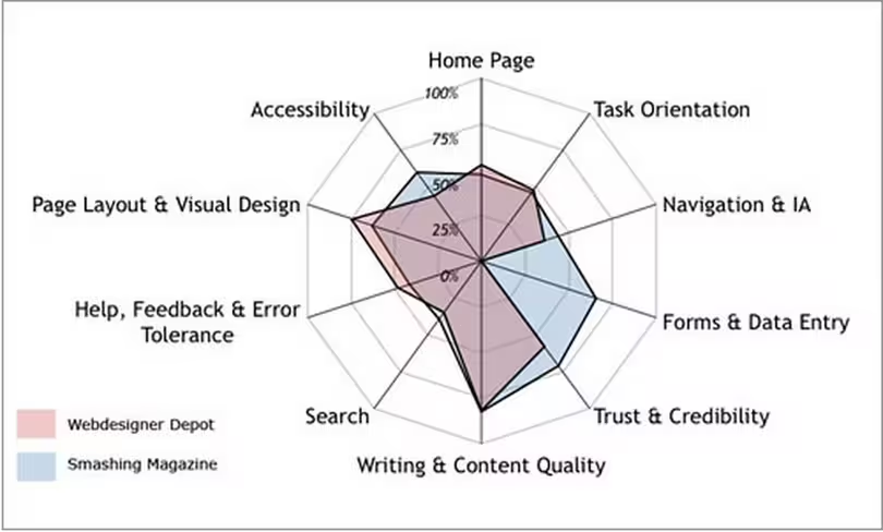 Source: A Guide to Heuristic Website Reviews
Heuristic reviews can even be carried out by non-UX folks provided they follow a set of guidelines. While they’re cheap and usually only require a day or two, they don’t actually tell you the usability of a system (since you’re not testing with real users) and may suffer from inconsistency and subjectivity (since they’re carried out by different people).
That being said, they are a still a great reality check since you’ll be able to catch glaring UX violations. We’ve summarized a scenario-based approach:
- Define your usability review scenarios — Define common and important user tasks. Who uses the product, and is this the first time? What task are they trying to complete, and what is their goal? For example, when evaluating a laptop, you would look at scenarios like sending email and watching movies.
- Walk through each scenario — Now that each scenario is defined, you need to walk through the steps to achieving user goals. Can they see how to do it? And how will they know if their action was correct? Walk through each scenario until you think the user achieved their goal or gave up.
- Complete a heuristic review scorecard — Use a template such as this 45-point checklist. It’s best to have three to five people do this. Remember that a high score doesn’t mean your product is actually usable, only that it should be usable.
Oracle uses a streamlined 10-point list of heuristics gauging everything from application complexity to frequency and helpfulness of error messages. Usability issues are categorized as either “low”, “medium”, or “high” severity with supporting notes.
The team then isolates the top 10 most important issues for immediate fixing. If you’re curious about what a full heuristic report may look like, check out this full heuristic evaluation of Apple iTunes.
User research report
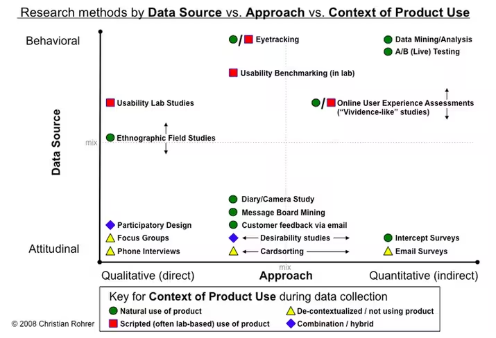
Once you’ve checked your product or prototype against best practices, it’s time to verify those findings with real users. Tactics like card sorting, tree testing, moderated user testing, unmoderated user testing, and other techniques can all be used (as you’ll see in the illustration below). We won’t discuss all the tactics, but we will provide a general framework.
While usability testing is more expensive than heuristic evaluations since you need to plan and recruit for controlled experiments, there is no better way to see how your product might perform in the wild
According to David Sherwin, Design Director at Frog, market research explains what users do and when they do it, but user research completes the picture by answering why they do it and how your product design can react accordingly. He advises a five-stage framework:
- Objectives — Create framing questions like “Who would share video clips?”, and “Why would they share these clips?”. Prioritize the most important questions, and then translate them into focused objectives like “Determine how frequent TV viewers in China decide what shows to record to watch later.”
- Hypotheses — Using your framing questions spend up to 8 minutes individually sketching answers. You may generate attitudinal hypotheses (TV watchers on social networks like to know their friends’ favorite shows), behavioral hypotheses (TV watchers only share clips from shows they watch frequently), or feature-related hypotheses (TV watchers will share clips if they’re popular with others).
- Methods — Sort all your hypotheses based on themes (attitude/behavior/feature) and then assign testing tactics. For example, observational and contextual interviews are great for building a foundation of knowledge. Diary studies, card sorting, paper prototyping, and other collaborative activities help explore design ideas.
- Conduct — Recruit around eight users for three testing sessions each (1 hour length). Develop an interview guide and then document all the notes, photos, and videos as you test. Constantly ask yourself if you’re discovering what you need to learn in order to achieve your objectives. If not, switch tactics.
- Synthesize — The why behind the data is more important than the what. Is there a pattern that suggests you need new designs? Did what you learn change how you should frame your research objective? And do you need to change the design activities that you’ve planned?
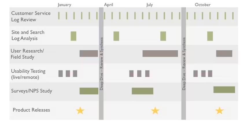
As you can see in the below diagram, there’s many different methods you can build into your overall testing plan.
Demetrius Madrigal and Bryan McClain, founders of Metric Lab, provide a helpful list of Do’s and Don’ts for usability testing. For example, you should get involved and observe as much testing as possible, but don’t jump to design conclusions based on only a handful of tests. And while you shouldn’t hide yourself from participants using a one-way mirror, you also shouldn’t turn your testing session into a product demo.
By sticking to a regimented user testing plan, Volusion was actually able to increase paid conversions by 10 percent and product trials by 6 percent. While it used a very specific formula of video-recorded testing sessions and A/B testing, it’s certainly proof that the process works.
If you’re looking for a leaner user research approach, you can follow this user testing framework (which you can learn in 10 minutes) and then document your plan in a simple format that resonates with stakeholders.
At UXPin, we’re big fans of guerilla testing. When testing new features, we enlist the help of UserTesting to record on video the reactions of designers, UX professionals, and product managers.
On the research side, we conduct in-depth interviews with product managers and UX folks from companies like Uber, Google, Etsy, and Apple to understand their pain points and how we fit in.
Analytics reports
Analytics reports are a quantitative complement to the mostly qualitative processes we’ve described so far. While qualitative methods like user research and heuristic reviews are bottom-up ways of analyzing users, analytics are top-down since you’re distilling broad data into a few insights.
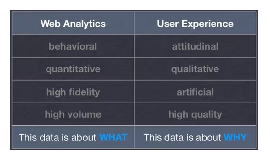 Source: Marrying Web Analytics & UX
Jennifer Cardello, Director at the Nielsen Norman Group, says that analytics has traditionally informed marketing strategy but is seeing growing usage in user research and design. Because qualitative research is expensive, you can first get a birds-eye view of potential issues and testing scenarios based on analytics reports.
For user research, analytics serves three crucial roles for identifying new tests and validating existing tests:
- Indicating issues — Weekly metrics reports can identify issues in web-based products. For example, you may find out that conversions suddenly dropped following a site redesign.
- Investigating issues —If any issues are flagged, you can investigate further. Is the decrease in conversions coming from a specific device? If so, you could design a device-specific A/B user test to check possible solutions.
- Verifying qualitative research — Analytics can also pinpoint trouble spots that arise during user testing. For example, study participants don’t know where to find information because a word on the site is confusing. Using a tool like Google Analytics, you can then check the keyword traffic for that term. If there’s a high volume, you’ve just verified that the problem is worth solving.
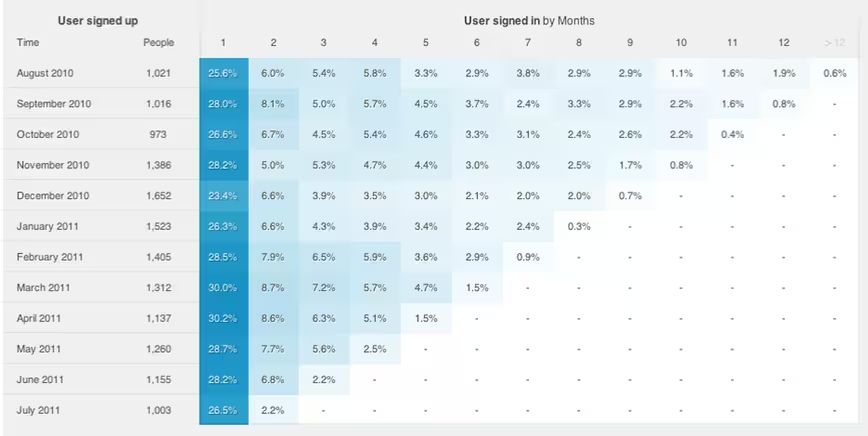
If you’re interested in specific user segments, you can also use cohort analysis to determine what further research and testing is needed. For example, you can treat Black Friday shoppers as a cohort, analyze their behavior, and design user tests accordingly.
 Source: Throw Away Vanity Metrics
If you don’t have a working product, analytics are still useful for doing market research. Keyword and backlinking analysis are both effective yet lean methods.
Using a tool like Google Adwords, you can check for search volumes and deduce consumer interest as well as competition. Backlink analysis will then tell you whether competitors are promoting similar products or services.
Research, Test, Validate
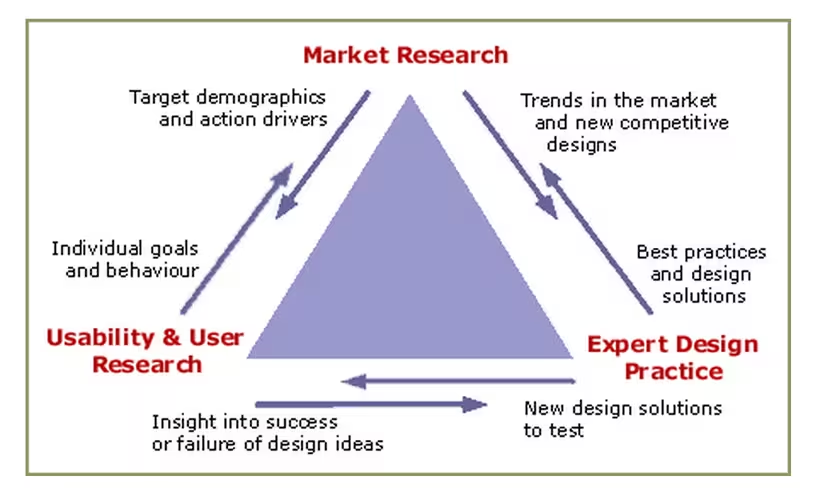
Market research lets you see the broad context, while user research helps you learn things that are immediately practical. Whether you have an existing product or are on the cusp of your “Aha!” moment, both will play a role in your product development.
 Source: The Research Triangle
When you combine market research with user research, you have a way to listen to the market as well as individual users. With that knowledge you mind, you can go forward and design solutions and test if they actually work. After all, if your product isn’t designed for users, it’s only designed for yourself.
Top image credit: Dangerous Questions In User Research
Read next: The danger of vanity metrics: Creating a reality distortion field
Get the TNW newsletter
Get the most important tech news in your inbox each week.
