Jerry Cao is a content strategist at UXPin — the wireframing and prototyping app — where he develops in-app and online content for the wireframing and prototyping platform. For details and visuals of how to incorporate usability testing into design, check out the e-book User Testing & Design.
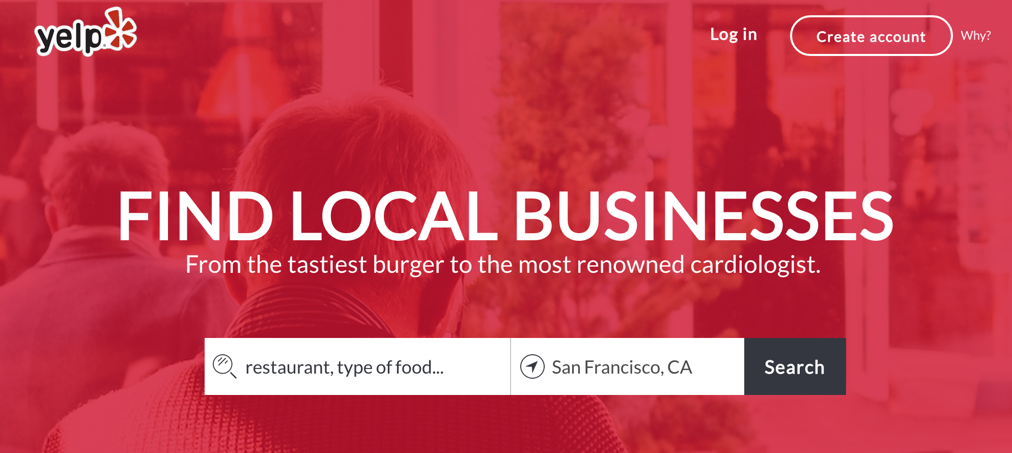
To demonstrate the power of usability testing in design, we teamed up with UserTesting and Optimal Workshop to run some tests on Yelp as part of a redesign exercise.
We specifically chose remote usability tests because they’re pretty quick and fairly affordable to run, compared to focus groups and other lab-based design tests. These tests were all unmoderated so that the users could interact with the Yelp website in the comfort of their own home for the most natural results. We encouraged them to think out loud and then recorded their reactions.
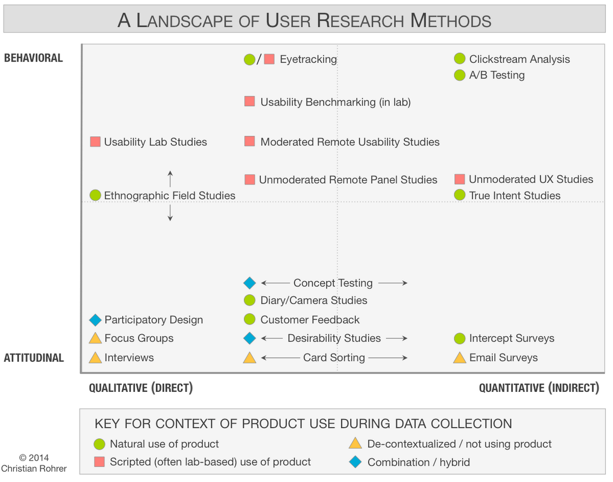 Source: Which UX Research Methods
If you look at the diagram above, you’ll see that our unmoderated remote tests lean more towards qualitative versus quantitative research.
Our goal is to show that user research isn’t about writing complex reports — it’s about asking the right questions and using the evidence to support design decisions.
In this piece, we’ll look at how we chose our users, how we set up the tasks and what the results were.
Selecting our users
As described in The Guide to Usability Testing, one of the first steps is figuring out who is testing your designs. In our experience, we’ve found that the demographics aren’t as important as behavior and familiarity with technology — how often do they use similar platforms, and how comfortable are they?
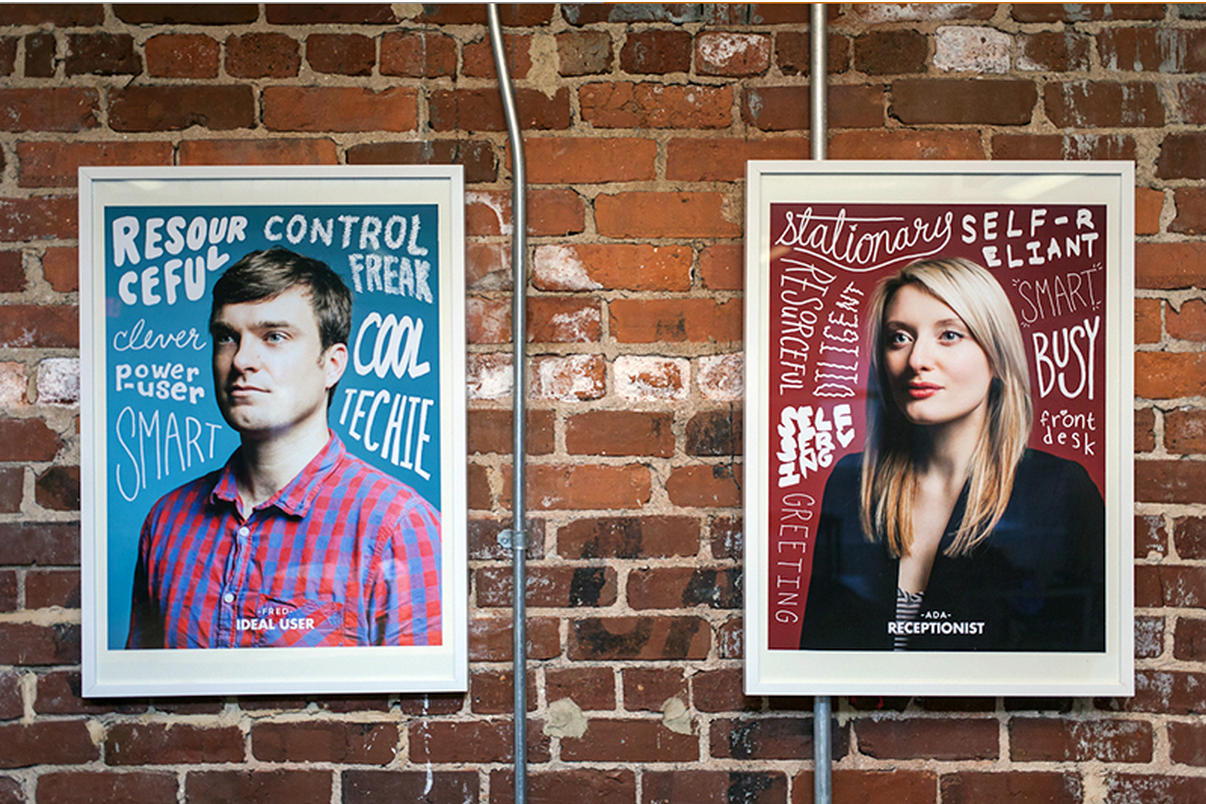 Source: MailChimp Persona Research
Yelp has a huge user base(138 million unique monthly visitors, according to Yelp’s Q2 2014 numbers), so our redesign site still needed to be familiar to the average current user. It wouldn’t make sense to alienate existing power users in favor of wooing first-time users.
For this study, we chose to observe current, semi-frequent Yelp users because we figured that user retention (rather than acquisition) would be an interesting business objective to examine considering the already-massive user base.
We didn’t focus on age, gender, income level, or experience using the Web since Yelp users come from all backgrounds. Because we’re handling qualitative data, we did not need to worry about statistical significance. We followed industry best practices and ran our study with a total of five users which would help reveal around 85 percent of usability issues (good enough for the exercise).
One of the tasks required users to log in to an account. This meant we needed to decided to create two segments for our test base: one with Yelp accounts (three users), and one without (two users).
For the segment with Yelp accounts, we only selected participants who had been Yelp users for less than six months to further eliminate the likelihood that they would be power users.
Finally, for the sake of simplicity, we only tested Yelp’s website on desktop, not on mobile devices. If this was more than just an exercise, we would have tested the experience on as many devices as possible.
As shown in the free e-book User Testing & Design, these are the exact requirements and screening questions that we used:
Test Details: Group 1 (Yelp account holders)
- User requirements: 3 users
- Any age, any income level
- Any gender
- Any Web experience
- Device: desktop computer
- Located in U.S.
- How often do you use Yelp? Every day | 3-4x a week | 1-2x a week | 1-2x a month | a few times a year
- How long have you been using Yelp? Less than 6 months | 6 months – 1 year | More than a year
- Do you have a Yelp account? Yes | No
Test Details: Group 2 (Not account holders)
- User requirements: 2 users
- Any age, any income level
- Any gender
- Any web experience
- Device: desktop computer
- Located in U.S.
- How often do you use Yelp? Every day | 3-4x a week | 1-2x a week | 1-2x a month | a few times a year
- How long have you been using Yelp? Less than 6 months | 6 months – 1 year | More than a year
- Do you have a Yelp account? Yes | No
Creating tasks for our users
Every usability test should start with the question, “What do we want to learn?”
For us, we wanted to learn how semi-frequent Yelp users complete very common tasks (to identify what features were most important), and at least one less-common task (to test the intuitiveness of advanced features).
We gave all users these types of common tasks:
- Focused task — Find a business based on very specific parameters
- Open-ended task — Find a business without being given very many guidelines
- Highly specific task — Look up a specific location to learn a specific piece of information
We wanted to learn when both user groups chose to search versus browse, how they interacted with filters, and how they made a decision about which business to visit.
As for the less common tasks, we provided a different task for each user group.
Since we had heard several complaints from registered Yelp users about Bookmark and Lists features, we asked registered users (Group 1) to save businesses for later reference. For unregistered users (Group 2), we asked them to find an event.

Below are all of the tasks that we assigned to both groups. After each test, we asked users if they were able to complete the task successfully and the level of ease or difficulty (known as the Single Ease Question).
Tasks: Group 1 (Yelp account holders)
- Imagine you need to reserve a private dining space for a group of 15 people. You are looking for an Italian restaurant with a classy ambiance. Your budget is about $20 per person. Try to find a restaurant near you that matches all of these needs.
- Imagine your best friend is having a birthday soon, and you’ll be planning a party. Find 10 bars or lounges near where you live that you would be curious to look into later for the party. Save them so that you can easily find them again on Yelp.
- Imagine you are driving through Boise, Idaho, and your car starts to make a strange noise right as you’re about to stop for the night. Your passenger recommends 27th St Automotive. Use Yelp to find out if they are open at 8:00 pm on Tuesday.
- Go to the place where you saved the 10 bars for your best friend’s party. Keeping his or her tastes in mind, choose one that would be a good match.
Tasks: Group 2 (Not account holders)
- Use Yelp to find a new restaurant near you that you haven’t been to yet. Spend no more than 5 minutes looking.
- Imagine you need to reserve a private dining space for a group of 15 people. You are looking for an Italian restaurant with a classy ambiance. Your budget is about $20 per person. Try to find a restaurant near you that matches all of these needs.
- Imagine you are looking for something fun and unique to do in your neighborhood this weekend. Try to find a concert, play, or other event using Yelp.
- Imagine you are driving through Boise, Idaho, and your car starts to make a strange noise right as you’re about to stop for the night. Your passenger recommends 27th St Automotive. Find out if they are open at 8:00 pm on Tuesday.
Once this was all done, it was time to start testing. It took around an hour to get the results before we could watch the user reactions and analyze the data.
Breaking down the usability data
For qualitative data, we ran a remote usability test with five users via UserTesting (which we described above). For the quantitative data, we tested ~35 users with a closed card sort (which shows how you to restructure your IA based on user feedback) and a first-click test (which shows what parts of the site make the strongest first impression).
You can learn more about the quantitative user tasks, but we’ll just summarize the top insights:
The Search bar was the starting point for almost all tasks. It was also the preferred backup option when users weren’t sure how to interact with the site UI (e.g. searching for “Bars” instead of clicking the category). Our redesign definitely needed to prioritize the Search bar.
The Events tab wasn’t noticeable.When asked to find an interesting activity, one user went to the Search bar while the other navigated through the Best of Yelp section. If we wanted users to actually interact with the Events feature on Yelp, we would need to make it easier to find.
The price categories weren’t clear. When given a budget to find a restaurant, some users weren’t sure what the dollar signs meant. In our new design, we added price ranges to the symbols.
The filters aren’t prioritized correctly. People didn’t use seven of Yelp’s 47 filters, and the most popular filters that arose in testing (such as “Accepts Credit Cards” and “Open Now”) take several clicks to access. Our redesign reorganizes filters into clusters of four for easier access.
Photos are a key part of the experience. When asked to find restaurants with a certain ambiance, users relied on photos the most. Our redesign makes Yelp more visual.
Bookmarking needs to be simpler. Currently, you can’t just save a restaurant or business straight from the search results — you need to visit each individual page to bookmark them. Our redesign lets you save a business with one click on the search results page.
To see how these insights reflected in the new design, you can play with the low fidelity Yelp prototype, and check out the final high-fidelity prototype.
We hope that our method gave you an idea of how you can use remote usability testing to create better designs for your site. Any comments? Let’s hear them below.
To learn more about how to incorporate cost-efficient usability testing into your designs, check out the free e-book User Testing & Design.
Read next: 15 ways to test your minimum viable product
Get the TNW newsletter
Get the most important tech news in your inbox each week.