The term “user experience,” abbreviated UX, is an often misunderstood and confusing concept for many in the design, development and marketing world. Understanding how to implement and improve UX takes time, skill and a deep understanding of users.
Simply put, user experience is the sum of the end-users’ interactions with a company or organization’s website to achieve a goal (obtain information, place an order, contact the company, etc.). It’s often measured by the ability of a user to achieve their goal in an efficient and pleasant manner, without errors, roadblocks, or otherwise abandoning the experience.
For Web designers, developers and product creators, the techniques and theories tend to center themselves around a set of elements that place emphasis and focus on the user experience and has an impact on the design (both visual and technical) of a website or product.

It’s hard to start any user experience project without any type of research or knowledge on the users that will be using either your website or product. Most UX projects start with investigating who their users are and why they are “users,” what is currently working and what isn’t, how users interact with the product or website, asking users what can be improved, and going through testing to learn more about user behavior.
Armed with details and insights gathered from researching your users and the current experience, how do you ensure your website’s or product’s user experience is both pleasant and effective? Below are critical elements of excellent Web UX design.
Usability
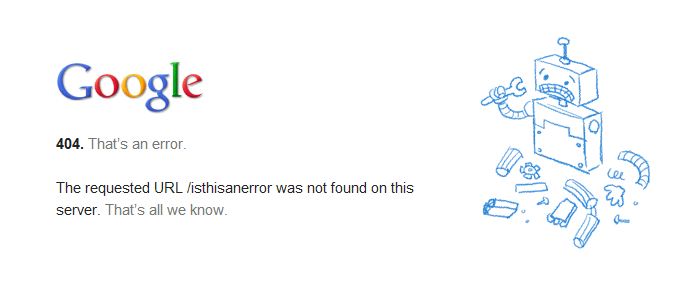
First and foremost, the website should be usable by any visitor to the site. If a user cannot use a site (i.e. site is down, links broken, next to no content, error messages), then the site as instantly failed the user and their experience. They often will become frustrated and leave the site.
Usability often concerns itself with the navigation, structure and organization of the site and content. The navigation needs to make sense and link to appropriate content. Using appropriate call-to-actions, accurate and descriptive headers and sub-menus throughout the site can help navigate users through the content and give them a sense of direction.
Not having enough – or having too many – content cues can hurt the user experience and can often lead to abandonment of the product.
The structure of the product should overall make sense based on content and purpose (i.e. don’t hide important pages/sections). Finally, the organization of content should be arranged in a fashion that navigating through content makes sense.
Accessibility
In addition to producing great content that is useful and organized well, the content needs to be able to be accessible by any and all users that visit the website or product. Not only should the site be free of errors and broken pages, but things like response time/load time, browser capabilities, device compatibility and disability compliance also rank high on ensuring a site is accessible to all.

While it is often easier to fix broken links, error messages and improve load times, other accessibility concerns tend to be left out in most user experiences. Most sites tend to not focus much on making their site accessible to those with disabilities (e.g. those who are blind, color blind, deaf or hard-of-hearing, or who cannot operate a device normally).
Making sure your designs are compliant in these areas takes a keen understanding of how these users use products and websites, but it’s a necessary step to ensure that every type of users has a positive experience on your site.
Findability
The site itself and the content the site displays should be easy to find for users. For the site, marketing, advertising and word of mouth help drive those who didn’t know about your business before to the site. Having a memorable name will help users recall the sites for return visits or recommendations.
For the site’s content, working on a search engine strategy where search engines can crawl their site and index their content with proper keywords and phrases makes content easier to find for those searching for information.
SEO (search engine optimization) is an ongoing process as content often changes and search engine algorithms adapt frequently.
Usefulness
Most sites should ask always themselves, “Are we useful for visitors who come to our site?” Almost everyone with a site would answer “Yes,” but more often than not, their site may not be as resourceful as they’d like to believe.
Oftentime, companies have websites that provide little to no information that having a website is almost useless.
Ways to make sure a site is useful include providing noteworthy and informative content, creating a site that is unique and different from others and ensuring that the site is leaving visitors satisfied for what they came for.
Avoid going overboard with links, videos and images. Use judgement to decipher the difference between valuable and distracting.
Desirability

The desirability of the site often comes down to the visual elements of the website and how these visual elements present content throughout the product or website. Most, if not all, of the elements of desirability in user experience comes from the visual website design.
The use of media (images, video), typography, colors and color schemes, arrangements of design elements and other design considerations all play into how a user desires visiting the site. A site that is terribly designed with lots going on and not very well laid out may find visitors finding it undesirable to visit and may leave the page.
The psychology of Web design plays a big part in the user experience. Users should feel as though the site is inviting and welcoming (conveyed in colors and layout), organized well, easy to read and content that is related to the site.
While the visual elements of the page and how the page is designed plays a role in how users feel about the product, users will only stay on the site if the content is desirable enough for them to continue reading. Use engaging copy to hold the reader’s attention after the visual elements have hooked them in.
Credibility
Finally, sites need to show and prove to users that they are credible. Users need to know that the information they are presented is accurate, truthful and from a reliable source. Content shouldn’t be overly pushy into making a sale, nor should it present information that gives users an uneasy feeling about the company or overall scammy or threatening vibe.
Ways to achieve credibility includes providing the information as expected by users, displaying appropriate content relating to the purpose of the product, the tone of voice in which content is written in and ensuring content can be verified by other reliable sources.
Building trust and being authoritative in the content presented to the user helps in boosting user confidence in the content they’re reading.
Putting the elements together
With a quick rundown of the basic elements of user experience design, putting them together on every project can be a bit puzzling. How can every single element be checked and optimized for every project?
User experience design takes practice and constant learning. Below are a few resources to help learn more about these elements and put them to good use.
Articles
- User Experience Basics from Usability.gov: Written by the U.S. Department of Health and Human Services, they discuss the elements and issues to look for when designing user experiences.
- What is User Experience Design? Overview, Tools and Resources by Smashing Magazine: If you are simply looking to brush up on a bit more on user experience, Smashing Magazine has put together a nice roundup to allow you to learn what you need to and see examples of user experience.
Courses
- User Experience Design Course by General Assembly: For those serious in becoming a top-notch user experience designer, online courses such as this one by General Assembly allows students to help understand users, communicate well through design decisions and present design decisions that enhance user experience.
- User Experience Design Immersive Course by General Assembly: Hands on, completely immersive course taught by General Assembly to teach you how to become a user experience designer in 10 weeks.
Graphics
- The User Experience Wheel by User Experience Project: Learn how each element works together in the bigger picture, and how to move through each element during the web design and development process.
- 8 Must-see UX Diagrams by UX Booth: For visual learners, this article is full of graphics and diagrams that help you understand user experience better.
Read next: The psychology of Web design: How colors, typefaces and spacing affect your mood
Get the TNW newsletter
Get the most important tech news in your inbox each week.
This post is brought to you by General Assembly, we turn thinkers into creators through education in technology, business, and design.


