A great web design is so much more than just delivering content and making it look good. When visitors come to your site, they produce a set of feelings about your website and your organization. The type of feelings they produce – positive or negative – are entirely in your hands and should not be overlooked when designing content.
Over the years, there has been a body of knowledge produced to help designers create effective visuals that play into the psychology of their viewers. In order to achieve this, one must understand how different web design elements and how we use them affect the mood, attitude and experience the visitor will have while browsing our website.
Below are four major areas of website design and development that have the biggest impacts on the psychology of website visitors. These are the tools you’ll need to create a visually-engaging site that encourages visitors to return.
Content
For websites, content drives the design you see on screen. Visitors come to a website to access information they need. Web design helps them find the information they need quickly and with ease.
In the early days of the Web, it was common to see pages and pages slammed with content, often pages with 10,000 words or more (as a comparison, this article is about 1,600 words). With pages loaded down with content, it made it extremely difficult to find content, let alone read through to get the information needed. This often invoked stress, anxiety and overall unpleasant feelings for visitors.
With today’s Web design, content should be edited and organized so that there is a happy medium between providing adequate and needed information while not overwhelming visitors. When content is in that happy place, visitors are able to find the information quickly and they feel good afterwards.
Hiding content, presenting too much content or otherwise mudding up your website makes visitors irritable, leading to possible loss in potential business.
In addition, the type of content you present sets a tone for you and your organization. If your content doesn’t present the right information in a logical place, is hard to follow or tends to beat around the bush on important information, then visitors will feel this way about you.
Keep your content clean, organized, easy to read, concise, and professional to help aid in the psychology of your visitors and produce positive vibes.
To help you craft the best content for your website, this article at Tuts+ goes into further detail on the psychology of great content for your website.
Space
The way a Web page is organized can dramatically affect how a visitor feels while they are there. Organizing content should be a priority in any web design, but this organization should take into consideration the space it takes up on the site.
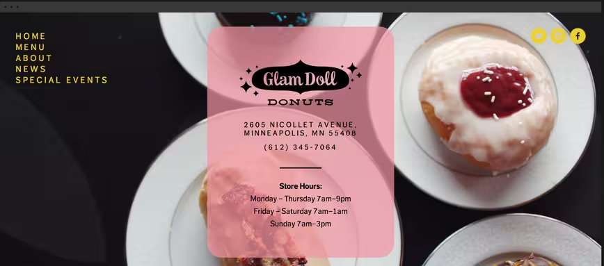
If you’re not familiar, “white space” is the areas of a design in which no content or visual element demanding our attention is present. White space plays an important role in any type of design work, especially Web design, because it visually gives a resting place for the visitor. These resting places are often found in margins and the space around things.

The concept of minimalism – that is, using the least amount of visual content needed to convey your point or idea – is currently very popular across the Web, specifically on services like Squarespace.
Said differently, if a visitor comes to your website and every inch of real estate on the screen is taken up by words, graphics, blinking things, etc., it starts to feel chaotic and makes them uneasy. If no white space is present, there is nothing for them to move their eyes to take a visual break.
If you take the time to edit and organize your content in a way that is respectful of the space you have to present the information, you give a feeling of professionalism, organization and overall good vibes to visitors. You want your visitors to feel like you have your stuff together and that you are easy to work with.
Keeping things simple with a well organized website using adequate white space tells visitors you know what’s important and you don’t want to waste their time.
Learn more about white space and keeping things simple in this Smashing Magazine article.
Color
When designing a website, often the colors are dictated by the organization’s new or existing visual identity (or brand). But how these colors are used affects how the visitor feels when they visit your site.
Most visual identities have neutral colors (i.e the tints, shades, and hues of whites, grays, and blacks) that are used along with their main colors. In most modern web designs, these neutral colors often take dominance in terms of how much real estate they take up.
For instance, if an organization’s main colors are blue and yellow, with neutrals being white and black, it is likely that they may choose a white background to display their content on, instead of a blue or yellow background.
These neutrals act much like white space does: it provides an opportunity for rest. Using the example above, if all you see on that organization’s website was blue and yellow, it would be an overwhelming site to focus your attention on (think yellow text on a blue background).
The types of colors you use also play into the psychology of your Web design. Cooler colors (blues, greens, purples) often provide an inviting, professional and relaxed feeling. In contrast, it can be used to give a very cold and unfriendly feeling as well. Warmer colors (yellows, oranges, reds) are soothing, warm, and give a sense of creativity but can also give off negative feelings such as anger and stress.
In addition, neutrals such as white often give a positive feeling of openness, but could also feel bland and dull. Grays are often considered slick, modern, and clean, but can be very cold and uninviting. Blacks are often associated with being professional and clean cut, but is also very overpowering and can be rather generic.
How you use colors to help convey the positive feelings discussed above depends on the tint (lightness), hue (type) and shade (darkness) of the color as well as how much of the color you opt to use. If you want your site to be inviting, open and creative, a combination of blues and greens, with touches of yellow or orange, on a white or light gray background will help convey these positive feelings to your visitors.
For more information on how exact colors play into the psychology of web design, Vandelay Design has a great article outlining each primary and secondary color and its effects on viewers.
Typography
Finally, typography can convey tons of emotions and feelings for visitors to your website. There are thousands of typefaces out there, and thanks to advancing Web technology such as CSS3, these typefaces have found their way onto websites as well.
No more picking a typeface out of the 15 or so Web-safe fonts. This has opened the door to thousands of new typefaces that can be used. And with great choice comes great responsibility.
Typefaces are designed to be used in specific situations and for certain uses. Serif fonts (those with little serifs, or feet, on the letters like Times New Roman) are often associated with professionalism, scholarly, and seriousness, while san-serif fonts (like Helvetica) are a bit more modern feeling, clean and more informal.
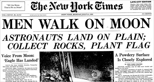
For example, most news websites (i.e. The New York Times) use serif fonts to help convey the feeling of tradition, importance and knowledge. They want you to feel like they are an authority, that what you are reading is important and that they know what they are talking about.
Sans-serif fonts are used more and more to convey a feeling of modern, clean, sophistication and upscale. Those in the technology industry often use san-serif fonts much more than serif fonts because they want visitors to feel like they are up-to-date and futuristic.
For more on what kind of fonts to use for your web design, Super Dev Resources has two great infographics to help you navigate your typography.
The way type is presented on the page is also important. Leading (space between the lines) and kerning (space between the letters) should be evaluated as well. Large leading with lots of white space between lines makes the copy feel airier and easier to read; little leading gives a crowded feeling and is hard to read more than one paragraph at a time.

Space between paragraphs, margins between blocks of text and other elements on the page, and font size (and its relation to leading) are also factors to consider. Tight paragraphs are uninviting and hard to read, copy that is too close to elements such as pictures make the page feel crowded, and too large or too small font size will either make the visitor feel like you are screaming at them or whispering.
Need ideas on the types of fonts available for your Web design? Check out offerings by Adobe’s TypeKit or Google Fonts for ideas on the possibilities.
Conclusion
It is often the designers’ job to understand the psychology of their design choices when producing a design, but understand the basics in some key areas of design will help you understand and even further help produce great content and manage your web design more effectively.
While these areas focus mainly on website design, a lot of the psychology of design can be used in other areas of design as well, such as logo and print design.
How will you apply these theories to your website?
This article was initially published in 2014.
Get the TNW newsletter
Get the most important tech news in your inbox each week.