As a company innovates and grows, rebranding is oftentimes an inevitable step in the process. Changes to the business need to be reflected in a new visual identity that reflects the company’s new culture.
Rebranding is the easiest way to show the world that changes are happening, and that a company is moving in a different direction. Even if most of the rebranding and repositioning changes are business-focused, a tweaking or complete revamping of the logo is common to keep the brand up to date.
As made evident by a slew of rebranding backfire over the past decade, people aren’t inclined to respond well to changes made to logos. Overhauls to branding can be incredibly controversial, particularly for companies with devoted followings or a deep historical identity.
Therefore, it is important to be prepared to present a rebranding properly, follow through with the commitment to change, listen closely to what people are saying, and ultimately make a decision to stay the course or scrap the new look.
Why rebrand
This might seem overly simple, but before starting the rebranding process you need to fully understand the reasoning behind the change. Keeping the “why” in mind during the process will focus your efforts.
There are many reasons to rebrand, some more positive than others. Hopefully your need to rebrand is positive, i.e. your company has merged with another and you want the branding to reflect the new partnership, you’re expanding your service offerings or perhaps there’s room for modernization.
Sometimes you’re not so lucky – bad PR, a scandal or internal upheaval are also reasons to rebrand. Regardless, you need to be prepared to explain why the change is happening.
If you’re modernizing, explaining the change isn’t as crucial if you keep the spirit of your old brand alive. Apple has gone through a logo redesign four times since 1976, but it has kept the same bitten apple shape and changed the color and style of the apple to reflect stylistic trends.
Small branding changes that stay true to the original look don’t need as much explanation – consumers understand the need to be relevant and are generally forgiving of small tweaks. Unfortunately, some brands aren’t as subtle, but more on that below.
During the rebranding
Now that you have decided to rebrand, be sure to do an audit of your existing brand assets. Rebranding is deeper than just a logo – it’s communicating your entire identity, and you’d be remiss to ignore what you already have going for you.
What’s your company history? How has that influenced your past business goals and branding? What are you known for? Don’t underestimate the power of nostalgia.
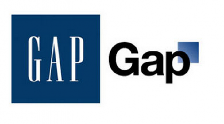
 The Gap modernized its look and in doing so, left behind the iconic blue square and serif font that was associated with years of holiday presents.
The company was coming out of a few years of low revenue and needed the rebranding to refresh the business and remind people of its relevance, but the new brand ignored what people loved about Gap to begin with – a simple style and classic timeless feel.
The announcement
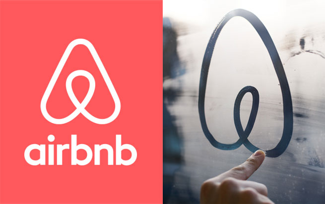
One company that recently presented its rebranding story well is Airbnb. Instead of quietly unveiling the new brand with a well-placed press release and a new website, Airbnb hosted a live video feed that its users could tune in to hear the tale of how Airbnb grew and became a worldwide community.
The founders then went into how the evolution of their company’s identity over the years, before unveiling a new logo and site redesign that were inspired by the lessons learned and the changes that had organically occurred.
Airbnb went from a cursive, bubble-lettered “airbnb” to a symbol, the Bélo. The story behind the rebranding and the presentation of it were both in line with the story Airbnb was trying to get across, and resulted in a successful initial turn over. Although the logo has received mixed reviews, it did not deter users from using its service.
Handling backlash
Just as we’ve seen in the new Airbnb or Foursquare logo, there will inevitable be some backlash to your new brand. Consumers aren’t fans of change, and the internet provides an open forum for uncensored discussions to occur. Everyone with any amount of emotional loyalty to your brand will consider themselves an authority.
This is a great thing when handled properly. In anticipation of the backlash, be prepared and have your responses ready. Listen to what your audience is saying and determine whether you’re going to stick to your new look or go back to your old branding.
The University of California lost touch when it rebranded its marketing efforts at the end of 2012, and the backlash was immediate. In an attempt to appear more modern, the almost 150-year-old educational institution commissioned a sleeker, simpler logo to replace the seal on its marketing and promotional materials.
The university didn’t control the story and misfired when announcing the new logo, and the misunderstanding cost UC a million-dollar brand overhaul. Impassioned UC students and alumni, and many residents of California, immediately rejected the new branding and expressed their opinions through petitions, op-eds, and protests.
If the University of California had been more clear about the purpose of the new logo, or if it had pulled back and stuck closer to its historical identity, UC may have been able to keep it. Instead, the rebrand was revoked, and the University lost face.
Rebranding is a difficult and intimidating process, but its by no means impossible to undertake. If you do your research before, keep your purpose in mind, control your story and listen to feedback, you can properly rebrand your company and come out of the transition successfully.
A good rebranding is extremely powerful – it can breathe new life into a dying brand, or keep one relevant, or simply proclaim to the world the changes that have transpired. Above all, tread carefully and confidently, and keep communication open to come out with a new look and new energy.
Read next: 7 rebranding mistakes to avoid
Featured image credit: Design Studio
Get the TNW newsletter
Get the most important tech news in your inbox each week.


