
As of March 2014, the average US consumer spends two hours and 42 minutes per day on their mobile devices, according to analytics service Flurry. Though the majority of this time is spent using apps (primarily games and Facebook), 14 percent of time spent on iOS and Android devices is spent on a Web browser.
As such, implementing a mobile-friendly website for your business is imperative to giving the 61 percent of US consumers who own smartphones (as of 2013) the best possible digital experience. Successful mobile websites make it easier to read content, to navigate pages and menus, and can be easily accessed by anyone, regardless of device.
Why go with a mobile-friendly website instead of an app? It’s much less expensive, you can use your existing content and/or code base (though it’s often recommended to rethink the UX to make it more mobile friendly) and it’s device agnostic.
Additionally, unless your content needs to be streamed or visitors need to get customized information (e.g. up-to-date transportation schedules), they are not going to want to give up precious device memory for another app.
So, what should you keep in mind as you consider UX, UI, organization and design?

The 💜 of EU tech
The latest rumblings from the EU tech scene, a story from our wise ol' founder Boris, and some questionable AI art. It's free, every week, in your inbox. Sign up now!
First, you need to determine whether the website is going to be adaptive or responsive.
An adaptive website is essentially a series of individual websites, and as a user navigates to your site’s URL, a script runs that detects the size of the browser window and then chooses which website to show. This is a more labor intensive option, but useful for sites with involved forms or multi-step flows that can’t be easily made larger and smaller.
American Airlines is an example of an adaptive website because of its highly interactive and secure ticket reservation system.
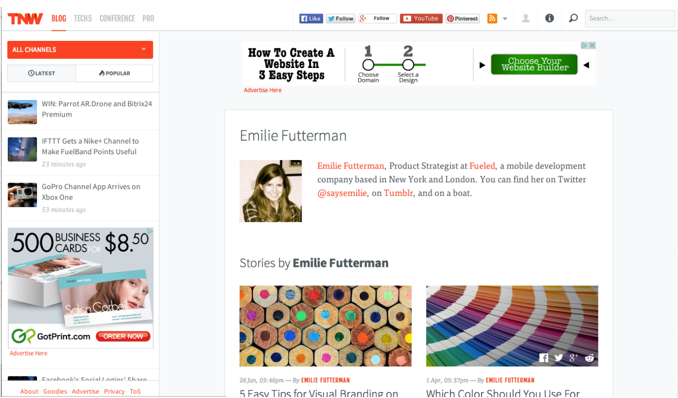
A responsive website responds to the size of a user’s browser by adjusting the pieces of the site to fit in the space available. TheNextWeb.com is a responsive website, and you can test this by adjusting the size of the browser window on your computer. I’ll use my own author page as an example below.
First, the Web page as it appears in a “normal size” browser:
And now, what the same page looks like when I make the browser smaller – about the size of my iPhone screen:
There are two key areas to note: the menus and the alignment of content
The main navigation menu on the left side collapsed into one side menu that now slides in and out when tapped.
This keeps visitors’ focus on what they really came to see – the content on the page – while keeping the navigation easily accessible. Additionally, the top menu with all the TNW social information collapsed into the “Follow” menu, de-cluttering the header and keeping the small window easily navigable and easy on the eyes.
In the example above there is also a realignment of page content that is absolutely necessary for a pleasant user experience. Users are in the habit of scrolling up and down when navigating content on their mobile devices, not left to right then back left then down.
The recent “content card” trend where different pieces of website content (blog posts, items for purchase, company information) is organized in a grid system is no accident. The fashion startup Zady is a great example of a responsive website that takes advantage of the content grid and mobile’s multi-gesture interface.
If you navigate to the Zady website with a browser window that is longer than it is tall, you will see a long horizontal header across the top, a carousel beneath it with two boxes to the right, and a lower grid that lead to different areas of the site (men, women, blog posts, featured items, etc).
As part of responsive design, the grids rearrange themselves, and the different content boxes fall underneath the carousel in order of relevance to the shopper.
The Zady responsive site has two particularly commendable features. The first is the menu organization: in the “regular” site, the top menu has a drop down under each option. In the mobile site, the menu is organized similarly with each “drop down” hidden under the corresponding option until you tap it to open it accordion style.
The second is commendable feature is the carousel at the top. When navigating to the site from a touchscreen device, the user can easily swipe to the left and right to see more content. “Stacking” content thus cleans up the screen and takes advantage of a users ability to play around with what they see.
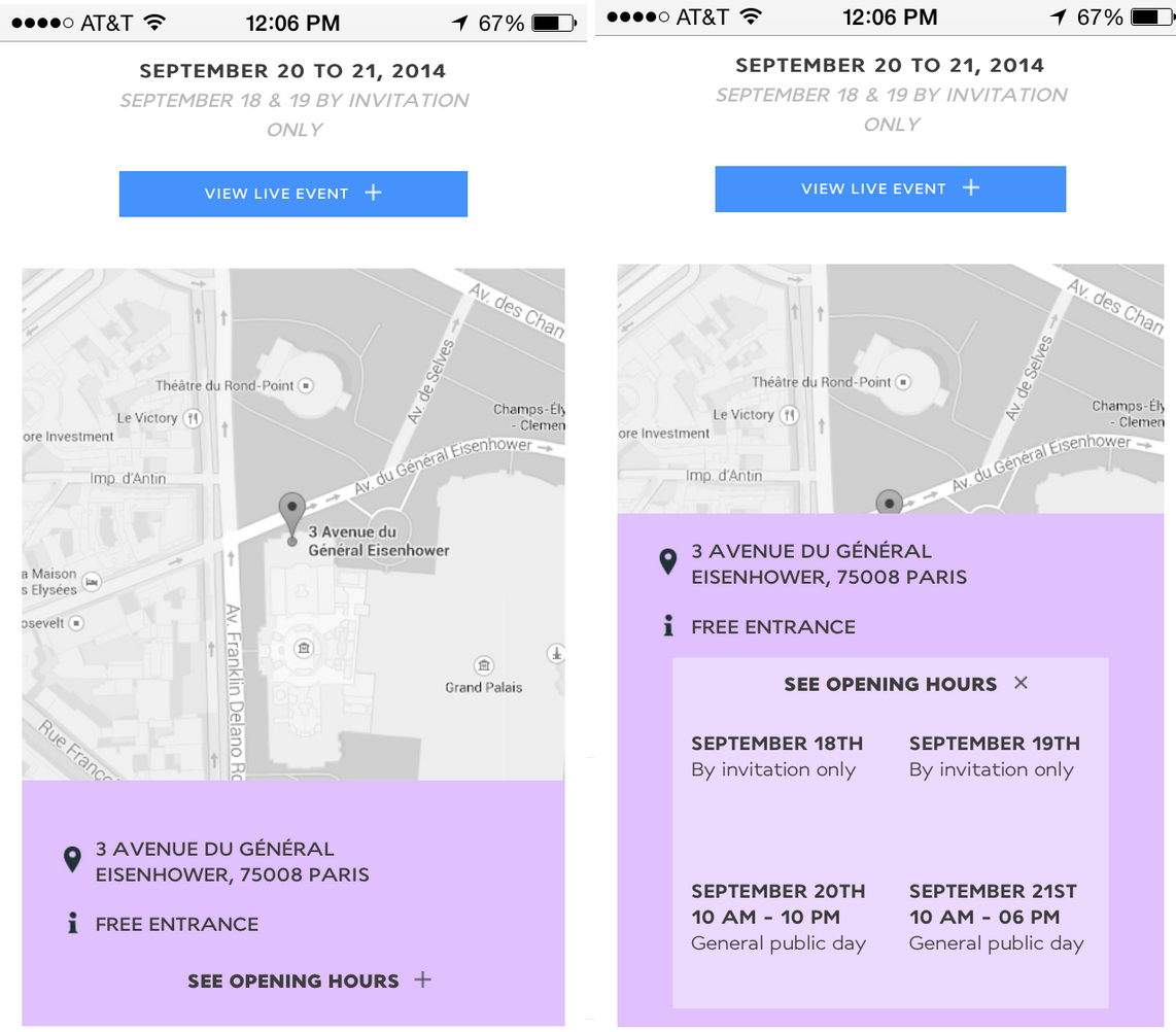
Another website that does this exceptionally well is the Air France Expo webpage.
Mobile-friendly websites for events are key
If your company hosts regular meet ups, conferences or events, it is imperative to have all the information ready in a mobile platform. Air France smartly designed a responsive website and a mobile app, each with a distinct use case: the website is for potential visitors and as such presents information about the event, how to get there, and hours.
The mobile app is for people already at the event and serves as a mobile companion for attendees – like a brochure. The website is designed with the same “cards of information in a grid that can readjust” design as most responsive websites, but the website has a couple of exceptionally useful features for mobile users.
The first feature that stood out was a “back to top” button at the bottom of the content. Organizing all your site’s content into one long column that can be easily scrolled up and down creates a potential dead-end when the user arrives to the bottom.
By implementing a “back to top” button you spare your visitors from having to scroll back through all of the content to get to the top of the page.
Another interesting feature is how Air France hid the hours of the exposition behind a Call To Action (CTA) to “See Opening Hours” (see images below). In an effort to keep important content on the surface and easily legible, it moved content that would only be useful for the more interested visitors, thus making the column of content smaller and keeping the most relevant details at the forefront. And, truth be told, the animation is fun and gives a more polished feel to the site.
The Air France exposition site is a great example of a simple responsive site that provides the minimum information necessary – but what if you’re a company or organization that needs a very informative website with a lot of copy and images?
This should not prevent you from implementing a responsive design – if anything you should absolutely implement a responsive design so that you can be sure that the experience of navigating through all the content you are offering is a good one for everyone.
Content-heavy websites
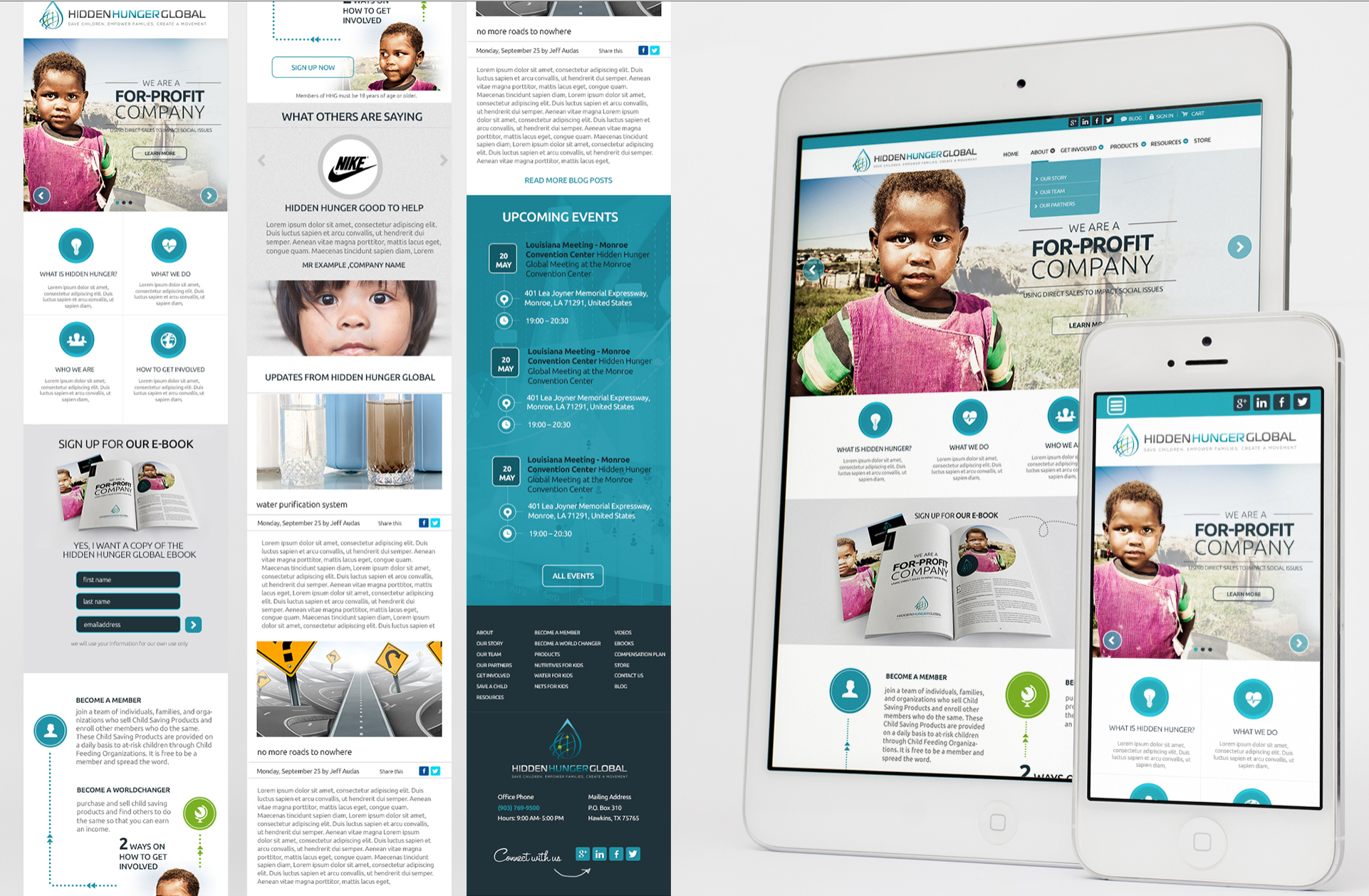
Hidden Hunger Global is an organization with a lot of reading material used to inform visitors of its cause. This material needs to be easily legible and visually appealing no matter the device being used. Therefore, it utilizes a responsive layout with easily navigable, scrollable content.
The website uses a lot of the features we have already discussed – navigable carousel at the top, gridded content that adjusts as the width of the website changes and a column of information divided into subsections. The app also does a good job of keeping each subsection about the size of a phone screen, so users can view and entire section at a time in their devices.
Additionally, because so little of the content is visible at one time (see rightmost screengrabs), it’s important to think of the order of the content. The top portion should be reserved for information about you and navigation, and should ideally be followed by CTAs or links to other areas of the site so that the user stays engaged.
Below the CTAs or links you can put more information about your organization that the user can peruse as they keep scrolling. However, be sure to keep white space between content and diversify words and images so that its not overwhelming on a smaller screen.
Now you’re ready!
To recap, mobile-friendly websites are most successful when content is organized in a grid-like manner that can easily adjust to fit a variety of screen sizes.
Be sure to keep the small canvas and natural touchscreen gestures in mind, and also be aware of where and when your users are navigating to your site. The content they need access to on their phones may be different from what they want to see when sitting at their desks.
Above all, don’t shirk on branding or creativity. Make it reflect your site’s personality, because at the end of the day, visitors want to know they’ve ended up in the right place.
Get the TNW newsletter
Get the most important tech news in your inbox each week.
