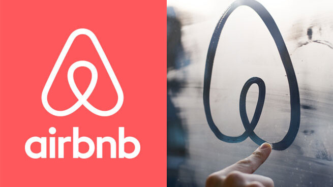
Airbnb today unveiled a new flat site and mobile design and replaced its logo with something that resembles an upper-case A, amongst other things. One glaring issue is that it looks nearly identical to the logo for Automation Anywhere.
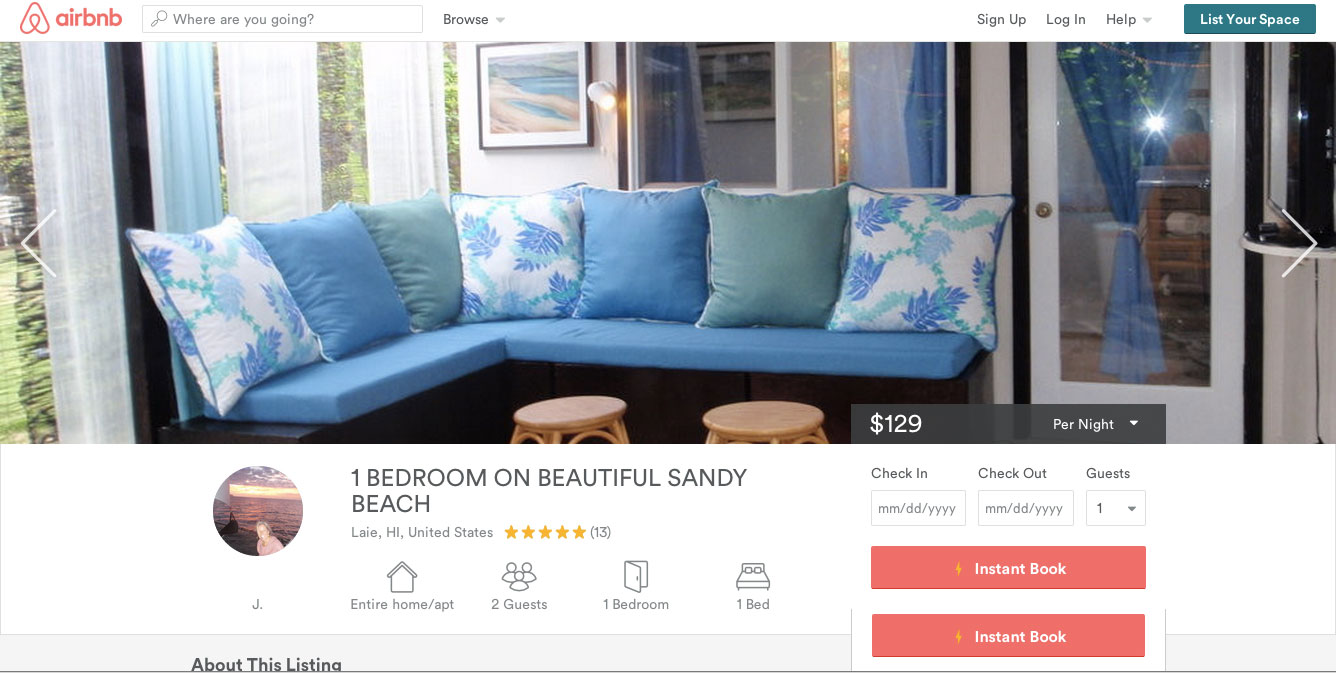
The new design removes all the drop shadows from the site and mobile apps (iOS and Android) and uses a system-wide font. It’s cleaner and easier to navigate which is helpful when you’re trying to book a spare bedroom in Hawaii for your next vacation.
The new logo, which Airbnb calls Bélo, is supposed to be “the universal symbol of belonging.” Sure, why not. Here’s a video about the logo:

The <3 of EU tech
The latest rumblings from the EU tech scene, a story from our wise ol' founder Boris, and some questionable AI art. It's free, every week, in your inbox. Sign up now!
Airbnb is also allowing hosts to create their own version of the Bélo logo. Hosts are prompted to “make a symbol that reflects your Airbnb experience, and add it to your Airbnb profile.” It’s actually a smart way to get hosts to market themselves while still sticking with Airbnb’s brand.
Update: Airbnb and Automation Anywhere sent Venture Beat the following statement about the uncanny similarities of their logos:
In early 2014 both Airbnb and Automation Anywhere began use of new logos that, by coincidence, have similar designs. Airbnb and Automation Anywhere are working cooperatively to address this issue, and Automation Anywhere is in the process of transitioning to a new logo design that is not similar to the Airbnb logo.
➤ Belong Anywhere [Airbnb]
Get the TNW newsletter
Get the most important tech news in your inbox each week.