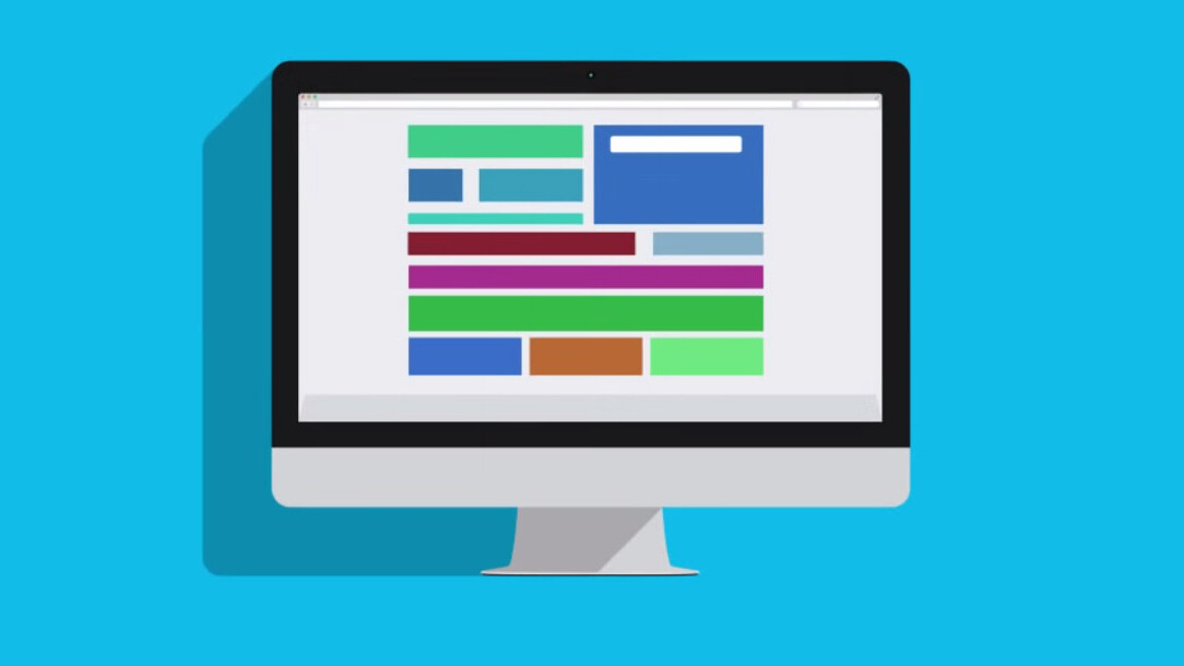
When using Google AdWords, Facebook ads or other forms of paid online advertising; it’s important to make use of landing pages to create one cohesive experience from your ads to your website.
Quite often a visitor’s initial interaction with your business is a landing page, which is why it’s so important to make an impactful first impression.
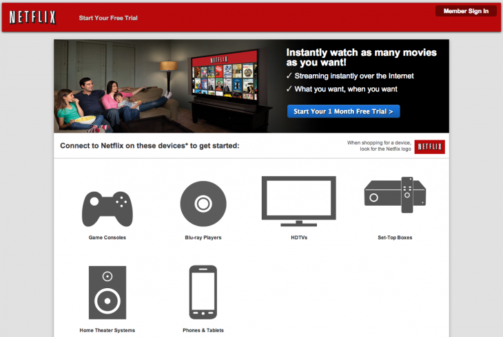
A landing page is a simple page on your website a person visits after clicking on an ad. The landing page has no top level navigation to distract a person, but instead a form or call-to-action button instructing a visitor to take one specific action.
There are other elements to the page to help improve the likelihood that a visitor completes the desired action like signing up for a newsletter, downloading an eBook or otherwise.
Landing pages can be extensively optimized using A/B testing to more effectively convert qualified leads for your business. Whether that entails changing the color of a button or moving the location of a logo.
According to Marketing Charts, marketers allocating more of their budget to optimization tend to have more success with their conversion rates. It’s evident that investing in creating the landing page that’s just right for your business is critical for the success of your ad campaigns and driving more leads into the sales pipeline.
Here’s are the first steps to finding success with your landing pages.
1. Use a simple, yet thorough form
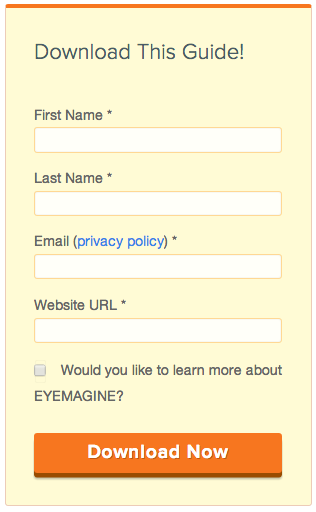
Using a simple form on your landing pages will make the sign-up process much more streamlined.
Include a few fields to gather pertinent information like a leads name, email address and website.
Make sure to find a happy medium between gathering enough information about a lead to ensure they are qualified and keeping the process simple to make the interaction as easy as possible for a lead to complete.
2. Include a description with bulleted benefits
The offer your landing page is promoting should be clear whether it’s to download a resource or sign up for an email list.
The benefits a person gets from supplying their information to your company should be evident in a bulleted list or highlighted text on the landing page.
By bringing these benefits to the attention of a visitor, they’re more likely to convert and claim your offer.
3. Highlight your brand with images or video
The landing page should remain simple, but that certainly doesn’t mean it shouldn’t be branded inline with your company’s aesthetic.
Brand the landing page to match the look and feel of your website and other online properties to help create one consistent experience for your audience, wherever they interact with your business.
Use images or video to highlight the advantages of signing up, using these visual elements as a trailer for what your business is has to offer.
4. Add trust elements
Videos and images can help build the trust of a visitor, especially a first-time visitor, who needs convincing to take an action with your business.
Trust elements are any items on a landing page that help establish the credibility of your company and its expertise including testimonials, logos of past clients or customers, awards won, certifications and more to build a stronger context for a visitor during their initial interactions with your business.
5. Synch your ads with your landing page
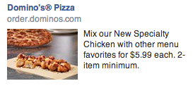
Include similar messaging and branding on your ads and your landing pages to increase conversions since you’re offering one consistent experience to visitors from each point of the funnel.
This will require the creation of a few different ads and landing pages to ensure each segment of your audience has messaging that’s relevant to the context of that group of visitor’s journey online and their individual demographics.
Offering a cohesive experience from an ad to a landing page is important because there are no surprises for a visitor, leading them through a path that is expected and connected. Providing a consistent experience for your audience reduces the bounce rate since your ad copy accurately explains what a person should expect on a particular landing page.
6. Alter your call-to-action
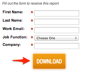
Create a call-to-action button for your landing page that is directly associated with the purpose of the landing page. For example, if you’re trying to get users to download your white paper then the call-to-action button might be download.
Many businesses make the mistake of going with subscribe as a default copy for their call-to-action button, which isn’t quite specific enough and leads to a loss in conversions.
7. Focus on being mobile friendly
Besides removing the top header navigation from your landing page to focus a visitor into converting, it’s also important that these pages be mobile friendly.
A recent study by Flurry found that Americans spend 162 minutes on their mobile devices per day, which supports the likelihood that they’ll probably access your landing pages from their mobile phone.
The ideal situation is to have a responsive designed website that resizes to suit the device being used by the user to provide the best experience. By having an optimized experience, it’s easier for a user to interact with your landing pages on mobile and therefore, increases the likelihood of a conversion.
8. Consistently A/B test
Regularly A/B testing your landing pages to figure out what elements work best to drive conversions is important to continue to see results from your ad campaigns.
Start by having a hypothesis that your team can effectively test. Next, create two versions of the same landing page with only one variable altered (like the placement of a photo or the number of fields on the signup form) to begin testing to see which resonates better with your audience.
Your organization can always reap the benefits of A/B testing because no landing page will ever fully be optimized, since it’s an ongoing process with constant iterations and room for improvement.
Get the TNW newsletter
Get the most important tech news in your inbox each week.
This is an advertorial brought to you by GetResponse: Create stunning newsletters and landing pages in minutes.


