
Anthony Rose is co-founder and CTO of zeebox, the social network for TV.
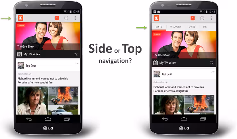
So, you have a mobile app where there are more pages or sections than can fit on a mobile screen at once. Your first thought might be to create a tabbed design, with a row of tabs along the top or buttons along the bottom.
But wait… that extra row of tabs or buttons wastes a lot of valuable real estate on a small mobile display, so let’s not do that. Instead, let’s move the options into a side menu, or side drawer, as our Android team keep reminding me it’s called.
If your mobile app has multiple views then I would be surprised if this subject has not been vigorously debated by your team:
- Persist all the navigation options on screen at all times so your users have clear visibility of all the main app views and single-click access to them.
- Or, free up screen real estate by moving the options into a side menu.

The 💜 of EU tech
The latest rumblings from the EU tech scene, a story from our wise ol' founder Boris, and some questionable AI art. It's free, every week, in your inbox. Sign up now!
The side menu has become fashionable on Android but not yet taken off on iPhone… and so another factor that enters the discussion is the desire for your Android and iOS apps to have similar navigation and user journeys, or not.
I thought it worth sharing our experience.
Side navigation or Top navigation drawer: Usability vs. clean design
When we first started zeebox, we began with a tabbed design with a row of buttons along the top. Our reasoning was simple: “Out of sight, out of mind” – i.e. if you don’t see the set of available options then you’re not going to know that they exist.
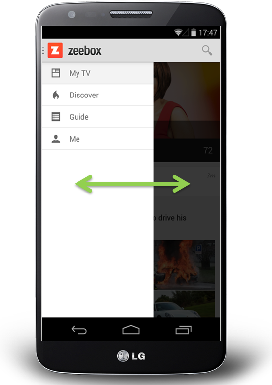
For example, in the above images, if you don’t see a GUIDE option then how would you know to go to the menu to look for it? And if you discovered it once, would you remember that each time you returned to zeebox? Even if you did, it would be two clicks to get to the guide rather than one.
On the other hand, the design looks so much cleaner without that ugly row of buttons along the top, moving the navigation into a side menu really lets the content breathe.
The idea of moving app navigation off-screen into a side menu – also known as a hamburger menu or navigation drawers – seems to have originated about 18 months ago.
Around Sep 2013 Facebook switched to a new side menu design – or at least my Facebook app did as part of its A/B test. Surely if Facebook was doing this, then it had to be good… right?
The friendly and wonderfully helpful Google Play team suggested that navigation drawers (which I’m referring to here as a side menu or side navigation) were the new way to go and would be the preferred design pattern for our Android app.
And so about six months ago, we decided to take the plunge and switch to a side navigation. To make sure people knew about all the available views and options we had the app start up by showing the navigation drawer open:
When we launched the new version the user reviews were great (“Love the new design, 5 stars”).
But when we looked at our analytics, it was a disaster! Engagement time was halved!
It looked like “out of sight, out of mind” really was the case.
The surprising truth
After realizing the gravity of the situation, we rushed out an update two weeks later that restored the top navigation as the default. We also provided a settings option that allowed users to turn on side navigation if they preferred so as to not upset those people who had loved the new side menu.
Anyway, cut to six months later.
The zeebox app has really come a long way in those months, we have a new My TV page that’s a constantly updated personal feed of news, TV shows starting for you, and posts for shows and from people you’re following. The My TV page is the place that our users want to see. But we wanted another go at letting the content breathe, so it was time to try that side navigation experiment again…
However, having learned our lesson, this time we’re going to do it the smart way: we’re going to A/B test it.
Our favorite A/B test tools and methodology
Lately we’ve become big fans of A/B testing, both with users coming into the office to test interactive Flinto prototypes and with A/B configuration built into our production app.
We start by creating mock-ups of various design concepts. We use Flinto to turn those into interactive prototypes that look just like the real thing, but which are built and iterated in minutes or hours.
You can see a couple of our Flinto prototypes here and here – click the links on an iPhone for best effect. Tap an hold anywhere on the page to see where all the interactive hotspots are, then tap on a hotspot as if you’re using the real app.
We advertise for users who love TV, anything from The Voice to Downton Abbey. Twice a week we have four to five people come by our office to our virtual lounge where they try out the various concepts and prototypes we’ve prepared.
Sometimes you’re able to get a clear design winner from that small user sample. But in other cases, like for side navigation, you really need to sample thousands of people using the real app. And for that you need A/B testing.
For mobile app A/B testing, we use Swrve – it’s the most sophisticated A/B testing product I’ve found. It provides not just useful features like Goal Seeking (the A/B test server can automatically switch all users to the best option once a clear winner has been determined) but Swrve also lets you serve customised experiences for every individual user.
For example, if you’re a Comcast subscriber and we notice that you haven’t yet discovered that zeebox can act as a remote control for your Xfinity box, then Swrve could instruct the zeebox app to pop a message telling you about that, with the timing of the message adjusted on a daily basis for optimal effect.
Anyway, we decided to go with a 15/85 test, where 15 percent of users were served the side navigation and 85 percent got the top navigation.
We launched the new version, waited 48 hours, checked the stats… would things be different this time…
The answer was a resounding No.
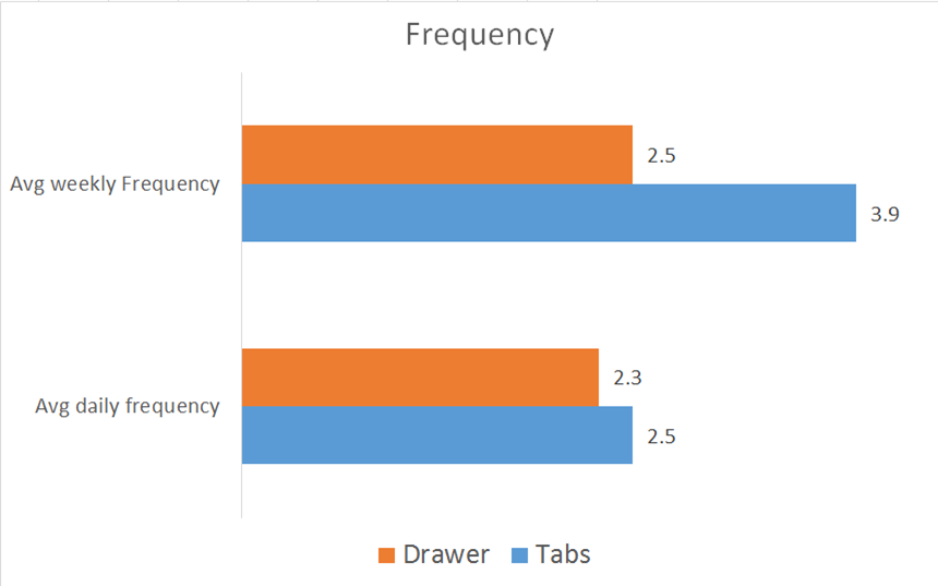
Weekly frequency was down. Daily frequency was down. Time spent in app was down. The side nav was as big a disaster as the first time round.
The good news is that, thanks to A/B testing, this time we could simply flip a switch on the server and set 100 percent of users to top navigation.
Given that the discussions about top or side nav are very likely a topic of debate in your company, I thought it worth sharing our experience.
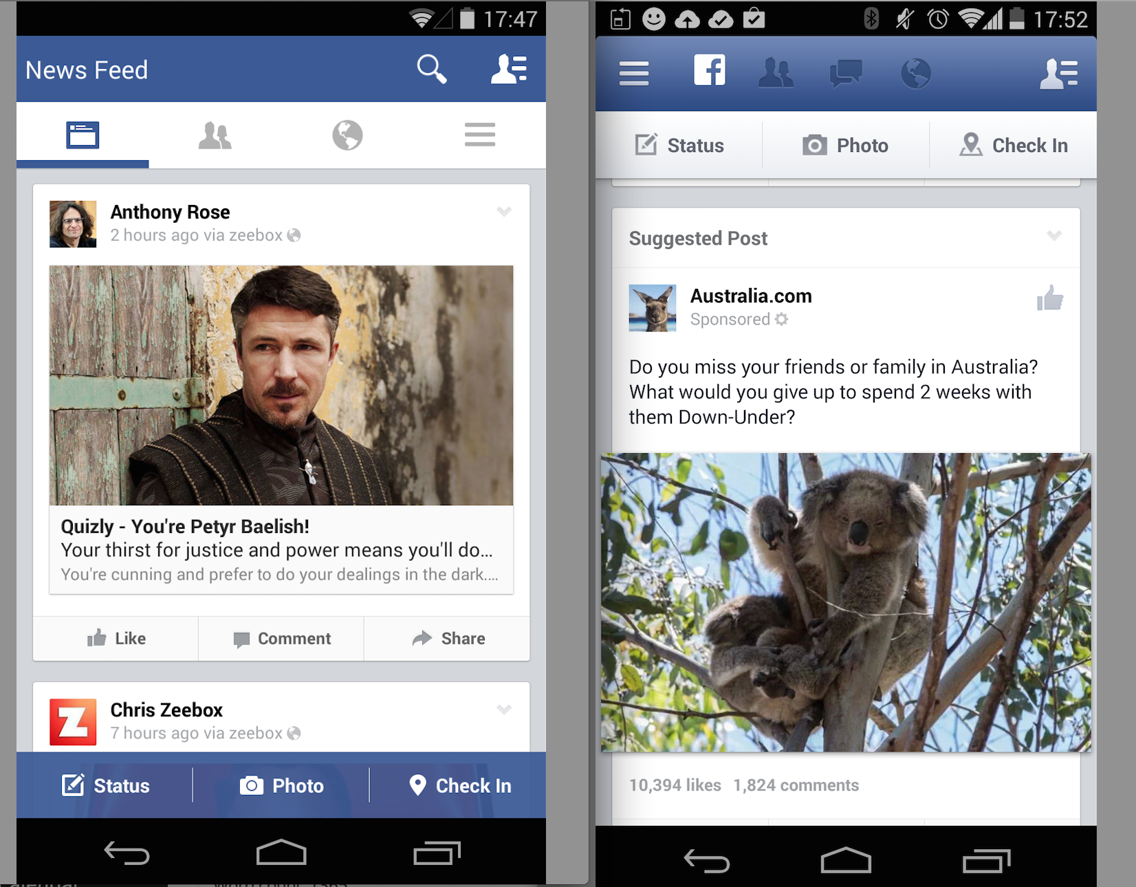
Back when we did our above A/B test and concluded that the side nav was not for us, Facebook launched its new navigation on iPhone, with a persistent bottom navigation on every page. So, on iPhone, the app has a persistent lower navigation.
However, on Android it’s, well… variable. Looking at Facebook on my Android phone (below left) vs. on my colleague’s phone (below right), Facebook must be A/B testing this right now as some people are seeing top navigation and others side navigation. I’d love to know what Facebook are seeing in terms of engagement with each…
When does side navigation drawer ever come into play?
My take-away from all of this is that if most of the user experience takes place in a single view, and it’s only things like user settings and options that need to be accessed in separate screens, then keeping the main UI nice and clean by burying those in a side menu is the way to go.
On the other hand, if your app has multiple views that users will engage with somewhat equally, then side navigation could be costing you a great deal of your potential user engagement, and interaction with those part of the app accessed via the side menu.
Get the TNW newsletter
Get the most important tech news in your inbox each week.