
Banner ads are the most ubiquitous form of marketing on the Internet. Since the days of Geocities and MySpace, banner ads have peppered the World Wide Web, advertising everything from free iPads to flash sales.
Recently, the proliferation of behavior based marketing tactics in web advertising means that the banner ads that are popping up are creepily accurate representations of your browser history. As if we really need to be reminded of our late night flash sale shopping binges in the harsh light of day.
Banner blindness – A real threat to your clicks
Because of their abundance, banner ads are, more often than not, ignored. The reasons include lack of relevance to the viewer, fear of spam, a virus, popups, or some other unexpected reaction, and general lack of engaging content.
In one AdKeeper survey, 43% of respondents said online banner ads don’t seem interesting or engaging and 31% of respondents said they only wanted to click ads when they were in the mood or interested in looking at them. There is no doubt that banner ads are a difficult medium for advertisers to execute successfully, but they can be very effective if certain principles are followed.

The 💜 of EU tech
The latest rumblings from the EU tech scene, a story from our wise ol' founder Boris, and some questionable AI art. It's free, every week, in your inbox. Sign up now!
After exploring countless pages worth of banner ads, and mercilessly subjecting my browser to a Chips Ahoy factory worth of cookies, I’ve come up with some things to keep in mind when designing a banner ad to ensure that it is clicked instead of ignored.
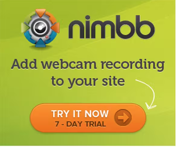
Keep copy simple and un-clutter your visuals
In a space where flat design is becoming more and more prevalent, loud banner ads are jarring and unappealing to users. Forgoing flashing, gifs, and a rainbow of colors for simple copy and an uncluttered image can mean the difference between a passing glance and an inquisitive eye.
In the L.L. Bean ad below, the product is unobstructed in the center of the image and the bold white copy at the top clearly lets the viewer know what they will get when they click ahead. The ad fits well within L.L. Bean’s brand image, further lowering the risk of viewer confusion or aversion. At the bottom of the image, there’s a very bright call to action so that the user knows how to engage with the content and benefit from the deal being advertised.

Have a clear call to action
A banner ad’s value is ultimately determined by the number of clicks it generates; therefore, it’s incredibly important to incentivize users to engage.
The best banners have a clear call to action that explains to users exactly what they should expect when they click on the ad. 57% of respondents to the AdKeeper survey mentioned above are wary of opening something they’ll wish they hadn’t. They are unsure where the link will take them and what the benefit would be.
In order to minimize viewers’ distrust and confusion be sure to include a strong CTA in a bright or contrasting color that not only asks the user to click, but also lets them know where they will be directed once they do. The banner below is a great example of a CTA that both stands out and clearly lets the viewer know why they should click it.
Don’t forget to follow through
Once someone clicks a banner ad, there is nothing more confusing than being directed to a website that looks completely different from the ad that was just clicked. A banner ad should be visually similar to the site that they direct users to.
When designing your banner be sure to stay on brand with your colors, your fonts, and your copy so that people aren’t thrown off when they arrive at the destination page. Volkswagen has a very strong brand image that they are notoriously good at keeping consistent over different types of content, as is evident in the banner ad and the screen shot of the Volkswagen website below.


Mind your ad buys
Though banner ad placement is more difficult to control than the banner’s design, careful location planning and customization can seriously pay off.
58% percent of respondents to the AdKeeper survey said that online banner ads are not relevant to them, and that this decreases the probability of engagement. Cookies and behavior based marketing have made it much easier to place ads that are relevant to users on the pages they visit. However, it’s possible to take it a step further and create banners that are relevant to every visitor to a webpage, no matter their demographic or browsing history.
Nissan has one example of great banner ad placement – they pulled data from Dubai house-hunting site Dubizzle to automatically suggest users a Nissan based on budget, neighborhood and family size.
Interactive
It’s no longer 1999, which means that interactivity with banner ads is no longer limited to shooting ducks as they march across the screen.
Advances in web languages allow us to push the boundaries of the banner ad box – quite literally in some cases. This Adidas banner ad does just that. The user is encouraged to pick up the pen and start drawing lines everywhere. As they do so, the line is populated with different line drawings that a little runner explores. The lies of physics seem not to apply, a fitting accompaniment to the Adidas tagline: “Impossible is Nothing.”
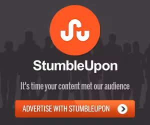
Keep it simple
In the end, the most important thing is to keep everything simple. Determine your core purpose, your branding, and your call to action and don’t deviate much further than that. The more content in the box, the more likely you are to confuse and therefore alienate your viewers. The StumbleUpon example below is on brand, extremely simple, and the call to action has a very clear purpose.
In Conclusion…
Don’t let your designs be limited by the boundaries of the box. At risk of sounding clichéd, thinking outside the box is the key to designing a clickable banner ad. The ad needs to have a clear purpose and Call to Action, be relevant to the space around it, and on brand with the website it will lead the user to and the company it is being designed for.
Many people think that banner ads are becoming a thing of the past, but their prevalence on webpages suggests otherwise. The space and the audience is there, advertisers and designers just need to be sure that they are using it to its full potential in order to general the clicks they’re looking for.
Image credit: Shutterstock
Get the TNW newsletter
Get the most important tech news in your inbox each week.