Mikael Cho is the co-founder of ooomf, a network that connects short-term software projects with handpicked developers and designers. Mikael writes about psychology, startups, and product marketing over on the ooomf blog.
I’ve noticed how seemingly small things like font and the spacing between letters can impact how I feel when reading online.
The right font choice along with the absence of sidebars and popups makes everything feel easier and better to read.
Websites like Medium, Signal vs. Noise, and Zen Habits are like yoga studios for content. Their presentation of content puts me at peace while reading, allowing me to fully focus on the stories without distraction.

The 💜 of EU tech
The latest rumblings from the EU tech scene, a story from our wise ol' founder Boris, and some questionable AI art. It's free, every week, in your inbox. Sign up now!
Just look at the difference between Medium and Cracked:
Exhibit A) Medium.com
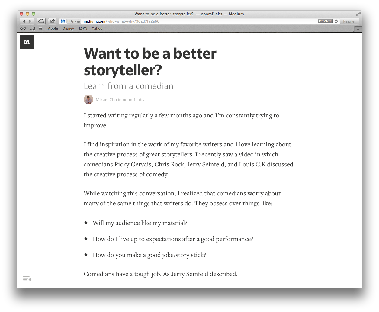
Exhibit B) Cracked.com
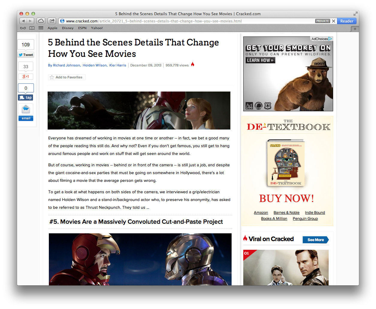
When you compare the two, it’s obvious which one makes you feel like crud.
The Cracked layout is painful to look at. Your eyes squint and dart, constantly second-guessing what you’re reading now with what you should be reading next.
After experimenting with how we display content on the ooomf blog, I discovered there’s an element of science behind why we feel this way toward certain typefaces and layouts.
How we read
When we read, our eyes follow a natural pattern called a Scan Path.
We break sentences up into scans (saccades) and pauses (fixations). Here’s theScan Path for a typical reader:
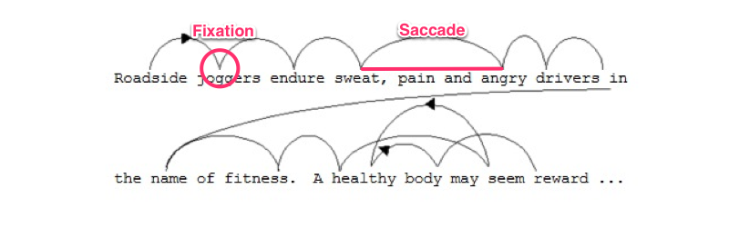
Your eyes typically move across a page for between 7 to 9 letters before needing to pause to process what you’re reading. As you scan a sentence, no useful visual processing is happening in your brain. Visual processing is completely dependent upon the information taken in when you pause.
So why does this matter? Understanding the way we read is important for designing how words look because you can directly impact someone’s connection to your writing with the right font and layout.
Why the right font layout makes you feel good
When I set out to write this post, I wasn’t sure I’d find scientific backing for why we feel a certain way toward certain fonts.
I thought choosing font was mostly art, with a sprinkle of science.
That was until I came across a study by psychologist Kevin Larson. Larson has spent his career researching typefaces and recently conducted a landmark study at MIT about how font and layout affect our emotions.
In the study, 20 volunteers – half men and half women – were separated into two groups. Each group was shown a separate version of The New Yorker – one where the image placement, font, and layout were designed well and one where the layout was designed poorly:
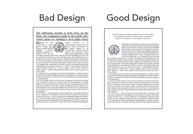
The researchers found that readers felt bad while reading the poorly designed layout. Sometimes, this feeling would be expressed physically with a frown.
The corrugator supercilii facial muscles that help produce a frown have been linked to the amygdala, an area of your brain responsible for emotion.
Meanwhile, the participants who read content from the good reading layout, felt like it took less time to read and felt better.
People exposed to the well-designed layout were found to have higher cognitive focus, more efficient mental processes, and a stronger sense of clarity.
The researchers concluded that well-designed reading environments don’t necessarily help you understand what you’re reading better, but they do make you feel good, causing you to feel inspired and more likely to take action.
Culture impacts your preference for fonts
One explanation for why some fonts make you feel a certain way is because of deep links in culture.
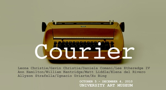
For instance, Courier fonts were designed to resemble old memos written on type writers:
Many people relate Helvetica with the US Government because it’s used in tax forms.
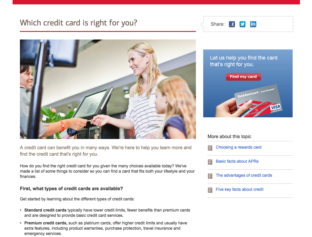
These associations are difficult to remove and should be considered when deciding on a font choice. Here’s how Bank of America’s website would look with the Impact font associated with News headlines:
Original Bank of America website:
Bank of America website with Impact font (associated with newspaper headlines):
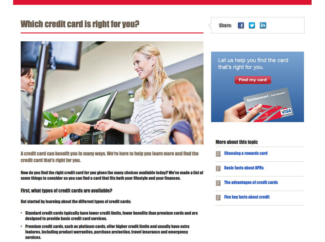
When the fonts are changed to Impact, Bank of America doesn’t exactly seem trustworthy.
Because fonts are designed by humans, there is usually some meaning attached to them. You don’t want to choose a font that is easily associated with something in our culture that’s markedly different than the vibe you’re trying to give off.
How to design better content
The quality of your content is the most important thing but how you present that content by choosing the right font and layout still has its place.
As French poet Paul Claudel put it, “The secret of type is that it speaks.”
So how can you design your words to help elicit positive feelings in people? Here’s a few techniques from typography experts that you might find useful:
1. Choose an anchor font
Type designer Jessica Hische recommends first selecting a typeface for the content that is most prevalent in your project (most likely your body copy).
This will be the typeface that you base your other font decisions on like headlines and subheads.
There’s four main categories of fonts to choose from:
Serif Fonts – Letters with short lines coming off the edges. Viewed as more formal and traditional. Best suited for print.
- Sans-serif Fonts – Letters without serifs. Viewed as informal and playful. Best suited for digital.
- Script Fonts – Resembles handwriting and often used in formal invitations. Not ideal for body copy.
- Decorative Fonts – Informal fonts viewed as original. Best suited for headlines but not body copy.
For reading on the Web, it’s best to stay away from script or decorative typefaces. Most Script and Decorative fonts have low legibility which slows down your reading because you are busy trying to figure out what letters are.
You don’t want your readers asking, “was that an ‘a’ or an ‘e’” every word.
If you’re scrunching your eyes trying to figure out a word that’s a signal that your brain is dedicating unnecessary energy to identifying words.
Decorative typefaces should be used for content that is meant to be seen at a glance, like in a logo, rather than read as multiple paragraphs in body text.
When choosing a font for body text, it’s usually best to stick with a Serif font or Sans-serif font.
Some typography experts recommend sans-serif fonts for reading online because the quality of screen resolutions is less than in print. But, as screen resolutions dramatically improve, Serif fonts are becoming easier to read on the Web. Content-heavy websites like Medium use a Serif font (probably to give off the vibe of a print editorial).
The most important thing with choosing a font is to make sure the letters are easily decipherable from one another so your readers don’t have to spend precious mental energy identifying letters.
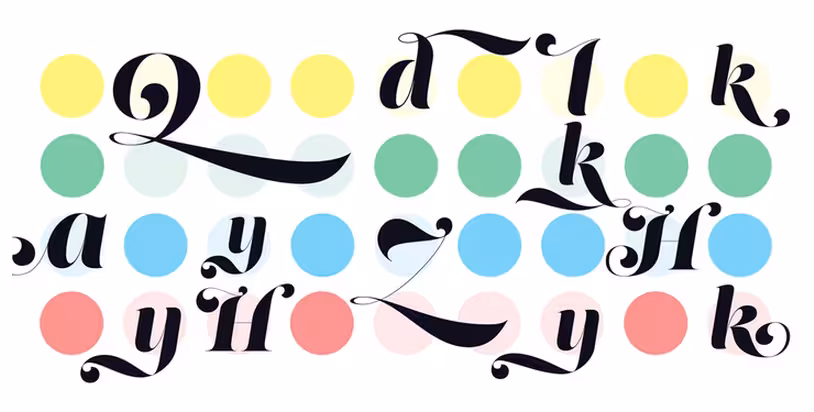
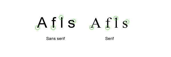
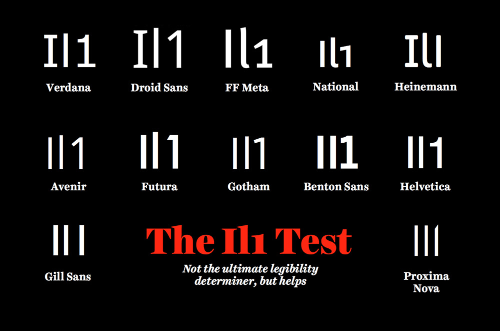
There’s a trick that Hische uses to make sure your font choice is a good one. She recommends that you make your fonts pass the Il1 test:
2. Pick a font size bigger than 12pt
In 1929, a study was conducted called the “Hygiene of reading.” One thing researchers were trying to determine was which font size would be best for reading. The study looked at 6pt, 8pt, 10pt, 12pt, and 14pt type sizes.
The researchers concluded that a font size of 10pt font is the most efficient for reading but a lot has changed in how we consume content today compared to the 1920s.
However, as more reading shifts to digital and screen resolutions improve, the way we read content is changing. Many designers mention that 16pt font is the new 12pt font. A recent study has also shown that larger font sizes can elicit a stronger emotional connection.
Medium has one of my favorite reading environments online and they use a 22pt font size. Several of my other favorite websites have adopted a font size over 20pt for their content:
- Medium – 22pt
- 37Signals: Signal vs. Noise – 22pt
- Zen Habits – 21pt
While having a huge font over 30pt most likely wouldn’t make sense, many blogs have font in the 10pt-12pt range. Try increasing your font size. If you’re using 12pt font, try increasing to 16pt font. If you’re using 18pt font increase to 22pt.
You can feel the difference.
3. Watch your line length
The line length is how far your sentences stretch across the page. The ideal line length should be between about 50 to 75 characters.
Here’s an example of the longest line length from Zen Habits. It’s 78 characters, about 6.5 inches:
This line length has been shown to be most effective in helping readers move through their Scan Path.
If the line length is too short, your reader’s rhythm will break because their eyes must travel back to the left of the page too often.
A line length that is too long makes it hard to find where lines of text start and end. It can make it difficult for your reader to get to the next line without accidentally jumping to the wrong place.
Research shows that your subconscious mind gets a boost of energy when jumping to a new line (as long as it doesn’t happen too often) but this energy dwindles as you read over the duration of the line.
Here’s the line lengths from the sites mentioned above:
- Medium – 75 characters
- 37Signals: Signal vs. Noise – 76 characters
- Zen Habits – 78 characters
4. Mind your spacing
Adequate spacing between letters is important for your readers to be able to move through sentences fluidly. The tighter your letters are together, the harder it is for people to identify the shapes that make up different letterforms.
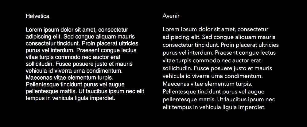
Take a look at another example from Jessica Hische of the readability of Helvetica versus Avenir. Hische recommends Avenir because of its more open spacing:
Proper spacing makes your readers feel good. Here’s 5 recommended font combinations from Google Web Fonts that have good spacing for reading long blocks of content.
I decided to put these tips into practice with our ooomf email newsletter campaign. Here’s a comparison between our original campaign and our new design:
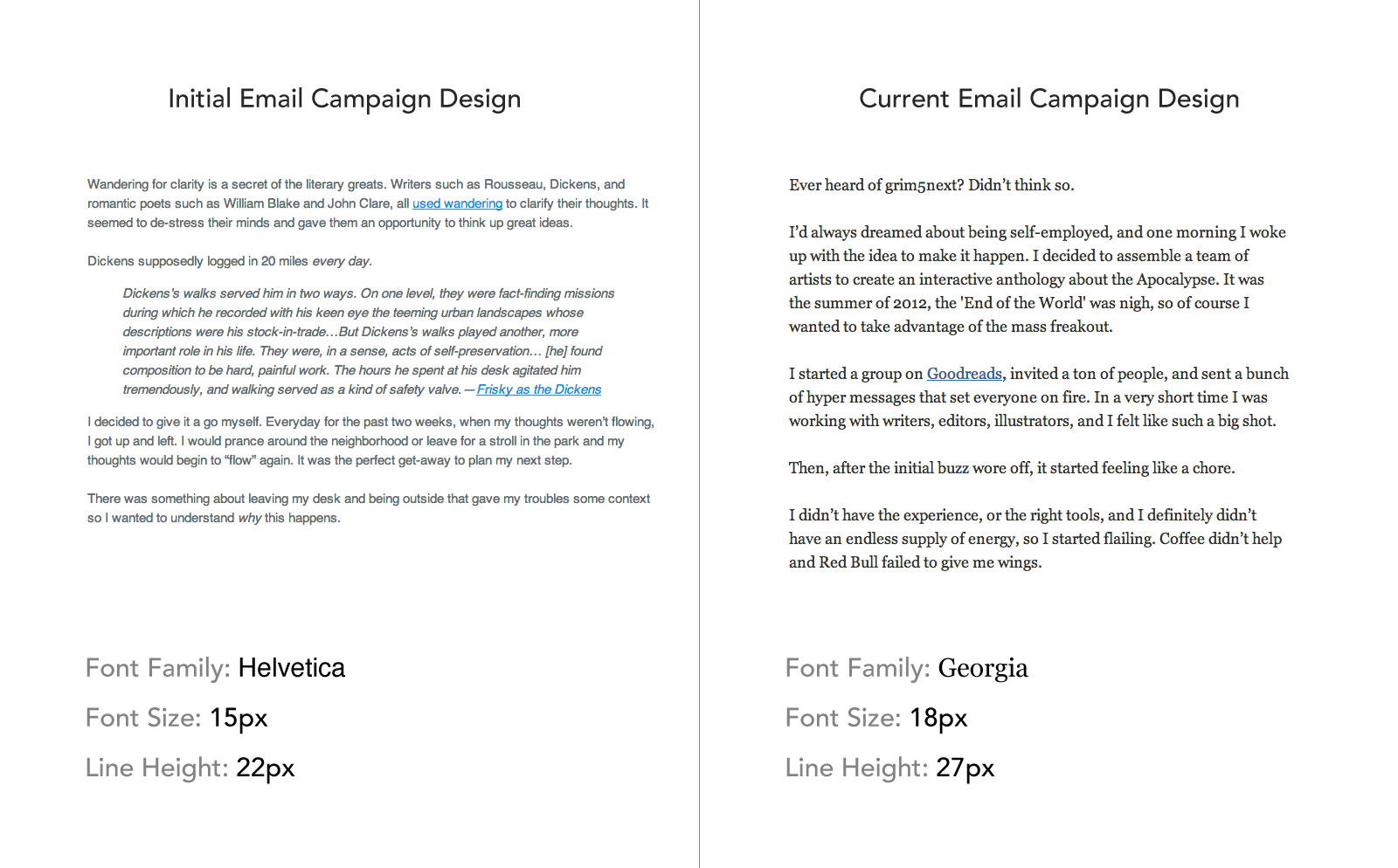
By changing the font and increasing its size, our email content felt much better.
Packaging content the right way is important and knowing why we feel the way we do about the look of content will hopefully help next time you design content for a project. As Aarron Walter, author of Designing for Emotion, writes,
“People will forgive shortcomings, follow your lead, and sing your praises if you reward them with positive emotion.”
It’s important to remember that while there is a science connected to how your words are designed, no amount of good design can save bad content.
Write well first. Design well second.
TNW originally published this piece in December of 2013. We felt the information within was no less relevant today than it was when we first published, and thus felt compelled to share it with you again.
Get the TNW newsletter
Get the most important tech news in your inbox each week.