
This post was originally published on Design Instruct.
Creating sites destined for success is tough. It requires a lot of planning, testing, and data analysis. So I asked a person who’s a veteran in the subject — Paras Chopra, the founder of Visual Website Optimizer — for his tips on how to improve a website’s conversion rate.
Paras is a pioneer and leader in usability, design testing, and conversion rate analysis. His company’s product, Visual Website Optimizer that he founded in 2009, has helped popular startups and big corporations like Groupon, Microsoft, GE, Mitsubishi Motors, Airbnb, and countless other companies increase their site’s conversion rates.
He and his team also regularly publishes their findings and case studies on improving conversion rates, which have helped many Web professionals discover better ways of building websites.
I emailed Paras and asked him one question: Based on your experience, what are the top 5 things a designer can change with his/her design that will significantly increase conversion rates and/or usability?
Here is his response to my question:
1. Remove multiple calls to action
What frustrates most users is seeing multiple options on a landing page and not being able to decide which one he/she should be using. This is also called the paradox of choice.

If you have all “Sign up for a free trial”, “Watch a video”, and “Learn more” buttons/links side by side, a visitor is bound to get perplexed about which one to choose.
We assume people know exactly what they want. But, instead, I’ve found that people want to be gently guided towards a possible solution instead of solving a maze to eventually get to what would benefit them the most.
2. Show more product/service images
How many times have you picked up a product at a retail store and examined it? It’s likely you do it for all new products you are interested in.
Unlike at physical store, on a website, customers can’t, of course, pick up a product. But you can give them the next best thing: images and screenshots.
Mere text won’t do. People want to be wowed, surprised and emotionally attach themselves to a product/service before deciding to purchase it.
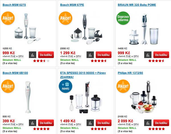
People do read text, no doubt. But text alone does not convince a customer to make a purchase. Providing screenshots or images goes a long way in establishing a comfort level with your product.
3. Provide lots of whitespace, remove clutter
We always try to cram a lot of information on a page. As designers, we’re in love with our product and we want to talk about it as much as we can.
But visitors think in a different way. They need space to pause, think, and analyze. Whitespace helps them do just that. It provides a natural structure to the page, so that the eye can jump to the information it is seeking in an effortless fashion.
4. Fix navigation
It’s surprising how many designers do not design navigation at all, or design it just as an afterthought.
A visitor needs to always know where he/she is right now on the website and where he/she could go.
Navigation should be designed right after considering business objectives; for example, products that are sold together could be grouped in a category.
Design menus, recommendations, footers and other elements of the website with navigation in mind.
5. Do not miss out on social proof
Social proof is a sure-shot way to increase conversions. Many designers provide too little social proof or introduce it too late on a landing page/website.
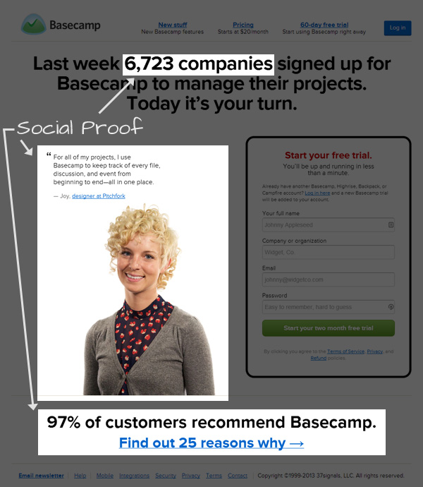
As a prospective customer, I need to know whether a particular product is tested and proven. Adding testimonials, case studies, success stories, logos of companies you have worked with, etc. right after an introduction convinces a visitor to want to know more — this is the right time to give more details.
Learn more about Paras Chopra by visiting his personal site.
Thoughts on conversion rate methods that work for you? Tell us in the comments!
Image credit: pav197lin/Shutterstock
Get the TNW newsletter
Get the most important tech news in your inbox each week.