Logos have long been the most publicly recognizable branding a company can have – many are instantly identifiable from across a highway or grocery aisle and can heavily influence consumer behaviors.
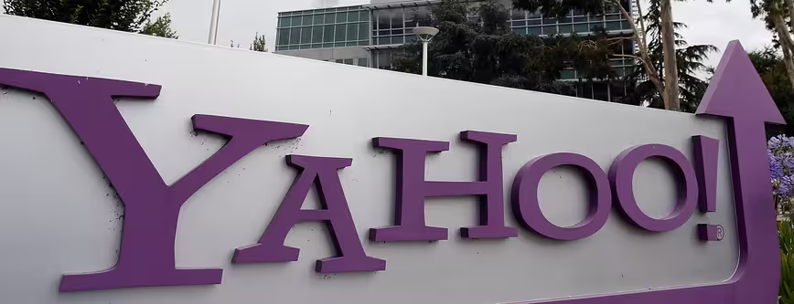
Today, Yahoo revealed its new logo at the conclusion of its 30 Days of Change campaign, which offered a new logo each day during the month of August. The new logo is meant to be “a modern redesign that’s more reflective of [Yahoo’s] reimagined design and new experiences.”
What’s in a logo?
Some instantly recognizable logos, such as Tide or Hershey’s, reassure consumers that they can trust the product they are buying; however other logos, such as BP or United Airlines, are often associated with poor company performance and PR disasters that can deter brand loyalty.
Recently, we’ve seen a shift in popular design as branding moves beyond print and packaging to web and mobile. These new platforms are much more diverse in presentation than grocery store shelves, highway billboards, and 8.5 x 11 inch magazine pages, and therefore require brand design to be responsive and flexible.

The 💜 of EU tech
The latest rumblings from the EU tech scene, a story from our wise ol' founder Boris, and some questionable AI art. It's free, every week, in your inbox. Sign up now!
Many old logos have not adjusted well to these new mediums and sit awkwardly in app icons and mobile browsers, much like your grandmother’s Victorian-era chair would look in Ironman’s swanky modern digs. Instead of inspiring consumer loyalty, an old company logo gives becomes passé, unaware of change, and out of place in our increasingly technology-centric society.
However, with change often comes backlash, especially if the reasons are unclear. Many logo redesigns receive mixed or even unfavorable reactions from the public, and sometimes it’s so extreme that they are pulled just after launch. Gap and Tropicana are two such examples – both companies received so many negative reactions to an attempted rebrand that they reverted back to old logos in a matter of days.
Since a new logo is sometimes necessary for a company to move forward, how can it successfully strike a balance between loyalty and innovation? The answer is in the public eye. And while the public is notoriously fickle about change, Yahoo may have the answer.
Yahoo’s ’30 Days’ campaign introduced the idea slowly to the masses, allowing them to get used to the idea that one of the most iconic ‘90s dot-com era logos is changing. And while the campaign was likely a combination of a field test and a marketing gimmick, we’d be surprised if Yahoo ignored 30 days of free public feedback when making a final decision. All the logos can be found on the Yahoo website.
Yahoo
The brand new Yahoo! logo was introduced with a video that exhibits Yahoo!’s new youthful identity. The soundtrack is a fairly popular pop song, one that many of Yahoo’s young Tumblr users will recognize. The new logo displays the same breaching of two worlds, the old Yahoo!and the new, youthful and hip Yahoo.
The logo has many of the same stylistic characteristics found in the old logo – the large “Y,” the differently shaped “O”s, and the angled exclamation point have all remained. But the font is slimmer, neater, and 3-dimensional, and the purple is deeper and more authoritative. Like eBay before it, Yahoo stuck closely to its original logo, tweaking the style only slightly. Marissa Meyer’s Yahoo! is clearly a new Yahoo!, but the core brand is clearly still very much alive.
Old:
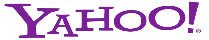
New:
![]()
Crowdsourced:
By GREYdesigns:
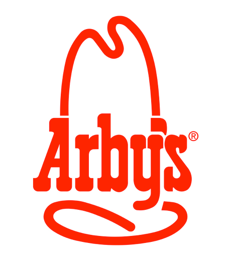
Arbys
The new Arby’s logo and accompanying motto is glossier than the old logo, and boasts a simpler, more modern font to contrast the textured outline of the cowboy hat. The new design direction doesn’t follow the omnipresent flat design trend, but it communicates sleekness and modernity while channeling the original 1960s Arby’s logo.
Old:
New:

Arby’s 1969:
By Ethan Prater/Flickr

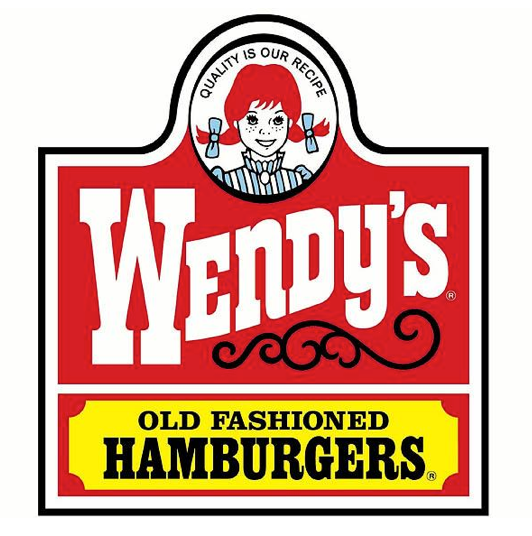
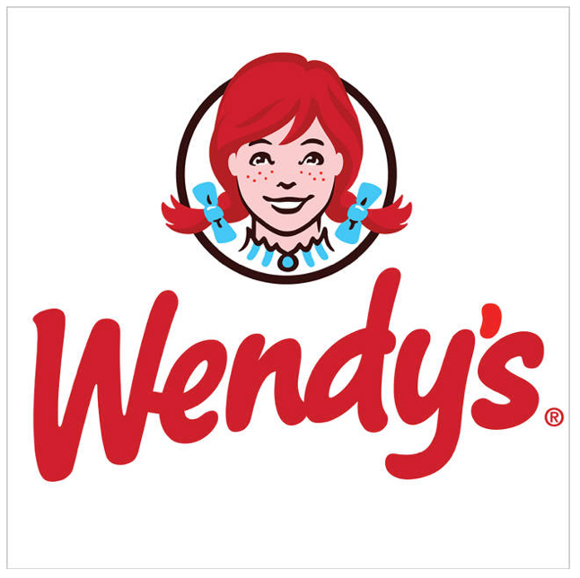
Wendy’s
Meanwhile, Wendy’s decided to completely part from its old look, opting for a more friendly and inviting script that radiates freshness, a direction that is reflected in its larger marketing strategy. The logo and advertising campaign set Wendy’s apart from competitors by leveraging friendliness and cleanliness as its defining characteristics.
Old:
New:
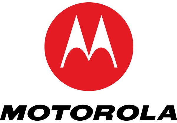
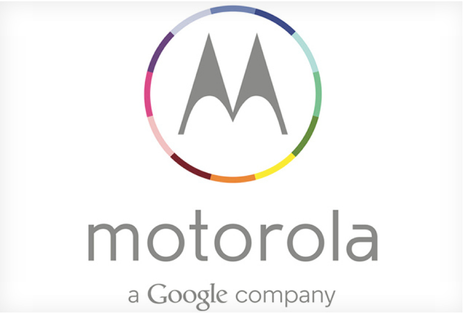
Motorola
When Motorola Mobility was acquired by Google two yeas ago, it readjusted to a flatter and more colorful design that closely fits in with the Google family. The rebranding was widely accepted as a welcome change.
Old:
New:
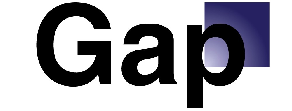
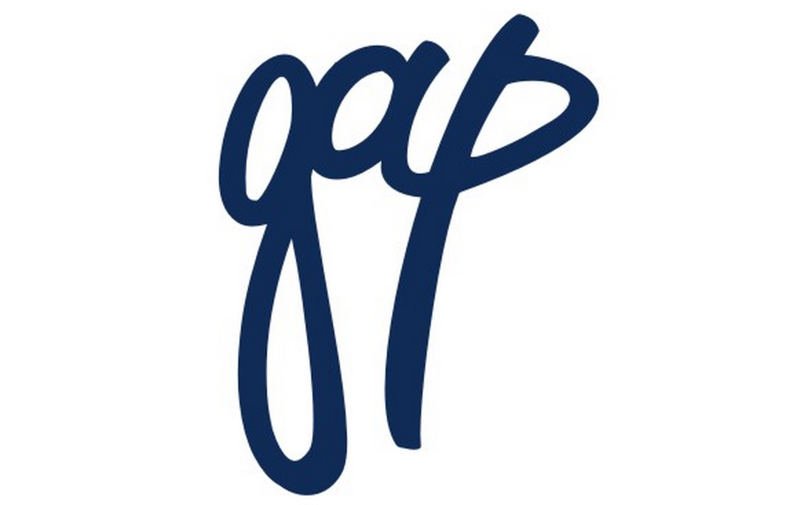
Gap
Gap’s logo redesign received a notoriously critical backlash, and was scrapped almost immediately. In an interesting turn of events, Gap actually asked the public for their own redesigns following the negative reaction to the new logo, but ended up reversing that decision and keeping the original iconic logo.
Old:
![]()
New:
Crowdsourced:
By Silence Design:
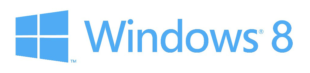
Microsoft Windows
Fun fact: Windows has gone through more logos in the past two decades than any other tech company. The Windows blog actually has a very interesting overview of every logo, which accurately reflects larger cultural design trends, from the original blue and grey rarely remembered, to the 8-bit pixelated version that defined 1990s tech style, to the most recent sleek and flat Windows 8 logo.
Windows 3.1:

Windows Vista:

Windows 8:
Crowdsourced:

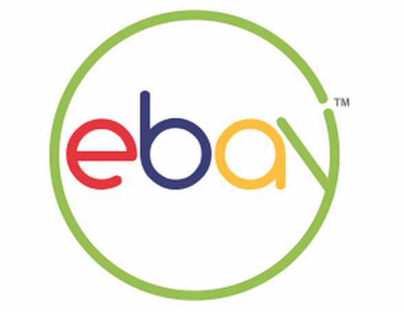
eBay
ebay’s logo redesign was subtle, but it is indicative of the larger shift in design trends. The letters are now all lower-case, have lost any overlap, and became uniform in size and shape. The new logo plays nice with all kinds of different media, but successfully retained much of its old character.
Old:

New:

Crowdsourced:
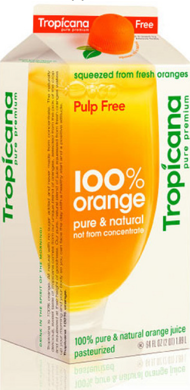
Tropicana
Tropicana’s new logo suffered a similar fate to Gap’s – consumers were upset with the change and reacted negatively, necessitating a complete return to the original logo. Interestingly, Tropicana’s new designs were very on point with the modern flat design trend, but consumers didn’t trust the new packaging – how do you know it’s orange juice if there’s no actual orange fruit on the carton?
Old:

New (scrapped):
American Airlines
American Airlines’ logo change is one of the boldest and most talked about from the past few years. The original logo dates back to the 1960s, and was representative of a very different age of design and air travel. The redesigned logo is a complete shift away from the bold font and stylized eagle that graced the airlines’ planes for half a century – the eagle remains, but it’s only suggested and the shadows and sharp lines are reminiscent of a plane wing.
Old:
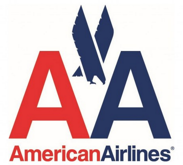
New:

It’s not just old stalwarts of the 20th century that are changing their look – many relatively new tech companies, like MailChimp, have slightly tweaked their logos to better suit responsive technologies. Flatter shapes and colors, simpler lines, and wider spacing are all features of logos that translate well from mobile to web to print, unifying design cross-platform.
When updating your logo in the digital age, the most important takeaway from all of these brands is to prepare your audience and explain your motivations. Not everyone likes change. But everyone likes to be made to feel like his or her opinion counts and to “be-in-the-know.” It’s important for companies to keep consumers in mind at all times.
This post comes courtesy of Fueled, a mobile design and development company based in New York and London. You can read more posts like it at theFueled blog.
Header image: Justin Sullivan/Getty Images
Get the TNW newsletter
Get the most important tech news in your inbox each week.