This is a guest post by Martin LeBlanc, the founder of IconFinder, a search engine for icons. You can follow him on twitter here
Shortly after the WWDC event in San Francisco in June, a plethora of iOS7 resources became available on the web. Throughout the hundreds of sessions, speakers and keynotes, Apple unveiled its new iOS 7 to thousands of delegates lucky enough to be there.
We found a great presentation called “Best Practice Guide for Great iOS Design” by Apple UX Evangelist, Mike Stern.
The first part of his presentation is about app icons and what Apple believes makes a good icon. He goes through a list of six important things to consider when you are designing your app icon. We will do our best to summarise the presentation in this post.
Mike Stern begins by explaining why it’s important to pay attention to the UI and app icon: Your users aren’t going to judge your app based on how many technologies you are using, or how many APIs you integrated or how elegant your code. The way they are going to judge your app is what it enables them to do and how it makes them feel. Users expect intuitive, beautiful and sometimes even magical experiences when using apps.
Six tips on how to design better apps icons
There are a few common pitfalls and mistakes made over and over by developers and a lot of apps get rejected from the app store during the review process. Bad app icons are among the top 3 reasons why apps get rejected.
The app icon is usually the first place most people will encounter your app. You have to stand out from the crowd. We’re shown a screen shot of a search in the app store on ‘Camera’ apps where apps like Path stand out from the crowd of camera apps using the camera lens metaphor. Being beautiful and instantly recognizable are the two main qualities you want to keep in mind.
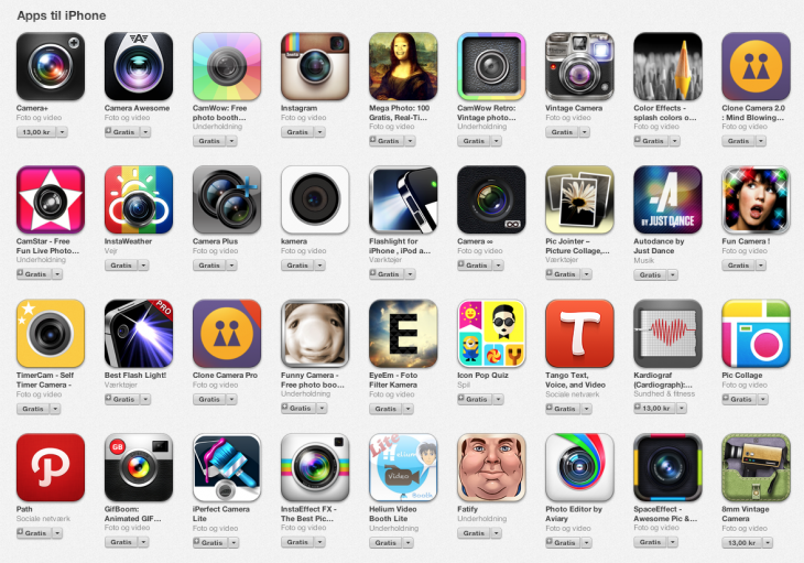
When users see your app icon in the App store they start to build assumptions about the user experience, how enjoyable i’s going to be to use, how intuitive it will be and how well will it serve your needs. If an icon looks great and is carefully crafted, it is reasonable to assume that the rest of the app is equally well crafted. But it goes beyond that – users start to build other kinds of assumptions about your app – how good your technology is, how secure you app is, is it stable, is it better than the competition? So, with that in mind, it’s really important to invest time and focus into your app icon.
Now, what makes an app icon great? Two things: beauty and, more importantly, instantly recognizability. So how do you accomplish that? There are six things that distinguish every great app icon from the rest:
Tip 1: Focus on a unique shape
These four icons are very different – some have many colors or feature gradients, but they all start with a simple shape. That allows them to be recognisable at a distance and at a glance.
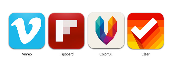
Icons are seen at all different sizes. They are large in the App store, get small on the home screen and even smaller in the notification center and in groups. Make sure that the image that you choose for your icons can reduce really well and is clear at any size.
Tip 2: Carefully select colors
Choose a limited palette. One or maybe two colors are enough. There are many great icons with many colors, but it’s hard to pull off.
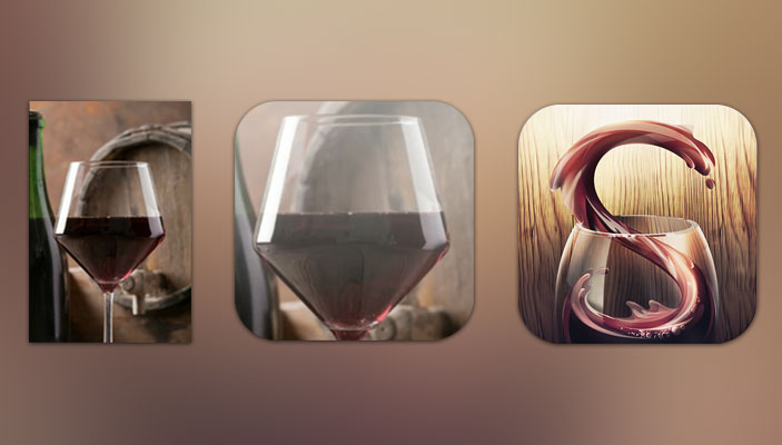
Tip 3: Avoid using a photo
Try to avoid photos in app icons. Sipp app is a great example of how an app icon can have the same elements as a photo, but it was illustrated with the shape of the letter ‘S’.
Tip 4: Avoid a lot of text
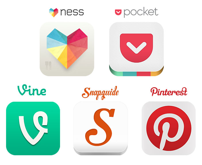
If you can get away with using no text then it’s probably the best thing to do. Try using just a symbol or your logo for the app icon. Great examples of this include Ness, Pocket, Vine, Snapguide and Pinterest.
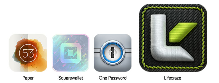
Tip 5: Accurately portray materials
This is perhaps a little surprising given the changes in iOS7. Paper is one example (previous ADA winner in 2012). Square wallet also ‘just pops really well’ with it’s hologram and distinct shape. The icon for 1password brilliantly reflects the security of the data and gives you ease of mind through an emotional response. LifeKraze has an app icon that nails the skeuomorphic approach so well, that Mike even admits to ‘not knowing how they made it – it’s the highest level of artistry.’ A genuinely big compliment to SoftFacade coming from an Apple designer of 7 years.
Tip 6: Be creative
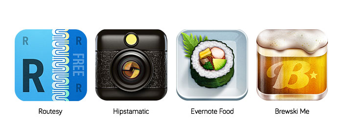
You’re trying to stand out from the crowd. Routesy, Hipstamatic, Evernote Food and Brewski Me all feature as darlings of this discipline. Often, the trick is to developed simple concepts – sometimes the most complicated of renderings are based on simple shape compositions.
Bonus tip: Test your app icon on different wallpapers
While your new icon might look great against the old raindrops, there’s no guarantee it looks great on all wallpapers. Make sure you test your app icon against all different kinds of wallpapers and try grouping your designs into folders to evaluate how it looks.
Cool case study: Turnplay
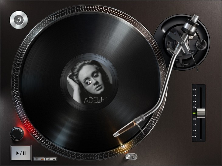
Famous icon design firm, Ramotion did a remendous work on an app called Turnplay. It’s a cool little app that lets you play your music files as though they were on a vinyl record.
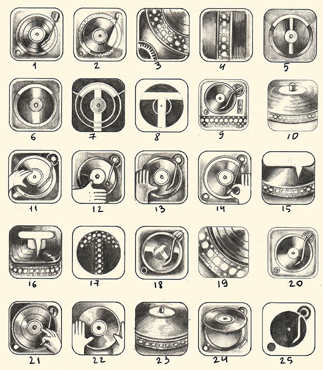
When it was time for Ramotion to design the app icon for Turnplay, they started the way they always do – with old school paper sketches. It’s awesome to see pencil designs in so much detail at the early stage and how they play with different ideas. You can see from the composition, that the team never lost sight of the design even as the renderings and detail became more and more complex.
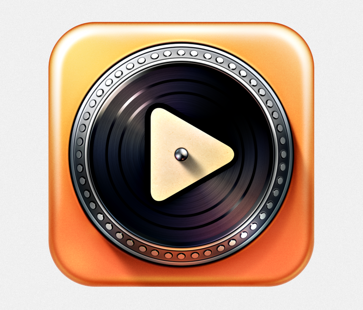
Among the many attempts, they tried to use the T from the name in the icon, fingerprints on the vinyl and so forth. Eventually they got to this: a turntable with a play symbol in the middle – a simple icon based on basic shapes:
If you get the opportunity to watch the session in full it’s definitely worth an hour of your time. You can view the full length version – it requires and Apple Developer account though.
Featured Image Credit / Shutterstock
Get the TNW newsletter
Get the most important tech news in your inbox each week.
This post is brought to you by Shutterstock – over 30 million stock photos, illustrations, vectors, and videos.

