Sean Mitchell is an interactive designer based in Vancouver, British Columbia, and the editor of TypeRelease.
We’ve gathered together an eclectic mix of new type for you this month — a dynamic slab from FontFont, a lusty script by Positype, a plump display from Fontyou, a layered family by S–Core, a 21st century didone from dooType, and many more — let’s get to it!
S—Core: Core Circus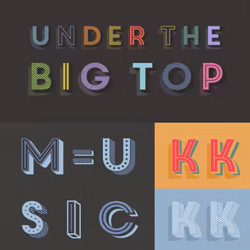
A layered type family consisting of seven 3D effect layers, eight 2D effect layers and one shadow effect layer.
FontFont: FF Marselis Slab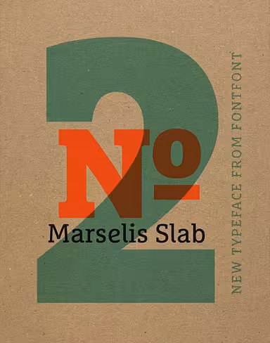
Crossbreeds geometric and humanistic forms, creating a freshly dynamic slab–serif family.
Rene Bieder: Gentona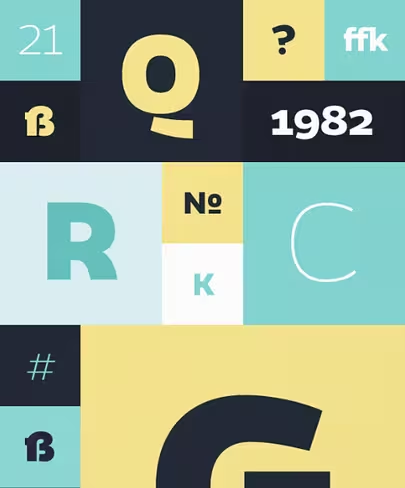
A nine–weight neo–grotesque family ranging from sharp and fine thin cuts to muscle–bound and strong heavy weights.
Letters from Sweden: Trim Mono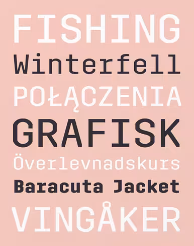
A monospaced version of Trim in 5 styles.
HVD Fonts: Niveau Grotesk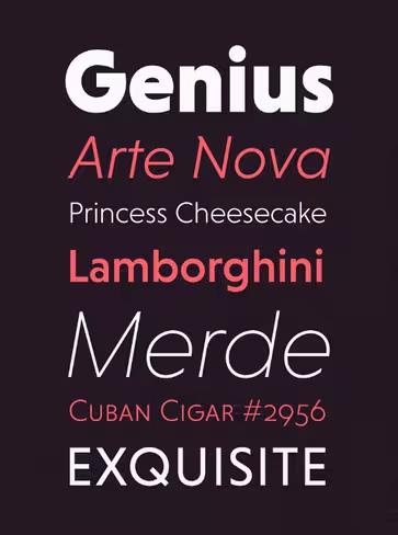
Based on geometric forms and influenced by classical nineteenth–century faces.
Fairgoods: Seashore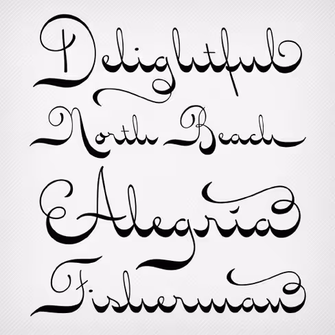
A feminine, graceful script whose thicker horizontals create a wave–like rhythm. A Fairgoods Exclusive.
Ahmet Altun: Festivo Letters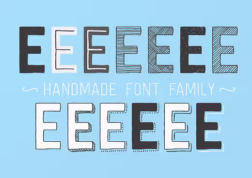
A handmade layered font system which includes several textures, shadows.
Lisi Design: Summit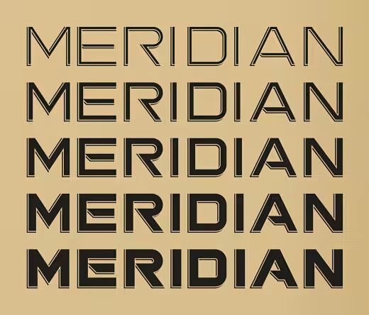
Inspired by geometric sans–serifs dating back to the late nineteenth–century.
DSType: Aparo
Aparo appears to be a very simple bold italic roman typeface, but it has plenty of calligraphic flair.
Hold Fast Foundry: Prohibition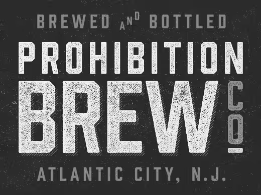
This vintage sans takes queues from classic war and workforce posters.
Fontyou: Squirrel FY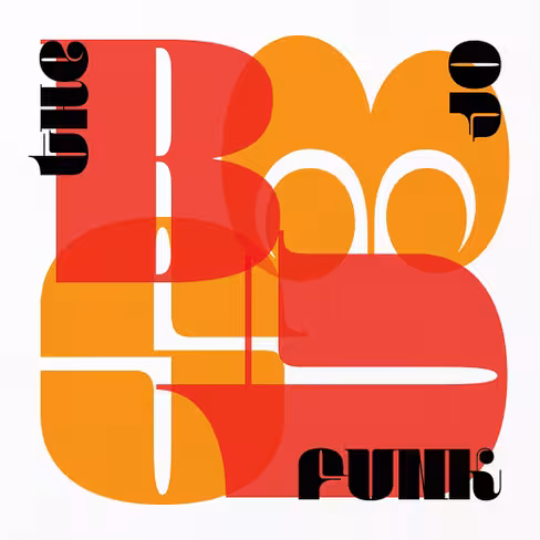
A new plump typeface with fancy alternates.
Fontyou: Kaili FY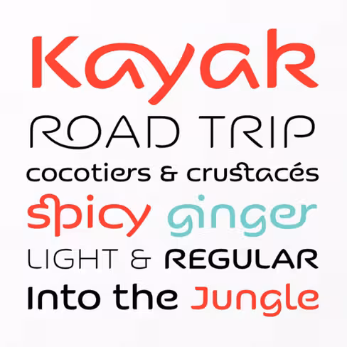
An exotic typeface with crazy ligatures.
dooType: Encorpada Classic
Brings the best features of the Didone genre, but with a 21st century look and feel.
Sudtipos: Zulia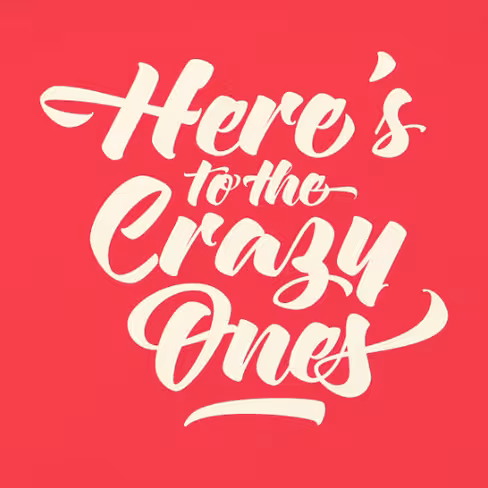
Based on two calligraphic styles: italic and brush pen.
Positype: Lust Script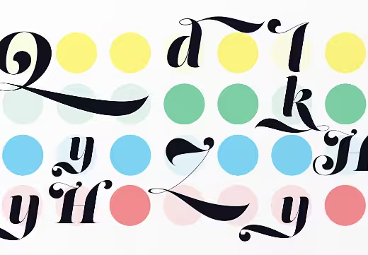
Packed with alternates to play with — enough to turn you on and satisfy.
Gestalten: High Times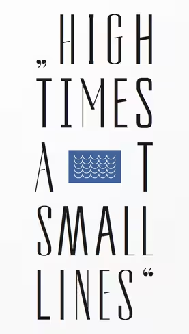
Takes its inspiration from the eras of Art Deco and Art Nouveau but with a radically contemporary approach.
The Northern Block: Kizo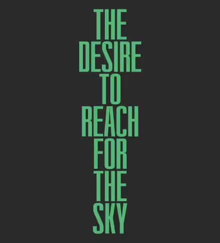
A geometric condensed sans–serif inspired by urban modernist architecture. Functional, rational, utilitarian and subtle in its nature.
Ludwig Type: Helsinki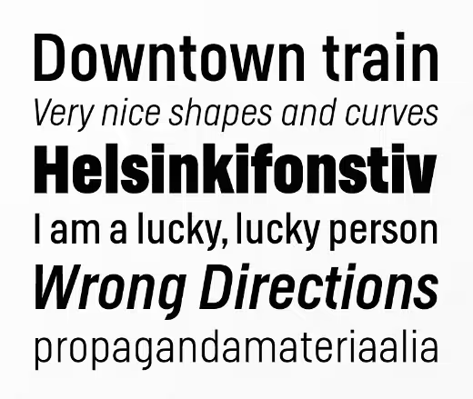
Based on geometric shapes, with technical and masculine forms.
Latinotype: Grota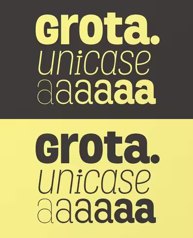
Grotesque, unicase and exceptional, a very expressive font inspired by hand lettering.
MVB Fonts: MVB Solitaire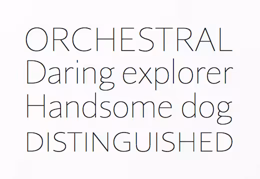
A tempered sans–serif somewhere between a humanist and a gothic, MVB Solitaire captures a 21s–century neutrality.
Wiescher Design: Supra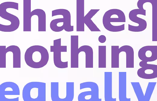
Pleasant flow and a warm touch combined with great legibility.
Mateusz Machalski: Bojo Print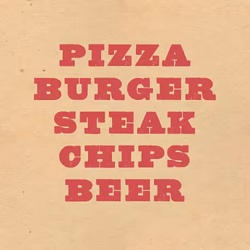
A heavyweight serif typeface, based on wood block printing methods.
La Goupil: Naive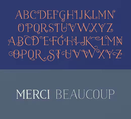
A handwritten serif with a poetic and unusual feeling.
Colophon: Archive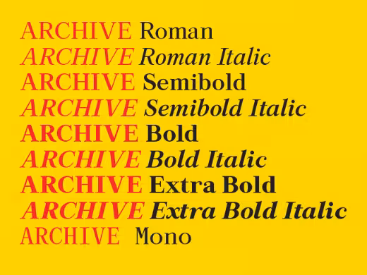
Archive’s strength and character lies in the feeling that it has already existed, or simply that it has been through a multiplication process.
Jeremie Hornus: Kefa II Pro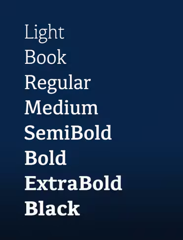
Redesigned and remastered, an elegant modern typeface with slab–serif origin.
Alexandre Saumier Demers: Harvey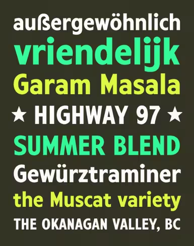
Inspired by the changeable letter signs littering Kelowna British Columbia on Highway 97.
Nootype: Dorica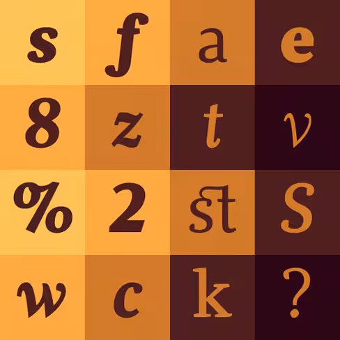
Sober and simple, with a classic appearance at first sight, but the curves and details make it very different.
Tipo Pèpel: Cinta
A humanistic skeleton, dressed up with a handmade mechanical suit.
Want more? Check out more lists of new typefaces from: July, May, April, March, February, January and Winter ’12. They’re worth it — we promise.

The 💜 of EU tech
The latest rumblings from the EU tech scene, a story from our wise ol' founder Boris, and some questionable AI art. It's free, every week, in your inbox. Sign up now!
Header image credit: Shutterstock
Get the TNW newsletter
Get the most important tech news in your inbox each week.
This post is brought to you by Shutterstock – over 30 million stock photos, illustrations, vectors, and videos.