Editor’s Note: This is a guest post by Rob Palmer, the UK-based head of design for Fueled, a mobile design and development company based in London and New York.
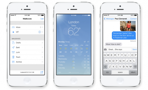
Apple is set to release iOS 7 this fall, an experience the company promises will be simpler, more useful and more enjoyable — while building on the things people love about the current iOS.
For developers, the rules of the game are about to shift with iOS 7’s new UI, new design and fresh take on the user and device relationship.
1. Stay simple
If you’ve seen teasers for the iOS7 (or used the current developer version that’s out) you know Apple has upped the ante on its passion for simplicity. The overall design is cleaner and app icons and interfaces are dressed down so keeping your design uncomplicated is essential. In other words, designs that just fit iOS 6, if they make use of heavy gradients or shadows, might feel clunky on the new system. That doesn’t mean you need to precisely replicate Apple’s motif; there is still plenty of opportunity to keep it innovative.

2. Layering
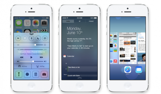
Apple has embraced a more compact experience in terms of layering its native apps. The benefits of layering include efficiency for the user and a sense of dynamism; so staying relevant to the new OS can also be an excuse to update your current UI. However: layering does not mean cluttering, so keep those home screens bright and open.
3. Interactivity
Apple has placed an emphasis on reducing app independence in order to increase interactivity between native apps. One of the advantages of iOS 7 will be increased visibility and accessibility of apps; therefore, it’s advisable to consider how your app can link up with those around it.
That could mean how you intentionally leave gaps in functionality; suggesting other apps to fill them (allowing for increased specialism); or being aware of how your app complements others. There is potential here for your app to be one ingredient in a very large Apple pie.

4. Stay True to Your Design
Acting iOS 7-relevant doesn’t mean sacrificing your application’s personality. The original vision held by your designers should still be alive amongst the simplified, colored, layered new skin of the app. The spirit of the app shouldn’t get lost during your upgrades; as long as it complements the new UX, it’ll be worth doing.
5. Ch..Ch…Changes
As exciting as a new OS promises to be it doesn’t necessarily mean your app needs to change. And while a misguided pivot is okay if you feel you’ve learnt something afterward, a head-reeling overhaul motivated simply by the release of a new OS could end up doing more damage than good. Like they say: ‘If it ain’t broke, don’t fix it’. That will be far less expensive as well.
While it’s up to your devs and your designers to sort out the finer details, the new OS does provide a new set of ‘rules’, which apps will benefit by observing. So stay sharp, and we’ll see you looking pretty this autumn!
Image credits: Shutterstock and Apple
Get the TNW newsletter
Get the most important tech news in your inbox each week.
This post is brought to you by Shutterstock – over 30 million stock photos, illustrations, vectors, and videos.


