Earlier this year, we revealed the process with which Google Ventures’ design team instills design into the heart of its portfolio companies. Now, courtesy of Google Ventures Design Partner John Zeratsky, we’re able to share the results of another design sprint which took place earlier this year.
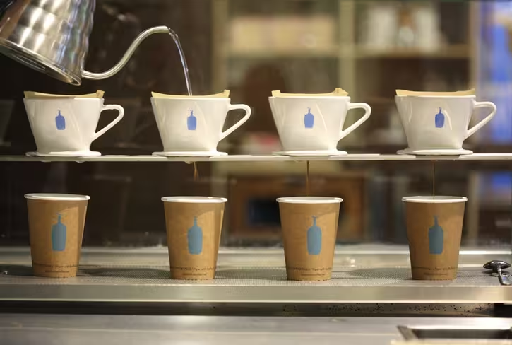
The company in question, Blue Bottle Coffee, has made a name for itself in the tech scene, despite focusing on coffee and not group photo sharing stickers. It’s scaled rapidly over the past few years in the shadow of the behemoth that is Starbucks, but its Web presence needed work. That’s the problem Google Ventures’ design team set out to solve.
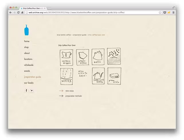
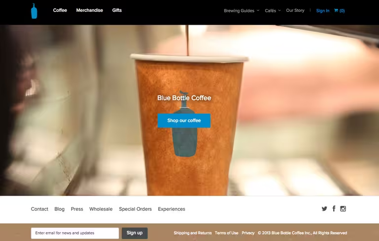
Aside from being easy on the eyes, the final results were led by a number of key design decisions — decisions you may even learn something from. Here’s what Blue Bottle Coffee’s site looked like before the design sprint:
According to Zeratsky, this sprint was much like the one TNW participated in last March with Ordr.in, but with a key difference: Google Ventures decided to research problems ahead of the sprint, instead of going in fresh. In addition, Blue Bottle invited a third-party into the mix: Montreal-based design firm Dynamo.

The 💜 of EU tech
The latest rumblings from the EU tech scene, a story from our wise ol' founder Boris, and some questionable AI art. It's free, every week, in your inbox. Sign up now!
Zeratsky tells us “the biggest challenge was to understand how people shop for coffee.” When it comes to the gourmet coffee scene, there are countless choices, brewing methods, regions and techniques. Blue Bottle needed to demystify the process, part of which involved educating customers on the difference between a Chemex and a french press.
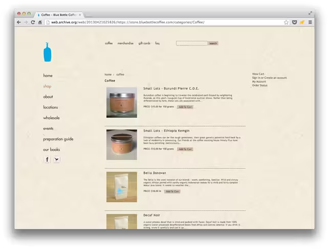
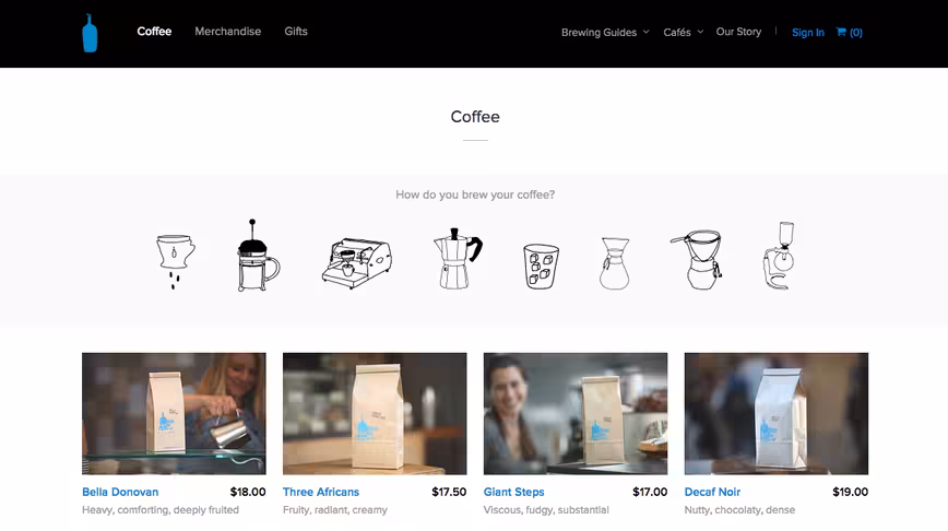
Interestingly, the team found through user testing that a coffee’s origin mattered much less to customers than Starbucks might lead you to believe. Instead, the team decided to sort coffee by how you make it. Here’s the result:
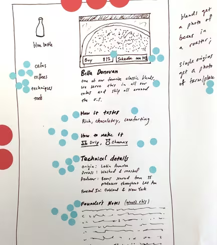
To get there, the same brainstorming techniques utilized in previous sprints came into play. Sketches were made (pictured below), elements were voted on, and three mockups were created via Keynote (yes, Keynote) for UX testing.
Blue Bottle Coffee’s end results are carefully tailored to guide users through the buying process, and also manage to cut down the learning curve traditionally involved with buying from a high-end roaster.
Most importantly, the new site brings Blue Bottle’s online presence inline with its in-store experience, making it possible for the company to encourage consumer passion in their products. See the final results here.
Get the TNW newsletter
Get the most important tech news in your inbox each week.