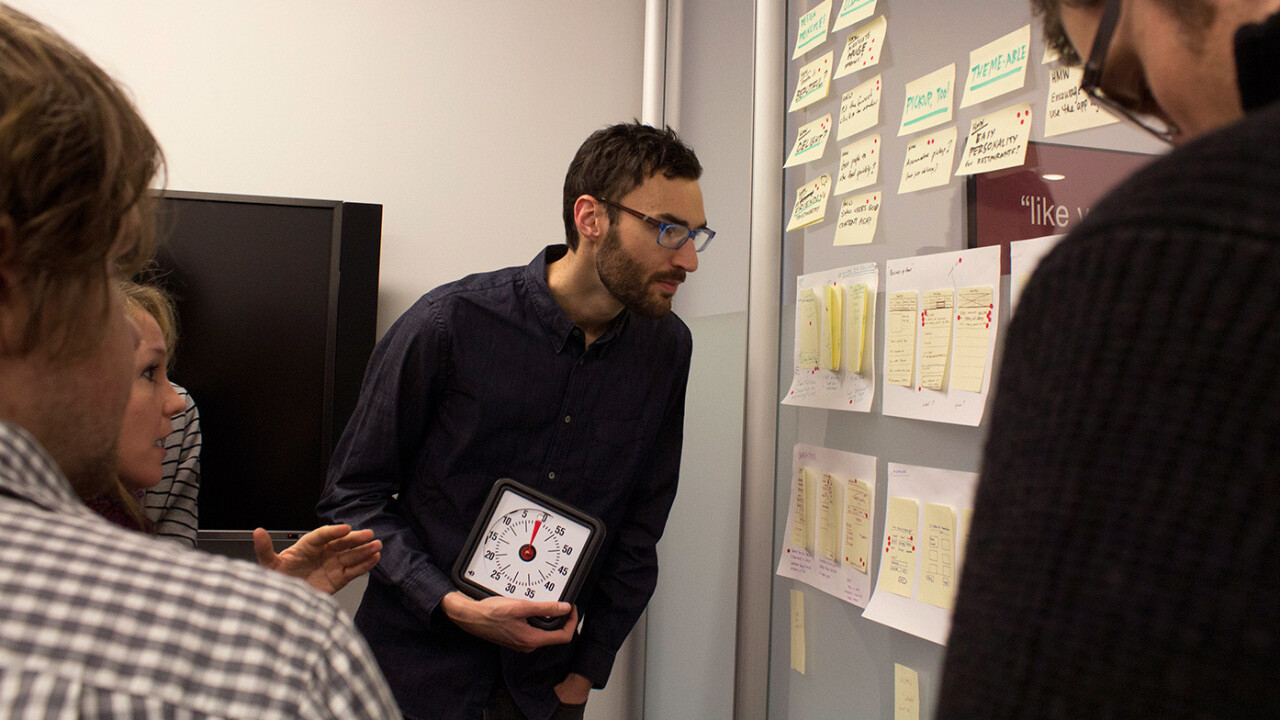
Officially announced last year, the Google Ventures design team consists of four designers and a single UX researcher. The team’s mission is to share its expertise and work directly with Google Ventures’s portfolio companies, many of which are unsurprisingly engineer-centric and have limited design staff.
In the past, the team has shared its insights externally. This time, however, TNW was invited to go behind the doors and participate directly with the Google Ventures design team during one of its multi-day hands on sessions.
The Sprint
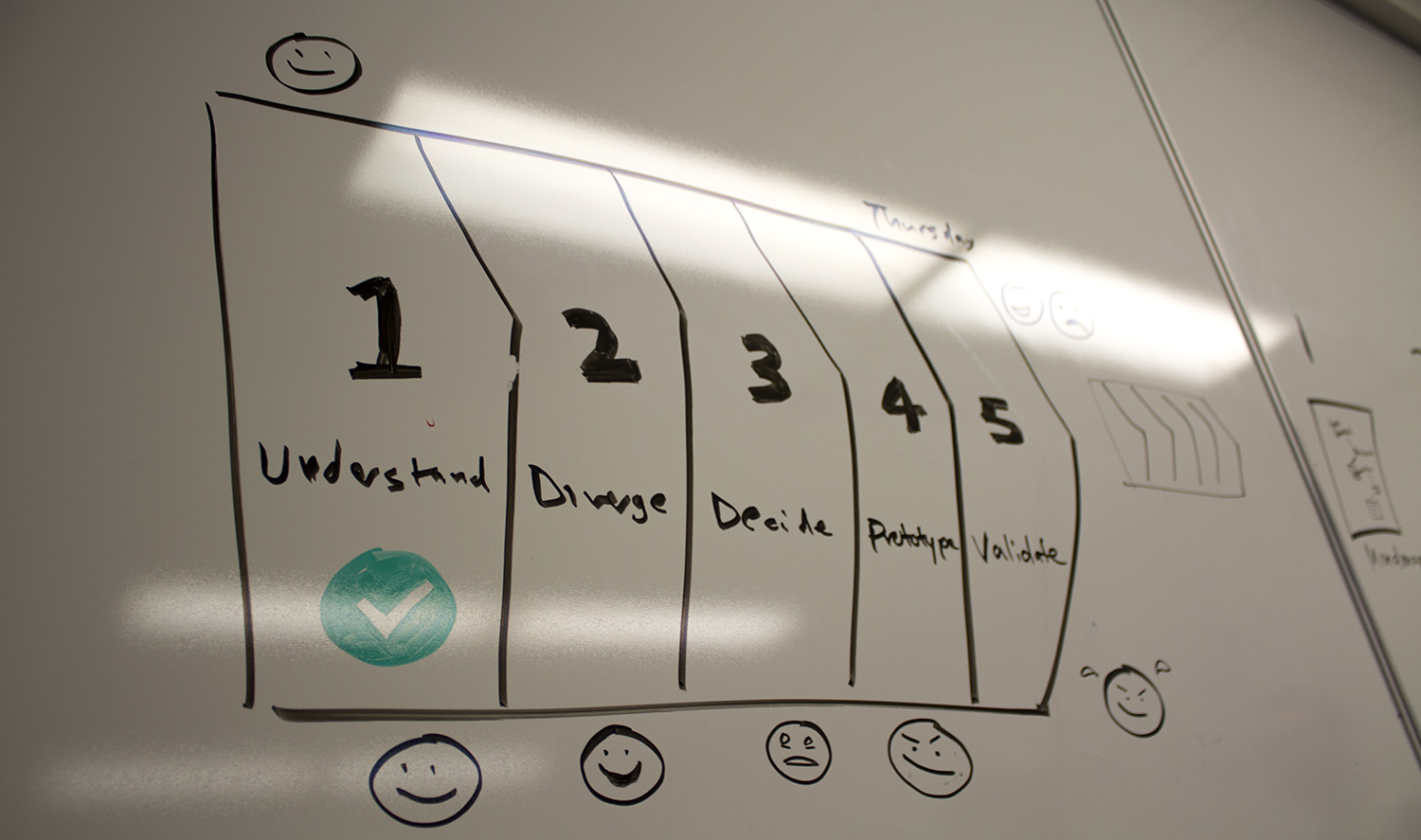
The Google Ventures design team isn’t necessarily radical — there are a handful of other VC firms that pride themselves as being very hands-on, Lightbank included. What is surprising, however, is the depth to which the team goes to perform what design partner Jake Knapp calls a design sprint.
What it sounds like: “We have designers to fix your stuff.”
What it actually means: “Let’s set aside a week for an intensive program where we can figure out what you want and need, conceptualize solutions, prove nearly all of your ideas wrong and then prove a handful of them right. In the end, we’ll have the best concept and potential implemetations possible.”
To be clear: I was thrown in as a fellow designer for the exhaustive process, tackling two upcoming products with Ordr.in, a Google Ventures portfolio company since October 2011.
But first, we all needed to learn exactly what Ordr.in is. The design team purposefully keeps from diving too deeply into each company beforehand, so it can address the problems at hand with a fresh mindset.
The Company
Ordr.in is a NY-based startup which offers “restaurant ecommerce-as-a-service,” operating firmly in the b2b space. In non-marketing speak, Ordr.in is essentially developing a massive web of restaurants that companies and developers can tap into for online food orders.
Ordr.in can be used by individual restuarants to handle their own orders online, but it can also be used by third-parties to offer specialized ordering services (like hotels and local publications). In this scenario, even a Seamless or Grubhub-like service could tap into Ordr.in’s network to expand its proprietary database of restaurants.
Day one of what turned out to be the “understand” phase, as Knapp called it, largely focused on introductions and planning. Ordr.in CEO David Bloom and CTO Felix Sheng guided us through the opportunities at hand, the company’s existing products, its current stats and goals.
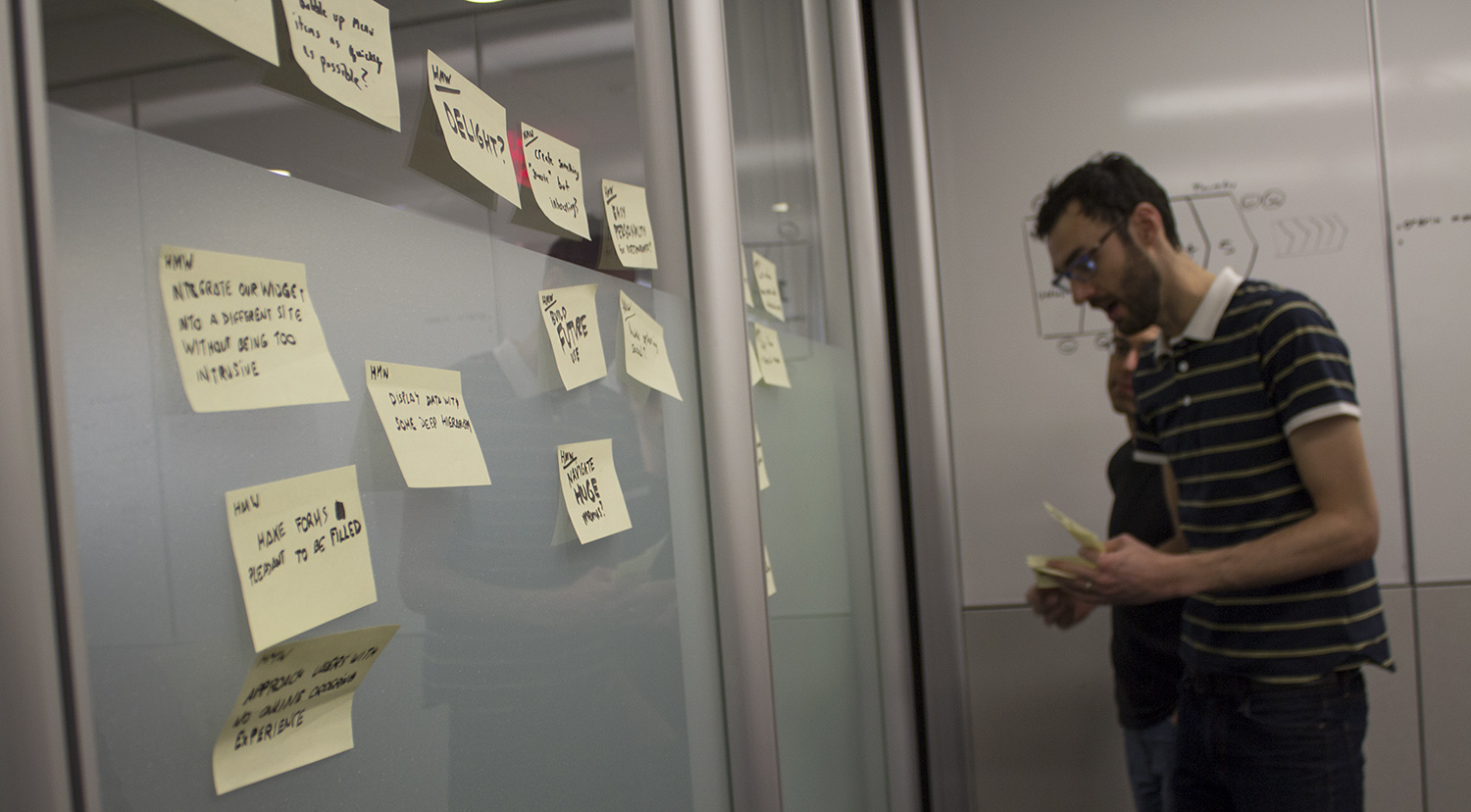
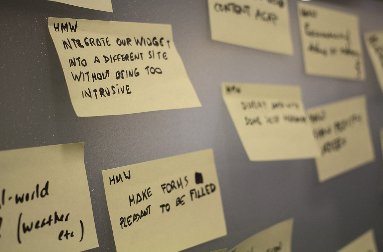
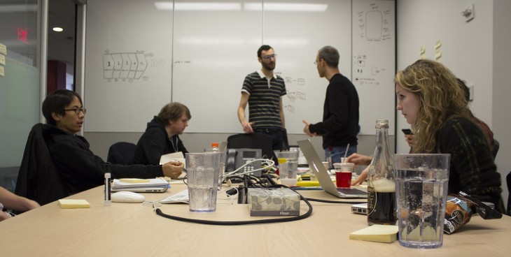
Meanwhile, the rest of us were instructed to take notes in the “how might we” format, to help identify specific and often less-than-tangible goals like building trust and catering to a wide set of demographics. We grew comfortable in our stark white conference room, located in Google’s Zagat branch of its massive Chelsea, NY headquarters.
The design team came to understand the basics, and quickly dove into the company’s core mission and plans for the future, some of which had to be kept off the record.
For the most part, however, the environment was unusually open, as we discussed Ordr.in’s next products: a white-labeled app for individual restaurants on mobile devices and a method for integrating directly with publications to serve a Seamless-like role in smaller cities and towns.
The Process
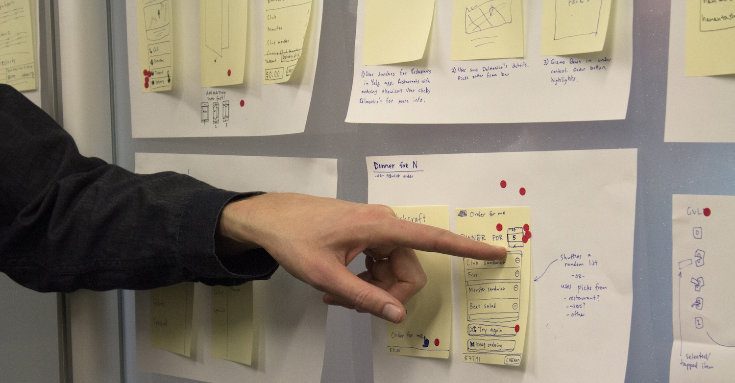
Day two kicked off with the task of making sense of our notes. Marking our favorites with red dots like a heat map, we reorganized them and entered the “diverge” process.
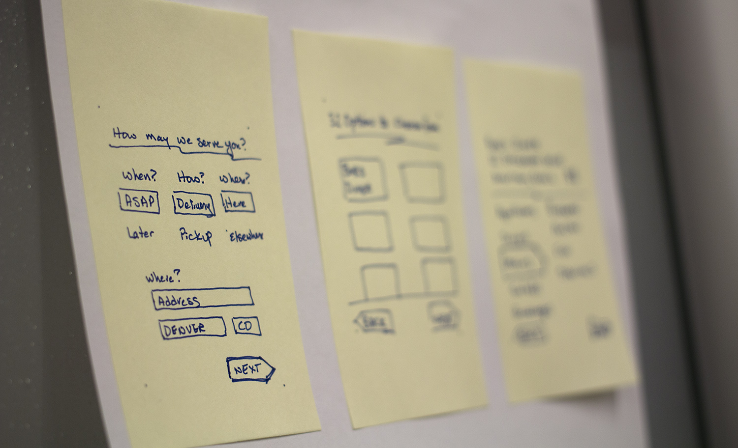
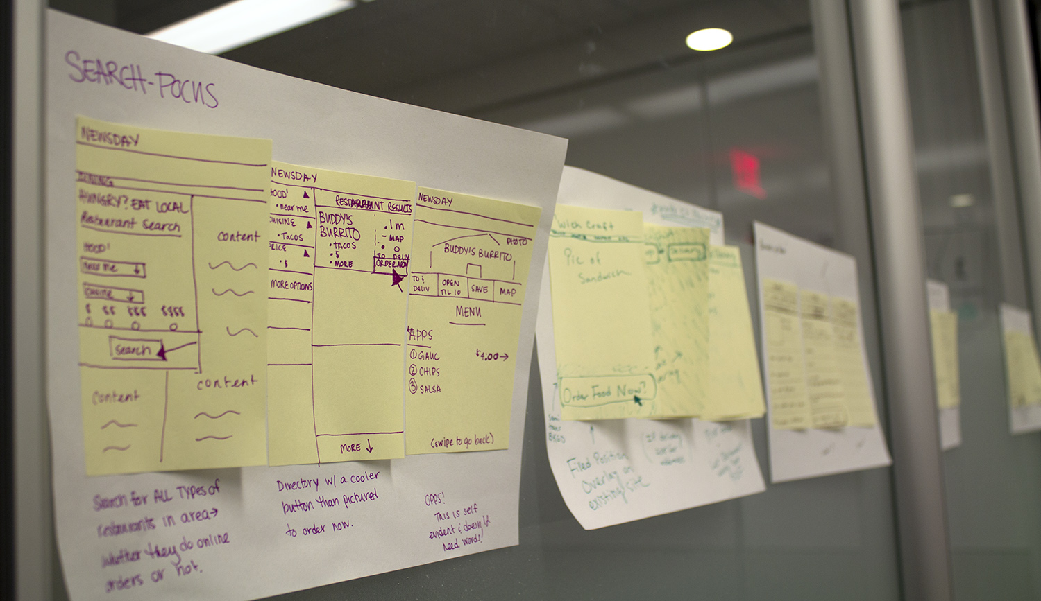
With everyone taking different angles on how Ordr.in’s upcoming products must be implemented, we moved quickly: from notes and mind-mapping to thumbnail sketches and elaborate storyboards — all on paper. No more than 40 minutes in, we took to critiquing our results, first silently observing and then with timed, three-minute assessments of what looked promising and what should be avoided.
As this sprint was scheduled to last just three days, finalizing potential layouts and developing user flows had to be done briskly. We entered the prototyping stage.
Building & Testing
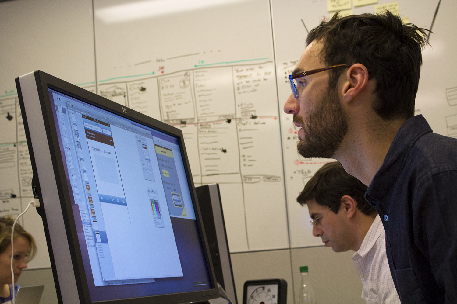
Design partner John Zeratsky, UX research partner Michael Margolis, Knapp and I took to creating the mockups for user testing. We were instructed to use Keynote, which (completely to my surprise) proved to be an extremely useful tool for building functional mockups. Often during user testing, subjects didn’t even realize they weren’t using completed apps. Our second day ended with the final validation stage on the horizon.
On day three, Margolis’ researching skills went to work; he had gone ahead and lined up subjects to test our prototypes days in advance.
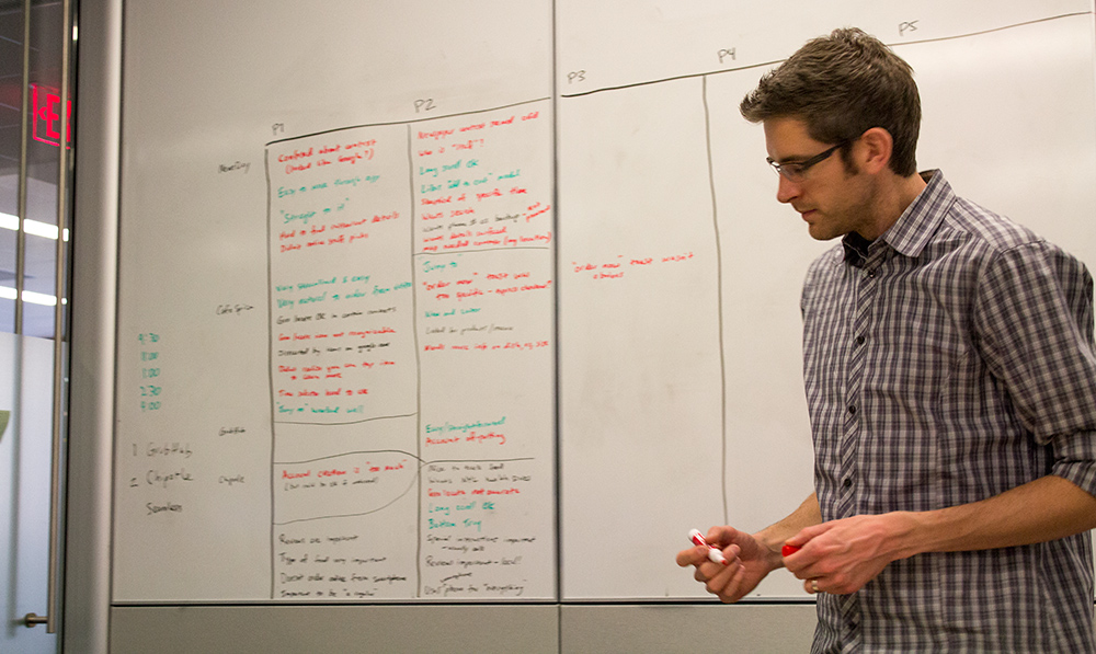
Margolis led the research study sessions — he’s led 35 over the past year — while we took notes in a separate room and Zeratsky made sense of the feedback on the conference room white board. These results helped confirm which ideas would likely fall short, but also flagged successful concepts and revealed what needed refinement.
With detailed, and now proven concepts in place, Ordr.in had to face its next steps.
What’s Next?
Following this sprint, the design team will gradually decrease its interactions with Ordr.in, a startup without a single full-time designer. This is done intentionally, and largely out of practicality; the design team is successful because it works in bursts of energy, and not due to latching onto startups as free, full-time staff.
There’s a reason why the team doesn’t just show up and churn out pretty designs like hired freelancers. The success of a sprint lies in how well Google Ventures can teach true design thinking. For example, the answer to the question “where does the button go” is precursor to “how can we make this button look attractive.” The latter is easier to solve once key usability challenges are addressed.
Participants are intentionally left not as trained designers but as team members now capable of making key design decisions. Those decisions can then be perfected by hiring design staff or working with freelancers.
As for the results, how Ordr.in fares with the launch of its upcoming products will certainly reflect heavily on the Google Ventures design team. We will, of course, keep our eyes on its upcoming releases.
While this approach may not sound appealing to every startup out there, the design team is clearly a selling point for Google’s VC arm, making it more attractive to promising early-stage startups. Google’s search brand can only cary it so far in a world with top-tier VC firms like Kleiner Perkins and Andreessen Horowitz.
Design is about making order out of chaos, encompassing everything from how a project looks to how it functions and feels. Google Ventures understands this, and is hell-bent on making sure that the companies that it invests in do as well.
Get the TNW newsletter
Get the most important tech news in your inbox each week.


