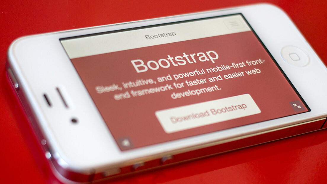
Bootstrap, the highly popular front-end framework originally built at Twitter by @mdo and @fat, is quickly approaching its next major release. As of today, the release candidate preview site for Bootstrap 3 is now up, revealing an early look at what to expect.
We’ve had a basic summary of what to expect for Bootstrap 3 since December. In short, the creators shared that the framework will “drop legacy code, improve responsive CSS, and centralize community efforts.”
Much more has changed, however, namely that Bootstrap 3 is now “mobile first.” According to the release candidate site, the upcoming launch has been rewritten “to be mobile friendly from the start. Instead of adding on optional mobile styles, they’re baked right into the core…Mobile first styles can be found throughout the entire library instead of in separate files.”
This growing emphasis on mobile devices is far from surprising (other popular Web frameworks have already taken note), but is still immensely important for the future of the Web, and is thus worth keeping an eye on.
You may have already noticed on the release candidate site that Bootstrap has reverted to a flat design — but fear not, gradient lovers; it hasn’t. Hacker News user benoitg discovered a statement from mdo: “gradients and other embellishments have temporarily been removed while I focus on other things. It has nothing to do with skeuomorphism or anything like that.”
➤ Bootstrap 3 RC preview via Hacker News
For fun, be sure to also check out this gallery of impressive sites built on Bootstrap.
Get the TNW newsletter
Get the most important tech news in your inbox each week.


