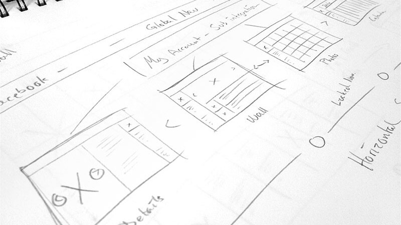
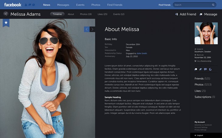
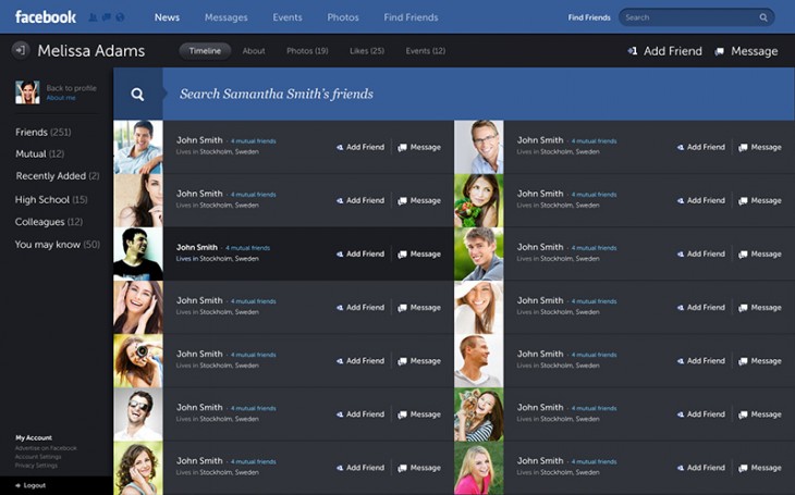
Australian designer Fred Nerby was taken by surprise when his attractive Facebook redesign project went massively viral last month after he posted it to online portfolio site Behance. The project has since been viewed almost 300,000 times there and millions of times across the numerous sites that picked it up.
The resulting attention took Nerby on a trip around the world, and it even got him a tour of the Facebook offices in Menlo Park. We caught up with him recently to learn more about his work and the role the Behance played in expanding his reach.
➤ Facebook – New Look & Concept
TNW: You’ve been traveling because of the design. Did any exciting opportunities come out of the project’s success. Did you hear from Facebook?
FN: 24 hours after this concept went live, firms from around the world started contacting me. Things changed drastically for me and I got invited to spend time overseas talking to a large number of companies and creatives within the digital space, both agencies and more product/platform based companies in the California region (Facebook being one of them) and also within Australia, which has been fantastic! I’ve had the opportunity to get face to face with the elite in our industry and people I never thought I’d be able to have a conversation with started to reach out to hear more about my vision of digital and how it connects with their existing methodologies, which in itself means a lot!
My vision about the digital space and where we’re heading has now connected me with firms within our industry who’ve been highly successful for many years on an international level and those conversations are extremely valuable and I’m very thankful for all the shared knowledge that’s come out of it! It’s also opened up new opportunities for selected work with a few brands I’ve always wanted to work with that are looking extremely interesting, which is really exciting.
I’ve had hundreds of creatives reaching out too from all corners of the world who are just happy and inspired to do more work on their own because of what they’ve seen and have been asking questions that are more related to education and guidance, which is very humbling. The idea of motivating others to create, connect and to dare to show themselves in the digital space is inspiring in itself and it’s what makes me want to do more great work in the future.
TNW: What was your main source of inspiration for this project?
FN: As funny as it may sound, the project was not actually inspired by visuals or UI work created by other platforms, but more so a deeper understanding and a personal interest in user behaviour. For a while I’ve been researching Systematic Design and what it actually represents and how it’s best applied in the digital space because it’s changed the making of media in the modern world and also how digital agencies are now working.
Understanding behaviour and the psychological success behind a platform such as Facebook is crucial before you get into the creation or execution of design. People around the world are already connected personally with the platform (or Facebook as a brand) for many different reasons; the main factor is that it’s fulfilling a need in people that wasn’t there a few years ago. If you understand the power of systematic behaviour then there are ways of drawing that emotional connection out of people with clever design that will make the experience even more powerful and engaging for the user; and that is where it all started.
TNW: Can you describe the process behind the creation of this concept?
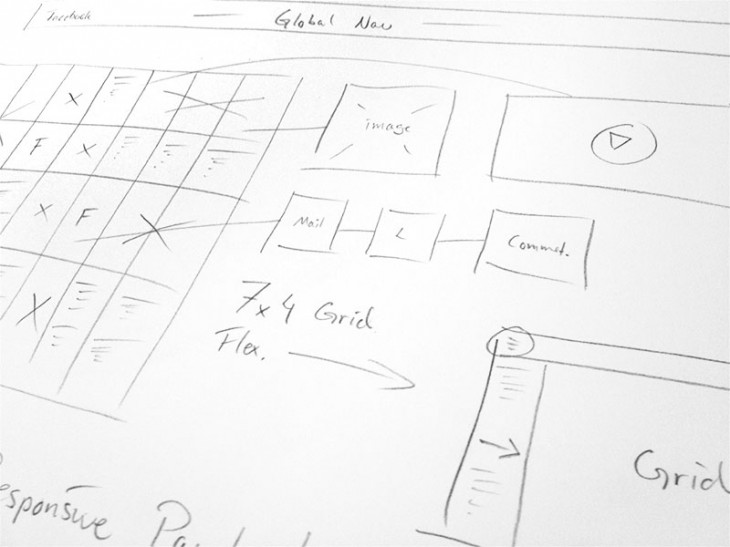
FN: First off, when dealing with a platform such as Facebook, which is heavily focused on a suite of behaviours, you need to get an understanding of how to actually design for that. The process of thinking is very different from how people have worked in the past at traditional agencies. It’s important to know that most traditional agencies are coming from a pure narrative space where the idea is to interrupt you to think of a brand you haven’t thought about and connect you through a story. Their greatest challenge in the modern world of media right now is to recognize that you can be creative within “Systematic Design”.
For example, the world is embracing the products and media invented in places such as the Silicon Valley (Apple) and the innovation that has been driving such places forward is not the innovation of narrative, it’s the innovation and more importantly the understanding of systems and behaviours. And today; that has become a creative discipline! Companies like Apple and Facebook are focusing on creating platforms and it’s a new world where you “invent media to frame behaviour”, which in itself means that the media is now creative and your relationship with the “making” is very different. If you want your UI to be successful you need to have a solid understanding of all this before you move on to architecture and design when taking on a platform.
All in all, the setup was thought through before I got in to the making of design so the overall process of creating the artwork went fairly smooth with a few minor hiccups on the way. Again, you can’t jump straight in to a design of such a project without understanding the user behaviour and then try to figure things out as you go along. That will never work!
TNW: Did you expect it to reach millions of people around the world?
FN: Definitely not; if I knew it would affect that many people in the world, chances are that I would probably have done things differently which in a way; I’m happy I didn’t! The way that people around the world have embraced this concept has left me speechless and what I’m most happy about is not the actual numbers but that it proves the point of systematic thinking and the power it has which is what I’ve worked hard for. People have adopted Facebook into their lives and I’m thankful for being able to encourage that need and feed an emotion with a new idea of what an enhanced interface “could look like” which has been embraced by so many people around the world now!
Today it’s reached out to millions and the project has been featured in an endless amount of blogs, magazines, people tweeting and sharing this on various social platforms etc which is nothing but amazing. The project exploded on Behance and quickly grew from there and creatives inside the Behance network are still connecting with it and sharing their opinions and I love seeing that!
TNW: Has the project connected you with people who have had a similar experience?
FN: Today, I’m in contact with a few people who have had similar reactions to work that they’ve published in the past. It’s been really good to be able to sit down and talk to them because there are a number of things to think about when something like this happens and I’ve gotten a massive amount of support and shared experience from them. Looking at it now, they’ve helped me and somewhat guided me to what’s important and understanding the importance of thinking things through for the future and not making radical decisions based on emotions. I respect and value those opinions and it’s helped me a lot along this journey that I’m still on.
TNW: Are there elements in this concept that you would like to change, do differently, and can we expect more added screens of the UI in the future?
FN: This project could be improved on over and over and that’s the perfectionist in me talking! Being a big project, you always end up with different versions of areas in the UI, some of them better than others. Yes, there are other screens that were never uploaded such as the creation of accounts, the way the entire admin area (accounts & settings) looks like, the interaction of chat, the treatment of advertisement etc.
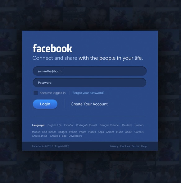
I’ve got the majority of these screens but the truth is that I was never 100% happy with them and I only uploaded what I felt was really solid, not realizing what was about to happen to this project on Behance. The one screen I decided to add in the presentation (that was part of admin) was the login to kick off the presentation; the others will have to wait. I think people need to realize that what happened with this project was never meant to happen on such a massive scale and it was always just a “concept” of what could be and with a little patience; I’ll add the additional screens for everyone to see.
TNW: What role did Behance play in helping your career?
FN: Looking at it now, Behance changed my professional future and the leaders of the digital industry around the world have been inviting me in for face-to-face conversations ever since. I’m now talking with firms who have pioneered the digital space for years and who are now asking for my opinion. Behance is a tool that enables exposure for creatives but it helps to be pro-active within your field as well as uploading projects onto their platform.
TNW: Any advice for up-and-coming designers and developers looking to get noticed?
FN: If you’re hoping to reach out and make it big in the world of digital you need to study that space and truly understand the industry you’re approaching or are already in.
Have a deep look into what you’re actually able to create within that space because too many people treat it as yet another channel of media, and it’s not! It’s a very complex environment built on user behaviour and it’s constantly moving forward and I’d recommend to do a bit of research into traditional narrative agencies and how they are different from digital agencies today to get a better understanding of where you fit in as a creative depending on what you love to do.
As a creative you need to be true to your craft and you need a solid understanding and a full awareness of the craft to call yourself an expert in your field, which is essential and actually required today in our industry.
If you’re highly skilled in the digital space and you’ve been in the industry for a while then chances are that you’ll get noticed for making a bit of noise around your work because great talent is always wanted! But it all depends on what your goals are as a creative too and I’ve learnt that it’s important to take time out and really think about your goals and where you can see yourself in the future in the digital industry “before you promote yourself” because there are different ways of going about it depending on the desired outcome.
TNW: What type of work or path are you leaning toward in the future?
FN: I’m having the luxury of being more selective with the type of work I love to be involved in today and even though I’m very hands-on with design, my main role involves Art Direction within a team. I’ve naturally moved more and more into the world of platforms and product creation/promotion and especially the creation of User Interfaces for mobile, tablets and desktop environments within the last year. I still love and appreciate other areas in the interactive space but my focus has changed a little bit lately and I’m finding myself working more in the space of integration design and systematic thinking, which is a very interesting area.
Images provided by Fred Nerby
Get the TNW newsletter
Get the most important tech news in your inbox each week.
