
Responsive design has recently become a buzzword, and for good reason: it captures the idea of displaying your content beautifully on each and every device. Responsive typography has also received attention, and various techniques have emerged to encourage type legibility across devices: like displaying different font weights to compensate for Retina displays.
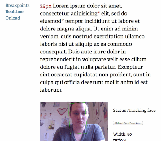
Now, an experiment by web designer Marko Dugonjić has taken the concept of responsive typography to a new level: using face detection, Dugonjić calculates the proximity a user is from his or her screen, and then adjusts font size accordingly.
Of course, this isn’t an exact science; there are varying opinions on how large body type should be for proper legibility, and the eyes of the user plays an important role (that’s difficult to calculate).
We’re particularly interested in seeing Dugonjić’s “on load” setting in action, which calculates the proper type size once (on load) and then sticks to that size indefinitely. Dugonjić also created a “realtime” setting, which adjusts the type dynamically as the user moves away from the screen.

The <3 of EU tech
The latest rumblings from the EU tech scene, a story from our wise ol' founder Boris, and some questionable AI art. It's free, every week, in your inbox. Sign up now!
See it for yourself via the link below, and feel free to share how you think this tech should or shouldn’t be used on the Web!
➤ Responsive Typography (found via Mike Rundle)
Image credit: Thinkstock
Get the TNW newsletter
Get the most important tech news in your inbox each week.