
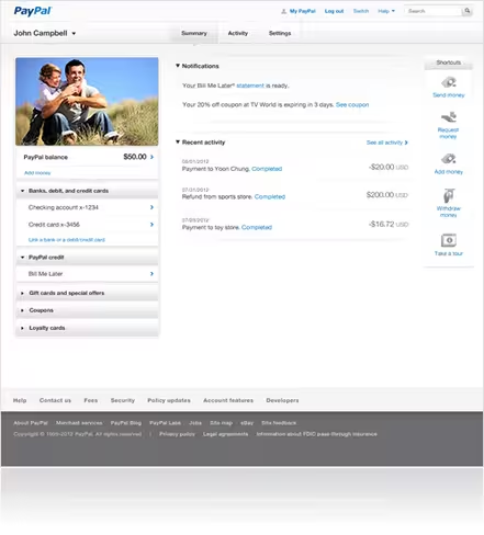
Following last year’s homepage redesign, which managed to make PayPal’s existing design seem all the more ancient, PayPal is now teasing what appears to be a completely new interface for logged-in users.
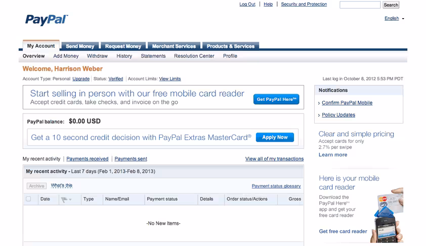
To say that this redesign is long overdue would be an understatement; if there is anything that shows PayPal’s age, it’s the company’s Web 1.0 interface. Here’s the new look, followed by the current design:
The aging design, currently still in use:
Over the years, PayPal has held onto its role as one of the most popular ways to pay and send money online, despite competition from newer alternatives like Dwolla and Stripe. In parent company eBay’s Q4 2012 earnings report, PayPal performed quite well. But as a popular standard, PayPal has seen public opinion of its practices and tools decline.
That decline is something which PayPal president David Marcus is attempting to turn around. A fresh look certainly won’t hurt.
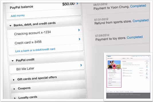
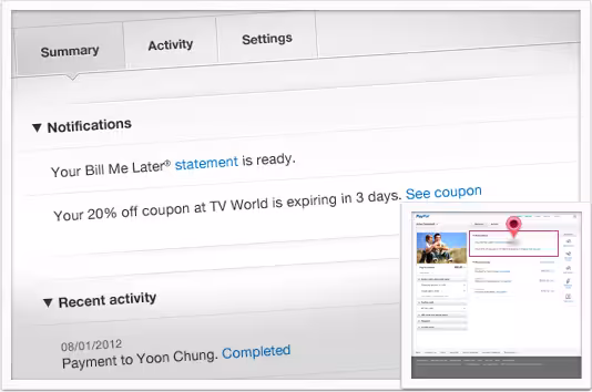
There’s a generally clean look to the new design. Notifications in particular (shown below) have become much easier to parse.
It’s unclear at this time when the new design will roll out to users, but it’s safe to say that the new look is on its way. For now, you can see a full tour of “The New PayPal” here.
Image credit: YOSHIKAZU TSUNO / AFP / Getty Images
Get the TNW newsletter
Get the most important tech news in your inbox each week.