The art of type design is for a special breed of designer. The insane attention to detail required to create typefaces is enough to drive the average person crazy, as every subtle curve and rule matters.
If you’re a novice to the world of typography, you’ll most likely be familiar with text type, or fonts created to be legible and readable at small sizes. Adobe Caslon, for example, is a great text typeface for large amounts of text.
Display typefaces, on the other hand, are less about legibility, (though that’s still important), and more about personality, character and distinctiveness. They’re best for logos, signage and posters, all at larger sizes (around 30 points+). Back in January, we covered a list of 9 inspiring, free display typefaces for you to use in your projects. Now, we’re back with 7 more free display typefaces for any project imaginable:
Cassannet

The 💜 of EU tech
The latest rumblings from the EU tech scene, a story from our wise ol' founder Boris, and some questionable AI art. It's free, every week, in your inbox. Sign up now!
Atipo, a multi-disciplinary studio from Spain, has recently released an entire typeface dedicated to the charming work of A.M. Cassandre, a French poster artist and typographer. The font is completely free, and only requires a tweet to download, though you also have the option to contribute a donation in support of the creators. Read our full review of the font here.
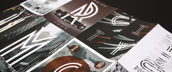
Metropolis
 Metropolis comes from the the industrial movement of the 1920′s where skyscrapers were born. “Using a double line technique, I wanted to create my own Art Deco style font that represented this era. The result is a bold, bumptious typeface with a stolidly calm disposition.”
Intro
 What distinguishes Intro is the strongly expressed geometric makeup and structure. The basic letters of the Alphabet like “A”, “O” and “H” are built on principles of simple geometric forms – triangles, circles and squares. In contrast to Futura, which possesses similar styling, Intro preserves the characteristic sharpened edges of the “А”, “V” and “W” letters even in its boldened form.
➤ Intro
Faustina
 Faustina is a quirky, hand-drawn display face that has a strong indie/hipster appeal. It’s also reminiscent of Where The Wild Things Are.
➤ Faustina
St Transmission 200
![]() St Transmission 200 is another peculiar face, but with has more precision than Faustina. The interestingly straight lines in the a, n, m and r really define this typeface.
St Transmission 200 is another peculiar face, but with has more precision than Faustina. The interestingly straight lines in the a, n, m and r really define this typeface.
Pinstripe Limo
 Although Dafont’s renderings make the font look poor quality, the highly retro Pinstripe Limo typeface is as sleek as it is distinct.
Abraham Lincoln
 Inspired by the proportions of the 16th President of the USA, and advertisements/playbills of the 1800s, Abraham Lincoln is a humanistic display face with moderate contrast and sturdy serifs.
These are just some of the best free display typefaces available on the Web. If I missed your favorite, let us know in the comments below!
Visit our full Design and Dev channel for more inspiration. Also, you can exclusively view typography articles here.
Get the TNW newsletter
Get the most important tech news in your inbox each week.