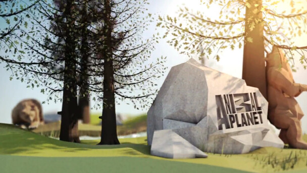
Not to be confused with a new visual identity (aka core branding and logo design), Animal Planet has released their newest station identity, which is a 5 second-ish segment that reminds you what channel you’re watching.
Yes, Animal Planet is still holding strong with its controversial logo redesign from 2008, and only now am I starting to really appreciate it. Seeing the risky design coupled with the charming, geometric motion graphics makes everything fit together quite nicely.
As you’ll see in the two videos below, the animations feel very natural and organic but are still sleek enough for younger audiences lacking in attention span. Anyone that appreciates motion graphics will get a kick out of them:
The videos were created by Discovery UK Creative in collaboration with Blue Zoo and Double G Studios, a leading motion graphics and branding house with a Flash website that doesn’t allow copy and paste.
All around, the videos are great inspiration for motion graphic designers and traditional designers alike. They definitely serve their purpose to strengthen the Animal Planet brand, but also add an unexpected element that’ll entertain viewers. Jolly good!
Get the TNW newsletter
Get the most important tech news in your inbox each week.


