Out of all the Web design fads to emerge since the glossy days of Web 2.0, scrolling websites have become a surprisingly powerful and useful trend. Of course, I’m not talking about any website with a scroll bar, but a design style that leads viewers to continuously scroll down the page.
This attention-grabbing technique certainly isn’t new, but is fast becoming a successful tool for generating interest. There’s a ton of awesome, yet practical uses out there, some of which are so well designed that it’s nearly impossible to not explore every inch of the page.
Here’s a list of 9 gorgeous scrolling website designs to get you inspired. Check these out, and then let us know your favorites in the comments below!
Jan Ploch
 Jan Ploch’s site is absolutely gorgeous. It’s 100% usable and flows so smoothly.

The 💜 of EU tech
The latest rumblings from the EU tech scene, a story from our wise ol' founder Boris, and some questionable AI art. It's free, every week, in your inbox. Sign up now!
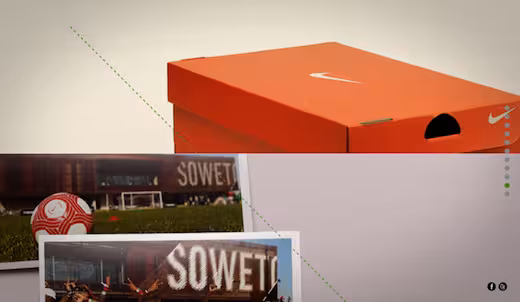
Nike Better World
 Nike’s Better World site makes it impossible to look away. It’s so easy to scroll through the entire site, and before you realize it, you’re at the end.
Building The Agency of The Future
 Dentsu’s site flows like an animated infographic, and makes the viewer want to scroll back up and experience it all again.
➤ Building The Agency of The Future
Bearhat Studios
 Bearhat Studios’ page is rather simple in implementation, but the design holds our interest. Oh, and the logo is awesome.
➤ Bearhat Studios
Unfinished Business School
 Unfinished Business School’s site, while a definitely busy, is very eye-catching and entertaining. It works especially well in balance with the subject matter.
➤ Unfinished Business School
Chappy Barry
 Love the animations and retro feel, which livens up an otherwise simple (and usable) design.
TEDxPortland
 TEDxPortland’s logo fades into static as you scroll down in this well designed, dark and captivating site.
Tiny Big Studio
 The portfolio navigation is a nice touch. So is the subtle argyle sweater pattern background and the way the ant logo takes you back to the top.
Bengtsson & Bengtsson
 Bengtsson & Bengtsson’s site is almost magical, especially with the way the logo “travels” through the illustrated pipes.
If you’re interested in creating a site like this, you’ll want to first map it out into sections. Start with the content you want to share and then consider drawing the entire wireframe out on a long piece of paper. Organize and then stylize, or else you’ll end up creating something that’s just showy.
You might also want to check out the Scrollorama jQuery plugin we covered early today, which makes it easy for Web designers to take advantage of this trend as a compelling communication tool.
If you liked this, check out our full Design and Dev channel for inspiration!
Get the TNW newsletter
Get the most important tech news in your inbox each week.