
From reputable news organizations to gossip magazines, everything is moving online. And to keep the flow of information going, content providers need profits. Everyone knows heaping revenues lie in advertising.
You might have noticed the adverts beside our posts here, on The Next Web. The odds are, you’re accustomed to being pitched to, and understand that free services like news have to pay writers somehow. But Ads can be done the right way or the wrong way.
Intrusive, auto-playing videos, gigantic banners that hide content below the fold and “Click here to continue” pages are some examples of what you are about to see.
CNN
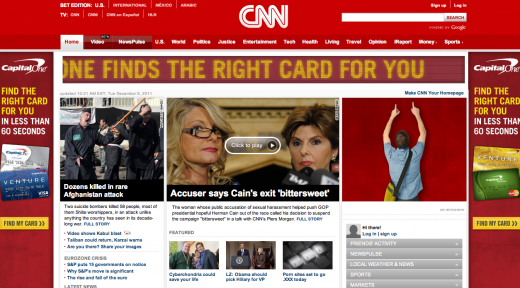
CNN’s offenses are clear. The internationally known company features a faux-led scrolling banner, squeezed between two sidebar ads, with another ad snuck into the content area. This screen shot really doesn’t do the level of distraction CNN has achieved justice.
CNN recently won the Society for News Design’s award for the world’s best designed news site, and when I activate Adblock Plus to hide the madness, I actually consider them to be a reasonable candidate.
Mashable
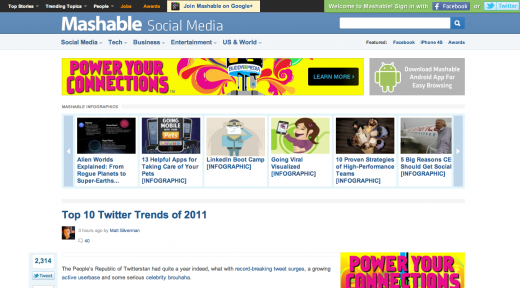
Mashable‘s homepage balances ads with content, but individual posts are nearly 100% hidden below the fold by advertising, related articles and wasted white space.
The balance returns half-way down the page, a point I usually don’t reach before closing the browser tab.
National Geographic
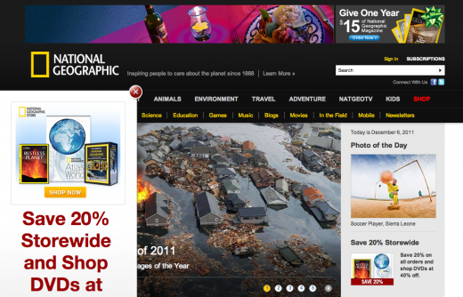
This highly respected print magazine does its handsome web presence a diservice with a massive, overlaid ad that hides content as you scroll. But don’t worry National Geographic, only content has been covered up. The ads are fine.
Forbes
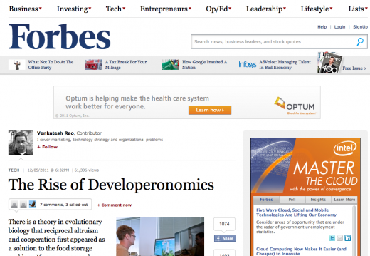
Forbes‘ offenses are two-fold. First, video ads autoplay with sound on the homepage, distracting visitors from reading the headlines. Second, like Mashable and Reader’s Digest, individual post pages show around one to two sentences of content above the fold.
What makes matters worse? Every day, the first time you visit Forbes.com, readers are presented with a full page ad blocking the site. This is forced advertising in the worst way.
NBC
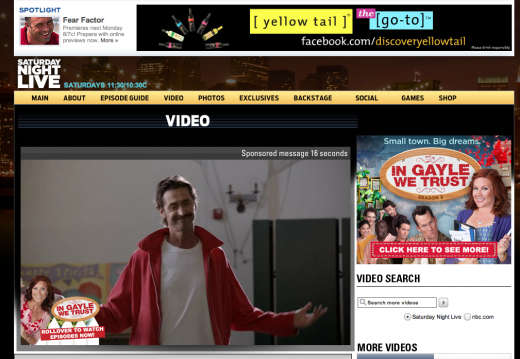
While attempting to watch an SNL skit (shown above), NBC manages to cover ads with ads to create a pile of clutter. I also have an overwhelming urge to try and get “In Gayle We Trust” cancelled.
OK!
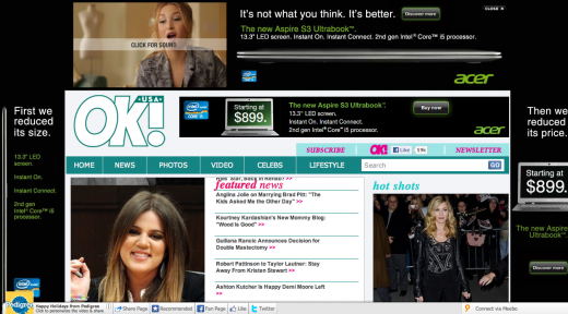
OK!, a well-known gossip magazine, is not renowned for its print design. That said, a visit to OK!’s online counterpart contains enough Acer Ultrabooks ads to make your eyes bleed. The glaring lack of respect for its own content should keep OK! on this list for life.
AOL

AOL‘s decently successful design feels fresher and cleaner than ever before. Crisp type and a clear information hierarchy make the viewing experience enjoyable — if it weren’t for all the floating, glittering Kohl’s dollar signs moving across the screen.
Marie Claire + Mens Health
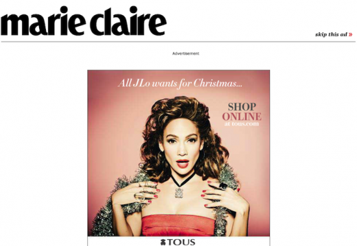
Would you buy a magazine if the only thing on the front page was an ad? Like Forbes, Marie Claire‘s homepage does just that, forcing readers to click a skip this ad button upon first arrival. Mens Health‘s acts similarly, with their content blocking, trial issue ad.
Is there a solution?
As much as I would enjoy picking out every single flaw within the major sites above, I understand that striking a balance between profit and content is hard to do online (especially for print publications making the online transition). But as content continues to be consumed digitally, it is hard to ignore the growing problems associated with a complete disregard for reading and viewing aesthetics.
Flipboard, a widely praised iPad app, brings print design to the tablet, and keeps ads separated between posts. PressJack, a US-based startup, turns RSS feeds into a Flipboard styled experience for standard browsers, and might be one of the better ways to enjoy quality content obscured by obnoxious websites.
Of course, there are some publications that provide a striking content presentation, while keeping ads on every page. Great examples of a quality balance include LIFE, TED, and The Atlantic. If only the companies above followed their lead.
Do you know of any UX train wrecks caused by advertising? Let us know in the comments!
Get the TNW newsletter
Get the most important tech news in your inbox each week.


