
The 90s and the early ’00s weren’t exactly known for their emphasis on aesthetics in the tech space. For the most part, technology companies dedicated their efforts to building massive, reliable infrastructures like Microsoft, Amazon, Google and Facebook. Fast forward 10 years and today’s tech savvy companies, most recently Google, are realizing that you can’t just be geeky anymore, you have to be beautiful too. After all, there’s a reason Acer isn’t Apple. It’s smart design.
We take great pride in our design at The Next Web. In case you hadn’t noticed, it’s undeniably more beautiful than our main competitors. A smart and beautifully designed website is a combination of an innovative, thoughtful user experience dressed up in a fabulous user interface; a website that provides users with easily accessible information with a disregard for click-through rates. Having a wicked cool product doesn’t hurt either.
“The biggest trend in user experience and visual design right now is designers going beyond standard metrics and trying to bring real pleasure to users. Gamification has been a big part of that for application focused websites. If you’re able to make people happy beyond just whatever they’re using the site for, then you’ve reached that goal,” says Matthew Moore, the Creative Director of Simande, a full service web design and development studio in New York City.
One of New York City’s most successful and popular independent user experience designers, Whitney Hess is also quite prolific. In her blog post “The UX Hippocratic Oath“, she writes:
“I will apply, for the benefit of the user, all measures that are required, avoiding those twin traps of overindulgence and corporate oppression. I will remember that there is art to experience design as well as science, and that warmth, sympathy, and understanding may outweigh the information architect’s taxonomies or the interaction designer’s wireframes.”
In the last year, technologies have emerged that solved a lot of problems in web design. For example, TypeKit enables designers to support non standard fonts, so all of a sudden designers can play with hundreds, if not thousands of different type faces. Jason Santa Maria, the founder and principal of Mighty, a Brooklyn-based design studio is a creative director at Typekit. Check out these beautiful explorations of possible sites for various World’s Fairs by Santa Maria and two other highly respected designers Frank Chimero and Naz Hamid. “All three designers are highly respected and on the cutting edge of web design,” says Matthew Moore. Their mission with these projects was to show off the power of Typekit.
Taking user experience into consideration, along with flawless site design and and exceptional product, we’ve brought together 10 of the smartest looking sites out there.
They are:
1. Nizo App

Literally built to impress, and therefore drum up press, for its mysterious yet-to-drop Nizo app for iPhone, a design team assembled ‘parts of the app’ as indicative clues of what the app will do. Perhaps on the fly, music effects? Paired with plenty of intrigue, the result is a beautiful, dynamically fresh website. The exclusive visual was designed by Jason Cotterrell who is part of the developing team Image Mechanics from Australia. Check it out here.
2. Flavors.me & Goodsie

The next two websites are from the same family and both have the unique ability to let plebeians like you and me own beautiful, simple design elements. Flavors.me is a simple, beautiful aggregator that lets you pull together all of your social media identities like Facebook, Twitter, Flickr, Last.fm, Posterous, Netflix, LinkedIn, Blogger, Goodreads, Foursquare, YouTube, WordPress, Tumblr, Etsy, and RSS on a simple, personal splash page. For those of you without the desire to own your own domain, it’s a no-brainer.
We first wrote about Goodsie in May, an online retail solution that comes from HiiDef, the creators of the Flavors.me. Just as Flavors.me focuses on an easy-to-use interface that still allows users to end up with beautiful-looking results, complete with personalization options galore. Goodsie works on the same principles, and that’s great news for users who want to start selling their products on the web right away. It’s an ideal solution for anyone wanting to set up a branded storefront.
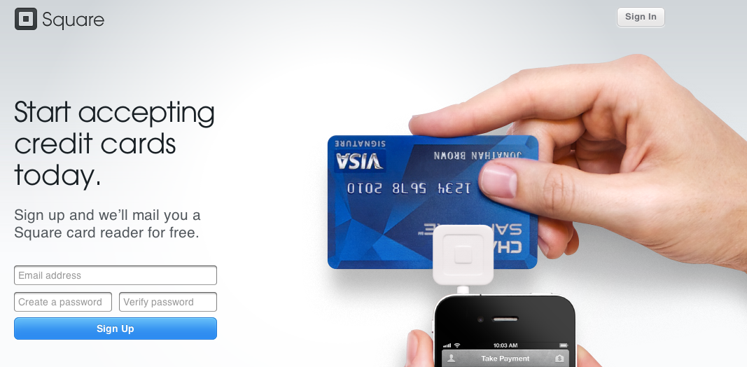
3. Square
Take one look at Square and you’ll know exactly what the product is and what the site offers. It’s simply and beautifully designed just like the product. According to Square founder Jack Dorsey, his payment service Square was almost called ‘Squirrel’ and the card reader dongle was made of wood and shaped like an acorn. Until he had lunch at Apple. I can just imagine that lunch in the Apple cafeteria with Steve Jobs telling Dorsey to drop the woodsy Acorn look and go with something white, minimal and squared off. Hey, it worked for Apple right? Read the full story here.
4. Dustin Curtis

Dustin Curtis’s website is a visually stunning blog. Curtis, who splits his time between New York City and San Francisco, spends about 2 days making each article look visually stunning. Don’t be put off by the minimalist homepage, it’s deceivingly simple but a smart trick that leaves you blown away once you start browsing his articles. You can follow him on Twitter here.
5. Svpply
Svpply (pronounced “supply”) launched last November and has fast become the Internet’s favorite “window shopping” site. Svpply, which made our list of best Boston startups, is essentially an endless scroll of apparel, accessories, shoes, tech, media, home stuff, uploaded by users with particularly good taste. In addition, Svpply provides sections for Editor’s pick, Gift guides and Popular this week for your browsing pleasure. One of the entrepreneurs and designers behind Svpply is Zach Klein, who’s also notorious for his work at Vimeo, CollegeHumor and Boxee.
“Our background is more engrossed in the aesthetic. One of our goals is to have a shopping site guys won’t be afraid of. On the front page, you dont even know you are being sold to,” says Ben Pieratt, Svpply’s CEO, who has twice been named one of our nation’s Top 20 Designers Under 30.
6. Gojee
“Recent trends in website design include use of larger graphics, photos and high res images,” says NYC Creative Director Matthew Moore. “Take Gojee for example. Without the images, the site would be a quarter of what it is. What’s so striking is their size.” The mouth-watering photos on Gojee, an awesome new recipe app based in NYC, are delicious enough to make Mary-Kate Olsen hungry. Tell Gojee what you have in your kitchen and curated recipes pop up in seconds. Recipes from are handpicked from food writers who know what they’re doing. The site will even deliver personalized recipes based on what you crave and what you dislike. This is the most successful iteration of the site yet, which has recently gained it attention on blogs such as SwissMiss and Gizmodo.
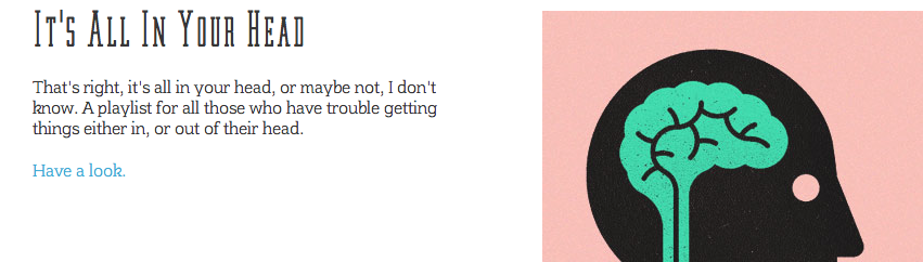
7. Decorated Playlists
This playful playlist site was designed and created by London based web designer and former DJ Simon Foster to explore the close relationship between music and design. “I have previously dabbled with the combination of design and mixtapes/playlists on (the now defunct) Bones Brigade Dj’s blog and also here in a tribute I made to Serge Gainsbourg, but I wanted to take it a step further. The final piece of the jigsaw came to me after I contributed a mix to the fabulous designers.mx project. You can think of each playlist as an art-directed blog post, but with music instead of words,” says Foster. This site uses the latest in HTML5 and CSS3 and will not work fully in old ‘lame’ browsers.
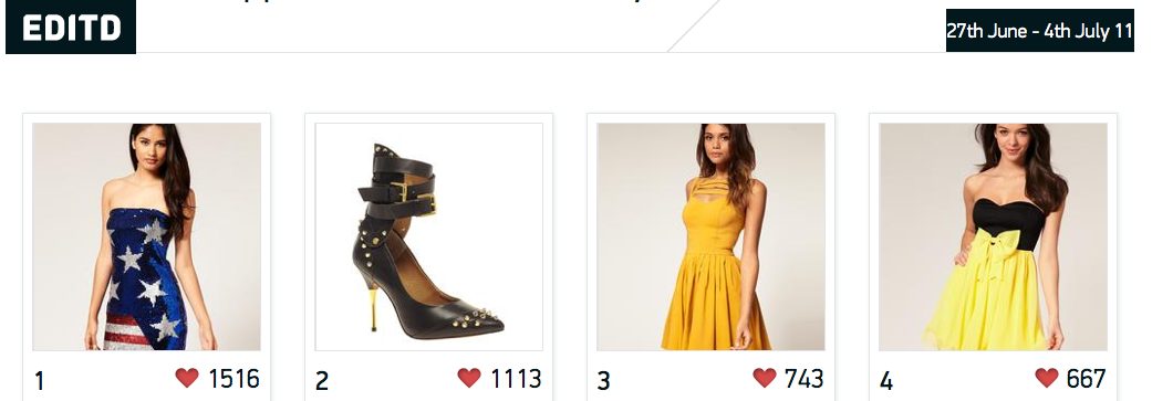
8. EDITD
The London based EDITD is a cloud-based social, commercial and factual observation instrument, giving businesses the ability to quickly understand trends and market dynamics in real time and over time. In June, EDITD scored $1.6 million in funding to handle data increases while continuing its global expansion. The B2B company mines social media including blog posts, tweets and Facebook to collect the hottest and most popular fashion items so that brands can better determine pricing and manage their inventory. It’s the anti-Gilt if you will. There’s something really elegant and fresh about EDITD that makes it the hottest looking B2B startup I’ve ever seen.
9. Gilt
Speaking of Gilt, every site under the Gilt umbrella including Gilt Groupe, Jetsetter, Gilt City, and Gilt Manual is simply stunning. Its newest family member, Gilt Taste (pictured above) has me nearly as hungry as I was on Gojee.
10. We Are NY Tech

I am a little bit obsessed with We Are NY Tech‘s “Randomize” feature in the top left toolbar of the site. It’s like an internal StumbleUpon. Genius. We Are NY Tech’s co-founder Matthew Shampine, who’s also the co-founder of Onepager, a yet-to-launch company in NYC that will allow small businesses to create great looking, simple websites for themselves believes:
“Great websites aren’t simply about functionality. Creating a memorable experience is what we always try to do. Maybe you can bring out the personality of the company in a unique way. Maybe you can turn a typically complicated part of a site into something fun and enjoyable for the user. User experience is the ultimate differentiator on a very crowded Internet.”
Honorable Mentions
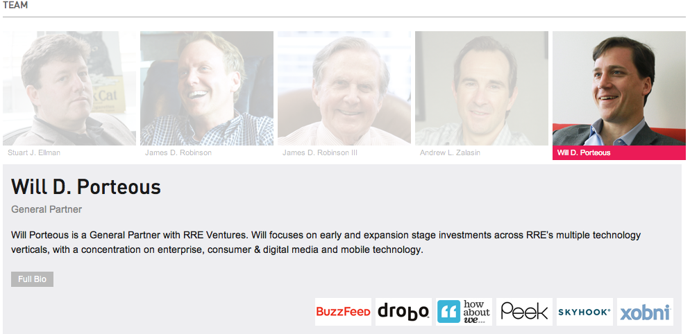
RRE Ventures
The new RRE website was designed by the brilliant minds behind We Are NY Tech. “They wanted to look professional and position themselves as NYC’s VC firm but at the same time they wanted to have that close interaction with startups to establish those relationships,” says Matthew Shampine. “First, we wanted to connect the people who work there with the actual companies they invest in.” Click on each investor and you’ll see what startups they’re connected to. Then click on the interact button and you’ll see the actual box for communcating with RRE that says “Talk to Us”. The site looks great on mobile as well. Check out the new site here and the old design here.
500px

We recently wrote about 500px, the social photo site that’s quickly luring the best photographers away from Flickr. The site lets photographers create contemporary portfolios with optional themes that are separate from the photostream. Portfolio also has sections for Biography and Contact. In fact, this makes it a great ready made website solution for photographers who are web challenged.
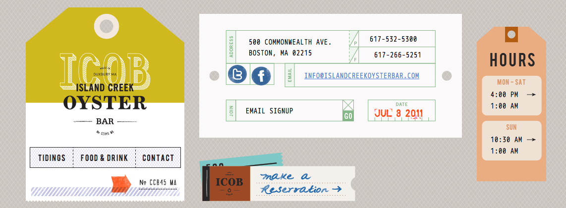
Island Creek Oyster Bar
While far from a tech company, the Island Creek Oyster Bar has one of the most lighthearted and fun websites I’ve seen in the restaurant world. Next stop Boston, and I’ll take a glass of champagne please.
MetaMarkets Group
 The San Francisco based company MetaMarkets Group specializes in predictive analytics for digital media. “These guys use color, type, and line rules really well. They could have gone a totally different direction and used stock photos or other cliched images of data, but instead they created a really beautiful site that really enhances their brand,” says Creative Director Matthew Moore.
Contemporary Graphic Design
While not a tech company, Studio Reizundrisiko is a graphic design studio based in Switzerland that designs books, exhibitions, publications, identities, and websites for cultural institutions, businesses and individuals. Because it’s in the design biz, the website is basically a stand-in for a resume, pitch or proposal. This guy has some funky stuff going on and being able to an anteater around the screen while your scrolling through previous projects is a plus.
For daily site inspiration, check out AWWWARDS, a site dedicated to design, creativity and innovation on the Internet and Dribble, a “show and tell for creatives.” In May, our West Coast Editor, Matthew Panzarino wrote up a list of 15 incredible sites to visit for design inspiration. Be sure to check it out here on your way out.
Get the TNW newsletter
Get the most important tech news in your inbox each week.