Google has done a lot of redesigning this week, giving many of its services a makeover in line with the Google+ aesthetic. But two of their most popular apps, Gmail and Google Reader, haven’t yet changed. Google is quite clearly trying to bring its whole network in line with this new look and feel, so we can only assume that the reason they haven’t yet changed is because they’re much bigger jobs.
GoogleDiscovery reader Geison Silva had some thoughts on how a G+ inspired redesign for the two apps might look and turned them into mockups. I’d be surprised if Google did make Gmail and Reader as clutter-free as Silva has done in these mockups, but I think on the whole they could be pretty accurate representations.
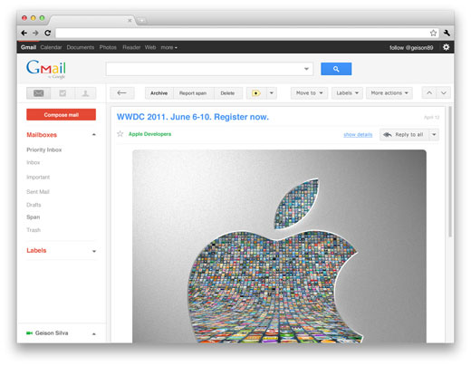
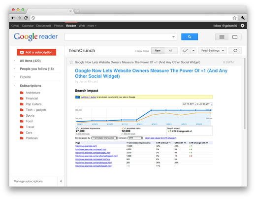
The glaring problem, of course, is that it’s TechCrunch in the Reader mockup and not The Next Web. Check out the full size shots over here.
Get the TNW newsletter
Get the most important tech news in your inbox each week.
