
The Web’s getting more and more visual. Emoticons have already replaced Internet slang. Local search results that include images attract 60 percent more clicks. And for 67 percent of consumers, images carry more weight than product information.
We can decipher the meaning of an image in a snap, but it would take us lines and lines of text to describe it with words – not to mention the fact that words often describe an image rather insufficiently. It, therefore, comes as no surprise that 40 percent of people respond to visual information better than text.
And you can see the effect of visuals on marketing strategies too. Just take a look at these few stats:
According to Xerox’s research, colored visuals increase our willingness to read a piece of content by a stunning 80 percent!
- Brain Rules reported that visuals achieve 98 percent of immediate recall, sentences reach 90 percent, while individual words only 88 percent.
- When visuals are coupled with text, their rate of recall increases by six times.

The 💜 of EU tech
The latest rumblings from the EU tech scene, a story from our wise ol' founder Boris, and some questionable AI art. It's free, every week, in your inbox. Sign up now!
I will show you a step-by step process for creating an image to enhance your content, and also share some of my favorite tips.
Which tools should you use to create designs?
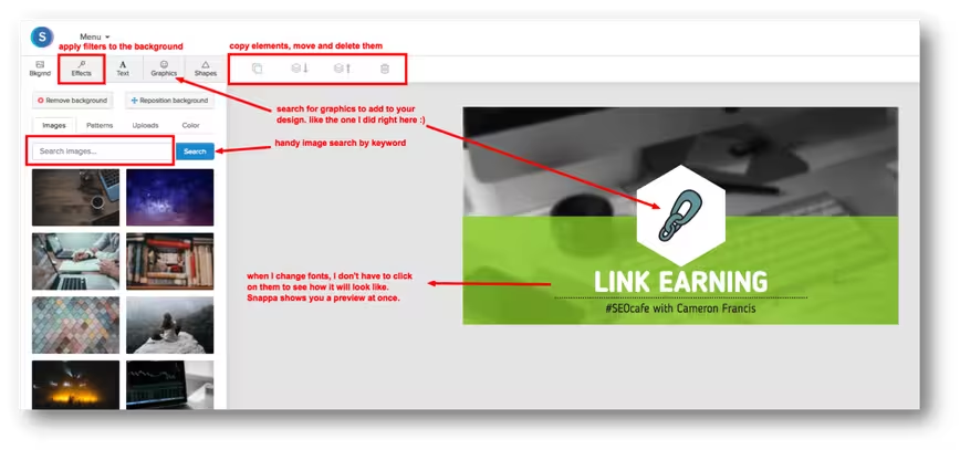
I think I’m going to surprise you here. Almost everyone recommends Canva these days, and this tool was my favorite until I came across an amazing, new one – Snappa.IO. Apart from having a huge free photo library, Snappa.IO makes it super easy to apply effects to a background, plus has a very handy search for graphic elements and its templates are not as recognizable as Canva’s, in case you’re looking for exclusivity.
Let’s cover all the steps of crafting an image for a Twitter post.
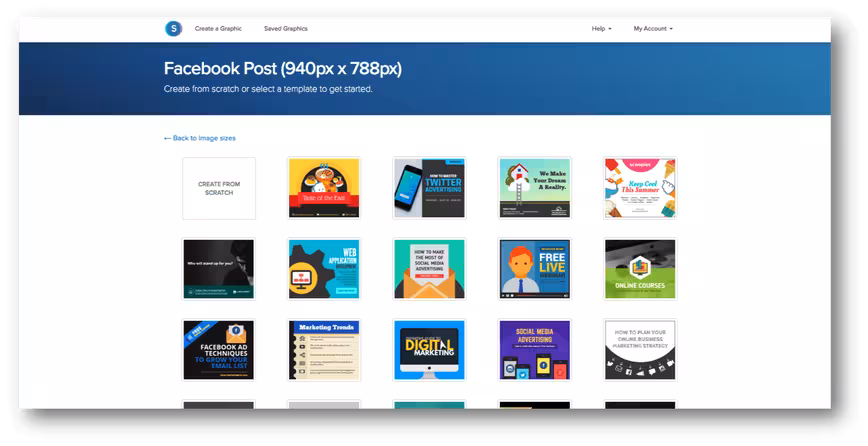
Snappa offers a variety of templates with predetermined dimensions – presentations, featured images for blog posts, Twitter and Facebook posts, etc. You also have the option to create a custom template with the exact dimensions you need.
After you’ve chosen the template you need, you can use one of the pre-made designs or create your own image from scratch.
Actually, modern design tools offer an incredible opportunity to create complex visuals. But if your goal is just to enrich text-based content with images and make it more visually appealing to your audience, then a background image + text layout works best.
Where can you find photos for your images?
So, the next step is choosing a background image for your post.
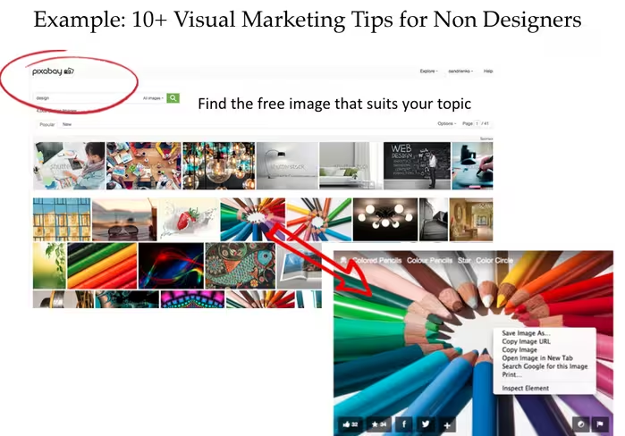
Google is full of images, but not all of them are allowed for commercial reuse, and using them might result in legal action against you. As I already mentioned, Snappa has its own image assets, but you can also check numerous websites that offer free stock photos.
The three main sites we use when looking for pictures are:
- Pixabay – here you can find tons of photos, drawings and vectors that can be used for free. You can search by image type, color, category or keyword.
- Unsplash – every 10 days this resource offers 10 new high-resolution images. Unfortunately, the images are not categorized, so it may take some time to find exactly what you need.
- Gratisography – this is a collection of pictures taken by photographer Ryan McGuire that’s free of copyright restrictions. New pictures appear on the website every week; and although the images are divided into a few categories, there are no search options.
So try using one of these sources. Find an image that suits your topic and upload it to Snappa.
How to choose and match colors?
Now it’s time to pick the right color to use for the elements of your image. Choose colors depending on the emotions you want to evoke for the audience. For example:
- We associate blue with security, integrity and peace.
- Turquoise suggests all things spiritual, healing, and also protection.
- Green equals health and freshness, but also money and fertility.
- Yellow suggests happiness or joy.
- Red, on the other hand, speaks of love, passion and energy, but also anger and danger, and we interpret it as a warning sign.
- If you want to make something look classic or stylish, the easiest and most obvious option is black and white.
You can discover more interesting facts about color usage in this fantastic guide to using colors in marketing by AdEspresso.
Some other aspects to consider when choosing colors:
- Your target country
Having said that, in many cases our language, culture, senses and personality traits affect our associations too.
For example, we consider certain colors to be cold or warm. Language also alters our color perception. As this guide to color associations points out:
The English language abounds with expressions pointing to connections between colors and emotions. It is possible, for instance, to be purple with rage or green with envy. Sometimes one sees the world through rose-tinted glasses; at other times one is feeling blue.
And so, since most of the time you target specific emotions with your visuals, make sure that you choose appropriate colors in your images to stimulate a specific emotional response from users.
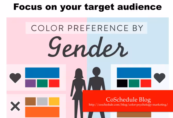
- Your targeted audience
Keep your target audience in mind; color preferences greatly vary for men and women. You can get more information about this from “The Ultimate Color Guide for Content Marketing” by CoSchedule.
- Your brand’s style
Besides, you probably have your own brand colors that you want to use in your designs. Ask your designers for the hex codes for your branding colors. If you have a brand book, then the problem of choosing and matching colors is already solved!
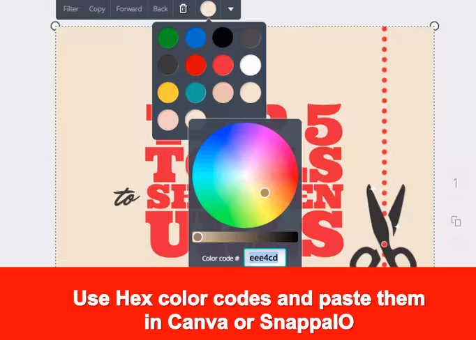
In other cases, you might need tools that will help you find colors that match perfectly.
- Adobe Color CC is one of our favorite tools. With it you can easily browse or generate color palettes by a chosen scheme – monochromatic, complementary, triad and so on. You can create palettes manually with the color wheel or use ready-made color schemes.
- Color by Hailpixel – find the color that you need by moving your cursor on the screen up: down moves change lightness; right to left moves change the hue. Then you can save the color by clicking and copying the code.
How to choose the best fonts?
Our brain makes choices we can’t even explain and this happens due to specific small elements that have a huge effect. Not only does our brain process fonts because of the messages behind the text set in them, but it also assigns meaning to a font itself. This statement is best represented by the awesome infographics by Crazy Egg: different font types evoke different emotions.
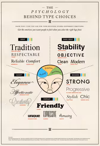
Let’s take a look at some examples:
- The well-known Calibri font (the default setting in MS Word, for example) can make an image be perceived as clean.
- Script fonts, such as Bickham Script are seen as elegant, creative, and affectionate.
- Serif fonts, of which Times New Roman is the most representative example, communicate tradition and respect.
- Readers view modern fonts as progressive and strong.
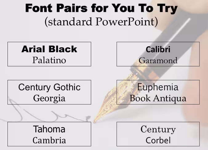
Moreover, different font combinations can affect your audience differently. To make it easier for you to decide on the best combinations, I prepared a quick cheat sheet for the most common combinations that will easily work together in your visuals.
Now let’s place text on your image. Add to your background a shape (rectangle, square, oval) in which you’ll then place your text and adjust the transparency.
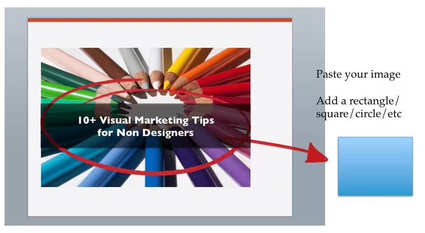
And…your image is ready!
Mobile apps
Even if your team members are not in the office, they are still able to create awesome designs from their smartphones with the help of mobile applications:
- VSCO Cam – to easily apply filters and effects to your pictures
- After Photo – to immediately add text and captions to your photo
- Word Swag – to create images with stylish designer text in few seconds
Tip for social media posts
When using visuals to promote something on social media, remember to include different images – this is a surefire way to keep your audience’s attention.
Create two to four images for each event or post, and use them at different posting times.
So what does your image-creation process looks like? What are your favorite tips for crafting visual content?
Get the TNW newsletter
Get the most important tech news in your inbox each week.