
This post was originally published on the Shutterstock blog and has been reprinted with permission.
Color makes the world beautiful. Nothing feels more energizing than a vibrant blue sky on a sunny day. And when we need peace? We take a walk through the snow, relax in the sand at the beach, or let ourselves become captivated with the orange, purple and pink sunset that, without fail, puts our busy days to rest.
Our everyday experiences teach us that color has value beyond what we see. It complements our moods, helps us organize our spreadsheets and reminds us of our favorite childhood toys. That’s why color theory is so important to your digital design.
In addition to seeing how color combinations look, it’s important to understand the science — and social science — behind what makes them work. Whatever your skill level is with design, these three color theory tips will help you navigate the complex art of choosing a color palette.
1. Sociology is the heart of color
Color makes us think as much as it makes us feel. Certain colors are tied to cultural, emotional and social experiences — that are sometimes bigger than us. When choosing colors, think about what your palette means to your intended audience. If you’re running an international campaign, for instance, you’ll need to understand what each color means in the country that you’re targeting.
Nicky Szmala, digital director at Geometry Global, posted a chart in which he breaks down the meanings of basic colors by geography. In the Western world, for instance, red signifies danger, love, passion, excitement and sacrifice. In East Asia, the same shade of bright red can correspond with celebration, happiness and long life. Among Celtics, meanwhile, red corresponds with death. In Russia? Communism.
According to the related Quora discussion, here is what some popular colors mean in the Western world.
Blue: security, tranquility, peace

Green: freshness, environmentalism

Yellow: energy, cheerfulness, caution

Purple: spirituality, luxury

Pink: romance, beauty, love, sensitivity

When choosing a color scheme for your Web project, take some time to refresh yourself on the values of those who you’re trying to reach. Better yet, have conversations with your target audience to determine what color means to them.
2. There’s a science to it
Colm Tuite, a user experience designer, emphasizes that the science of picking colors is of equal importance to the subjective component. He explains that colors fall into three general categories.
Pures: Colors that are usually incorporated into bright designs and convey youthful, summery, cheerful, energetic or “cool” appeal.

Tints: Colors mixed with white that convey a lighter, more peaceful, low-energy feeling.

Shades: Colors mixed with black that convey mysterious, dark, evil or dangerous moods.

When working on a design project, your gut may tell you something about the emotional connection created by your chosen color combination — and it’s probably right. The next step is to understand why.
3. Design for diversity
Our biology and physiology control how we perceive color. Some people are color blind, while others have trouble reading text up close. When designing for the Web, be sure to accommodate that diversity. Make your content as easy as possible to read — which means avoiding a neon yellow font on a light gray background, for example.

Focus on inspiring audiences across the spectrum. We all see the world through our own eyes, and as marketers and designers, our job is to make this process as easy as possible.
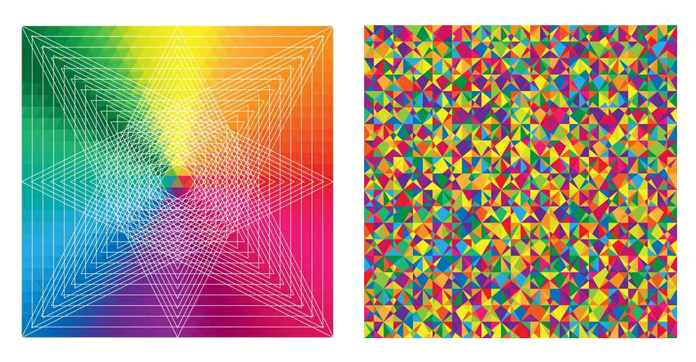
View all of the images featured in this post in this Color Theory lightbox.
Get the TNW newsletter
Get the most important tech news in your inbox each week.