
Alexander Huls is a freelance writer who has been writing about pop culture for over five years. His work has appeared in the New York Times, the Atlantic, National Post, Film School Rejects and more. This post was originally published on the Shutterstock blog and has been reprinted with permission.
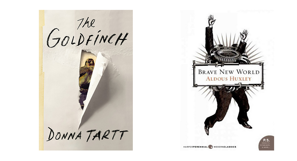
With hundreds of thousands of books published (and self-published) every year, it can be difficult to get noticed; a great cover can often mean the difference between a sale and a trip to the bargain bin. Book-cover designers have to choose from a wide range of techniques — illustration, collage, typography, photography — to find ways to make sure you take a closer look.
Gregg Kulick, David Pearson, and John Gall are experts at this. As some of the industry’s most sought-after cover designers, their work can be seen on titles published by companies ranging from Penguin to Vintage, and for authors including Cormac McCarthy, John Le Carre, Jennifer Egan, and Haruki Murakami. We spoke to them about the fine art of book design, and how photography, typography, and collage come together to create compelling cover art. Read on for 10 key takeaways.
1. A book cover must be both art and commerce.
2. The book always comes first.
Early in his career, Kulick admits that he often made the mistake of putting his design interests before the needs of the book itself. Now he stresses that the book always has to come first. According to Kulick, designers have to “let the book determine what the design is.” Pearson echoes that sentiment, stating that as long as a cover is “supporting and representing the book in a kind of immediate visual graphic form, then that’s all it really needs to do.”
3. A great cover should push industry boundaries.

To Gall, a great cover is not only something that “represents a book, but also elevates the art form. It pushes the boundaries of what book cover design can do, or what it can be.”
4. Using photography? Know what you want first.

Kulick stresses that when you’re going to be using a single image for a book cover, “you can’t go in without an idea. You have to define for yourself what you’re trying to look for.” He notes that this practice is particularly important for covers that require original photo shoots, like the ones he’s done with Mike Tyson and Penn Jillette.
Kulick points out that publishers’ budgets aren’t very big, so designers rarely have the luxury of experimentation. To get the look he wants with limited resources, Kulick asks himself the following: “What is this book? What is the essence of what this book is about? And then you try to find that in a photograph.”
5. Let the photograph do the work.

Compared to more elaborate book covers with which designers can play more, using just a single image presents a unique challenge. It can be tempting to want to do more, but that can result in a cover that’s cluttered and less effective. Kulick said that when using a single image, he’s learned that, “it takes a little more restraint in the design to make it work. You just have to pull back a little bit and let the photo do work.”
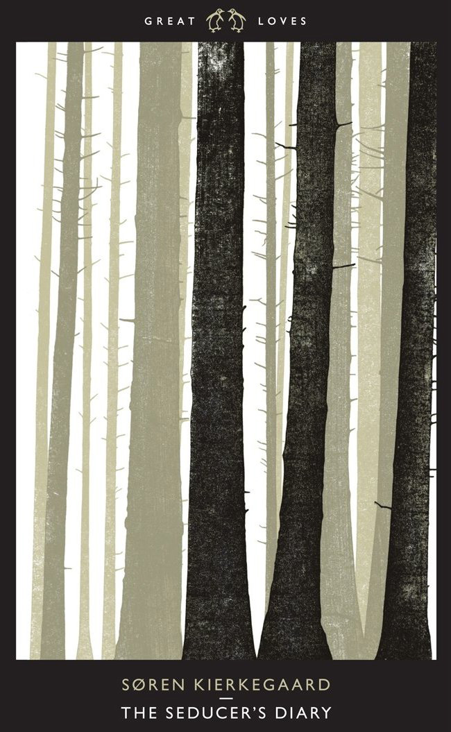
6. Typography can create powerful relationships.

“You’re not robbing them of the ability to create their own imagery, and you’re inviting them to decode this abstract representation and link it to the text.” Forming that relationship with a reader is, to Pearson, the greatest thing a book cover can accomplish.
7. Don’t be afraid of typography.
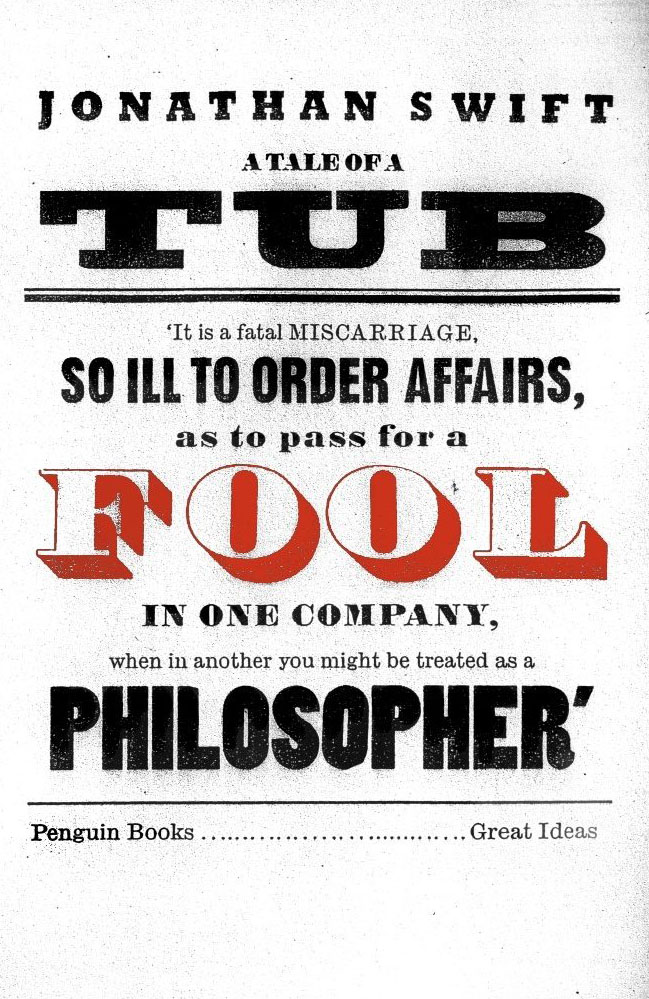
Pearson has found that many younger designers are wary of typography because “they’ve been told by some tutor that you’re somehow a bad designer if you use more than one typeface. It’s just nonsense.” Pearson believes that typography should be played with, stretched, broken, and put back together again — “bastardized,” he says with a chuckle.
That’s not to say you shouldn’t know the rules of typography — just don’t be bound by them (pun intended). “It’s all about the spirit and the style that you use with typography,” Pearson says. “It’s about the voice you give it. It really is just another form of expression.”
8. Find creative freedom in limitations.

In explaining why, he offers great advice for all designers: “If you know what your palette is, you can cancel out thousands of different potential decisions. It really focuses the mind.” He also puts it another way: “I think the most important thing is limiting your choices. You can feel very creative beyond that point.”
9. Make old images new again.
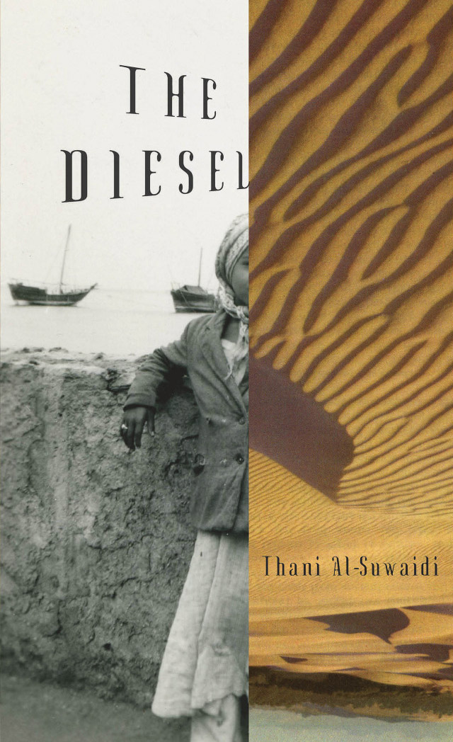
From archival photos to old Japanese baseball cards, John Gall’s work often gives new context to older images. “If you take historical things and treat them more symbolically and metaphorically, you can take them out of their historical context,” he explains. In doing so, designers can create surprising and compelling covers that resonate with audiences, while still communicating about the book itself.
10. The key to collage is juxtaposition.

Pearson stresses that designers have to ask themselves questions like, “What can you say by showing a little bit? Or too much? How jarring are these things when they’re next to each other?” Finding the right balance can lead to great design — and great book covers.
What are some of your favorite examples of book-cover design? Let us know in the comments.
Top image: Blank book cover on wood background by Konstantin Belenkov
Get the TNW newsletter
Get the most important tech news in your inbox each week.