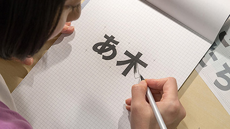
Adobe has joined forces with Google to release a new set of Asian OpenType fonts that span the Chinese, Japanese and Korean languages. The Adobe font, named Source Han Sans, is a new open source offering for the company’s Pan-CJK typeface family.
Google is simultaneously releasing its own version of this font under the name Noto Sans CJK as part of a plan to build out its Noto Pan-Unicode font family. Both sets, developed in collaboration, are identical except for the name and will serve 1.5 billion people — roughly a quarter of the world’s population.
The new typeface family is available in seven weights, supporting Japanese, Korean, Traditional Chinese and Simplified Chinese, all in one font. It also includes Latin, Greek and Cyrillic glyphs from Adobe’s Source Sans family, according to an Adobe blog post and a Google blog post describing the massive release.
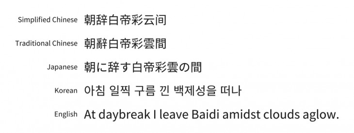
“Because it’s a sans serif typeface, it’s a workhorse font — good for a single line of text or a short phrase or something you might see in a software menu, as well as longer strings of text that would appear in an ebook or a printed publication.”
Source Han Sans is available in weights spanning ExtraLight, Light, Normal, Regular, Medium, Bold and Heavy. Heavy and ExtraLight were designed by hand, however the middle weights were created via software interpolation, Adobe said. Overall, Adobe is releasing 42 fonts, taking into account seven full font weights and region-specific subsets for screen and print.
Noto Sans CJK is also provided in seven weights: Thin, Light, DemiLight, Regular, Medium, Bold, and Black, according to Google’s blog post.
Each font weight in the family has a total of 65,535 glyphs (the maximum number of characters supported in the OpenType format), and the entire family contains just under half a million total glyphs.

Open source
This project, four years in the making, is the result of a unique international collaboration among five companies including Adobe and Google in addition to type foundries in Japan, China and Korea. This marks the first time a typeface family of this magnitude has been offered via an open source license and made available to designers, developers and general users.
“Not only are the open source fonts free, but users can extend and modify them,” Minoza said. “They would have the right to add Vietnamese characters, for example. Hardware and software manufacturers can install the fonts on their devices. There’s a really big audience and the licensing rights for open source makes it good for device manufacturers.”
Discussions around creating a Pan-CJK font started about 15 years ago at Adobe, but the company couldn’t get beyond the overall cost in terms of time and resources.
With this joint project, Adobe was able to contribute its design, technical skill, in-country type experience, coordination and automation, while letting Google take control of the logistics for project direction, defining requirements, in-country testing of resources and expertise and funding.
“Adobe has a depth of knowledge and skill in not just building high quality fonts but in building fonts for CJK. Google wants to create the best solution for our users and so working with Adobe was a natural choice,” said Stuart Gill, tech lead and manager of Google’s Text and Font team.
.
Design logistics
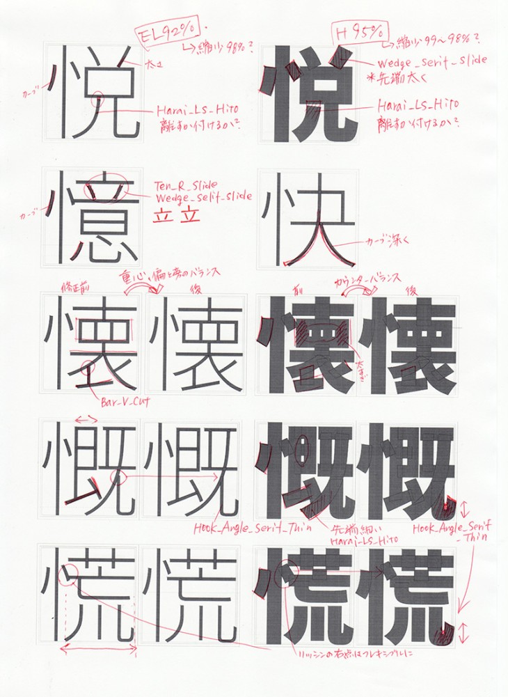
To make sure the font was authentic for native readers, Adobe sought expertise from foundries such as Iwata Corp. to expand the Japanese glyph selection, Sandoll Communication, designer of Korean Hangul (the Korean language native alphabet) and Changzhou SinoType, Adobe’s longtime collaborator in China.
Each foundry was assigned a different task for a unique contribution to the project. Said Minoza, “Iwata fleshed out the original Japanese design, which was provided to our other partners. Sandoll created the Hangul characters from scratch — and they needed to make sure they harmonized with the other characters as well as with the Latin characters — and SinoType not only had to expand the Chinese glyph sets but they had to analyze each of the glyphs to make sure they satisfied regional considerations.
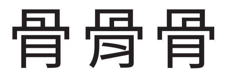
“There are a lot of instances and regional variations for the characters even though they all evolved from the same character originally.” The new font also features Hong Kong and Taiwanese character sets.
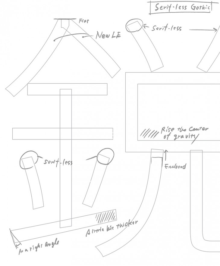
Ryoko Nishizuka, an Adobe senior designer on the Tokyo type team, created the overall type design from which the other language variations are derived.

Limits of OpenType
Why is the type limited to 65,535 variations (if one could call that a limit)? According to David Lemon, manager for Adobe Type, OpenType was built on the foundation of the sfnt font file structure that Apple originally defined for TrueType.
Multiple aspects of the format reference entries in the font file (such as characters, glyphs and layout adjustments) by their index in tables that hold each kind of information – and in the sfnt structure, the indices are defined as two-byte values. 65,535 is the number of values you can record with two bytes of information.
Said Lemon, “If we put more glyphs into a font there’d be no way to access them. When we defined OpenType we considered the option of allowing larger values, but we decided the benefits of staying compatible with existing TrueType fonts outweighed the limitation.”
Finding Source Han Sans
The fonts are now available on Adobe’s Typekit site via desktop sync. If you don’t have a Typekit account, Adobe provides a free subscription via Creative Cloud so you can start using the font right away. Similarly, the Google variation Noto Sans CJK is available from its website.
Adobe holds the copyright to the typeface design, and the fonts are released under the Apache 2.0 License, which makes them freely available to all without restriction.
Downloadable versions of the full multi-language font family, individual language subsets and original sources, are available on SourceForge and GitHub.
➤ Source Han Sans/Noto Sans CJK
Featured Image: Ryoko Nishizuka, Adobe senior designer on the Tokyo type team. (Credit: Adobe)
Get the TNW newsletter
Get the most important tech news in your inbox each week.


