Alexander Huls is a freelance writer who has been writing about pop culture for over five years. His work has appeared in the New York Times, the Atlantic, National Post, Film School Rejects, and more. This post was originally published on the Shutterstock blog and has been reprinted with permission.
Designer Thomas Porostocky, founder of creative agency TOM, believes in the power of infographics. When he talks about them, the enthusiasm in his voice is immediately noticeable. He’s also really good at creating them. Having worked with Wired, the New York Times, Nike, IBM, and others, Porostocky is in great demand for his ability to create beautiful visuals that make complex information and processes easy to understand.
We talked to the artist about infographics – what makes them important, how he approaches designing them, and what you can do to make yours great, too.
Why we need infographics
We live in a time of information overload. Humans will produce more data in the next five years than we have in the last 5,000. Much of that information is important for the general public, but because data alone can be dry, un-engaging, or difficult to understand, it often goes ignored. According to Porostocky, that’s where infographics come in.
“Infographics help to illuminate a lot of these ideas in a way that is understandable,” he says. “Making them stand out is the hard part, but if you present them in a way that’s a little more engaging, a little more elegant, it really helps bring all this stuff to life.”
Start with the Data, Not the Visuals
Every infographic project Porostocky works on begins with a client providing raw data. He starts by asking some key questions to help him tackle all the information he’s given: “What am I trying to explain? What am I trying to show? What’s the key idea? What is the interesting kernel we’re trying to communicate?”
Then he cuts down the info — a lot. “If you can get rid of 80 to 90 percent, that will help strip down to the real story,” Porostocky says. That’s not to say you shouldn’t respect the data. In fact, he says, it’s crucial to always be accurate and cite your sources.
Story is king
This is something Porostocky talks about a lot. “Storytelling is extremely important with data visualization and infographics. If there’s no story, then who cares? It’s just raw data. The story is what will set you apart. If it’s memorable and entertaining, then people will remember it.”
According to Porostocky, designers not only need to figure out what the story is, but also find the best way to make it relatable and engaging to an audience.
The power of unique visual touches
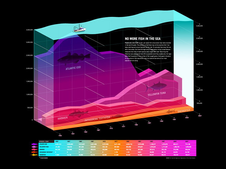
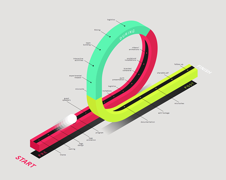
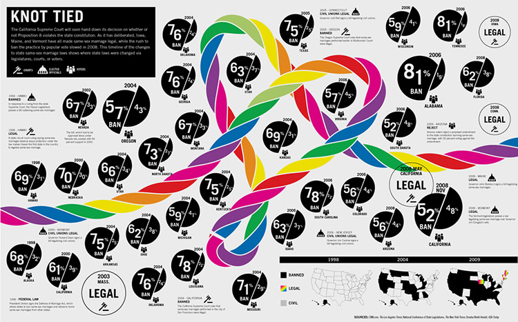
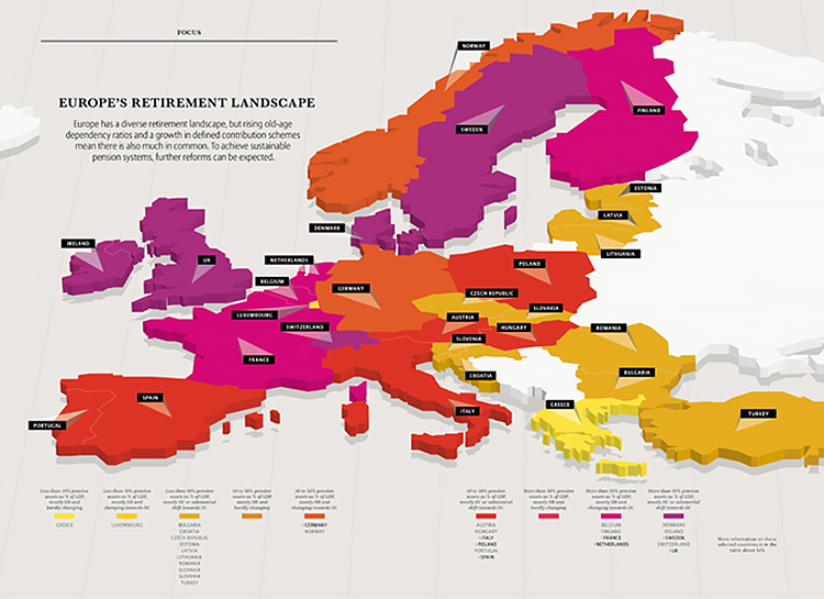
What makes Porostocky’s infographics different from others is his willingness to add a little something extra. He often uses isometric angles, tilting, or – most notably – 3D design elements. He admits that the last one has actually become a calling card for him.
But it’s not just a gimmick. “I’m drawn to that 3D style and like the idea of being able to show things in a different way than just your typical flat illustration. Even with a bar graph or pie chart, adding a little bit of depth or visual interest draws the users in a little bit more.”
The three basics of infographic design
Porostocky notes that designers need to keep three things in mind when creating infographics: “It has to have appeal; your audience needs to want to look at something. It has to make sense; your audience needs to understand what you’re talking about,” he said. “And your audience needs to remember what you’re showing them. If you have those basic three things, then chances are you’ve done a pretty good infographic.”
The future of infographics
Porostocky believes that the infographic is an art form still very much in its infancy. He posits that the next stage in infographic evolution will focus on interactivity. As he says, “We’re starting to see them migrate onto platforms where you can really start engaging people.”
He also points to Reshaping New York and One Race, Every Medalist Ever — two recent infographics from the New York Times — as examples of where the medium is headed.
“I like how they seamlessly integrate information design into the whole piece. It’s not just a sidebar, or its own standalone element; it’s integrated into the animation and story,” he explains. “The whole piece is just a nice mix of technology, solid editorial content, and strong visuals. It’s very New York Times.“
For Porostocky, of course, infographics are more than a trendy way to visualize data. They’re an emerging medium with the potential to change the way we tell stories. There’s even a hint of childlike joy in his voice when he says, “I’m pretty excited about seeing what’s ahead — and finding ways to be a bit of an innovator.”
Get the TNW newsletter
Get the most important tech news in your inbox each week.


