The color wheel has nothing on Prism, a new iPhone app that lets you roll your own photo filter combos based on the colors in your original shot.
There are plenty of photo filter apps for the iPhone—more than enough by any objective measure. But I’d argue that such image enhancements—which often sport names like Holga, Toy Camera, or simply a year from the past century—have been partly responsible for the depth and variety of the bustling iPhoneography scene.
Lots of photographers eschew filters, but they do serve a creative purpose. And that’s why a mysterious newcomer called Prism from developer Hyojin Mo, which has a different take on the whole setup, piqued my interest.
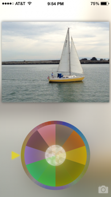
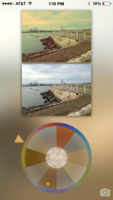
Prism employs a dual wheel-based interface for all photo handling—from choosing the photo to applying its filters.
To start the process, select the photo you want to work on by swiping on the first frame that appears. After that, the wheel engages to cycle through all the photos in your camera roll as you rotate it slowly with your finger. Tap to choose a picture or just shoot one with the app. Then tap the image to call up the colored dials.
As you rotate your finger around the outer dial, the app dynamically changes the color cast of the photo, emphasizing certain colors according to the built-in color groups. As you tap alternate points, different hues dominate. Tapping inner and outer dials mixes up filters with colors, offering a vast variety of effects and hues.
Pressing down on the outer arrow lets you preview your original and the new effect together.
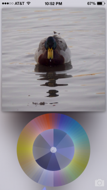
As you tap around, you can try for more brightness, contrast or posterization effects, but there are no specific controls that offer these exact results. It’s all trial and error, yet somehow it works. I found it best not to overthink the concept.
Prism forces you to think about your photo in a different way than standard filter programs do. While some interface elements could be more specific, an app that propels you to concentrate on the undefined visual is not a bad thing.
You have to conceptualize more of the emotion you want to express with your picture, without the help that comes with a filter called 1970 that defines it for you. With Prism, you have to define the look yourself in the vernacular of sight, not language.
Despite its cryptic interface, a couple of odd social networking elements show up randomly. The very center of the double wheel occasionally sports the letters T or F or a star, inviting you to tweet, like, share, or rate the app.
Each time you take a social action you are supposedly rewarded with additional new filters. I tried posting on Facebook and Twitter, but both actions stalled.
Despite Prism’s enigmatic interface, I found that it had an appealing, subtle effect on many of my images. Dispensing with definitions and zoning into the image’s space on its own terms gave me a different perspective on my shots.
That said, a couple of improvements might help users for the future.
It would be nice if there were a landscape mode instead of the app appearing strictly vertical, but that would call for the kind of space a tablet can provide. You can operate Prism on the iPad in 2X mode.
I’d also like to see a zoom function that lets you see more of how the effect is working. Most filtering apps have some way to save a favorite combination or adjustment, though that might be a bit much for the way this app operates. Still, it’s a thought.
And yeah, a bit more in terms of explanation wouldn’t hurt. We don’t need a doctoral dissertation, but some additional tips from developer to user might encourage people to fork over $2.99 for an app they’ll get the most from.
Image credit: Shutterstock
Get the TNW newsletter
Get the most important tech news in your inbox each week.


